A new design but it still feels like us
Costco Wholesale Corp, founded in 1976, is an American multinational corporation which operates a chain of membership-only warehouse clubs. We’re familiar with their brand.
The logo hasn’t changed at all since the 80’s so I took it upon myself to give it a refreshing touch. The idea is to bring the identity up to the same level as the rest of the market while keeping the identity recognizable for its current supporters.

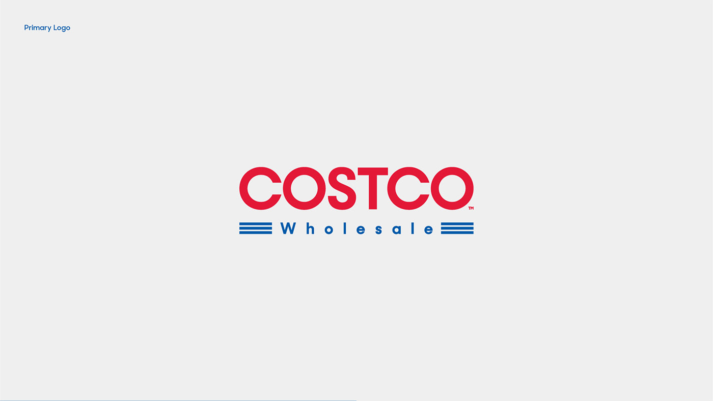
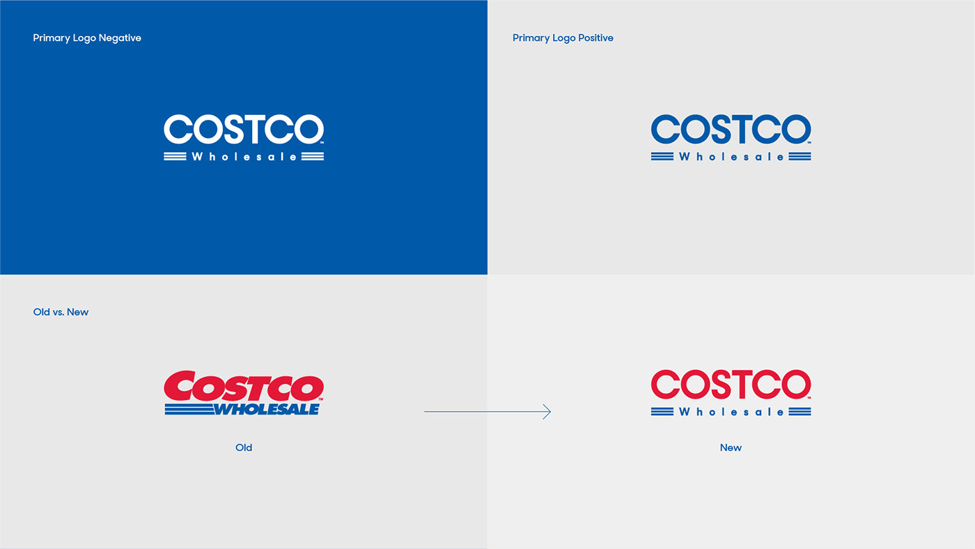


I focused on refreshing the elements that make the current logo iconic without losing their essence. Rounded uppercase letters replace the chunky, non-resizable and blown out letters in the name, and lowercase letters in “Wholesale” keep the emphasis where it should be— in the word “Costco”.
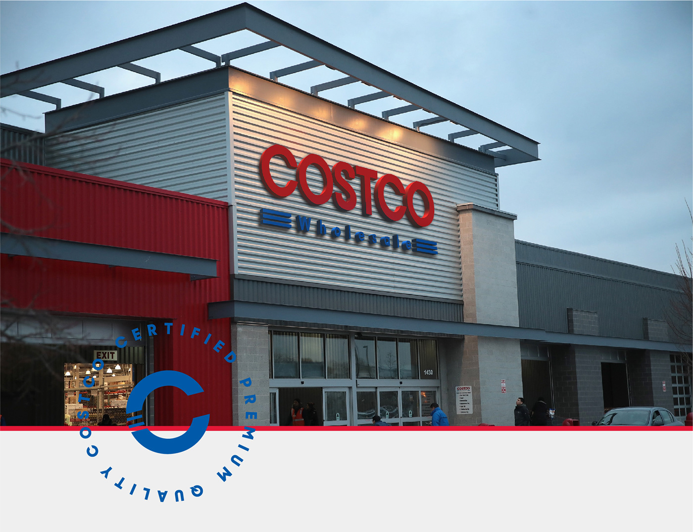
I decided to keep the 3 blue stripes as an essential part of the identity and use them prominently on the secondary logo (which should be used as a stamp representing “Costco Quality” on all certified products). The simplified version should be used for icons in web and mobile applications.
As for the typography, I needed a font that would fit well with both new and old Costco members. The Sharp Sans font family works perfectly because it is designed with the intention to look great in any context.