MacKay Sposito
As a well-established company opened in 1974, MacKay Sposito has experienced some growing pains in recent years. As they expanded services, entered new market sectors, added new employees and fought off the recession, they encountered confusion over who they are and what they do. And that confusion was shared both internally and externally. Plus, like many companies in the service-based industry, their brand individuality fell prey to the herd mentality.
The Challenge
Define a clear, comprehensive brand personality that honors their history.
MacKay was thriving, but mostly as a group of individuals. The brand lacked clarity, definition and any compelling personality. This made it difficult for people throughout the company to succinctly communicate the company’s offer, nor did they have the tools to be effective and consistent.
With no clear direction internally, clear messaging externally also suffered. Employees needed a clear focal point and story to rally around - a tangible message to take hold of and live out on a daily basis no matter their role.
The Solution
A memorable brand personality delivered both internally and externally.
Imageworks distilled MacKay Sposito’s core personality traits into a few key words and concepts to establish something memorable - and a rallying cry was born. With all aspects of the business encompassed within a distinct brand personality, employees know exactly how to deliver value to their clients. Since the brand personality was built on established core traits, behavioral change didn’t have to come into play. Instead, MacKay now has clarity and definition about who they’ve always been so that they’ll never be lost in the herd again.

The Results
With a strong brand personality leading the way, we had a clear map to a visual identity that truly reflected that brand. The new design embraced MacKay Sposito's vibrancy, personal touch and freshness – a unique position in a service-based industry that helped win the first proposal they pitched using the new standards.
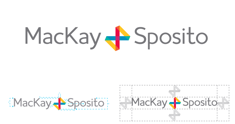
Primary Signature
MacKay Sposito’s brandmark, or “Join Mark” is derived from the mathematical symbol for Natural Join. The Join Mark is infinite, and journeys without an end, because relationships do not end when the project does. The Join Mark doubles as both an ampersand and a plus sign, all analogous with natural partnership.
MacKay Sposito’s brandmark, or “Join Mark” is derived from the mathematical symbol for Natural Join. The Join Mark is infinite, and journeys without an end, because relationships do not end when the project does. The Join Mark doubles as both an ampersand and a plus sign, all analogous with natural partnership.
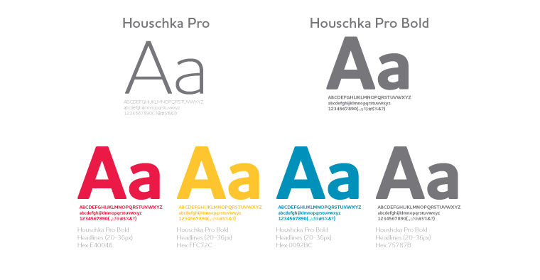
Typography
The corporate font we chose is a clean and legible modern sans serif typeface that retains a uniquely charming character with its rounded corners and rolling curves, for a soft and friendly appearance.
The corporate font we chose is a clean and legible modern sans serif typeface that retains a uniquely charming character with its rounded corners and rolling curves, for a soft and friendly appearance.
Expression
It’s not enough just to develop the tools for a brand. Once a brand has been defined, we use those tools to express that brand to the world.
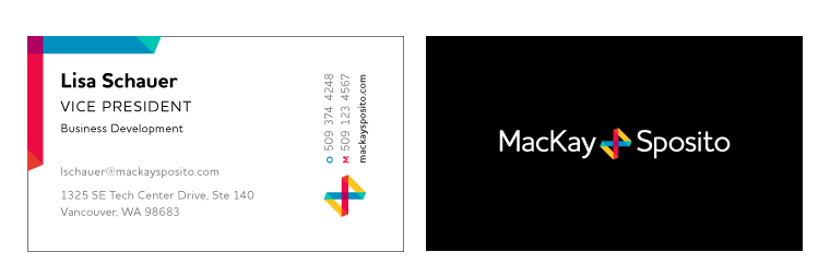
Collateral (biz cards, letterhead)
All basic collateral materials were redesigned using the new design system to properly reflect the personality of the brand.
All basic collateral materials were redesigned using the new design system to properly reflect the personality of the brand.
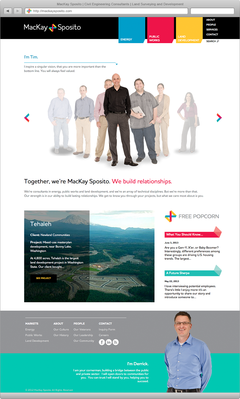
Website
Websites in this industry tend to focus solely on qualifications and past projects, often ignoring the people behind them. MacKay Sposito is different. They are selflessly dedicated to the people involved because, at the end of the day, it’s the people who matter and therefore is the focal point of the site.
Websites in this industry tend to focus solely on qualifications and past projects, often ignoring the people behind them. MacKay Sposito is different. They are selflessly dedicated to the people involved because, at the end of the day, it’s the people who matter and therefore is the focal point of the site.
Brand Journey Video
We created a video to help the company’s leadership articulate the purpose for this initiative and explain the value of undertaking such a journey.


