
Cultural Care Au Pair Brand Refresh
Under the mantra of “Travel. Learn. Grow.” the challenge was to turn the intimate experience of family into a global movement towards tolerance and to unite the host family and the au pairs' worlds to be the largest and most trusted au pair organization in the world.
Team
EF Global Creative, Lucerne
Cultural Care Au Pair, Boston
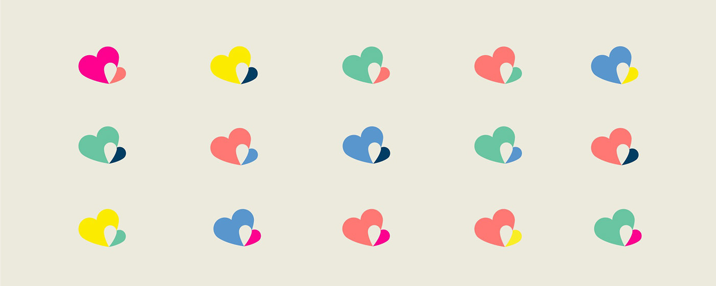
The Logo
The host family and the au pair are depicted by two overlapping hearts representing the experience, the unity, a blended family and cultural exchange.

The Identity
The combination of the brand elements, such as the pin shapes (the overlapping part of the hearts), the frame and the colors, convey an identity that is fresh, fun and hip yet sophisticated, trustworthy and authentic. Through the use of different hero-colors within a shared color palette two audiences can be approached within one brand.
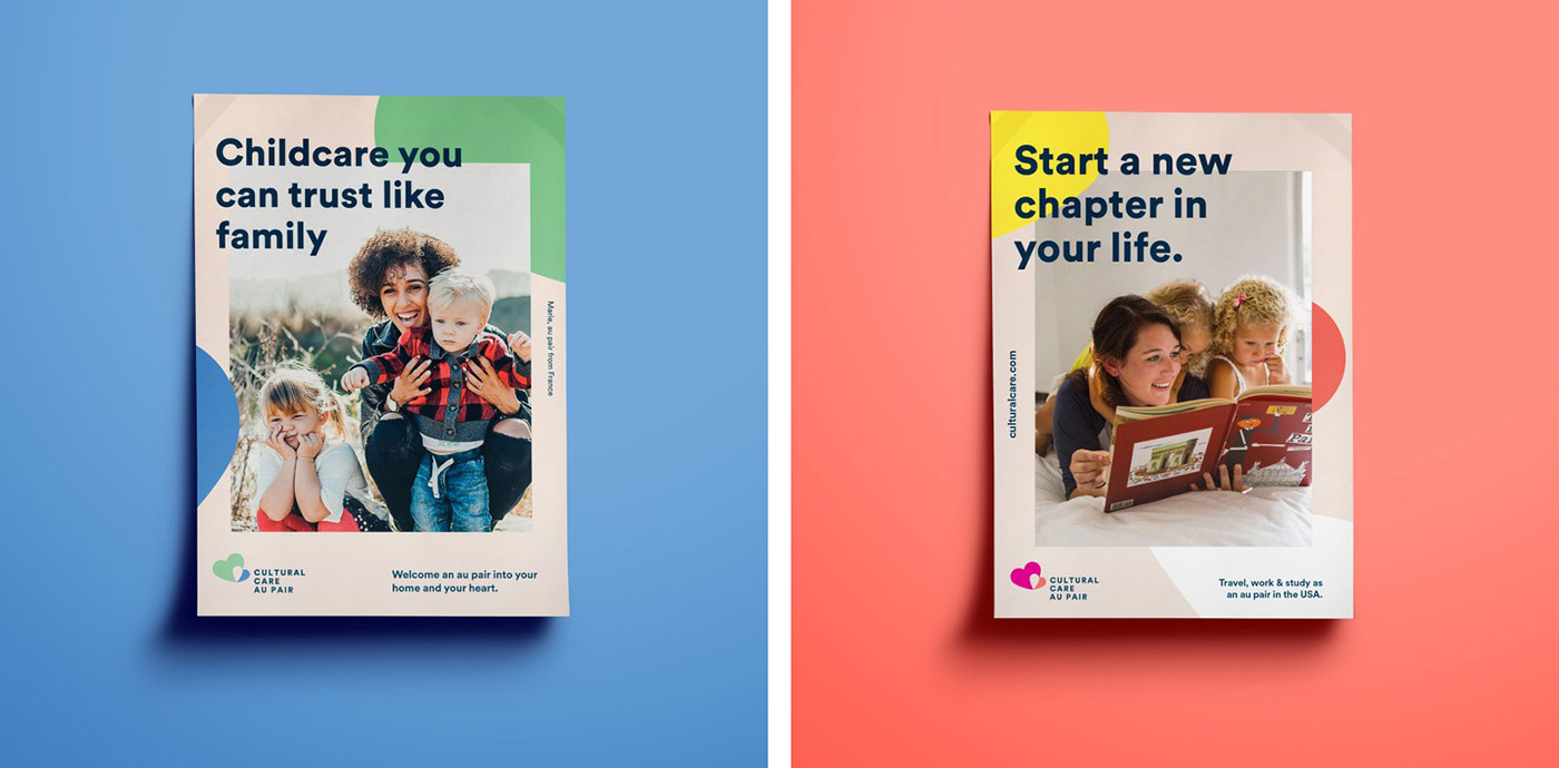
Poster targeting host families & au pairs


Merchandising for babies and small children utilising the logo pattern

Merchandising for au pairs utilising the logo pattern


The Cultural Care Au Pair Brand Identity is flexible and easy to adapt to a wide range of applications. It can be used bold and loud but also silent and discreet.


