Pitos Reserve is one of the premium wines by Dragomir Estate Winery. Based in Bulgaria this winery became a synonym of quality and perfection in winemaking. Working for such a serious producer is always a great responsibility especially when you have to change, upgrade and restyle an existing wine packaging that was really good and stood out proudly for many years on the shelf. I did not want to put this project in Before and After section because the original Pitos was really good packaging and my job was not to turn something bad into something good but simply to upgrade the existing one and lift it to higher ground.
This time I had no brief, no directions, nothing like this. I work with Dragomir for many years and there has always been some special chemistry and mutual feelings every time we started something new.
Pitos Reserve wine packaging design was a matter of professional honor – this new design had to mark the next level in my career as a graphic designer and in Dragomir’s evolution too.
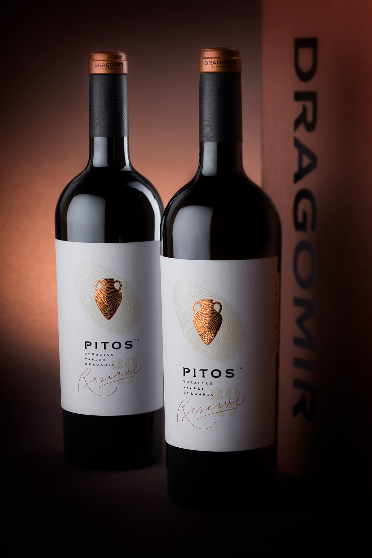
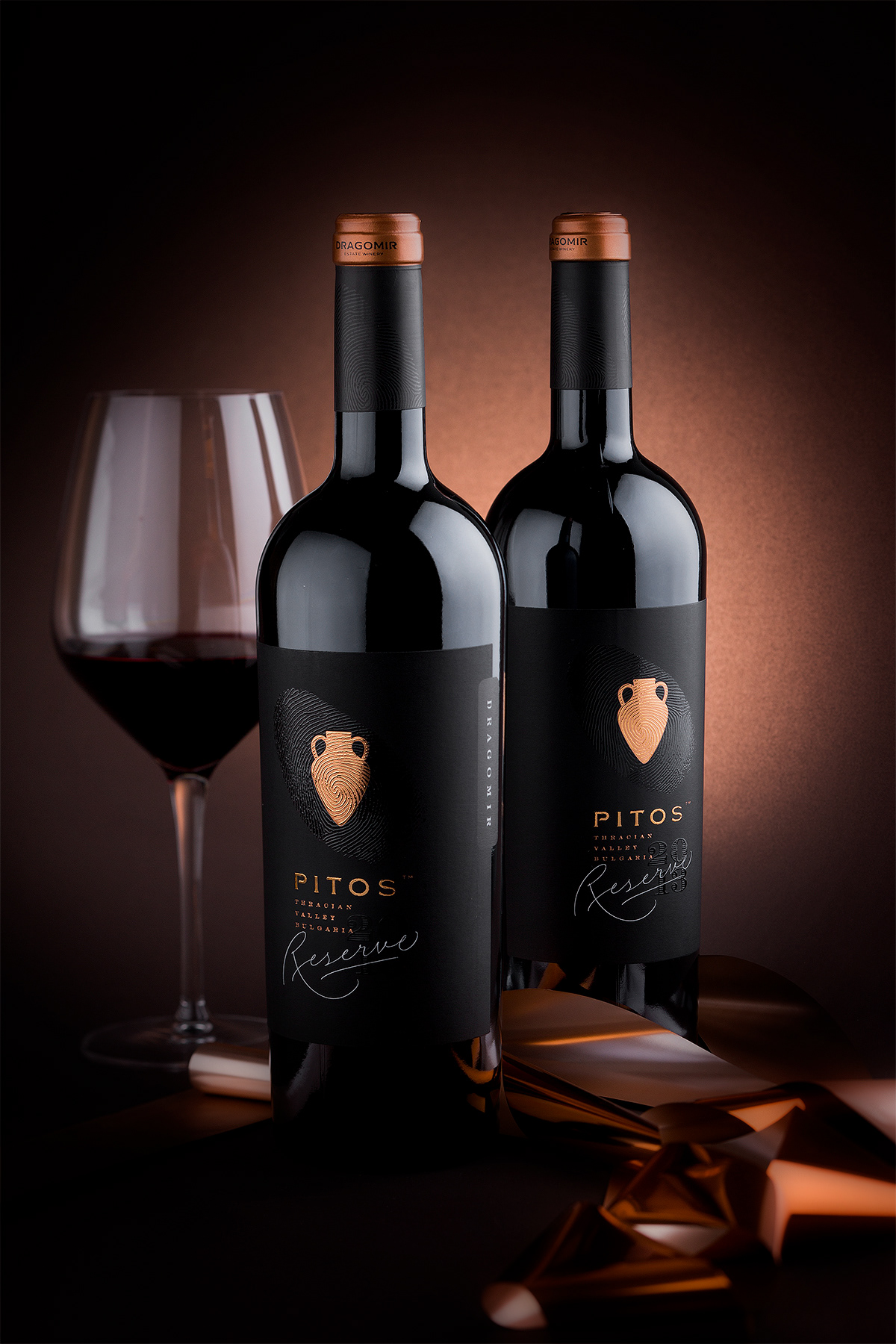
There are two wines in this brand – a very famous red blend and a barrel fermented chardonnay.
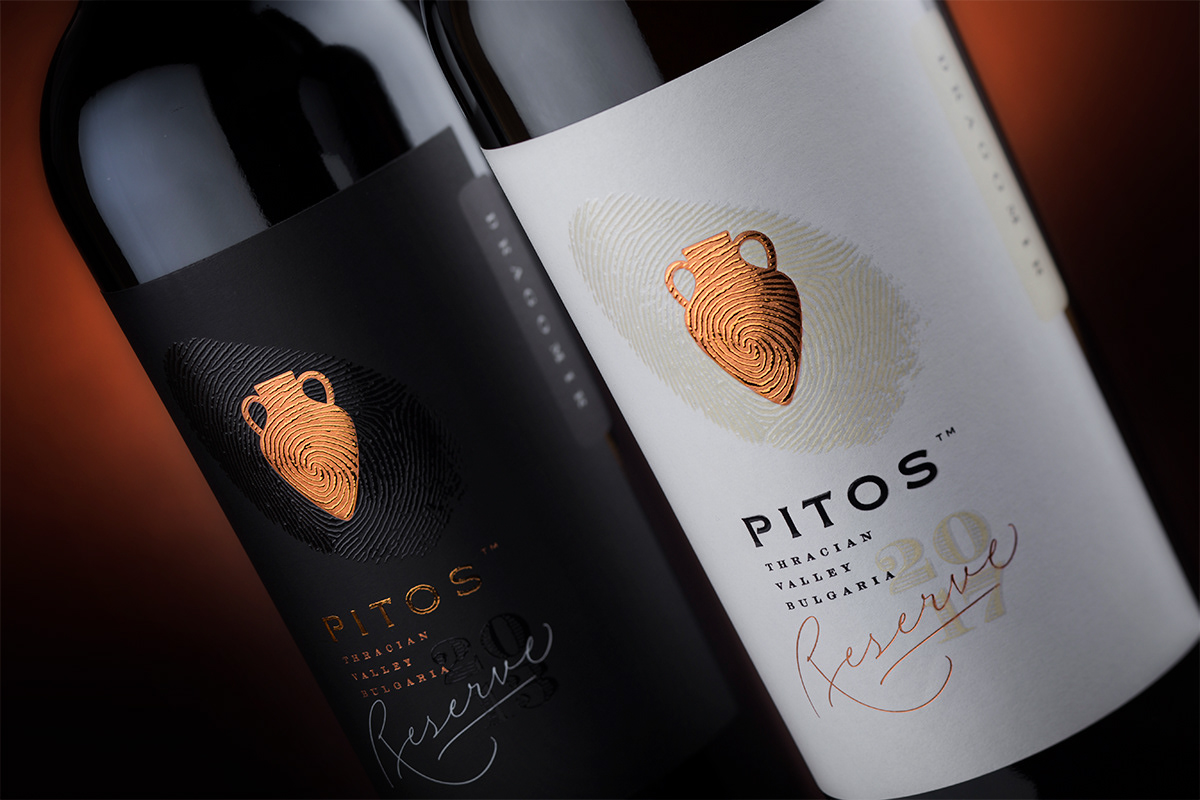
We decided to make things easy and simple – black label for the red and white for the white wine. The old label featured very artistic pitos illustration which I used in my design preserving its silhouette. I wanted somehow to express in my wine packaging that this winery is completely bound with words like craft, artisan, hand-made, boutique.
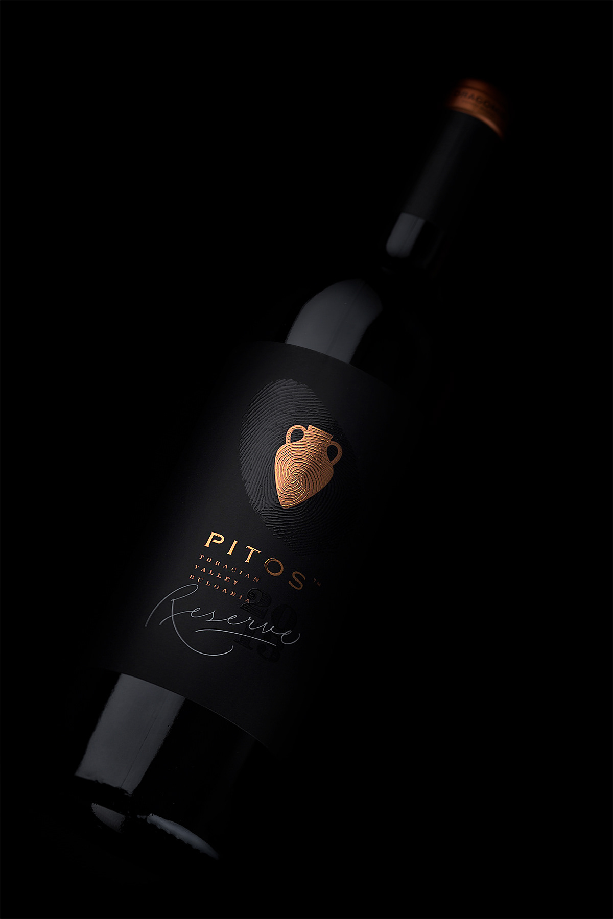
Everything Dragomir do is a reflection of their own selves – it is really personal. So with these thoughts in my head I decided to use the fingerprint as a foundation of my design. It is that kind of image that embodies all these tags I listed above – so complex, unique and memorable.
I don’t want to bother you with the whole process but I have to mention I manipulated and redraw number of times the fingerprint image as it was extremely difficult to have it printed in same area with transparent raised varnish and with silk foil at once. In fact the design was much easier than the production itself.
We decided to make things easy and simple – black label for the red and white for the white wine. The old label featured very artistic pitos illustration which I used in my design preserving its silhouette. I wanted somehow to express in my wine packaging that this winery is completely bound with words like craft, artisan, hand-made, boutique.
Everything Dragomir do is a reflection of their own selves – it is really personal. So with these thoughts in my head I decided to use the fingerprint as a foundation of my design. It is that kind of image that embodies all these tags I listed above – so complex, unique and memorable.
I don’t want to bother you with the whole process but I have to mention I manipulated and redraw number of times the fingerprint image as it was extremely difficult to have it printed in same area with transparent raised varnish and with silk foil at once. In fact the design was much easier than the production itself.
At the end we had a larger fingerprint intersecting with the copper pitos image at its center. All shining with very visible and sensible embossing effects, details and reflections.
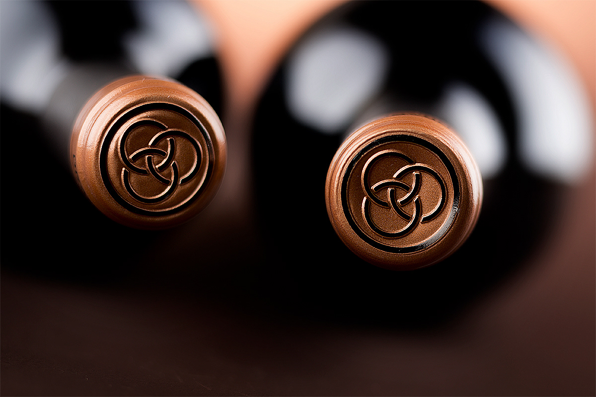
Under the pitos image I created on my Ipad pro a monoline lettering for the word Reserve – on the black label it is stamped with white hot foil while on the white one it is stamped with copper hot foil.
Under the pitos image I created on my Ipad pro a monoline lettering for the word Reserve – on the black label it is stamped with white hot foil while on the white one it is stamped with copper hot foil.
The vintage is printed with transparent raised varnish against the paper background.
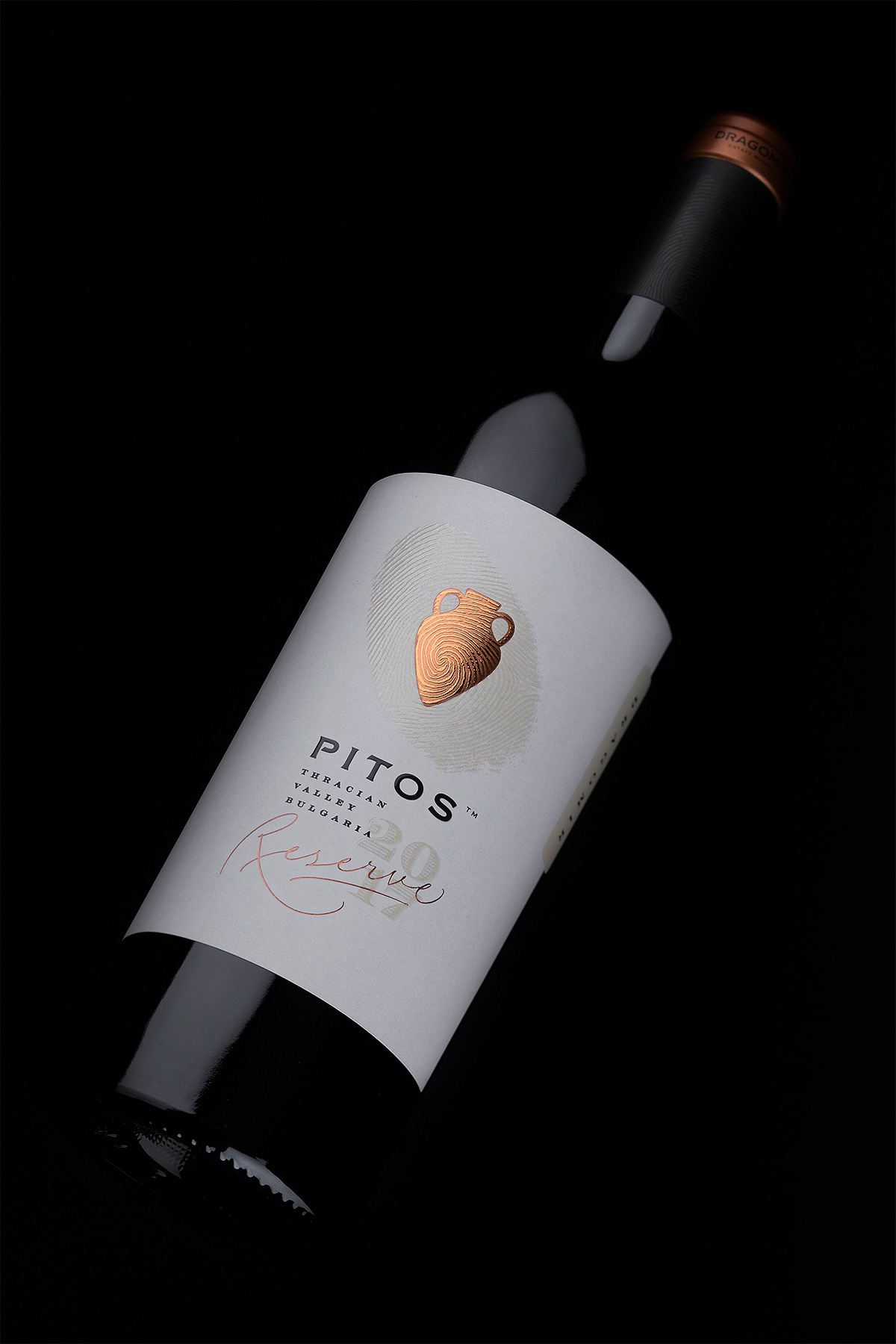
The whole play of these varnishes, silk foils and hot foils, the beautiful paper I used, the fingerprint repeated on the capsule, the shining copper – all these details accumulated in one wine packaging design really make everyone want to have this bottle in his hands and touch it and feel every single detail.
The Pitos Reserve wine packaging design was not an easy project. It took a lot of time and efforts to make clear every detail but the final result really paid off and made me feel deep happiness from the work of everyone involved in this project – from the winery to the printer.
Credits:
Client: Dragomir Estate Winery
Design: the Labelmaker
Printer: Rotoprint
Paper: Arconvert
Photo: Jordan Jelev
Client: Dragomir Estate Winery
Design: the Labelmaker
Printer: Rotoprint
Paper: Arconvert
Photo: Jordan Jelev


