MIS_TAKE - DARE TO FAIL
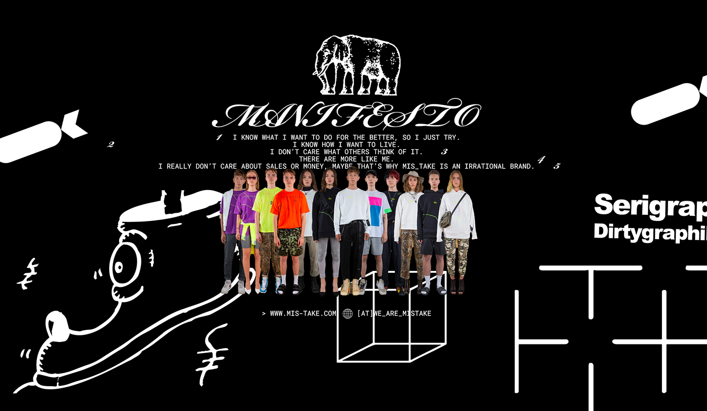
MIS_TAKE is a slow fashion brand initiated by a small group of teens. They love to experiment and just go with it, never-minding the mistakes or fails along the way, because that’s what it’s all about. All are welcome to join them in creating not necessarily a better world, but one they prefer.
Situation
After 20 schools, over 100 teams, two elimination phases, and a variety of tasks and assignments, the initial society –as we call it– was born. These chosen ones (remember, they’re still in school!) are in charge of evolving MIS_TAKE. That’s where we came in, as a partner, helping with the brand strategy and visual identity.
Process
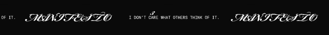
In creative workshops and strategy sessions, together with the clients we defined the values that became the basis of their manifesto. The main idea is to inspire and help build a community, or target an audience, of all the people who dare to make mistakes, be brave and free and experiment. That’s why MIS_TAKE is more of a platform for like-minded people than a fashion brand.
Insight
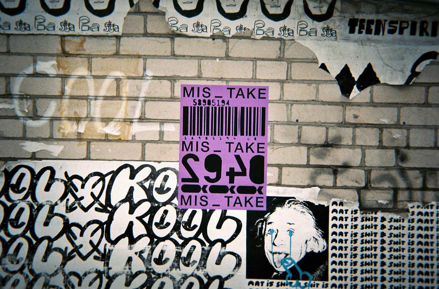
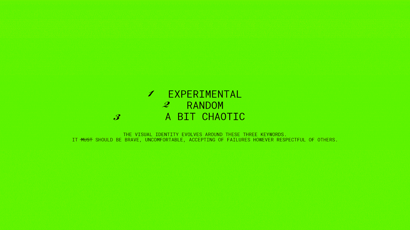
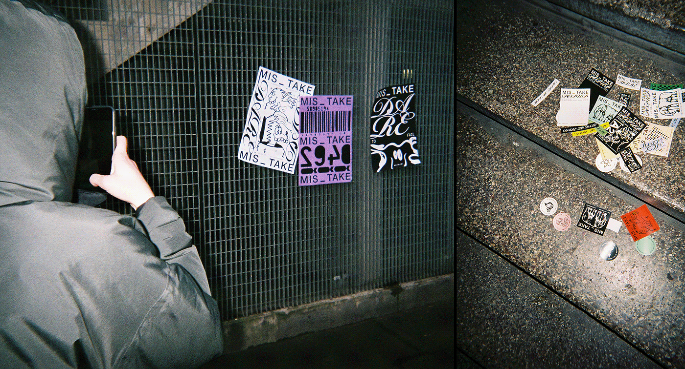
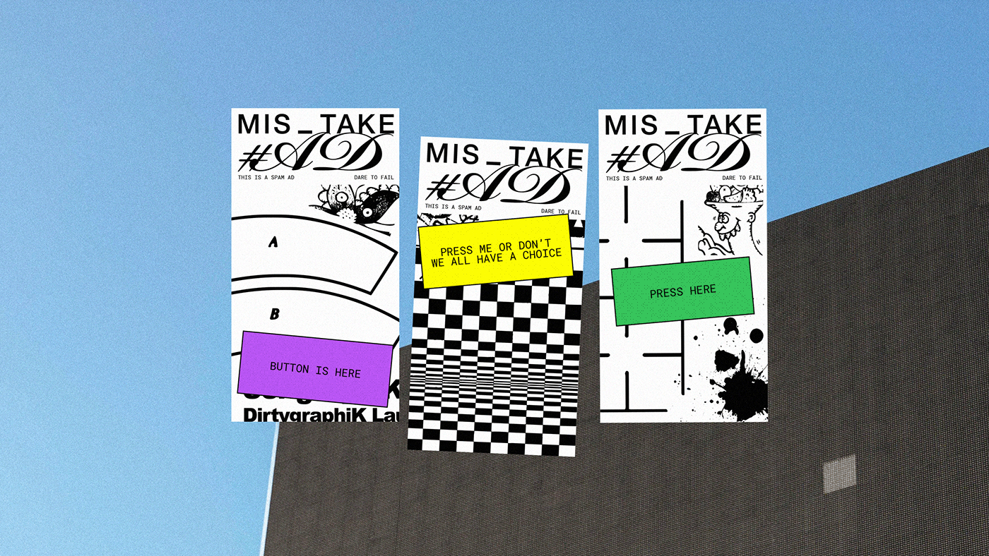
We understood that in order to provoke the target audience and convey the message of mistakes, the visual identity needed to be completely unpredictable, a bit crazy, and reflect the idea that experimenting and being wrong is acceptable. Everything had to revolve around the key word: RANDOM.
Goal
The biggest challenge we faced was to create a dynamic identity system for effectively communicating the manifesto and its values with tools and guidelines simple enough for the teenagers overseeing the brand to use.
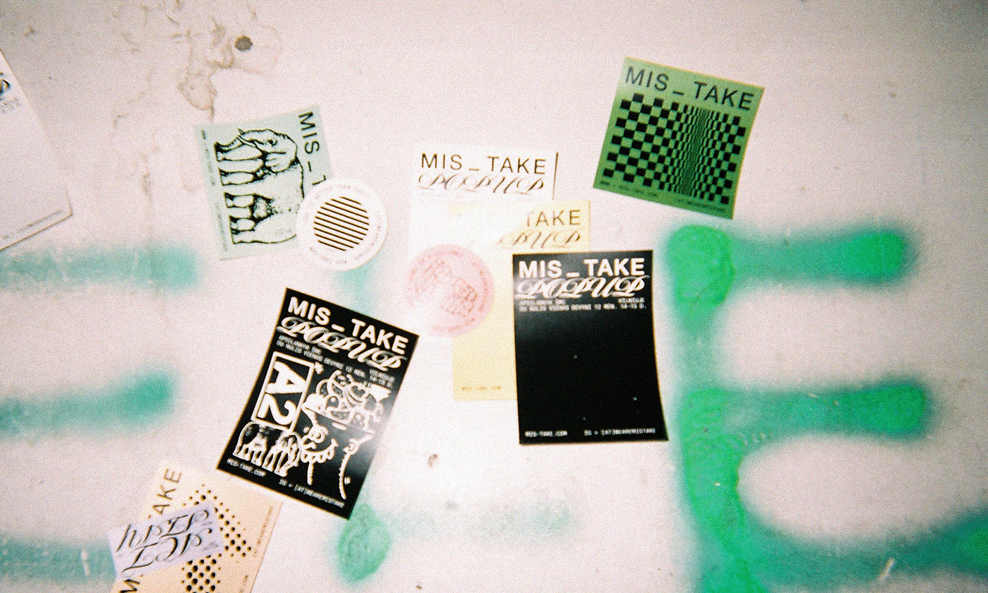
Result – a brave and experimental visual identity
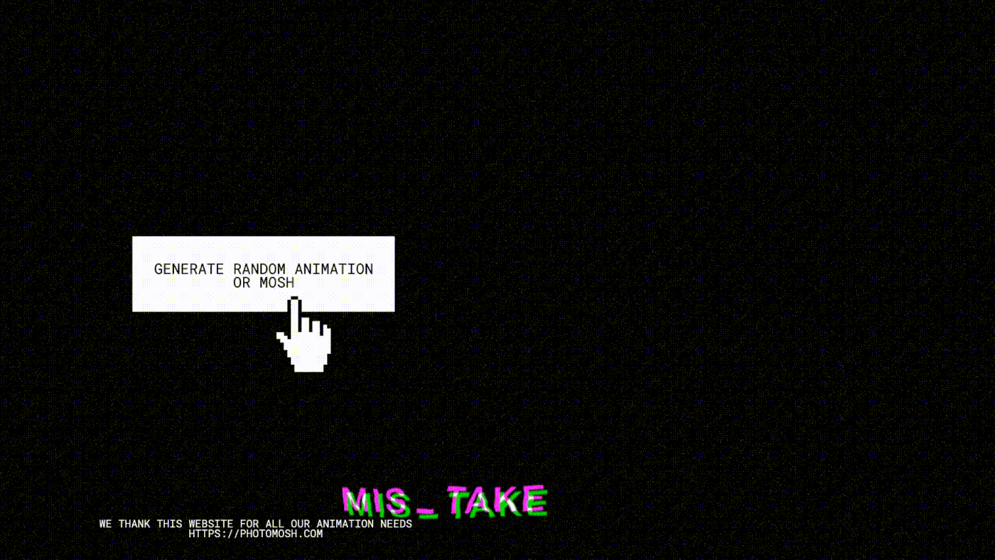
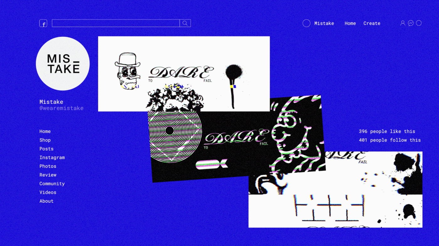
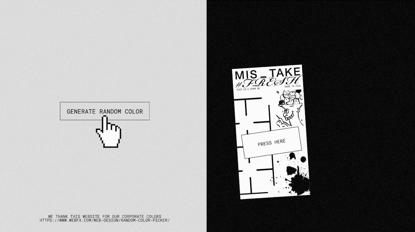
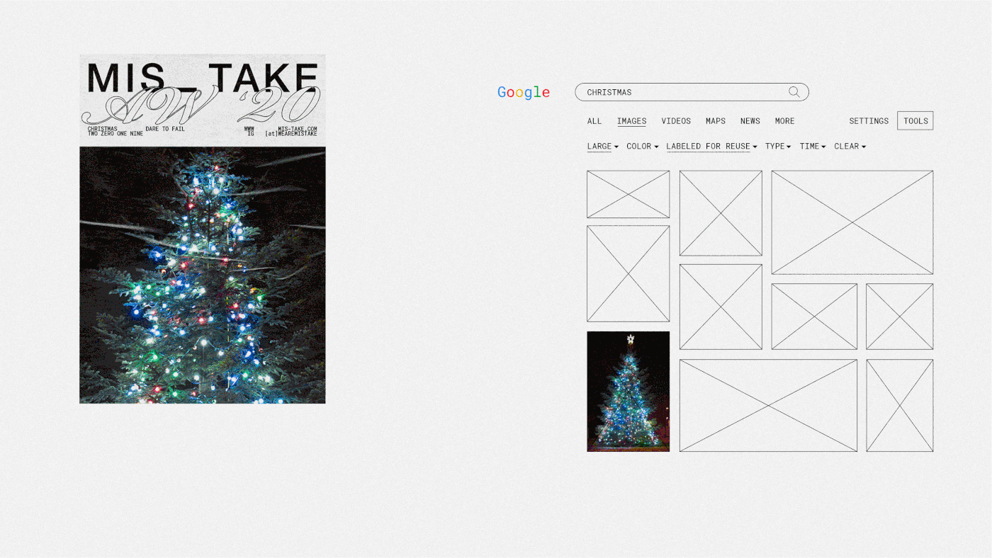
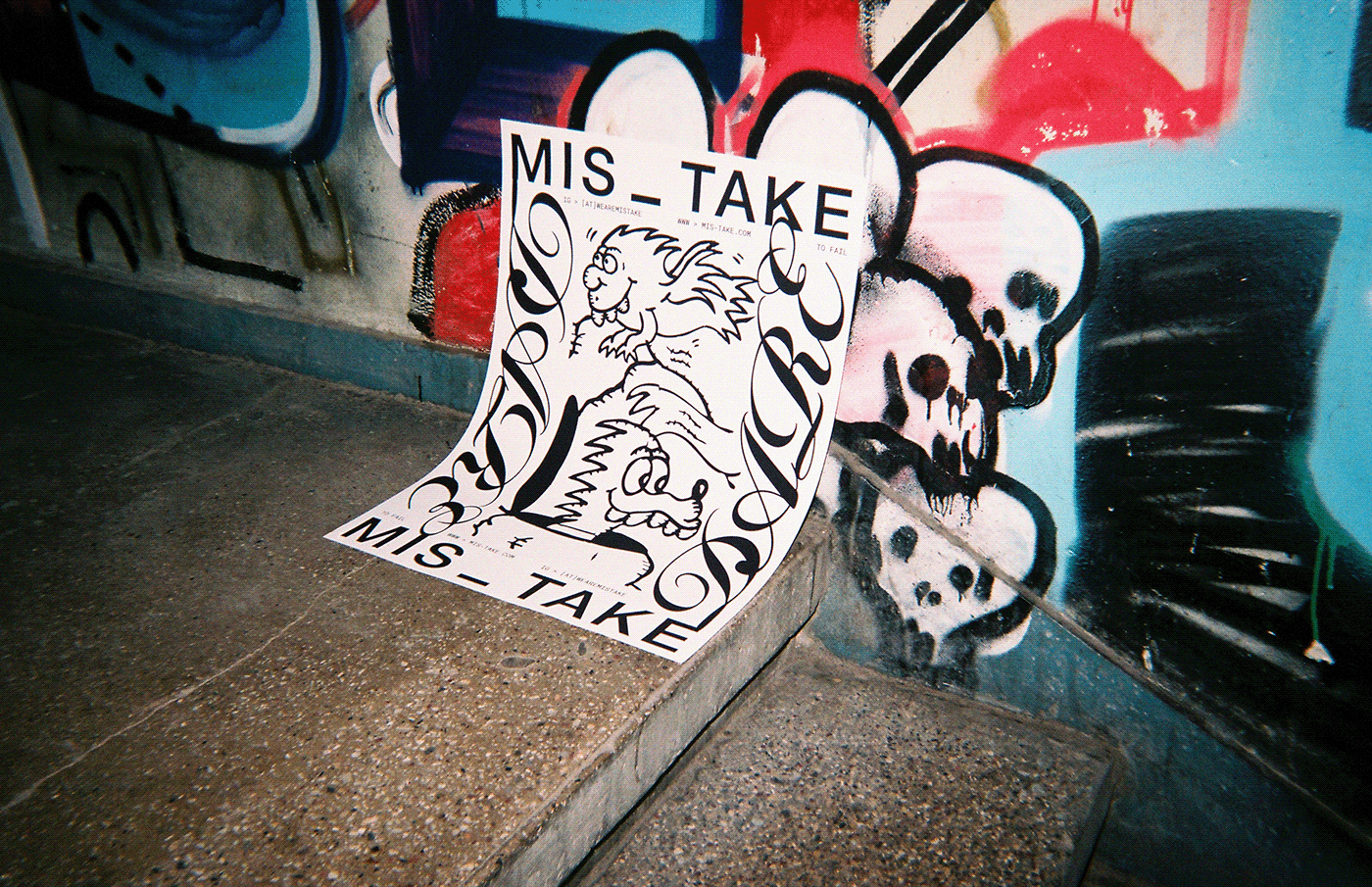
We took the main components of a visual identity and gave them an element of surprise, or an unknown factor. Some online platforms became tools for generating unexpected content with the press of a button.
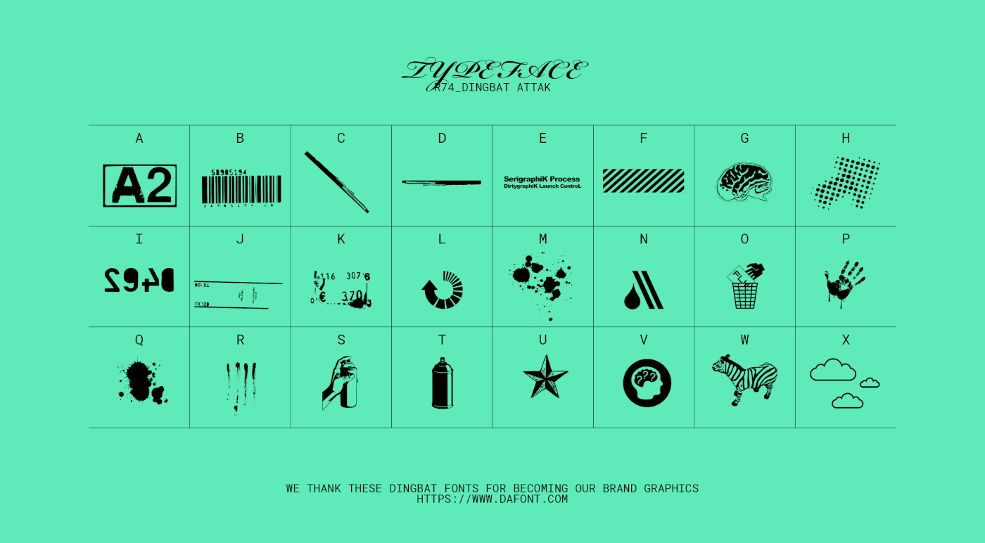
Brand colours? No, no, we use all colours. And they're generated randomly each time. Photography? A quick keyword search on google or any other free-to-use platform will work, no stylistic guideline needed here. Ok, to make it more interesting there is just one rule – pick a photo from among the first 10 results. Graphic elements? FREE DINGBAT FONTS! Type in the first letters you see, and you have a visual. - Animation? A generator? Yes, hats off to this page please: photomosh.com.
Developing content and visual communication has become a fun, creative process for the teenagers, which in turn attracts others like them who want to become members of the community and express their unique perspective to the world.
Randomness allows MIS_TAKE’s identity to be dynamic, experimental and bold. Permanent dynamism is a constant among all the identity touchpoints, which enables visual communication to convey the brand’s youthful energy and values to its audience.


Client: First priority
Photography: Mykolas Saulytis
Year: 2019


