Chlorophilia – Garden Store
MÉXICO
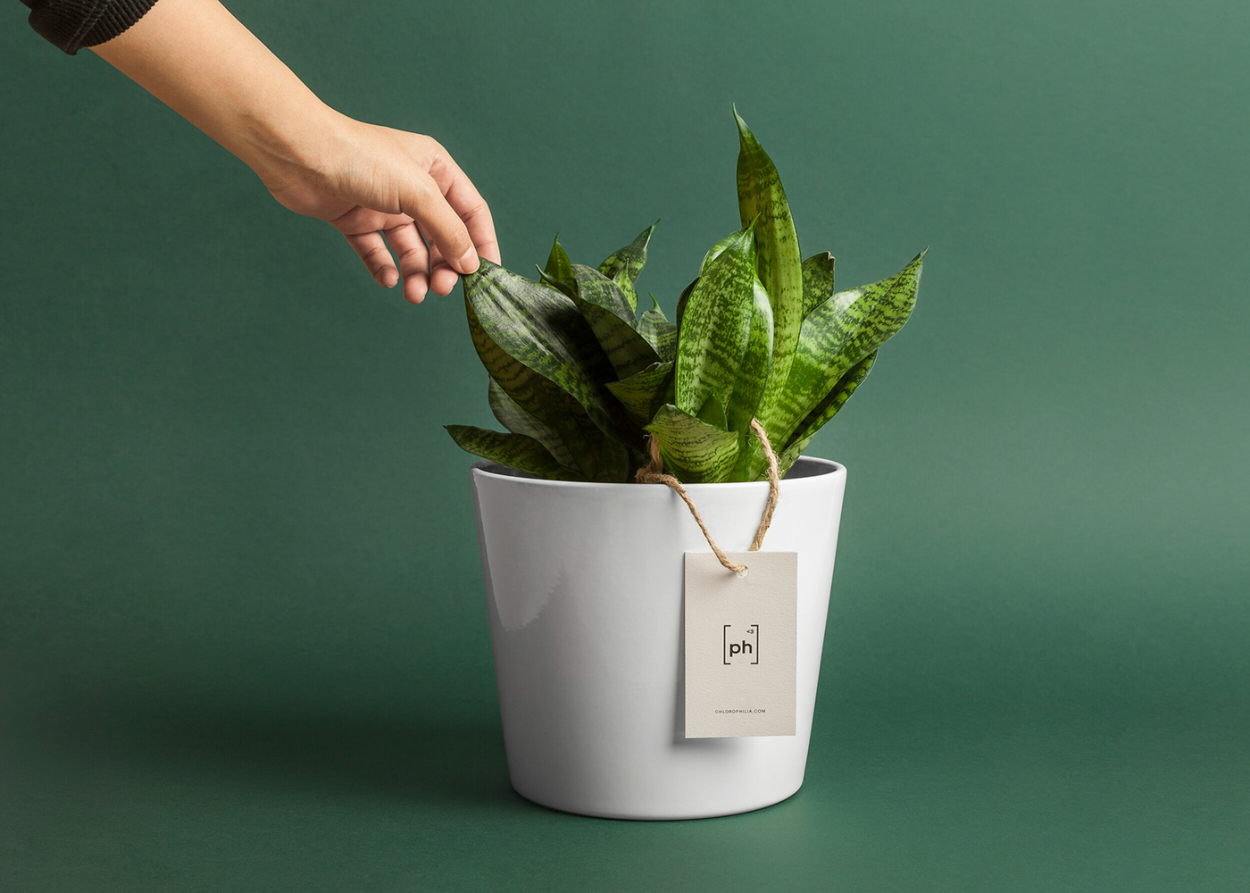
Plants are a great gift, not just for others, but also for oneself. However, most people just don’t have the time or the skills necessary to assemble a mature specimen. Chlorophilia came up with a solution. The brand provides a user-friendly web platform where shoppers can choose from over 12 species of shade plants and 7 pot styles, have the full-grown plant put together by specialists and receive it wherever they like.
To create a compelling brand name, we merged two Greek words that reflect what the firm represents: Chloros, which means green, and Philia, the term for love, care and attraction. This denomination not only sounds like “Chlorophyll”—Clorofila in Spanish—the biomolecule responsible for the photosynthesis process, it also communicates the best features of the brand.
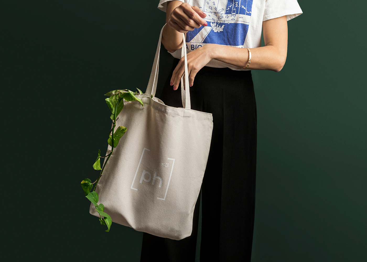
Inspired by the same concepts used in the naming process, we took the central PH letters from the name and created a meaningful icon. The universally recognized pH symbol stands for Potential of Hydrogen, the scale used to measure the acidity and alkalinity of the single most important asset for plant growth, the soil from which it draws essential minerals and nutrients. Also, the icon plays on the idea of a new periodic table element, incorporating a small superscript “greater than” character and a number 3, a nice set that resembles an emoji heart.
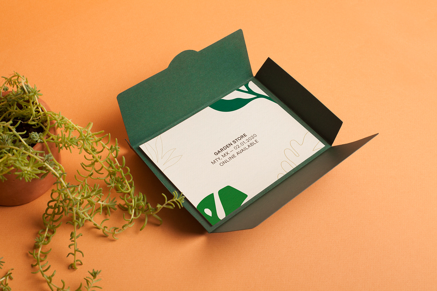
The entire branding and graphic work has a fresh feel to it. It holds appeal for millennials as well as fully pledged, long-time plant lovers. We created a set of illustrations depicting a variety of plant species sold at Chlorophilia and used them to show the personality of the brand in different applications. The pattern used throughout looks really friendly and dynamic, it was inspired by the infinite variations in species and colors found in the great realm of nature.