Faceplace
Naming and Identity
FACEPLACE is a cosmetic clinics network that puts forward the idea of a single service. Here you can have peeling or depilation done, but most importantly – the “beauty injections”. The business format is represented by small clinics with two or three rooms in places with high traffic flow. Moscow, large Russian cities, then reaching abroad: Spain, Germany, other European countries.
Project objectives
The main feature of the brand is providing the medical services that can be obtained immediately during shopping or lunch time at a business center. Our objective was to come up with a solution that will reflect the medical seriousness of the brand and at the same time be suitable for the mass market.
Solution
One of the key objectives was to come up with a universally applicable name that would be appropriate both on the Russian market and abroad.
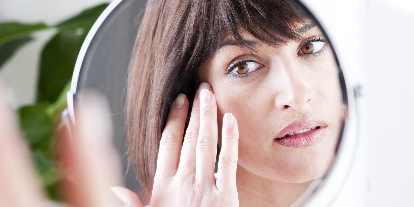
Our target group includes ordinary girls and women. They are looking for a simple, affordable, but at the same time professional service. They don’t need well-trained administrators, alpine tea served in porcelain cups or silk robes. All they need is just the service itself but provided with dignity. If they see a name that is too complicated, they will decide that this is another elite salon for sophisticated customers and they will pass by. Therefore, we were looking for something that, at first sight, would attract customers, create a feeling of an apprehended and affordable service they could definitely treat themselves with.

FACEPLACE is a place where they take care of your face, literally the “place of the face”. The place where most ordinary girls and women can dedicate some time to their beauty.
The name looks particularly striking coupled with the interlinear “aesthetic medicine”. Together, they clearly communicate the company’s specialization.
The company works in the beauty industry but approaches it from a medical point of view. Therefore, the visual image of the brand should be closer to medicine and clinics than to beauty salons.

We have created a style system by dividing all branded media into two types: image and functional. The former operate as points of contact with potential customers, for example, at a shopping center. These are advertising materials, posters, social networks’ design. They all look bright, catchy, with large captioning, color patches, photographs of ampoules and liquids.

The sterile and neat design fits well into the interior of the medical rooms.

Discreet golden section layout and uncommon for the industry photo material allow us to detune from competitors, routine solutions, and images of beautiful girls with perfect skin.

We have used bright and clear shades of blue, turquoise, green and pink, including for the purposes of creating signature gradients. In this context, traditionally “medical” blue color reveals itself in a more modern, expressive, juicy way.


The second group of media is business publishing and documents. They are used by doctors and clinic staff and must be functional, neat and clear. Therefore, here we adhere to a restrained design: no frills, everything is close to the matter.


Creating a good project for the mass market is no less interesting than developing a particular design for a rare product. We have come up with a neat solution that works fine: the first FACEPLACE outlets have already been launched in Moscow-City.
По-русски: https://lvmd.ru/works/face_place.html


