
PRIMARY / logo & package design
objective
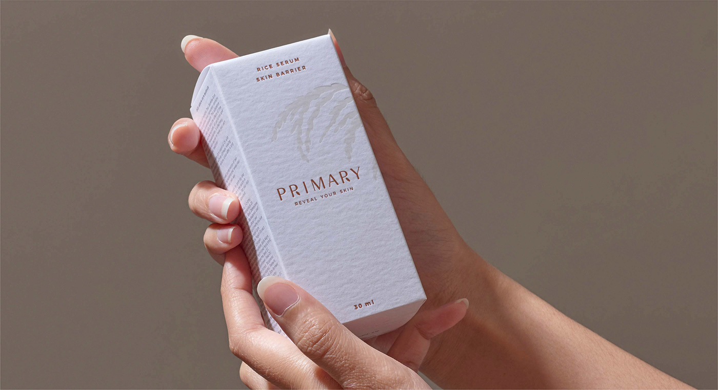
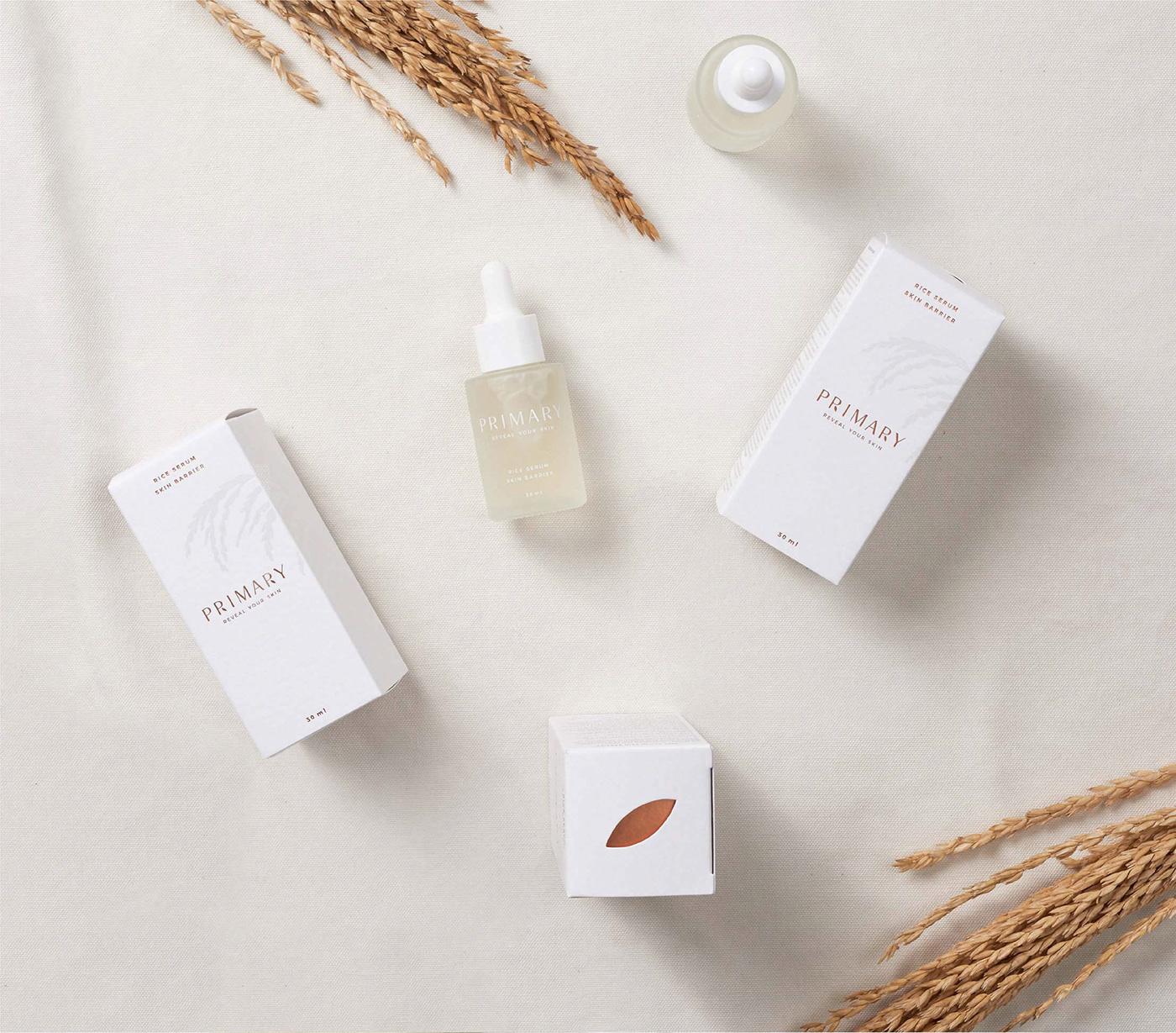
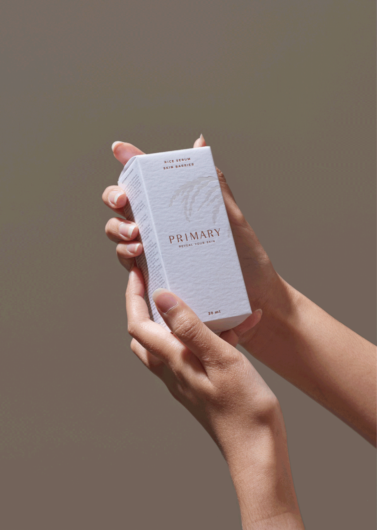
The packaging design presented sense of natural and the benefits of Thai jasmine rice which is the main ingredient. Also create a sustainability visual and valuable package.
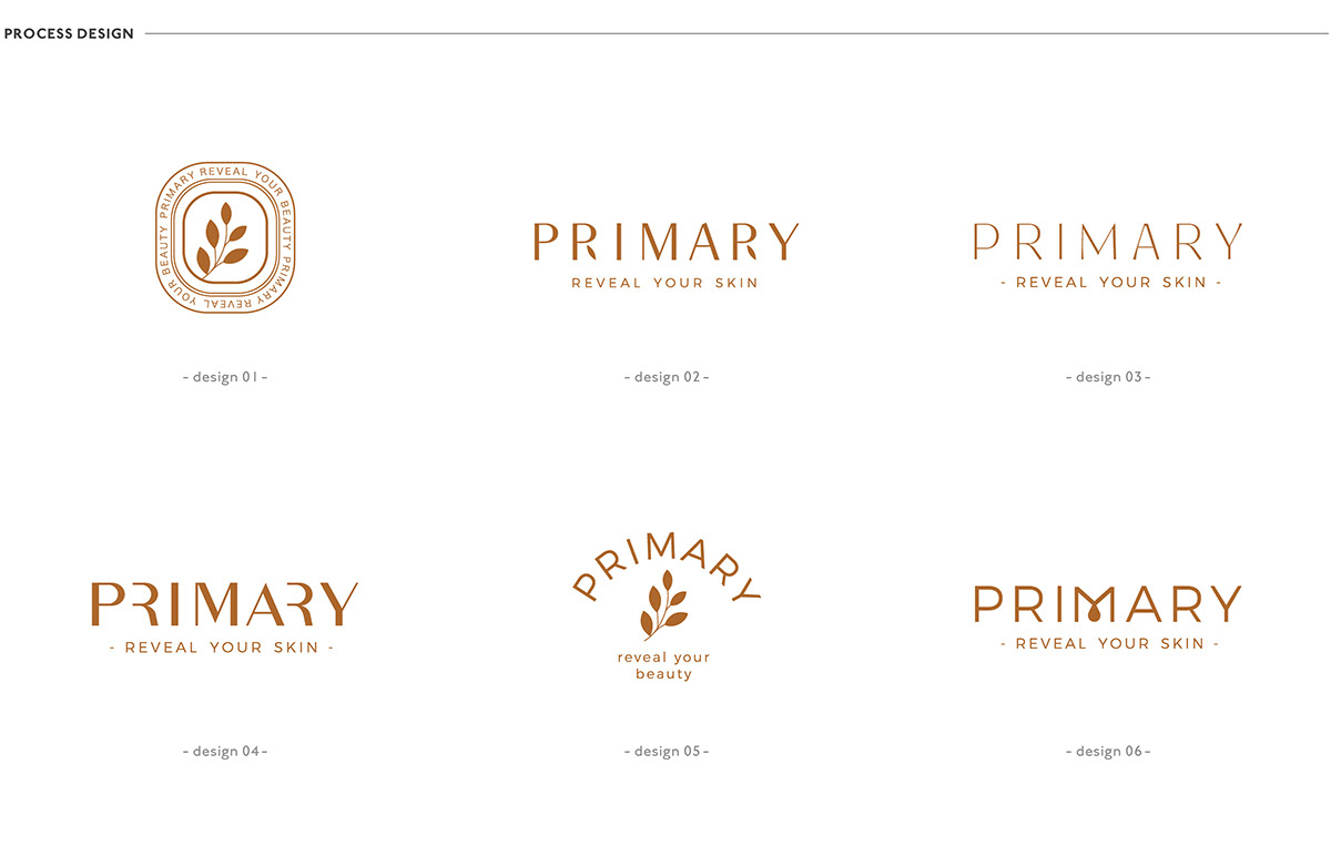
logo concept
The name “PRIMARY” refers to the brand's origin as a natural source. The rice shape is used as a symbol to create a memorable visual that presents clean and simple.
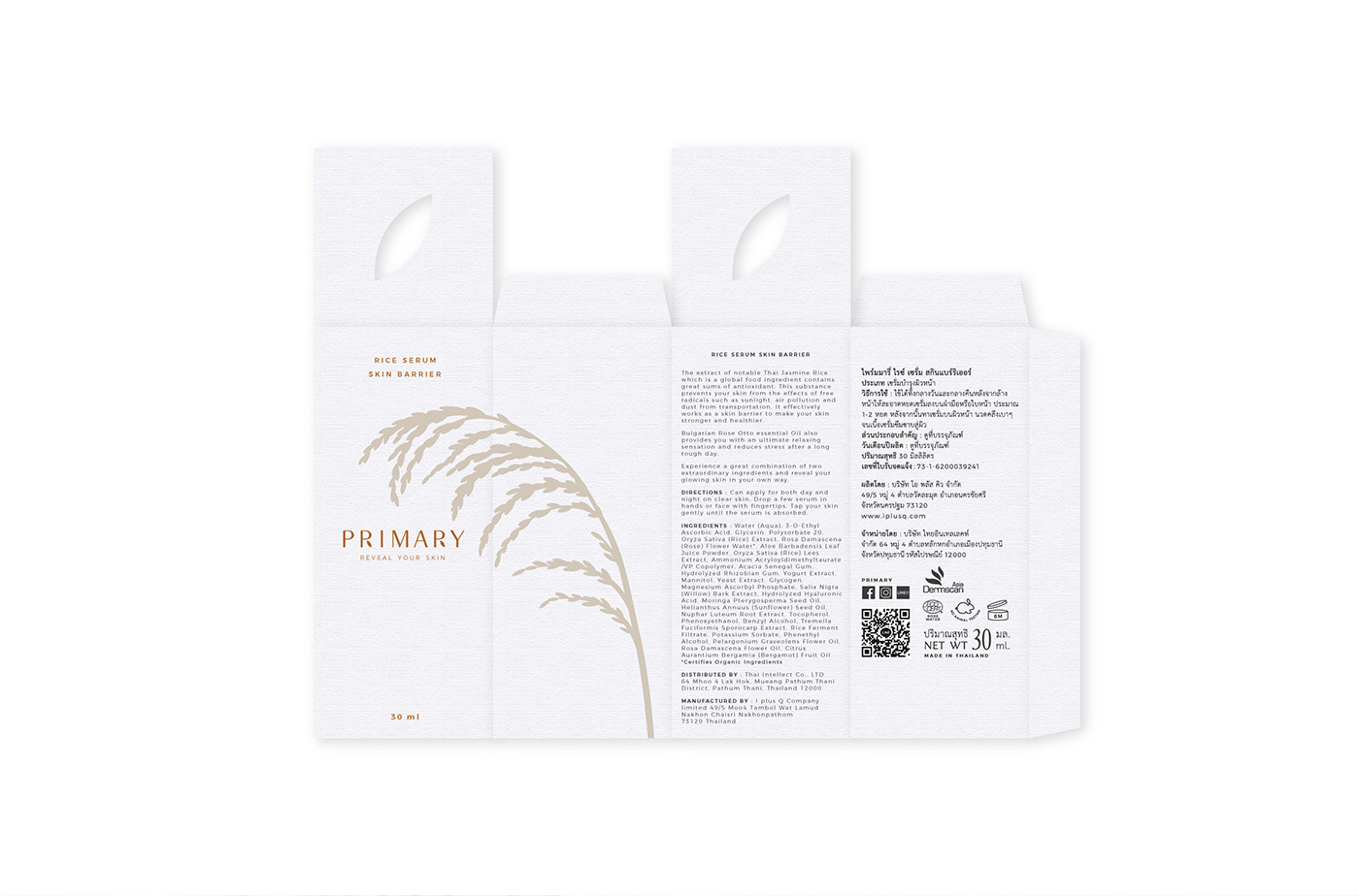
packaging concept
Primary is a skin care brand that deeply concern about preventing skin from the effects of free radical. In addition to pre-biotic and pro-biotic which incredibly act as skin barrier making your skin become healthier. Following from the Logo, We use rice to create main visuals on the packaging as to enhance the benefits of the serum. We use paper with texture, given the look and feel of a quality hand-crafted paper. However, we add more value by using copper foil on logo and some part of the packaging.


AGENCY :
Andon Design Daily Co.,Ltd.
CREDIT :
Design Director by Pongtorn Wachirapoka
Logo Design by Nuttavee Jiratthitikan
Package & Visual Design by Natcha Dusadeepun
Photographed by Parinya Kawsrito
VIA :
www.primaryofficial.com
www.facebook.com/Primary.officialthailand/
www.instagram.com/primary.officialthailand/
Exclusive for Andon Design Daily Co.,Ltd.
Copyright © 2019 Andon Design Daily Co.,Ltd.


