
Coffe Country is a personal project.
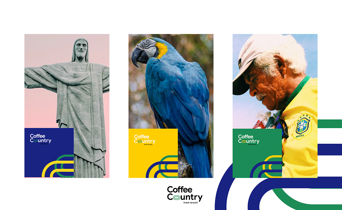
In this project, I want to introduce my passion to coffee and Brazil - country of festival, football and tropical ecosystem.
The main goals is to create a harmonious, beautiful and distinctive brand identity. The image of Brazil is considered as one of the important factors in building a brand image
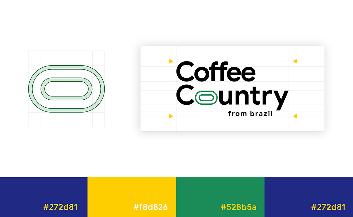
In this logo, I used two concentric circles that represents for a closed process in coffee production, the connection between natural and human, harmony and product quality is preserved intact at every store in the system.
In terms of colors, I used three dominant colors in the Brazilian flag. However, I have slightly changed their shades to make them even more special.
- The Green represented the environment and the rich vegetation (FRESH).
- The Blue represented great beaches and a long-standing culture (FRIENDLY).
- The Yellow represented the luck, youth and dynamism in the product (FAST)


Thanks for viewing...
Following for cheering me!!!


