Barilla package redesign 意粉包裝設計
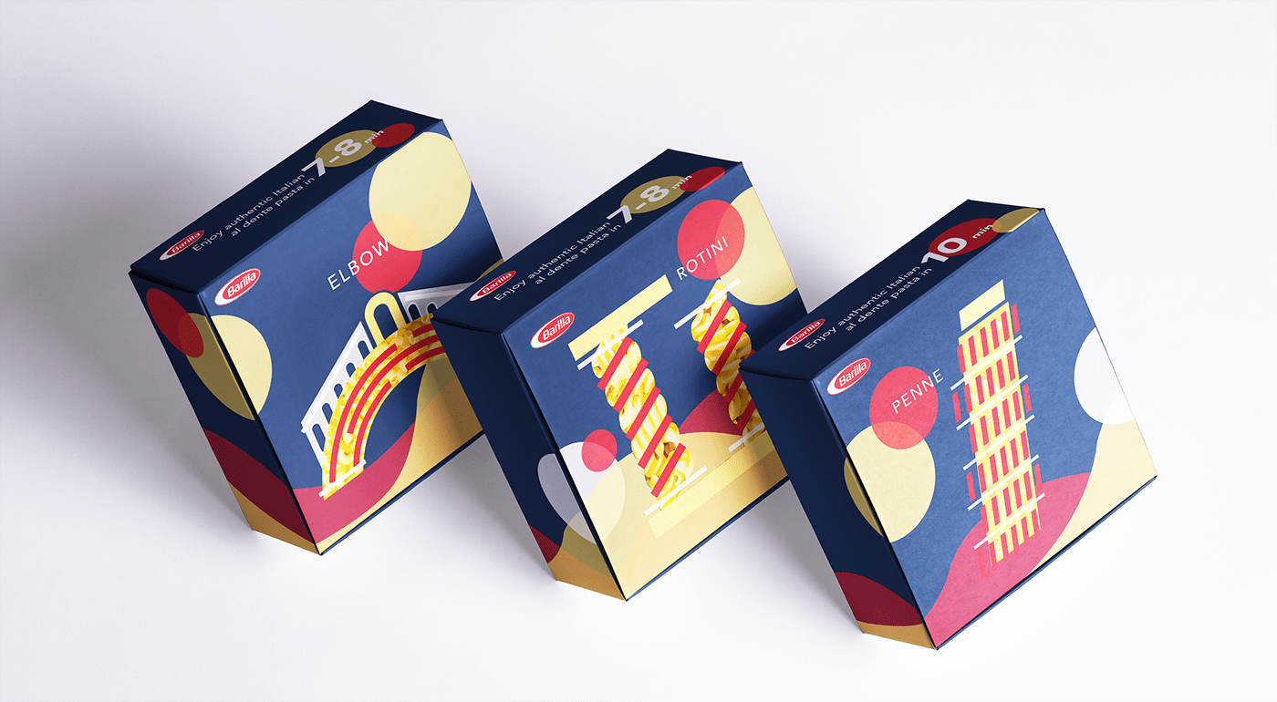
The brief of the redesign assignment requires a redesign that celebrates their anniversary. In order to emphasise the brand history and their Italian identity, I used the shape of the pasta the create the image of some famous architecture from Italy. The shape of the pasta becomes a little window that shows through the pasta inside the box. The geometric flat design gives it a very simple look. The required cooking time is written on the top of the box, allowing customers to see it easily when they open the box. I kept the original colour scheme to allow customers to recognise the traditional brand with the new design.
The brief of the redesign assignment requires a redesign that celebrates their anniversary. In order to emphasise the brand history and their Italian identity, I used the shape of the pasta the create the image of some famous architecture from Italy. The shape of the pasta becomes a little window that shows through the pasta inside the box. The geometric flat design gives it a very simple look. The required cooking time is written on the top of the box, allowing customers to see it easily when they open the box. I kept the original colour scheme to allow customers to recognise the traditional brand with the new design.


