


RO: Un canal de YouTube românesc despre review la tot felul de mâncare, tip fast-food, restaurant, tradițional, dulciuri, etc. Un proiect susținut de către un bărbat de 28 de ani, din Oradea care a început în anul 2018 și a reușit să strângă un număr total de 38.000 de abonați până azi.
Lipsa unui brand propriu si o identitate vizuala constanta a canalului de YouTube poate dezvolta o problema de imagine dar si una in comunitate. Faptul ca acest canal este bazat in mare parte pe film-it/upload-it poate duce la o oprire de crestere a canalului.
-
EN: A romanian YouTube channel about food review with all type of food, fast-food, restaurant, traditional, sweets, etc. A project sustained by a 28 y/o man, from Oradea that started in 2018 and achieved a total number of 38.000 subscribers until today.
The lack of an own brand and a constant visual identity of the YouTube channel might generate an image problem but a community one too. The fact that this channel is based mostly on "film-it/upload-it" it could go to a stoppage of increasing the channel.

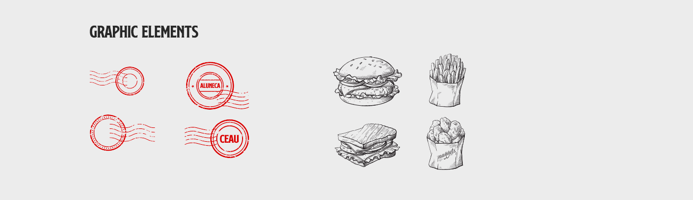
RO: Principala tinta a acestui proiect este creare unui brand si a unei identitati vizuale pentru a mentine constant un mesaj si o strategie a canalului. In constructia acestui brand am dezvoltat o linie constanta de elemente grafice, am folosit 3 culori principale precum rosul pentru o vizibilitate marita si atragerea atentiei, un negru-carbune pentru completarea rosului in diferite ocazii si un galben-mustariu ca si o terta nuanta pentru un strop de culoare.
Vizual, brandul a fost construit in baza unei cercetari de piata, analizand publicul tinta, tipul de continut si cel mai important felul in care trebuie perceput canalul.
Vizual, brandul a fost construit in baza unei cercetari de piata, analizand publicul tinta, tipul de continut si cel mai important felul in care trebuie perceput canalul.
-
EN: The main target of this project is the creation of a brand and the visual identity of it to maintain a constant message and a channel strategy. In the construction of this brand we developed some constant graphic elements, we used 3 main colors like red for a better visibility and attracting the attention, a black-coal to go along the red in diferent occasions and a mustard-yellow as a third hue for a touch of color.


RO: Principala tinta a acestui rebrand este schimbarea perceptiei a canalului, dintr-un canal simplu si modest la cu totul alt nivel, un canal cu o identitate vizuala, un public tinta bine definit si o consistenta a brandului.
Am creat un intreg univers vizual pentru acest brand incat in orice "segment" al brandului te vei duce, vei putea regasi aceleasi elemente care sa nu devieze de la mesajul si aspectul acestuia.
Website-ul, papetaria, merch-ul dar si piesa de rezistenta, social media, toate au acelasi feeling, un lucru foarte important in strategia de brand pentru a mentine "clientul" in aceeasi bula.
-
EN: The main target of this rebrand is changing the perception of the channel, from a simple and modest channel to a totally another leve, a channel with a visual identity, with a well defined target audience and a brand consistency.
We created an entire visual universe for this brand that in any section of the brand you'll go, you will be able to find the same elements that won't depart from the message and look of it.
The website, stationary, merch and "la pièce de résistance", social media, all of them have the same feeling, a very important thing in the brand strategy to maintain "the client" in the same bubble.


RO: Pentru a crea o conexiune intre IMI PLACE SA MANANC si abonatii sai, am creat design-ul si pentru merch-ul canalului.
Am mentinut imaginea, elementele grafice si mesajul pentru a reprezenta cat mai bine canalul prin diversele bunuri vandute ca si merch. Exista diverse bunuri precum pin-uri, sepci, cani, tricouri, etc.
-
EN: To create a connexion between IMI PLACE SA MANANC and he's subscribers, we created a design for the channel's merch.
We kept the image, graphic elements and the message to represent as best as possible the channel through the merch.
There are different goods like pins, snapacks, mugs, t-shirts, etc.
We kept the image, graphic elements and the message to represent as best as possible the channel through the merch.
There are different goods like pins, snapacks, mugs, t-shirts, etc.


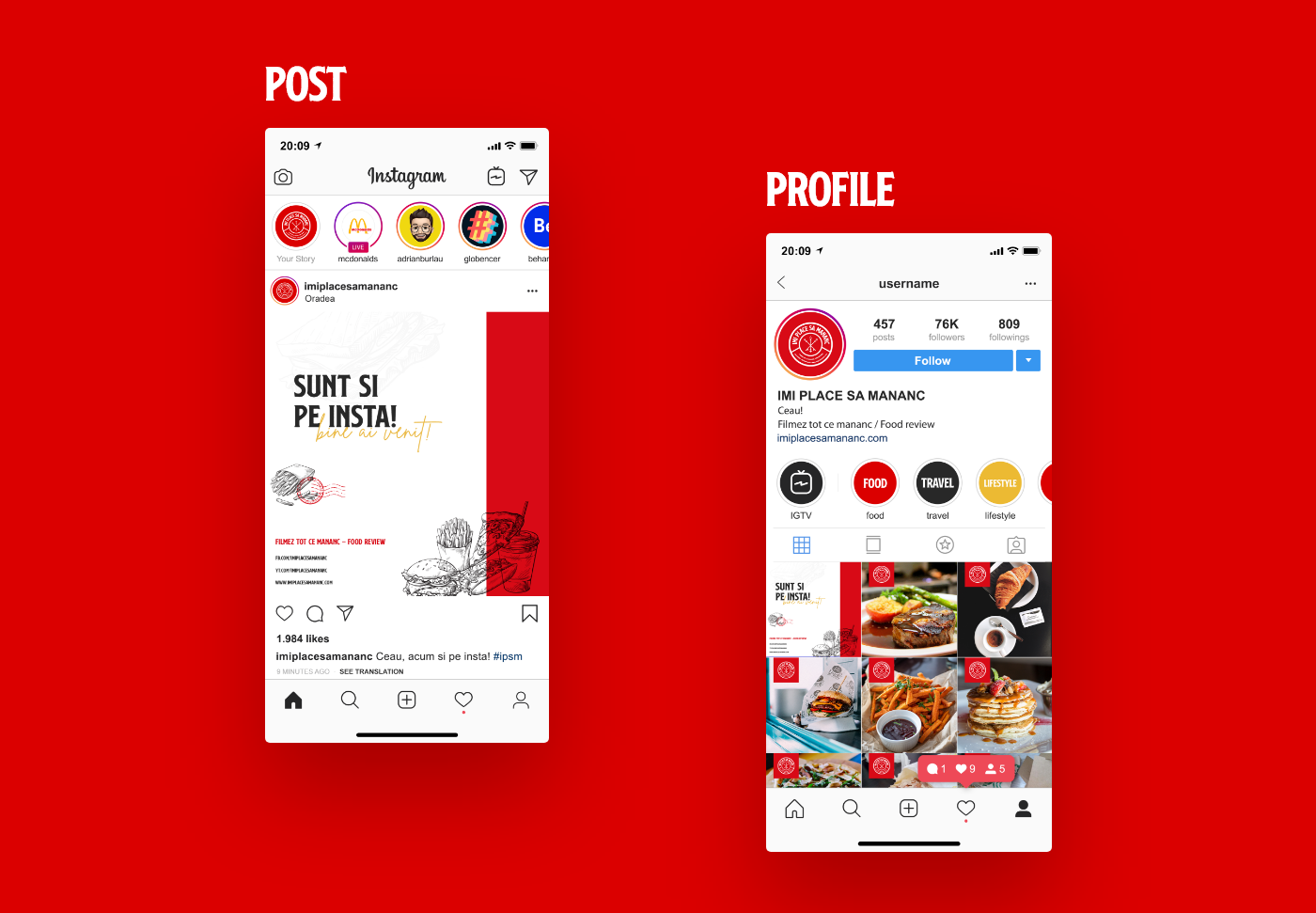
RO: Social media este cel mai important segment de activitate pentru un canal de YouTube. Am decis sa ii dam un nou aspect si paginii de Facebook si Instagram. Adoptand acelasi design ca pe canalul de YouTube pentru coperta ne vom asigura ca transmitem consistenta si o stabilitate a design-ului.
Social Media face parte din strategia de brand fara nicio indoiala, pentru a mentine comunitatea activa este necesar sa mentinem "feed-ul" cat mai activ pentru a oferi continut pana si aici prin diferite postari.
Social Media face parte din strategia de brand fara nicio indoiala, pentru a mentine comunitatea activa este necesar sa mentinem "feed-ul" cat mai activ pentru a oferi continut pana si aici prin diferite postari.
-
EN: Social media is the most important field of activity for a YouTube channel. We decided to give a new look to the Facebook page and Instagram page. We adopted the same design for the cover as the YouTube channel so we will ensure that we share a consistency and stability of the design.
Social Media is part of the brand strategy without doubt, to maintain the community active it's necessary to maintain the "feed" as active as possible to offer content even here with different posts.


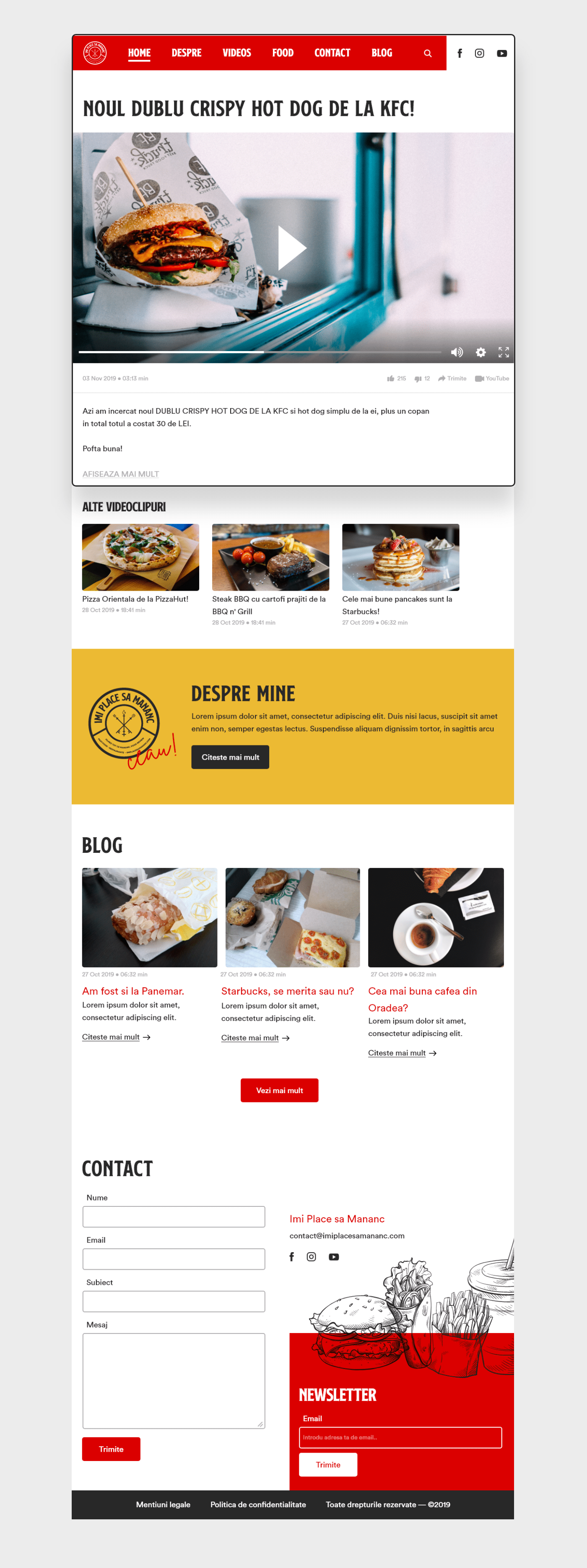
RO: Si ultima dar nu cea din urma, website-ul. Principala misiune a website-ului este de a tine la curent abonatii cu videoclipuri, noutati, mai multe despre canal si un canal de contact mai eficient si rapid.
Cel mai important aspect in crearea website-ului a fost dezvoltarea unui design modern si simplu pentru a avea un design responsive atat pe tableta cat si pe mobil. Site-ul este compus din 6 sectiuni (menu, header, despre mine, blog, contact, footer).
Cel mai important aspect in crearea website-ului a fost dezvoltarea unui design modern si simplu pentru a avea un design responsive atat pe tableta cat si pe mobil. Site-ul este compus din 6 sectiuni (menu, header, despre mine, blog, contact, footer).
-
EN: And last but not least, the website. The main mission of a website is to keep the subscribers up to date with videos, news, more about the channel and a more efficient and faster way of contact.
The most important thing in the creation of the website was developing a modern and simple design to have a responsive version for tablet and mobile. The website is composed by 6 sections (menu, header, about me, blog, contact, footer)
The most important thing in the creation of the website was developing a modern and simple design to have a responsive version for tablet and mobile. The website is composed by 6 sections (menu, header, about me, blog, contact, footer)


IMI PLACE SA MANANC®
Designed by Adrian Burlău
Contact: adrianburlau@gmail.com
Contact: adrianburlau@gmail.com
Presentation by Adrian Burlău
ⓒ2018 Adrian Burlău. All rights reserved.
*This is just a rebranding concept, the "company" did not changed the old visual identity system with this one. This project is just for my portfolio for the moment.
NOTE: Different images are just for visual content and has nothing to do with the company or the graphic designer.
NOTE: Different images are just for visual content and has nothing to do with the company or the graphic designer.


