See Full Project at redkroft.com

Modlin Airport Railway
Visual identity, on which success depended the image of the new railway during the UEFA Euro 2012 World Cup.
The whole project was commissioned by the Ministry of Infrastructure and the Polish Ministry of Regional Development. The investment was also tagged as a strategic one for the Polish State in connection with the implementation of the final tournament of the 2012 UEFA European Championship.
Design works covered nearly 30 branding elements and a comprehensive brand manual. From the logo, brand colours, typography, through outdoor advertising, templates of presentations, press release and other official documentation, to promotional gadgets and accessories.
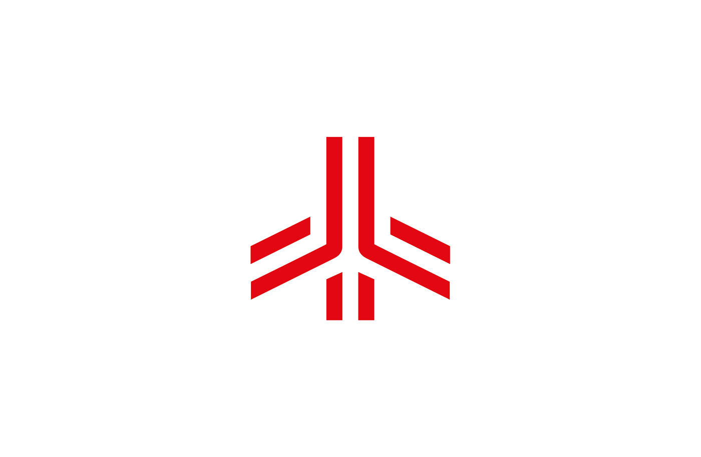
Quite the classic logo design à la the 70s
– timeless, very simple and geometric – strongly suggests the professionalism of the carrier as well as its purpose. Logo shows what the project is: a railway to the airport. It was targeted to the broad audiences of all ages and backgrounds.

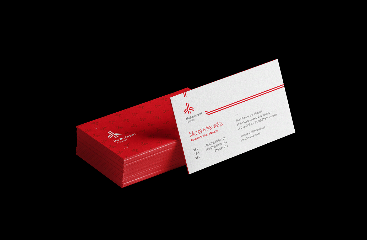


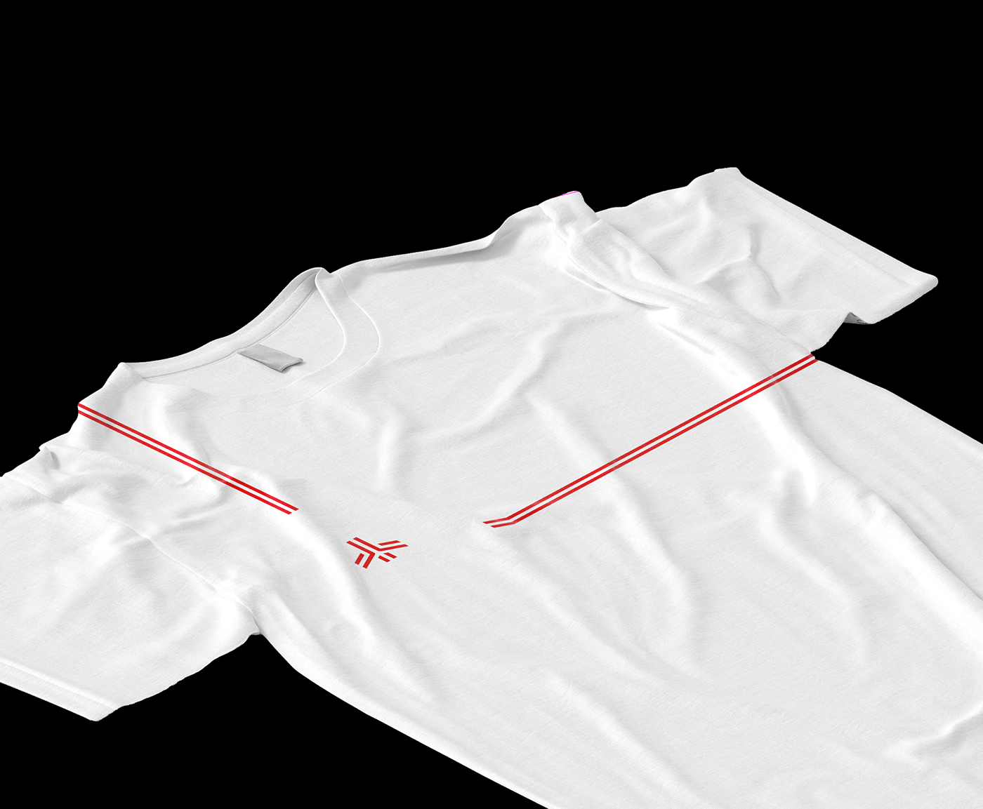
The visual system allows working on very diverse materials and formats
and bases its functionality on consistency, flexibility and aesthetics.
The two red lines, symbolising railway tracks, lead through all the materials and create the logo. Those elements flexibly work with layouts depend on their content. For example, though most often the logo is placed at the very top, when used with a photo it moves to the bottom. Logo works well in every format and guarantees the geometrically based aesthetics of the whole identity, thanks to the materials’ grid architecture which was based on logo proportions.
The two red lines, symbolising railway tracks, lead through all the materials and create the logo. Those elements flexibly work with layouts depend on their content. For example, though most often the logo is placed at the very top, when used with a photo it moves to the bottom. Logo works well in every format and guarantees the geometrically based aesthetics of the whole identity, thanks to the materials’ grid architecture which was based on logo proportions.