Flip the page!
Curator╱天藍 Tiana Wong
Design╱曦成製本 Hei Shing Book Design
Scope of Work╱Exhibition Main Visuals & Promotional Items
-
Promotional Poster/ Leaflet
Size╱A2
Paper╱Polytrade - UV/ULTRA II, Oxford 135gsm, UV335
Publisher╱Hong Kong Book Art Festival 2017
Year╱2017
Design╱曦成製本 Hei Shing Book Design
Scope of Work╱Exhibition Main Visuals & Promotional Items
-
Promotional Poster/ Leaflet
Size╱A2
Paper╱Polytrade - UV/ULTRA II, Oxford 135gsm, UV335
Publisher╱Hong Kong Book Art Festival 2017
Year╱2017


The world is going too fast. Relax, open a book, and enjoy the scenery beyond the book… – Exhibition label
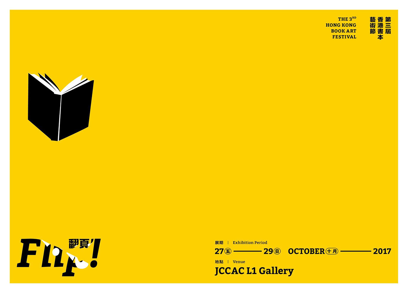
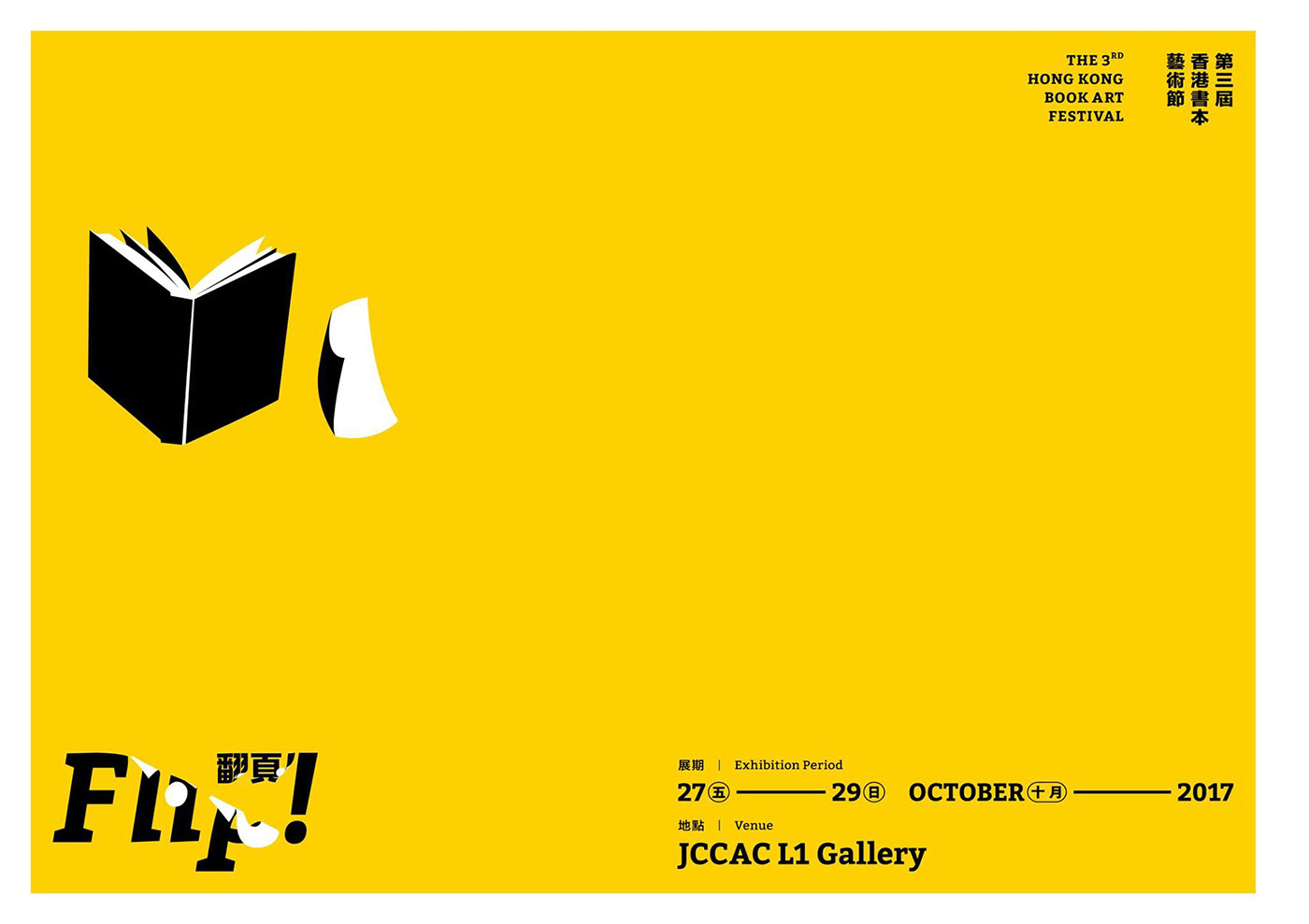
In 2017, I handled visual design for the Third Book Art Festival. This edition’s theme is ‘Flip! Flip the page!’ The idea behind it is rather simple. Through the casual act of flipping through the pages of a book, the reader explores the scenery beyond the book. Whether it be a beautiful landscape, or a desolate terrain, it is a unique world created by the writer, which deserves the full appreciation of the reader.
For this project, I use the decal sticker as the main visual element. The urban, street-smart style is direct and exciting, and the typeface of the theme resembles a decal sticker in the process of being applied on a surface. It suggests the motion of flipping. In an experiment, I had printed the word of ‘Flip!’ in both English and Chinese on a piece of paper, and then I repeatedly folded and unfolded it, rolled it up, and spread it out. At long last, from all possible manipulated two-dimensional shapes of the word, I chose a few that pleased me the most. I singled one out and made it into this form after a series of sketching and fine-tuning.
When it came to colours, I chose mango, black, and white. This combination offers great contrast and is very eye-catching. Big solid colour blocks, bold lines, fat typeface, and clean visuals make up these light and refreshing vector graphics, creating instant visual impact.
