Located at Yonge and Eglinton, Noted on their website; 'they serve authentic Indian food. This is reflected in our choice of unique menu items, that are prepared from local farm fresh vegetables, spices and ethically sourced meat. We allow ourselves to cook your meals with care, love and time. We stay true to our intentions by serving real home style Indian food with a contemporary touch.' As mentioned on their website.
Hired on as a contractor by Branding & Buzzing to create the logo, social media content and branding assets to carry the restaurant into it's opening.

The first time I tried their food I can honestly say I was blown away. They have immense passion behind what they do and I am proud to have developed their branding.
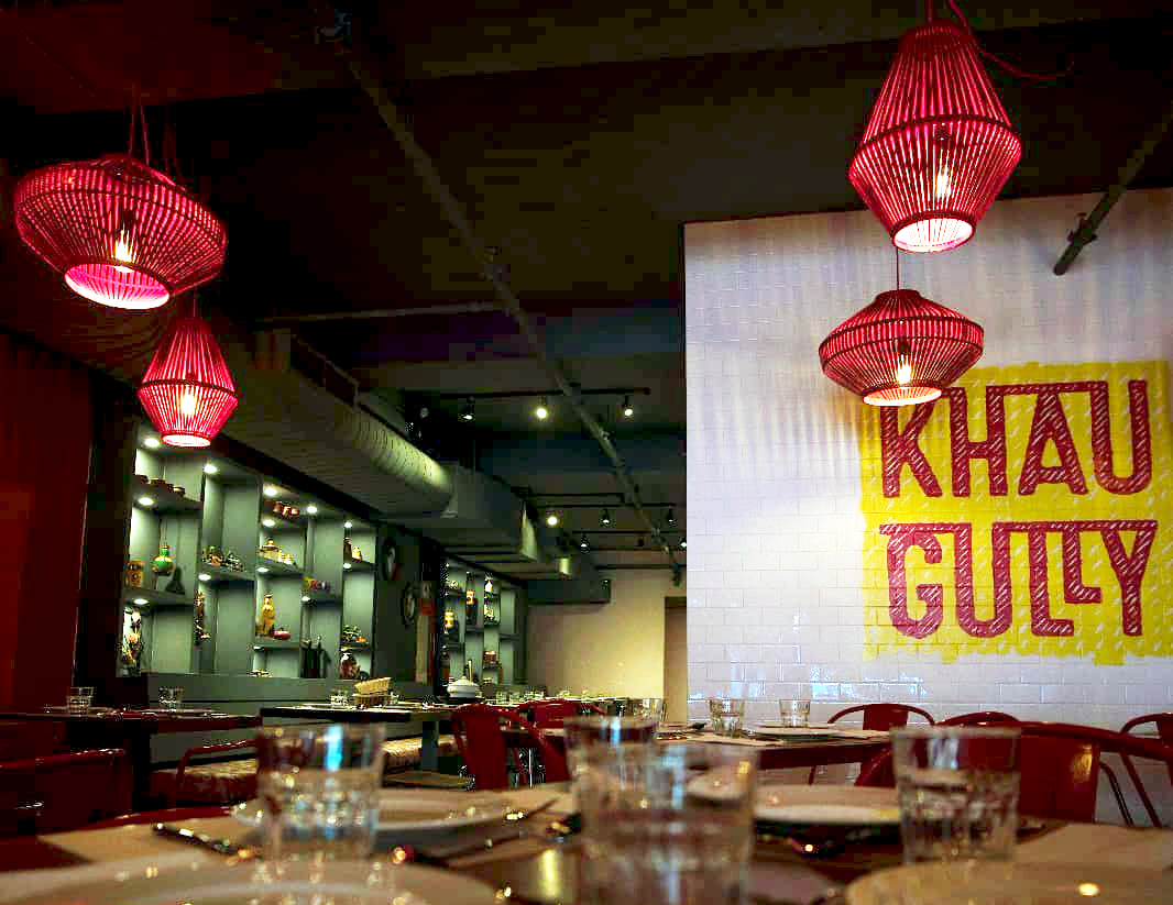
The logo itself has multiple subliminal imagery. When I produced the logo I was briefed and told the bakcound was to represent Indian Street food, and so the logo incorporates feet walking in the 'LL'. Along with a subliminal 'i' for 'Indian' between the H and U. It is subtle but intended to have purpose of the logo.