

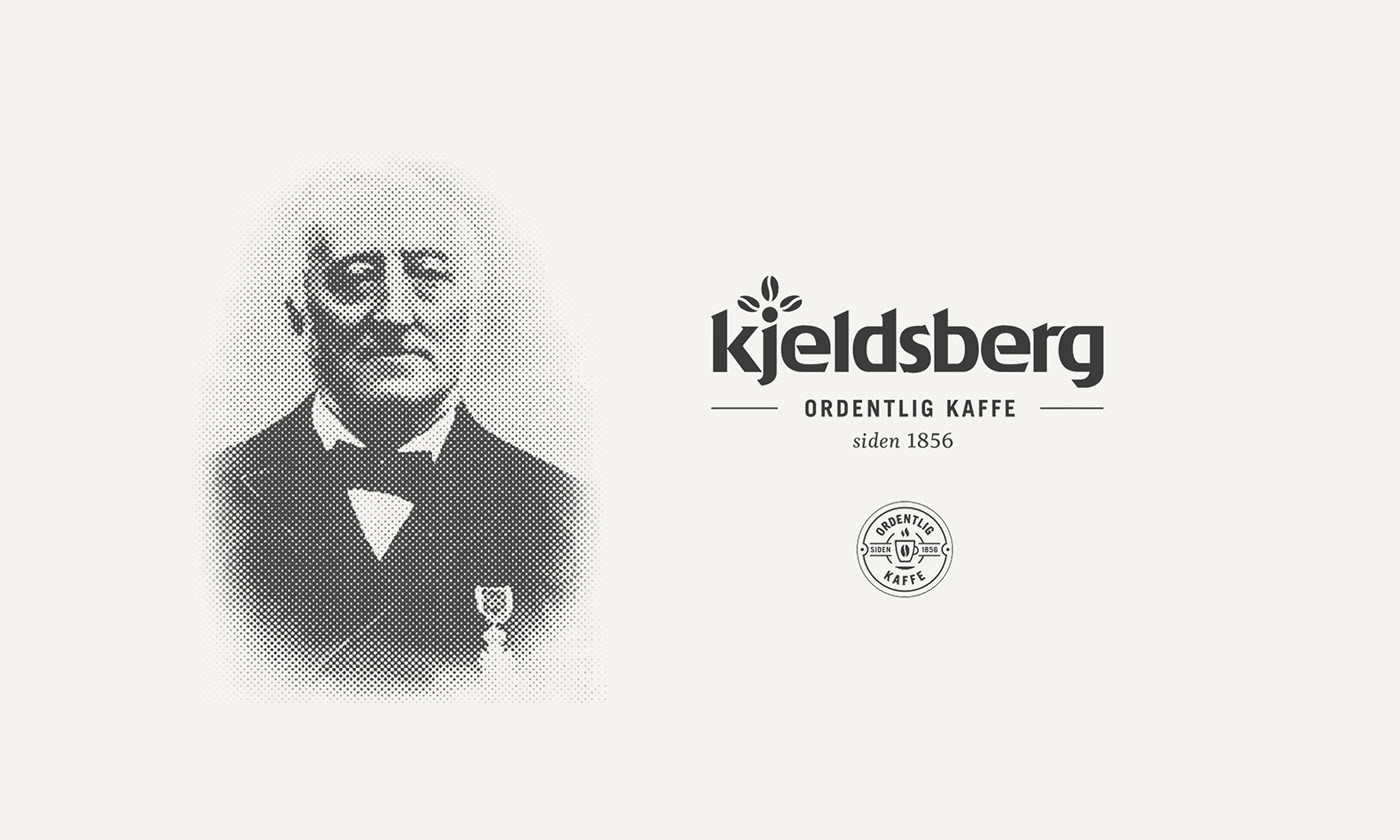
Kjeldsberg is a coffee roasting factory from Trondheim, Norway. The company has long traditions making quality coffee. Rasmus F. Kjeldsberg was the owner of a grocery store who predicted that coffee would become a very popular drink, and in 1856 he started making his own brand – Kjeldsberg.


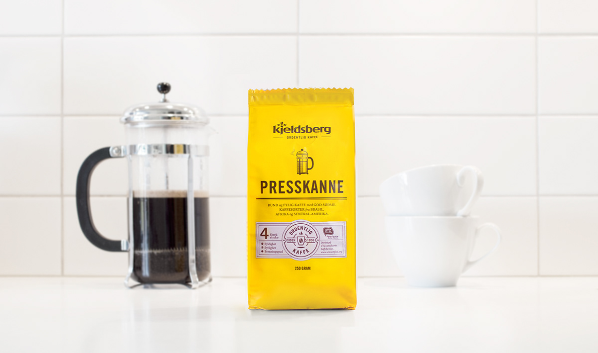
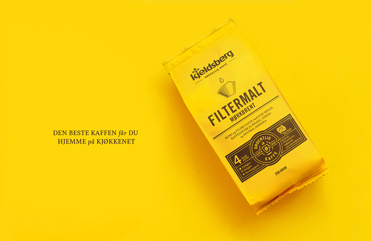
The Challenge for the new design was make Kjeldsberg pop out on the shelf, with much more impact. Kjeldsberg is known as «the yellow coffee» but the colour has been subdued significantly through the 80s and 90s to a much duller yellow. It has been particularly important to reclaim the strong yellow as most of the competition uses a strong red as their main colour.
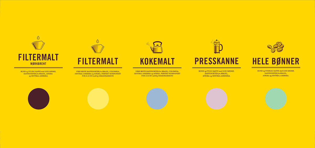
We knew from our research that many have problems finding their type of coffee among the many products on the shelf. This problem was particularly noticeable for elderly people and across all of the brands available. It was our clear goal to make the yellow coffee an easier choice for our customer. We wanted to bring back the strong warm yellow and make the design super-clear for what type of coffee the customer wanted. The icons are custom-made for this purpose and the inspiration behind the styling was taken from Kjeldsberg’s newspaper advertisements in the 50s. This helps root the design in the company’s long traditions.
The soft pastel colours identifies the different varieties of Kjeldsberg coffee. This system was inspired by early train and bus tickets, which were printed in one colour on pre-coloured paper. It helps separate the products, but still lets the yellow stand out as the dominant colour.


Thanks for Watching


