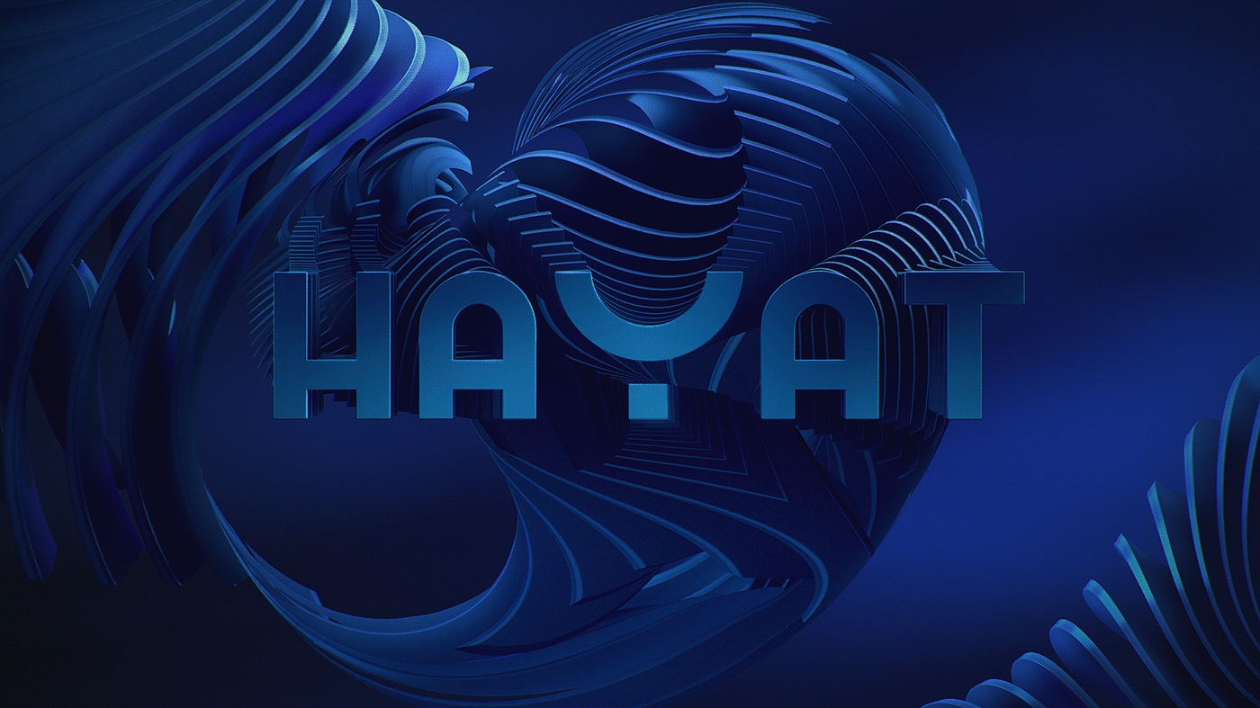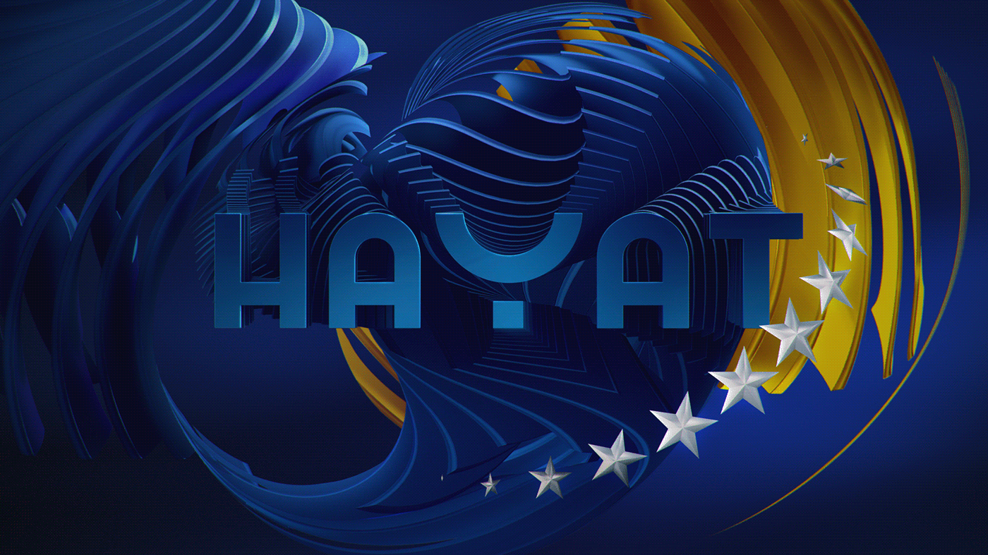
Our goal was to push brand further, to more grown up and stylish look, keeping the connection with old branding.
We create bold and clean look, colors are simple, and main character is dominant and spread out of the borders.

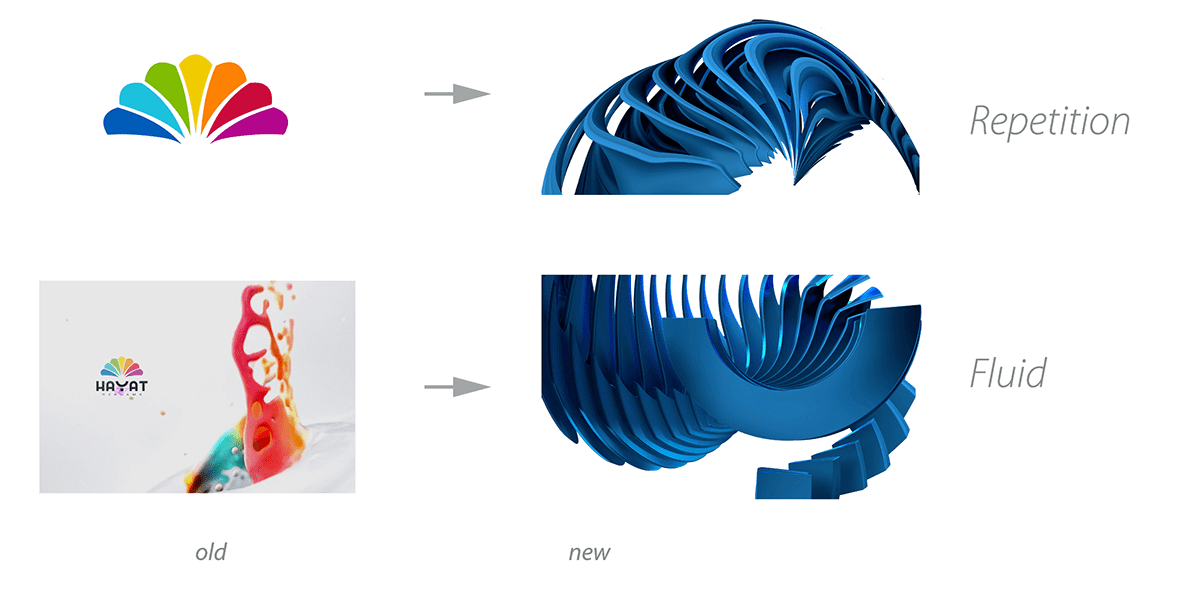
As a link to the earlier design, we keep the elements such as repetition and fluid.
The main challenge was to create fluid forms that are solid and massive.
Bold and massive character are transform in to a fluid forms and a whole model flow over the edge of the picture.
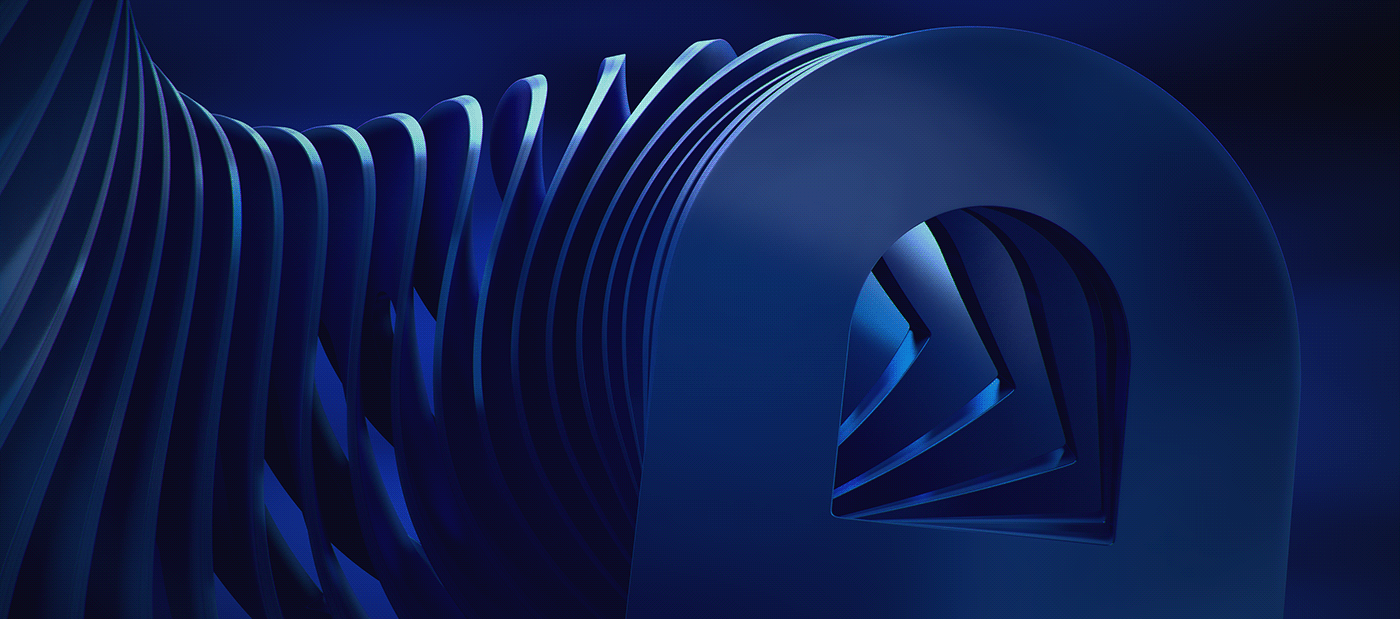
Chiaroscuro lightning technique gives more depth to a model and space, and filmic atmosphere.
With materialization we simulate deep brush metal or highly polished monolith stone.
Reflection is deep so that gives a whole model depth.
UI Layout