3rd Year Communication Design Project
Corporate Identity and Brand Development
This was the 1st project for 2010 that I received. I was very excited about this, since I love layout and corporate identity development so much.
Project brief:
Finally, the long awaited year 2010 has arrived. But with the great power of being the host nation of the Soccer World Cup, comes great responsibility... As designers the best manner in which to live up to our responsibility is by designing a corporate identity for a real/fictitious(I did fictitious) company or entity that will play a role in the hospitality sector in 2010 and beyond. Think of an organisation that adds a uniquely South African flavour to any tourist's travels.
Client:
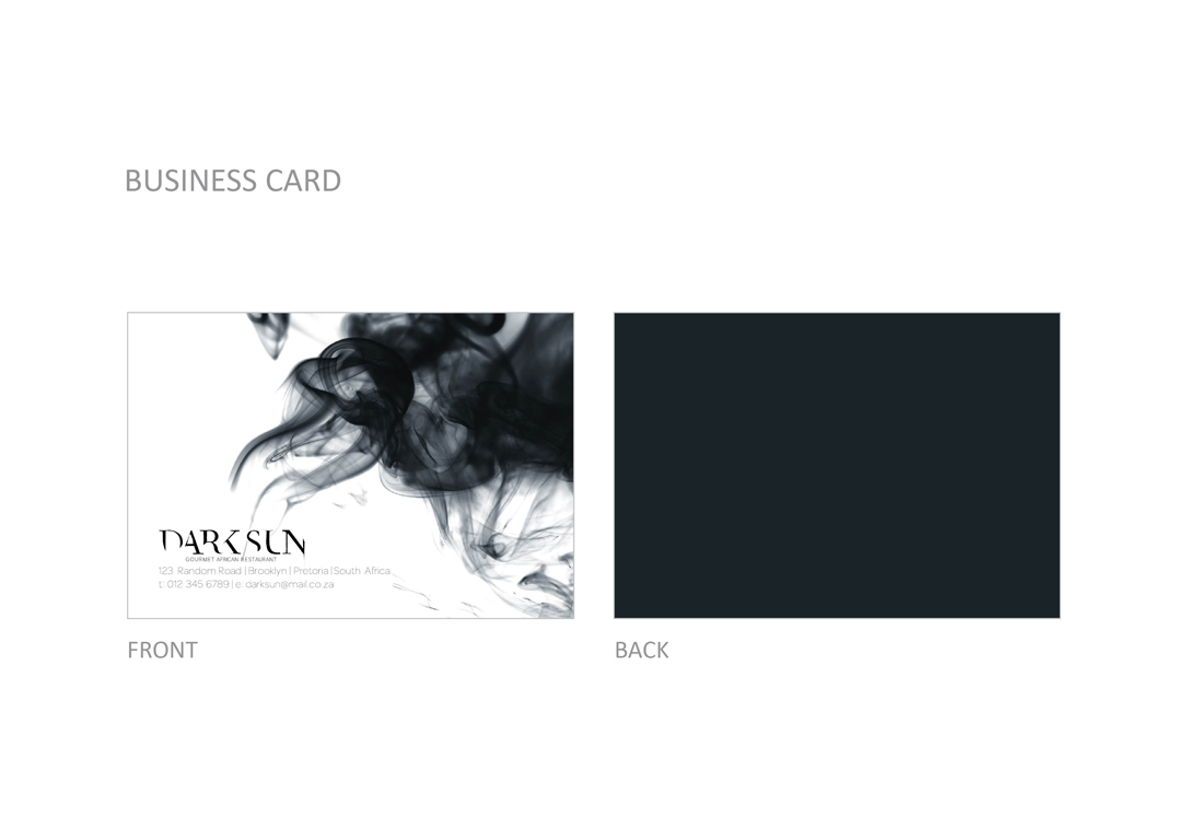
The name of the business I chose is Dark Sun, with slogan, Gourmet AfricanRestaurant. “Dark” refers to the mystery that Africa embodies and“Sun” refers to the climate of the continent. So, in essence therestaurant should reflect a vague, mysterious sort of feel, andobviously this should show in the application of the corporateidentity on the printed media.
The above outcome shallbe achieved by using plenty of negative space, which will also beinfused with the negative space. The typeface for the logo will be amodified serif font of which certain strokes of the letter has beenremoved to add to the mystery. The logo should also have a slighttexture around the edges to enforce the grungy, African feel. Theslogan will appear under the logo in caps, but forms part of the logo.
Why I chose this clientwas because there aren't many gourmet African restaurants in SouthAfrica, and tourists/international clients with taste, large suppliesof money and design background will appreciate this restaurant andthe theme it represents. Why they will appreciate this is because therestaurant and printed media represents an acceptable design stylethroughout the corporate world, with it's clean layout and simplisticfunctionality. This sort of tourist/international client will mostlikely want a high level of service quality and also the appropriatestyling applied to the interior decoration and printed media, such asthe menu.
The reason why thesmoke imagery was applied in the design was that smoke usuallycarries an air of mystery about it. When some person sees a cloud ofsmoke in the distance, they will most likely wonder what's burning/onfire. In this case the smoke used in the design is of an invitingnature. It will spark the viewer's interest, and it is also visuallypleasing.