About a month ago, I noticed that the Baiyun Beauty Bay was soliciting proposals for their visual identity. Although there was an impossible timetable (only two weeks) and no financial compensation for submitting a project, it still an extraordinary opportunity for me. So I decided to participate, and here's the project…
Background
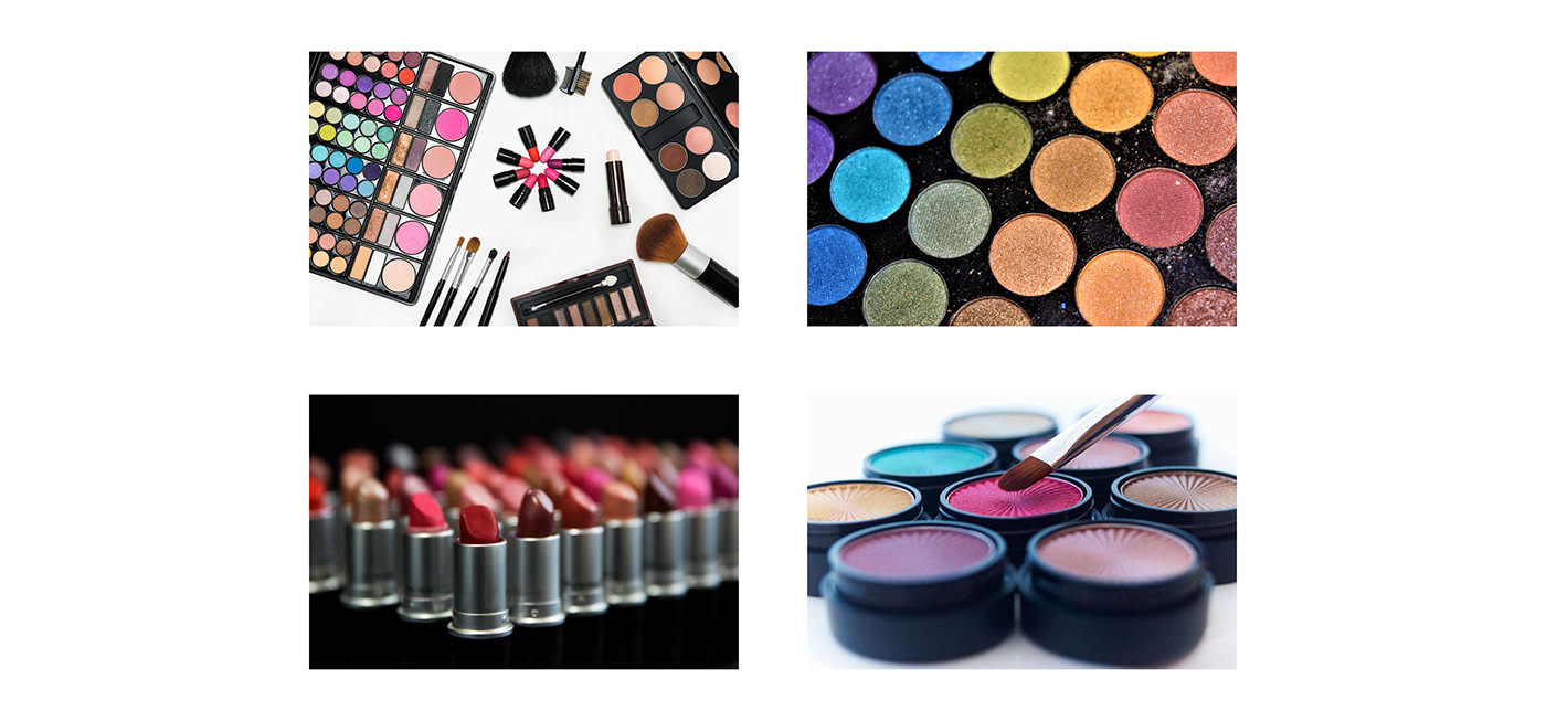
After years of development, Baiyun district (Guangzhou) has become the largest cosmetics industry cluster in China, with a complete industrial chain including r&d, production and sales. However, the long-term lack of standardized management makes it fall into chaos and disorder, which severely damages the reputation and restricts the development of the industry.
In response to the call to build the Guangdong-Hong Kong-Macao Greater Bay Area and better promote the orderly development of the local economy, the local government proposed the concept of "Baiyun Beauty Bay", hoping to integrate and upgrade the whole industrial chain through the accumulated industrial and resource advantages and get rid of the low-end labels, and build the a “global beauty production and market”.
项目背景
虽经多年发展,广州市白云区已成为全国最大的化妆品产业集聚地,拥有包括研发、生产、销售在内的完善的产业链条。但长期缺乏规范化的管理使得当地化妆品产业陷入混乱和无序的状态,严重破坏口碑的同时也制约着产业的发展。
为了响应建设粤港澳大湾区的号召并且更好地推动当地经济有序发展,当地政府提出“白云美湾”的概念,希望通过累积的产业和资源优势将整个产业链条进行整合升级,摆脱低端标签,打造千亿级“全球美妆产销地”的品牌形象和城市形象名片。
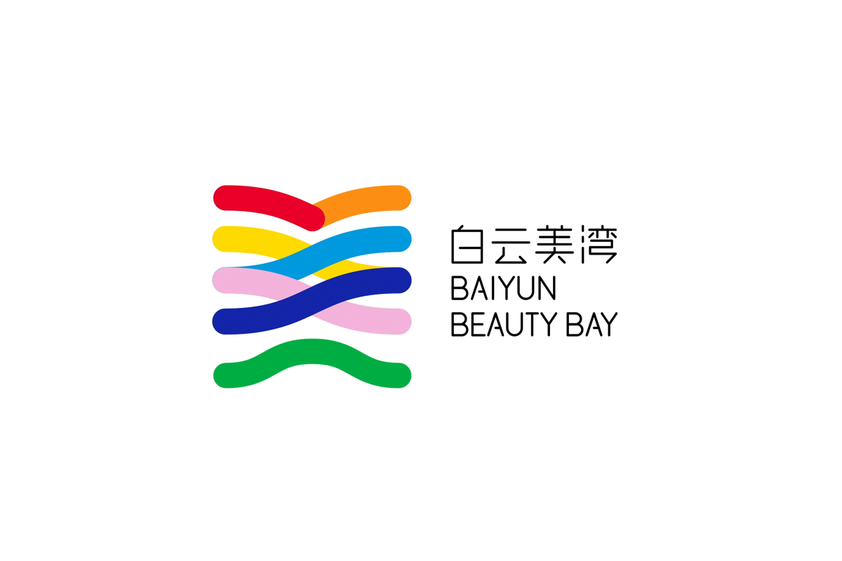
Concept
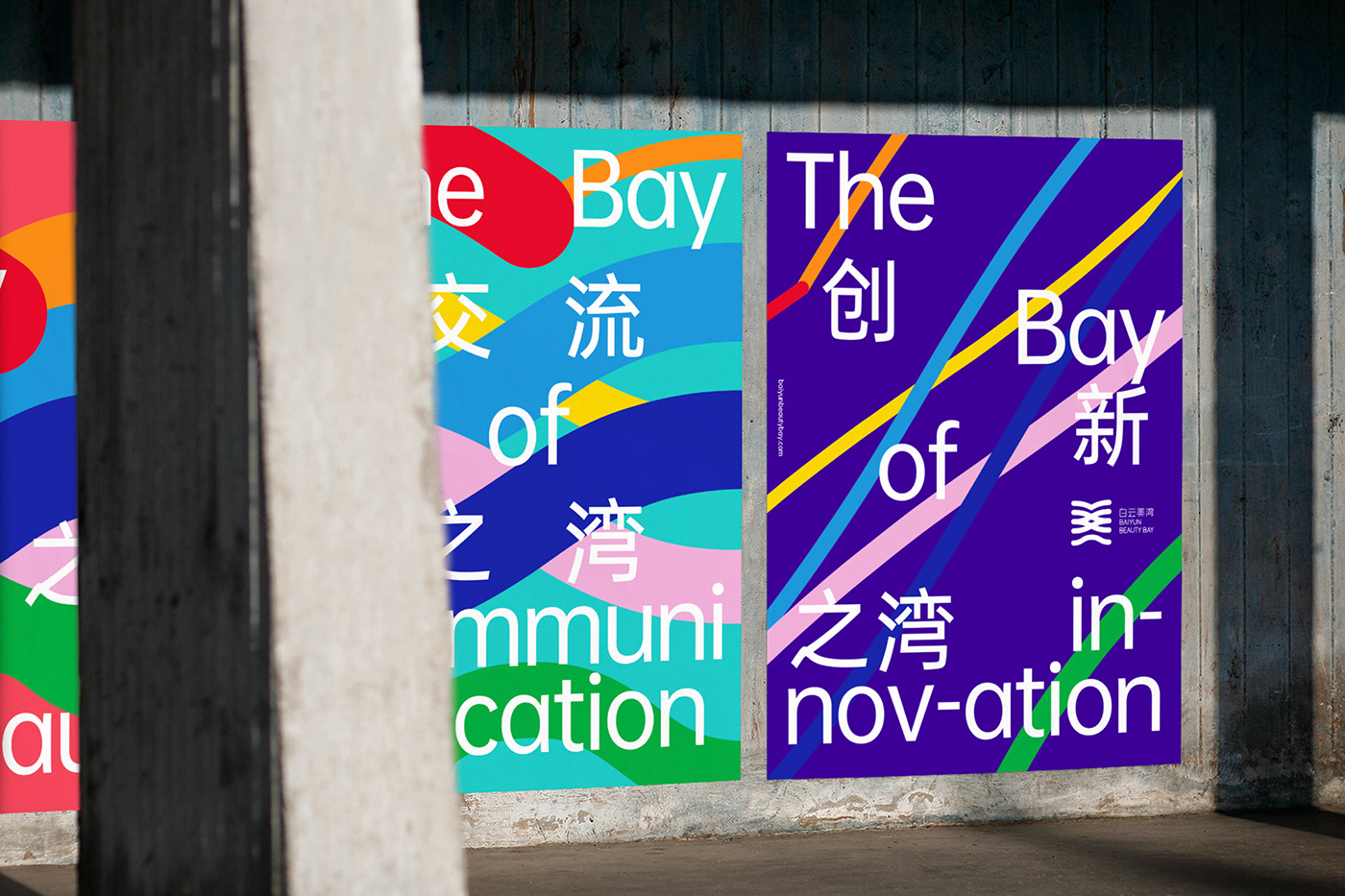
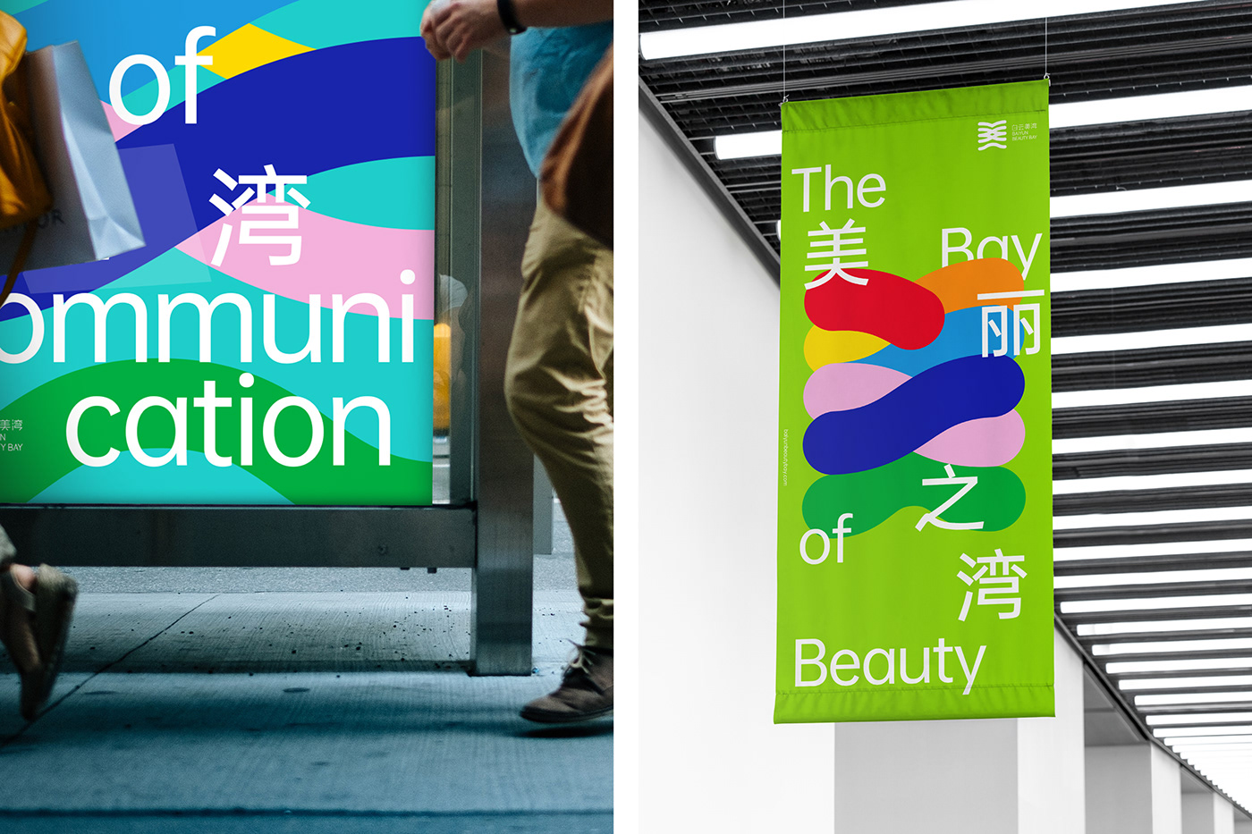
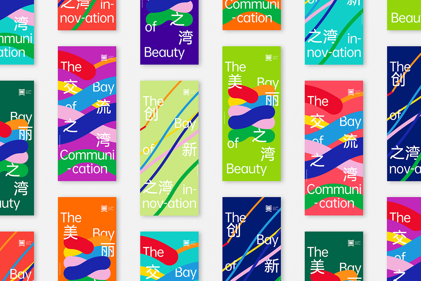
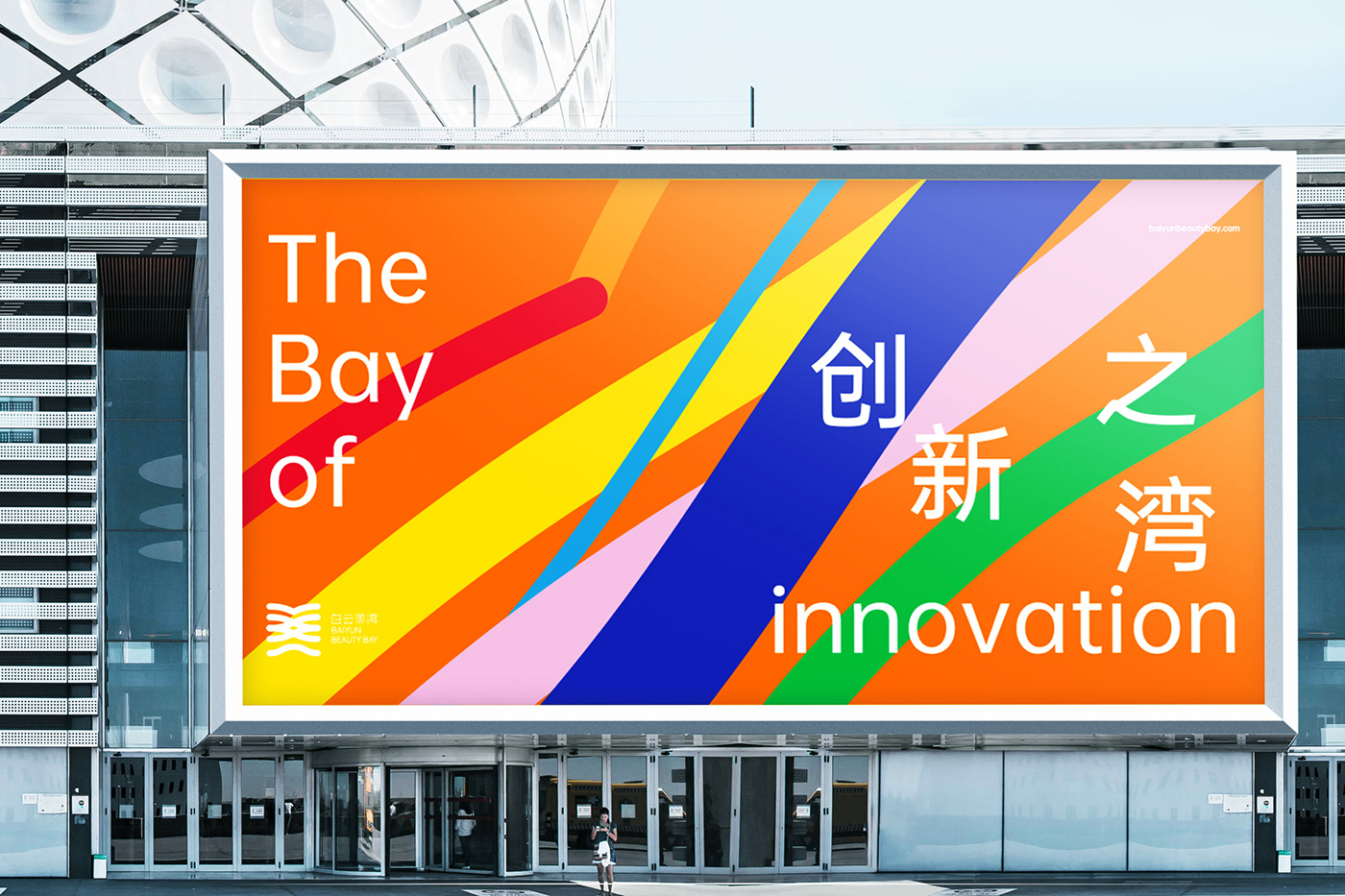
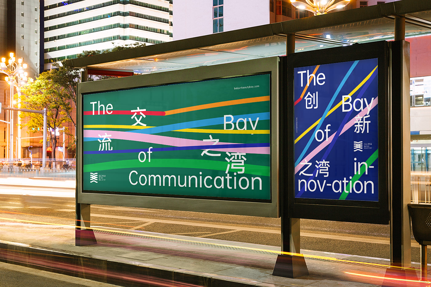
Baiyun Beauty Bay is a cosmetics industry cluster located in Baiyun district, Guangzhou, covering an area of 795.79 square kilometers. It aims to create the visual identity of "a global cosmetics industry cluster of one hundred billion scale”. I think its visual language should be in line with contemporary needs and unconventional, should seek for breakthroughs while preserving the roots of traditional culture, and according to the changing characteristics of the global market, it should also be changeable.
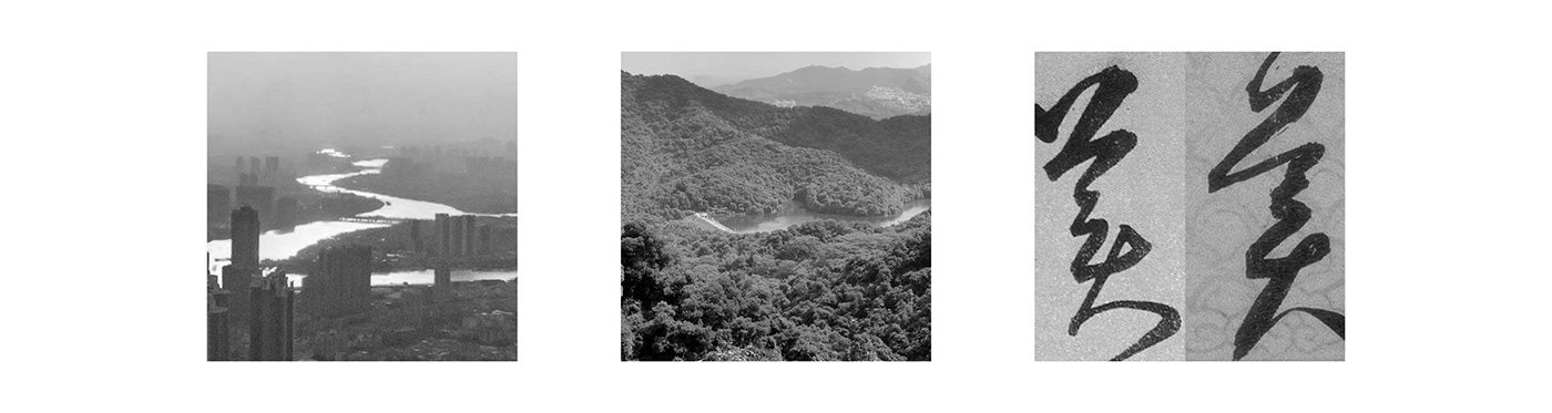
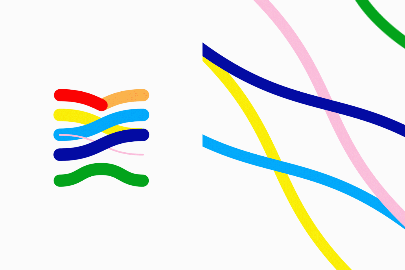
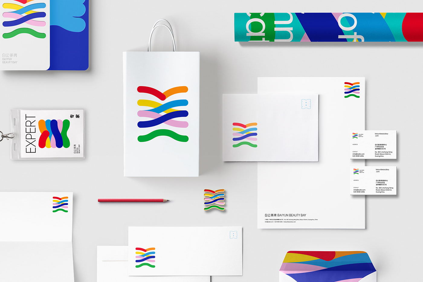
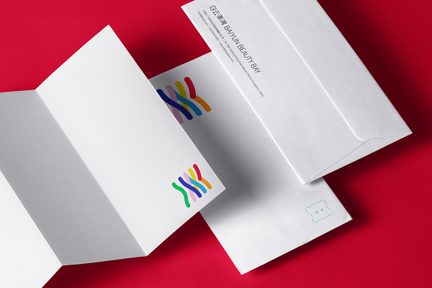
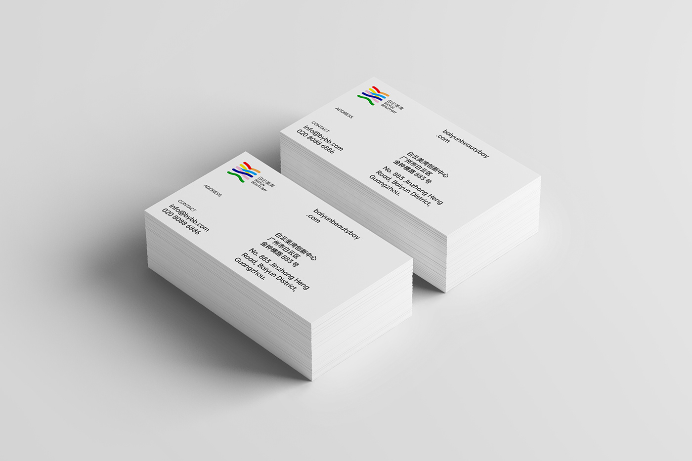
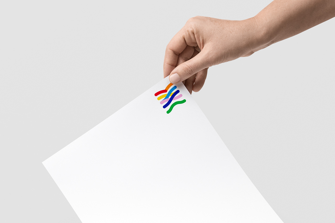
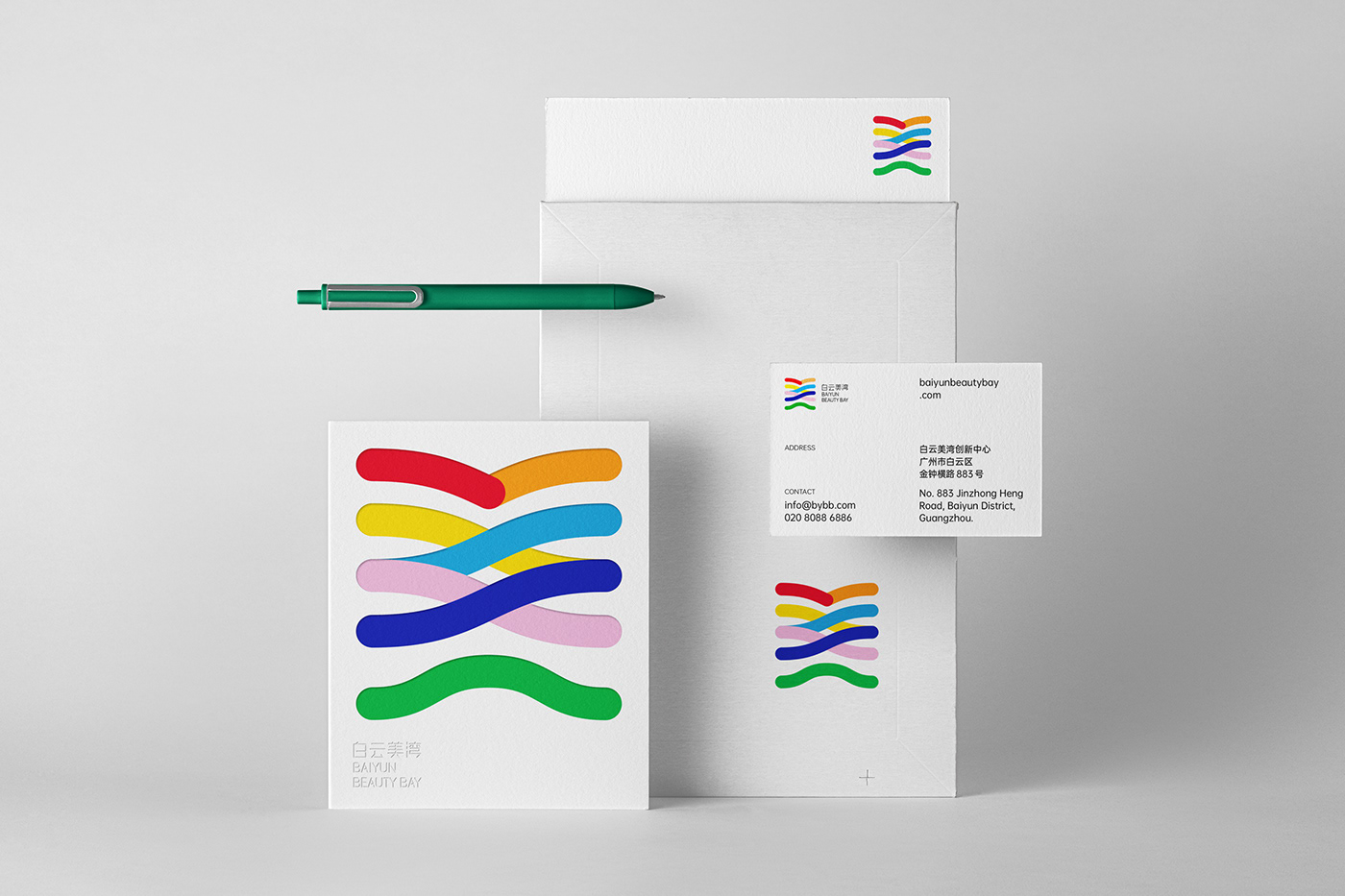
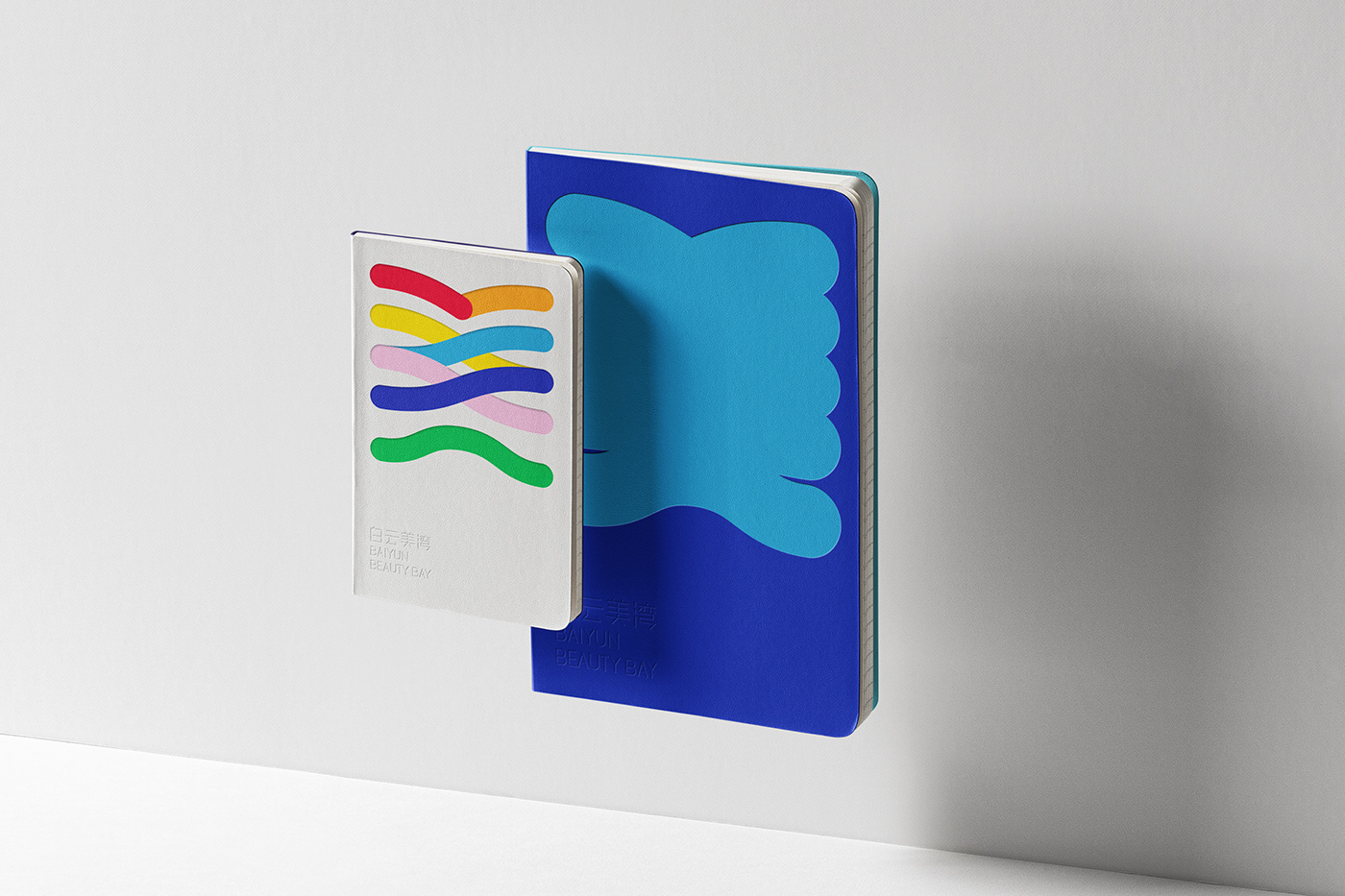
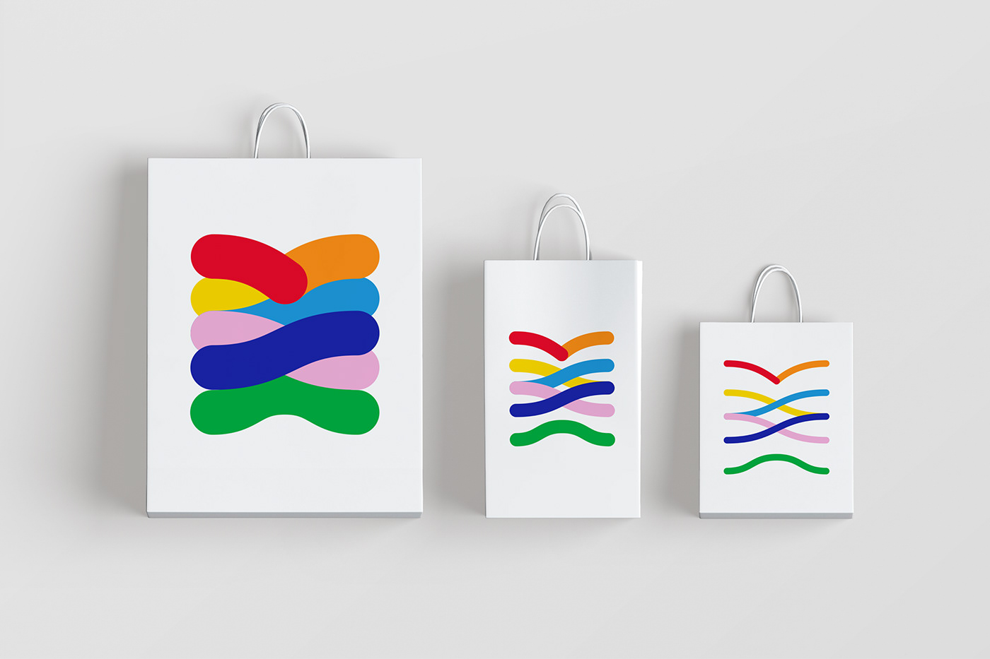
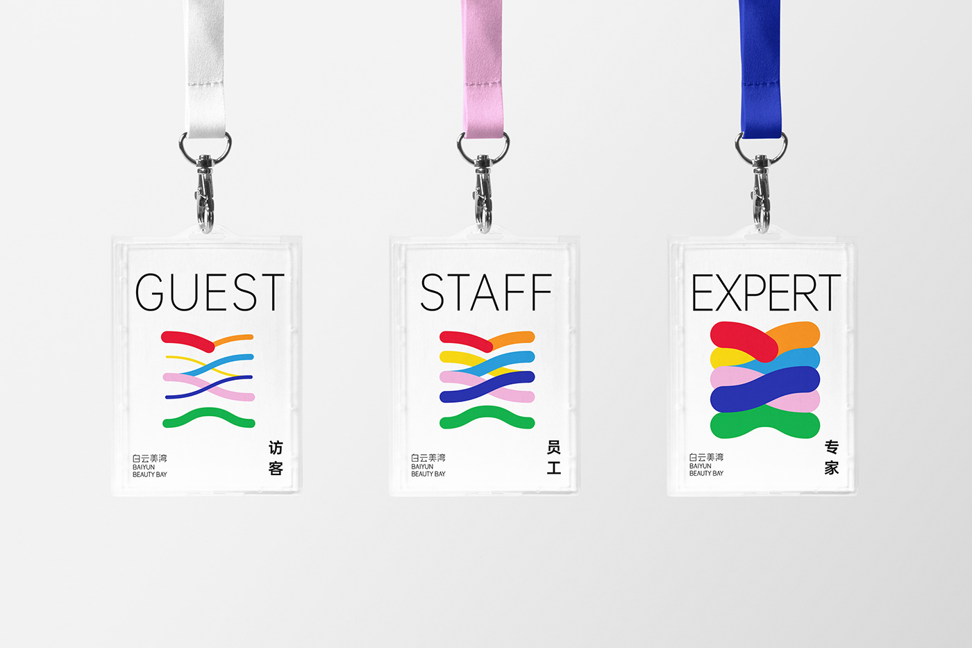
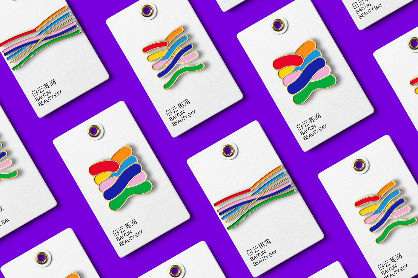
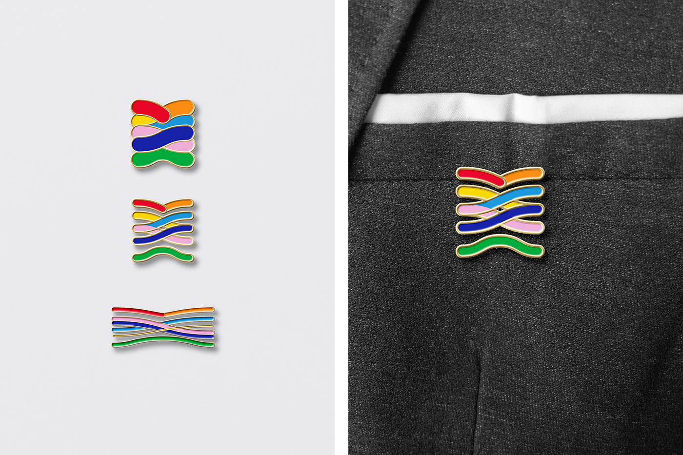
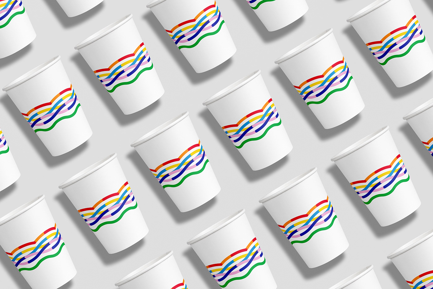
The visual core of the brand is the Chinese character beauty(美), its symmetrical shape has a sense of stability and power, which not only marks the brand's industry attributes, but also implies Baiyun Beauty Bay’s ambition to strive for the top. The shape of logo was inspired by the unique geographical condition of Guangzhou (Baiyun Mountain and the Pearl River) and the strokes of Chinese calligraphy, then a flexible and diverse visual identity system was built by changing the scale of the logo.
—
设计理念
白云美湾作为国内最大的化妆品集聚地,旨在打造全球化的“千亿级规模的化妆品产业集群”的品牌形象和城市名片。那么使用“美”这个汉字作为视觉识别的核心是最好的选择。从造型上看,其对称的造型充满了稳定感,象征品牌走向规范化专业化的决心;从寓意上看,它既能直白地表示行业属性,也能表明品牌的宗旨与追求。值得注意的是,使用汉字作为标识还能够更好地向海外强调该品牌来自中国,这与品牌的全球化策略相吻合。
标志的线条是弯曲且相互交叠着的,灵感来源于广州独有的地理特征—白云山和珠江,以及草书中对“美”字笔画的处理;也借山、水和书法,寄托对丰饶的物质和精神生活的愿景。
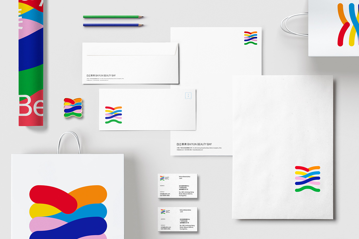
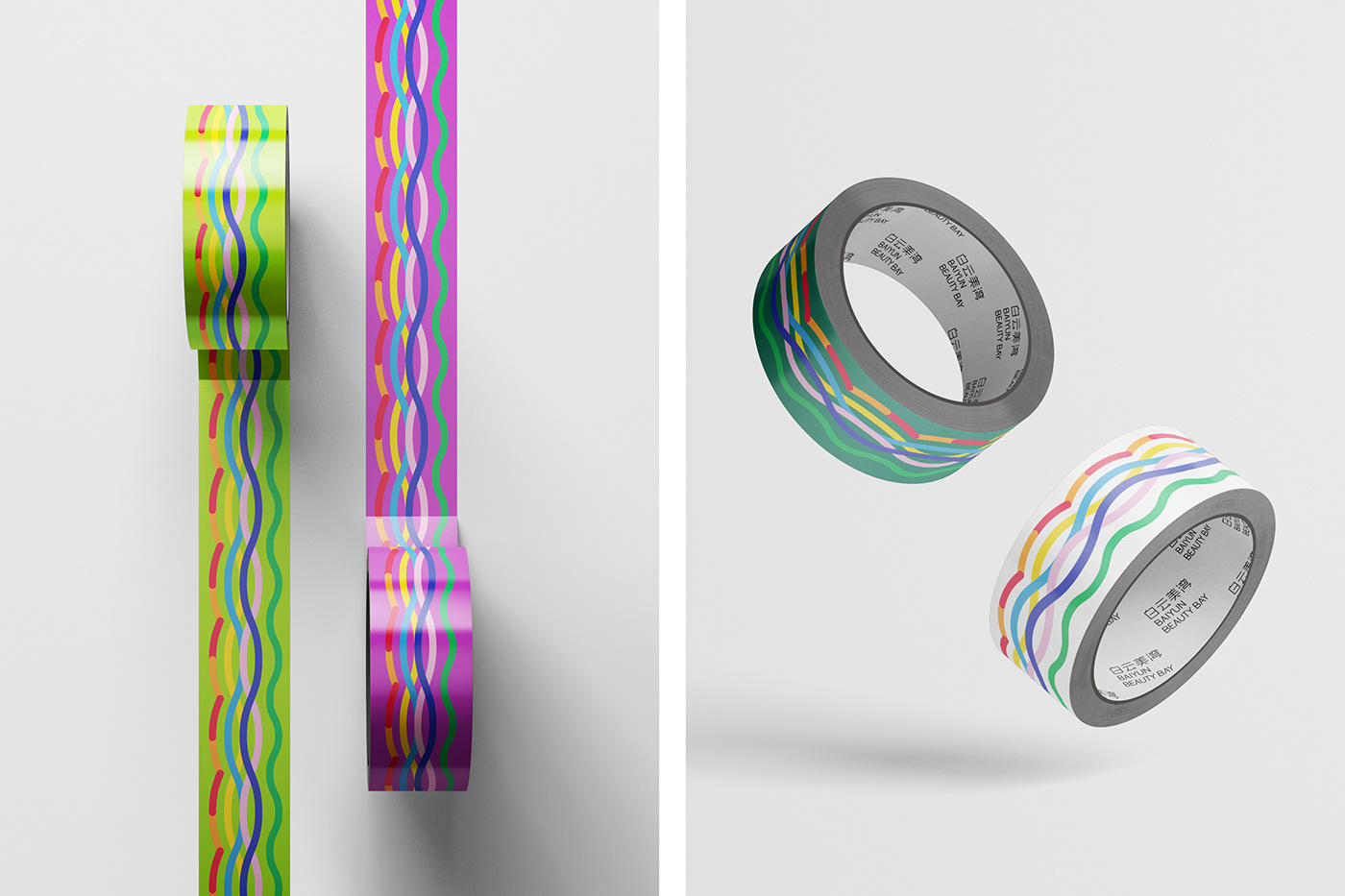
Color palette
Inspired by the colorful characteristics of cosmetics, the brand’s standard colors were extracted and adjusted from the seven colors of visible light, which symbolizing the complete and diversified product categories and industrial chain of the Baiyun Beauty Bay. the support color is in the extension of these seven kinds of color, so that it can easily adapt to different media.
—
色彩计划
从化妆品的多彩特性中得到灵感,提取可见光的七种颜色并加以调整后设定为标准色,象征白云美湾所具有的完善且多样的产品种类及产业链;
辅助色则是在这七种颜色的基础上延伸而来,使其能够轻易地在不同媒介中以更为丰富的形象出现。


Although this project was not selected, but I still learned a lot from the process.
Anyway, thanks for watching


