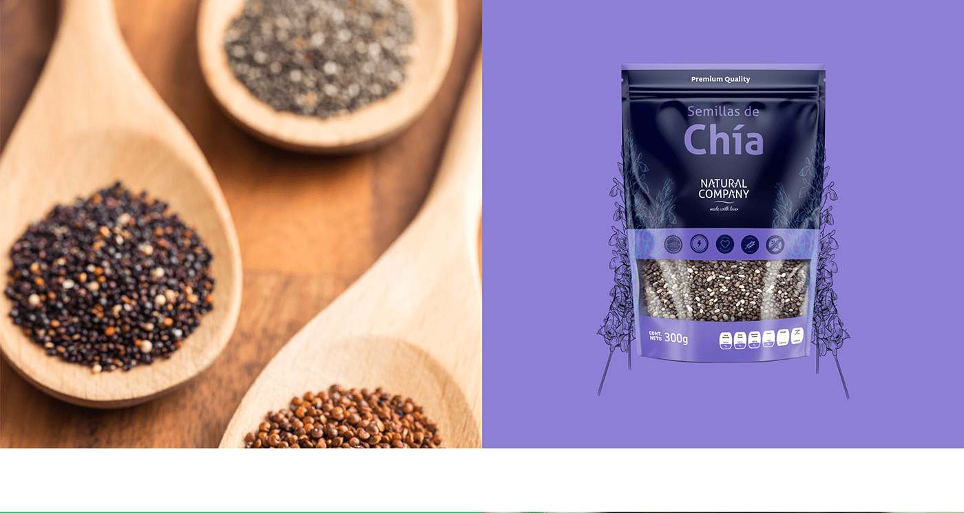
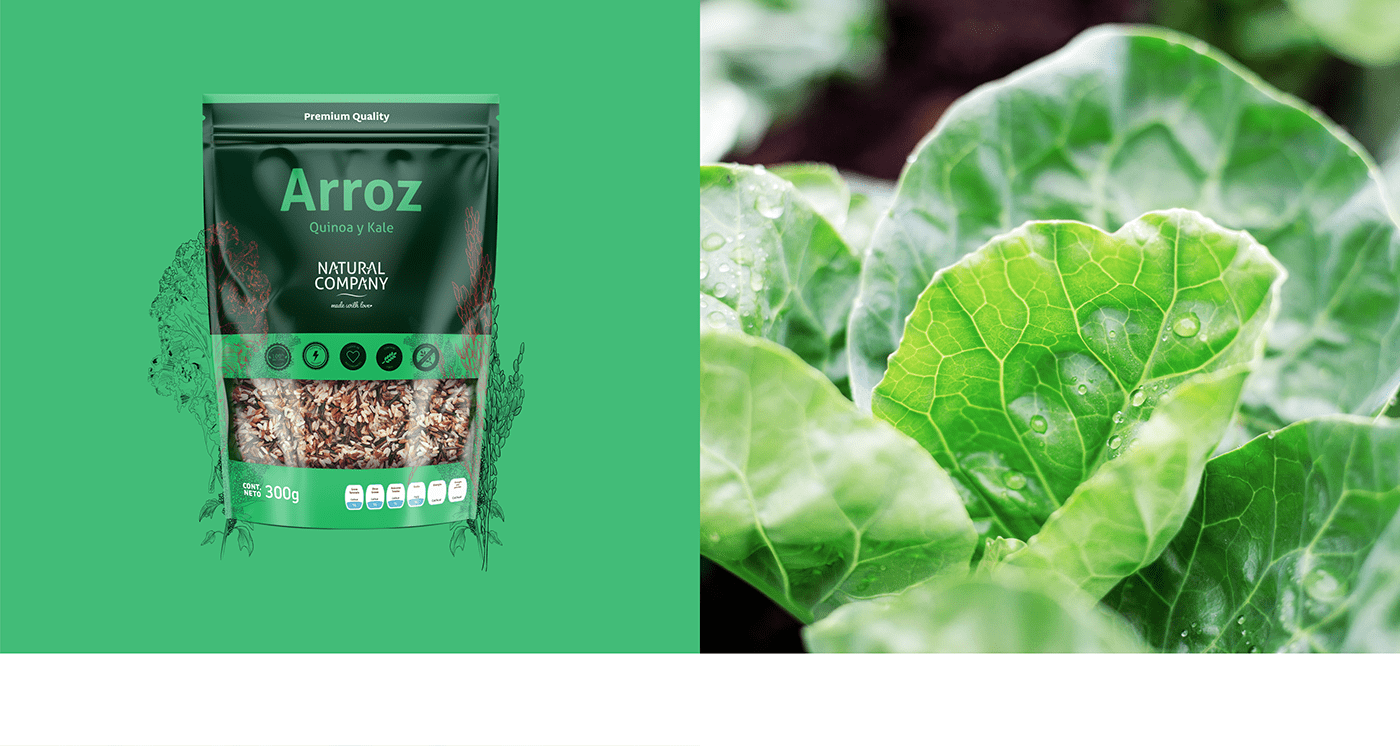
In 2019, Brand Industry were tasked to improve the perception that consumers have of the brand by creating a new packaging design. We analyzed the original packaging and decided to keep the most representative elements such as the clean design and the multiple color palette. Then we made a change with a brighter color palette and we put the name of the flavor as the core element of the new proposal. We also create a series of hand-made illustrations to reinforce the look and feel of the design This was translated into an improvement not only in the perception of the product but in readability for the consumer.

One of the elements that we saw as an opportunity to polish was the logo, wich was fine, but it needed a little twist for readability and execution. We decided to integrate the small leaves from the upper part of the logo into the name so we can get rid of a distracting element.