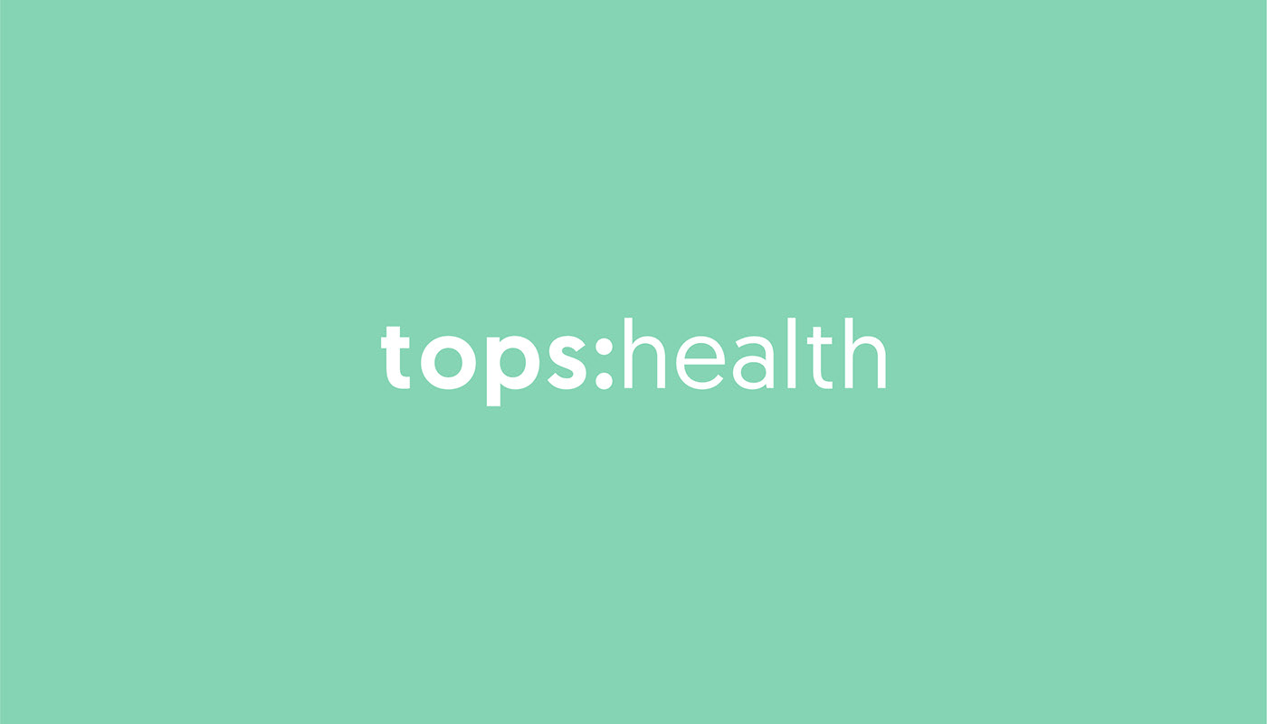
tops:health
Full brand identity for Oxford's leading health and movement practice, with physiotherapy at it's heart
Founded in 1984, tops:health - formally The Oxford Physiotherapy Service - is the the largest independent physiotherapy and multi-disciplinary clinic in Oxford, based across 5 locations. Providing physiotherapy, sports assessment and rehabilitation, massage, women's health, pilates, yoga and group classes such as Tai Chi, Barre and functional fitness, as well as a holistic, individual service and an active community to support people's overall health and wellbeing.
When tops:health approached ORCA to rename and overhaul their current brand identity, digital presence and ongoing strategy, we jumped at the chance. ORCA share a lot of core values with tops:health, and so having the opportunity to improve people's health and lifestyles through the way they interact and engage with the tops:health brand was a challenge we were happy to accept.
Nicola, Managing Director, of tops:health, says about the renaming:
"The tops:health values have always been to help clients in a friendly environment and to feel better through movement, with the guidance of a trusted pair of hands.
Those values still haven’t changed, although their abilities and specialities have evolved over time, and the business required a new name and a new brand to reflect these changes. The previous name felt restrictive as tops:health couldn’t easily convey that their practices incorporated not only physiotherapy, but pilates, yoga and much more. tops:health wanted a way to be able to shout about everything we offer in a concise way, and hence our rebrand was put into motion."
The new name encompasses everything that tops:health are proud to offer, and also enables them to grow and evolve the business, while adding more services and offerings.
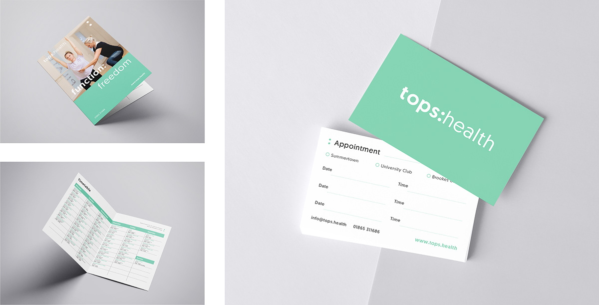
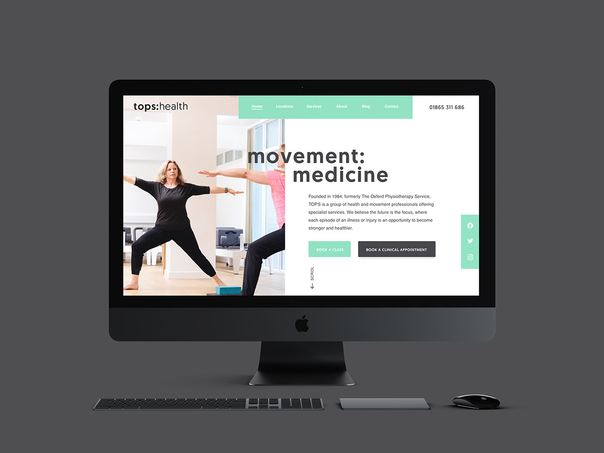
Deliverables include:
- Naming
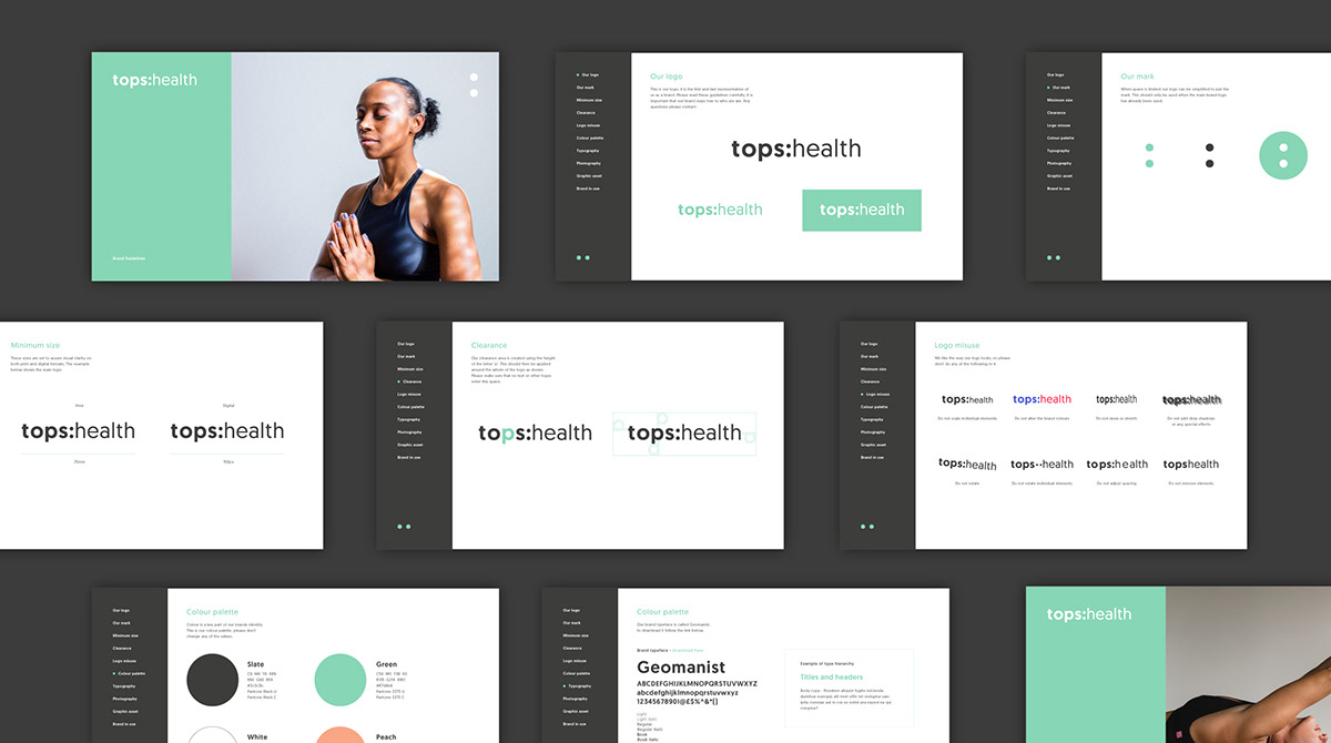
- Brand identity
- Brand guidelines
- Signage
- Stationery
- Collateral
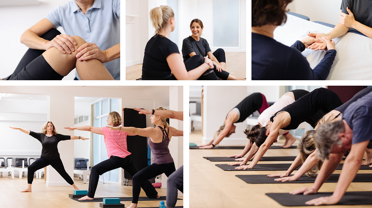
- Photography
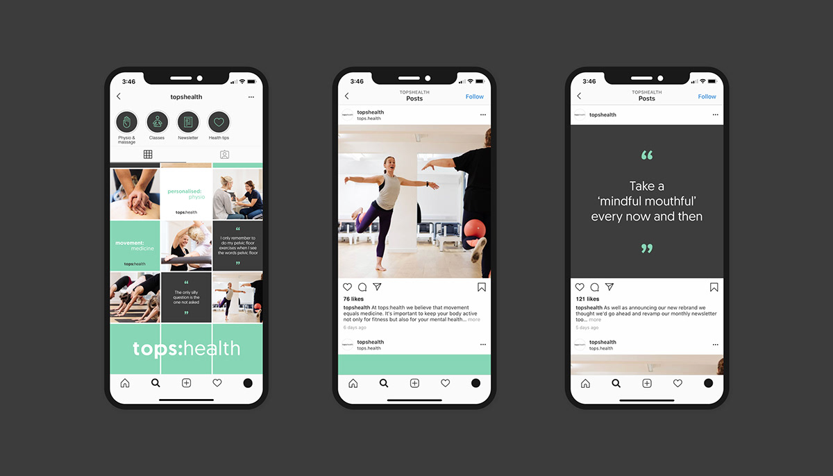
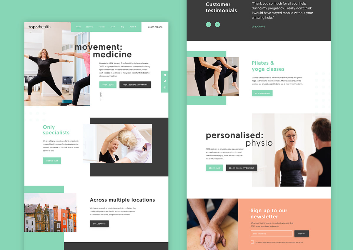
- Website
- Ongoing brand and strategy support
From the offset, it was clear the tops:health wanted to portray a friendly, communicative, empathetic and expert brand image, while also reflecting their professional and forward thinking approach. tops:health were keen to remove any unnecessary clutter from the brand, and focus on clean imagery and clear messaging, delivered with a knowledgable but unpatronising tone of voice.
The outcome is a clean, modern brand, utilising bold sans serif typography with a vibrant and friendly colour palette and a photography style which is modern and positive; concentrating on mobility and a healthy lifestyle.
The outcome is a clean, modern brand, utilising bold sans serif typography with a vibrant and friendly colour palette and a photography style which is modern and positive; concentrating on mobility and a healthy lifestyle.