Graal is a London-based medical start-up. The company is entering the Russian market, offering a new service: vitamin infusions and intramuscular injections.
Our task was to make sense of Russia’s service market, research the customer base, and zero in on the appropriate target segments, as well as to develop the company’s positioning, name, identity, and website.
Positioning
There are no companies in Russia currently offering vitamin injections as a distinct service. We analyzed
the Western market and local audience segments, and then applied our findings to the Russian context.
We identified the core customers not as athletes, as in Western markets, but rather as people looking to maintain their youth and beauty.
the Western market and local audience segments, and then applied our findings to the Russian context.
We identified the core customers not as athletes, as in Western markets, but rather as people looking to maintain their youth and beauty.
In our positioning, we therefore decided to focus on the product’s key properties: wellbeing and anti-aging.
This framing was also used when it came to naming the start-up.
Naming
The product name had to meet two main requirements: be easy to read in Russian and English, and align
with the brand platform. Out of all the suggested names, we chose the one that concisely captured the essence of the product: Graal (grail in russian).
with the brand platform. Out of all the suggested names, we chose the one that concisely captured the essence of the product: Graal (grail in russian).
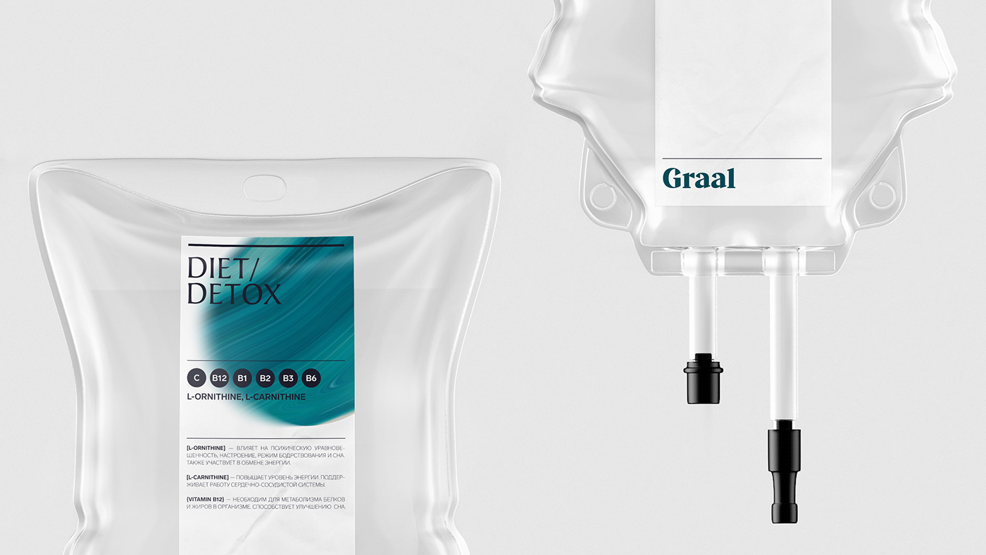
The Holy Grail is a fabled relic, the source of eternal life. In our interpretation, the vitamin drip is like a precious vessel filled with vitamins and minerals that protect health and youth.
Visual identification concept
Vitamin infusions are a new service on the market. The formula of each infusion has to be shown and discussed in an accessible manner so as to gain consumers’ trust.
Infusions are an upscale service, and the conceptual vibe should reflect this. We chose our tools judiciously
to convey Graal’s respect for their customers and the company’s painstaking approach to their work.
We selected an understated palette composed of hues that are not distracting, but rather underscore the content and enhance the tone.
We developed a logo suggesting the premium quality of the service, adding a dash of charisma
with characteristic serifs and finishing touches.

The key stylistic element of the concept is the consistent layout. Printed materials and packaging featuring detailed information expound the benefits of each component of the formula, describing the properties
and benefits of the product.
and benefits of the product.
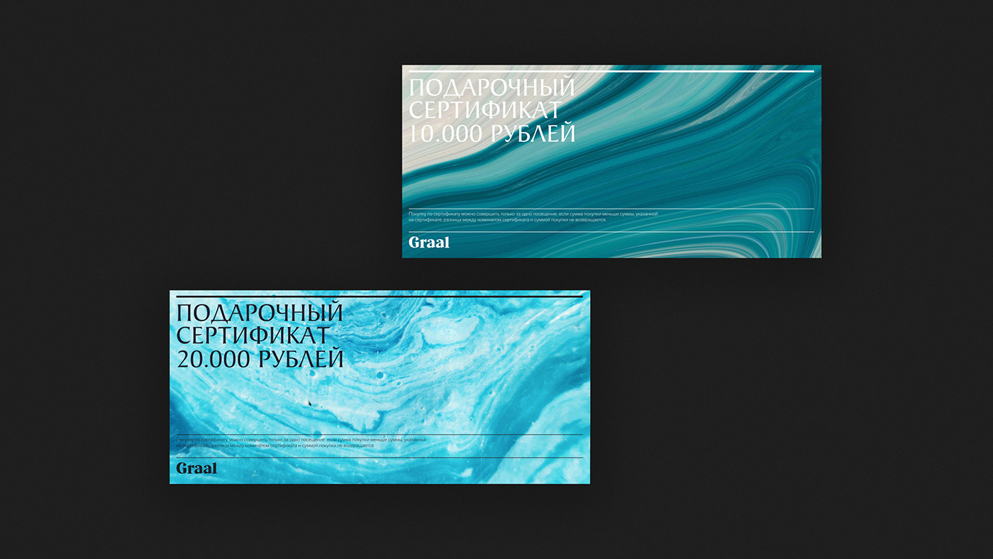
We use a photorealistic style to suggest the diffusion of liquids. We came up with a series of copywritten
texts to support the brand’s distinct vibe and highlight the infusions’ properties.


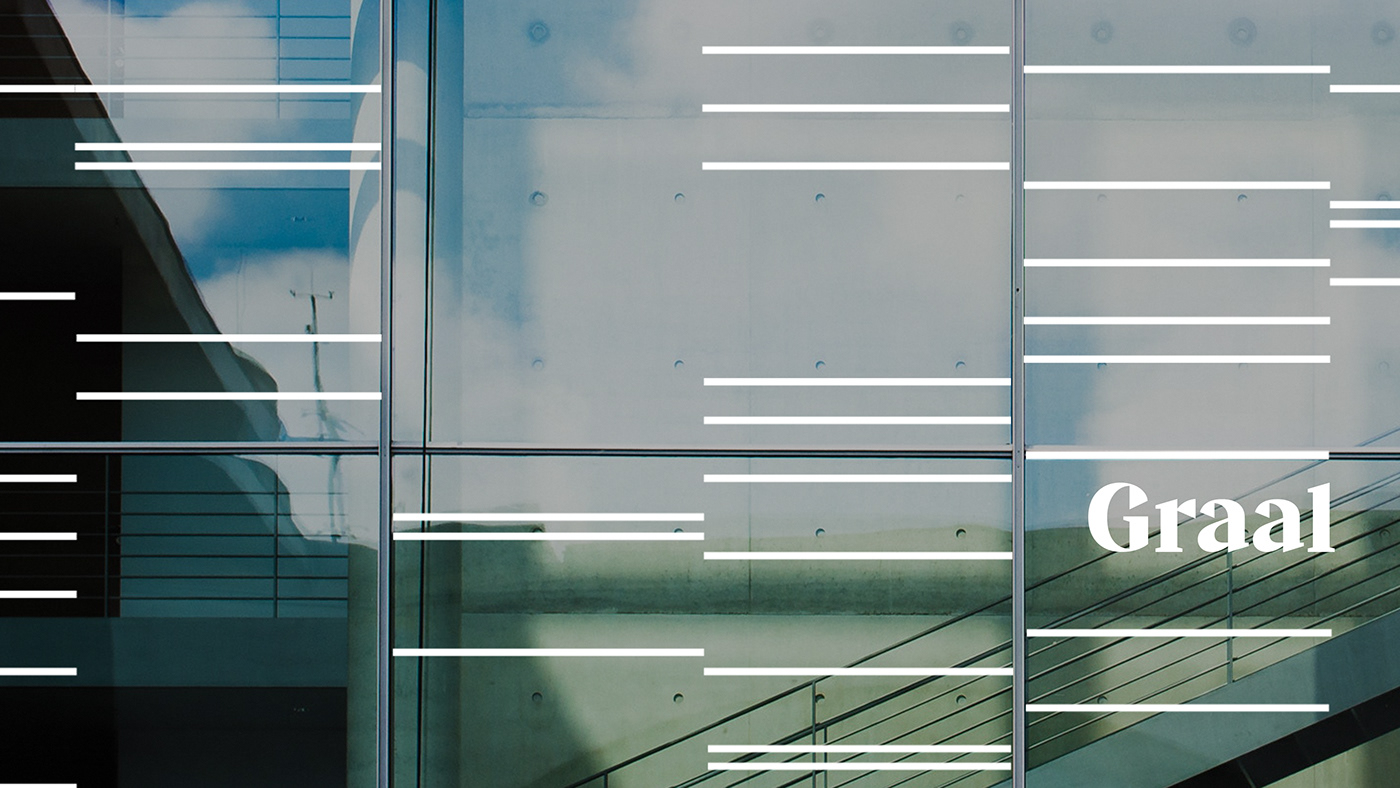
For media where full-color visuals or photos cannot be applied, we developed a signature pattern, built along grid lines and harmonized with the lines of the layout.


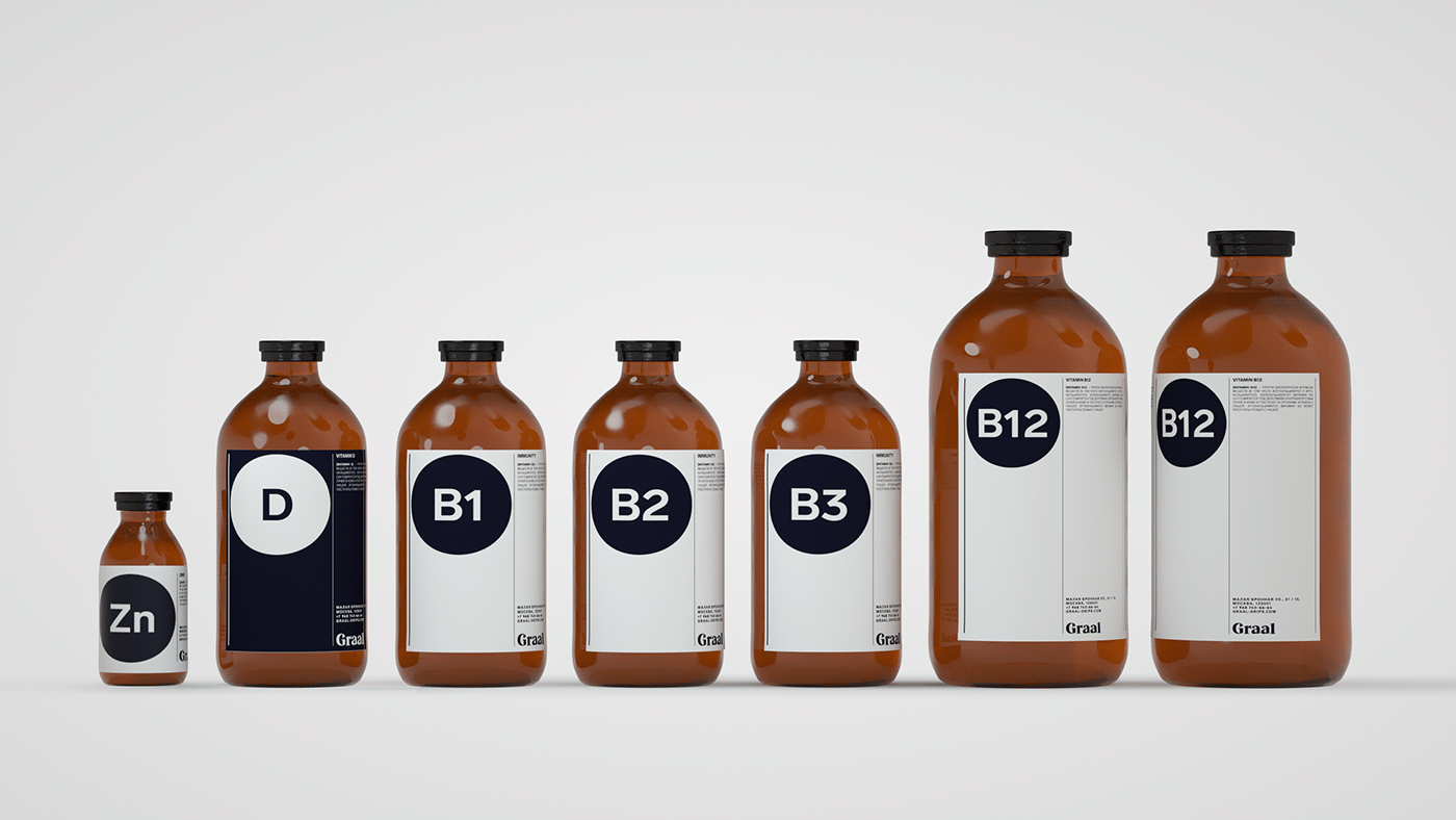
Stickers were created for the infusions and boosters. These can be adapted to any given medium thanks
to a flexible layout.
to a flexible layout.


For each label, we selected a photo that reflects the purpose of the injection. Most of the space was allocated
to the formulas and their components.
to the formulas and their components.


Website
We put together a website which details the procedures and types of injection, and can also be used to book
an appointment. The site will be launched once the project gets off the ground.
an appointment. The site will be launched once the project gets off the ground.
Alina Vikhareva — Producer and Strategist
Pavel Konyukov — Art Director
Alexey Salmin — Designer
Maria Troitskaya — Designer
Sergey Ivanov — Web Designer
Ekaterina Burtseva — 3D
Pavel Konyukov — Art Director
Alexey Salmin — Designer
Maria Troitskaya — Designer
Sergey Ivanov — Web Designer
Ekaterina Burtseva — 3D


