

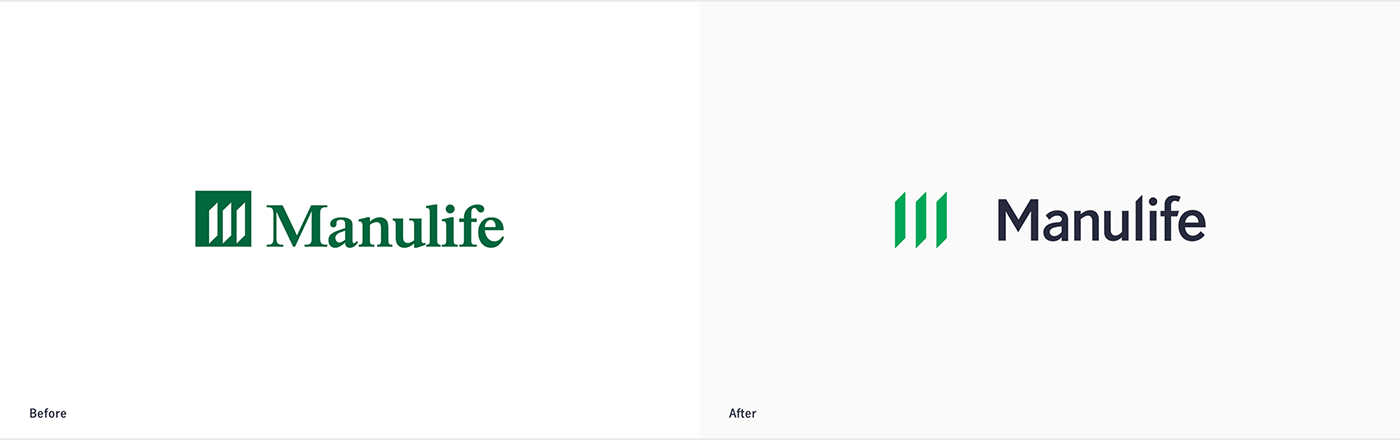
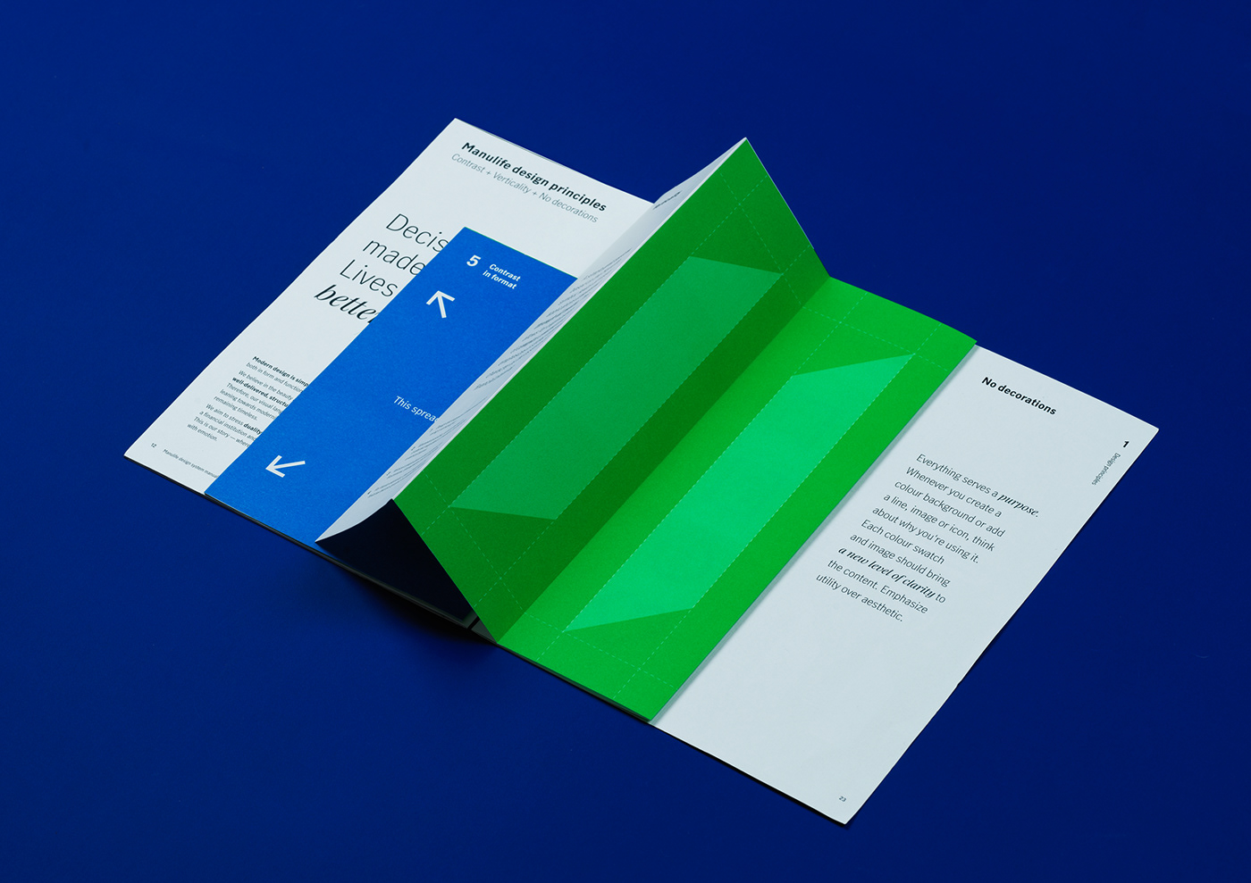
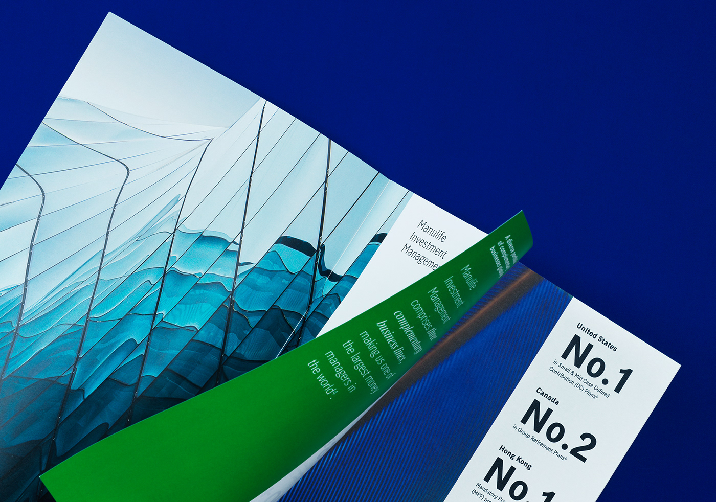
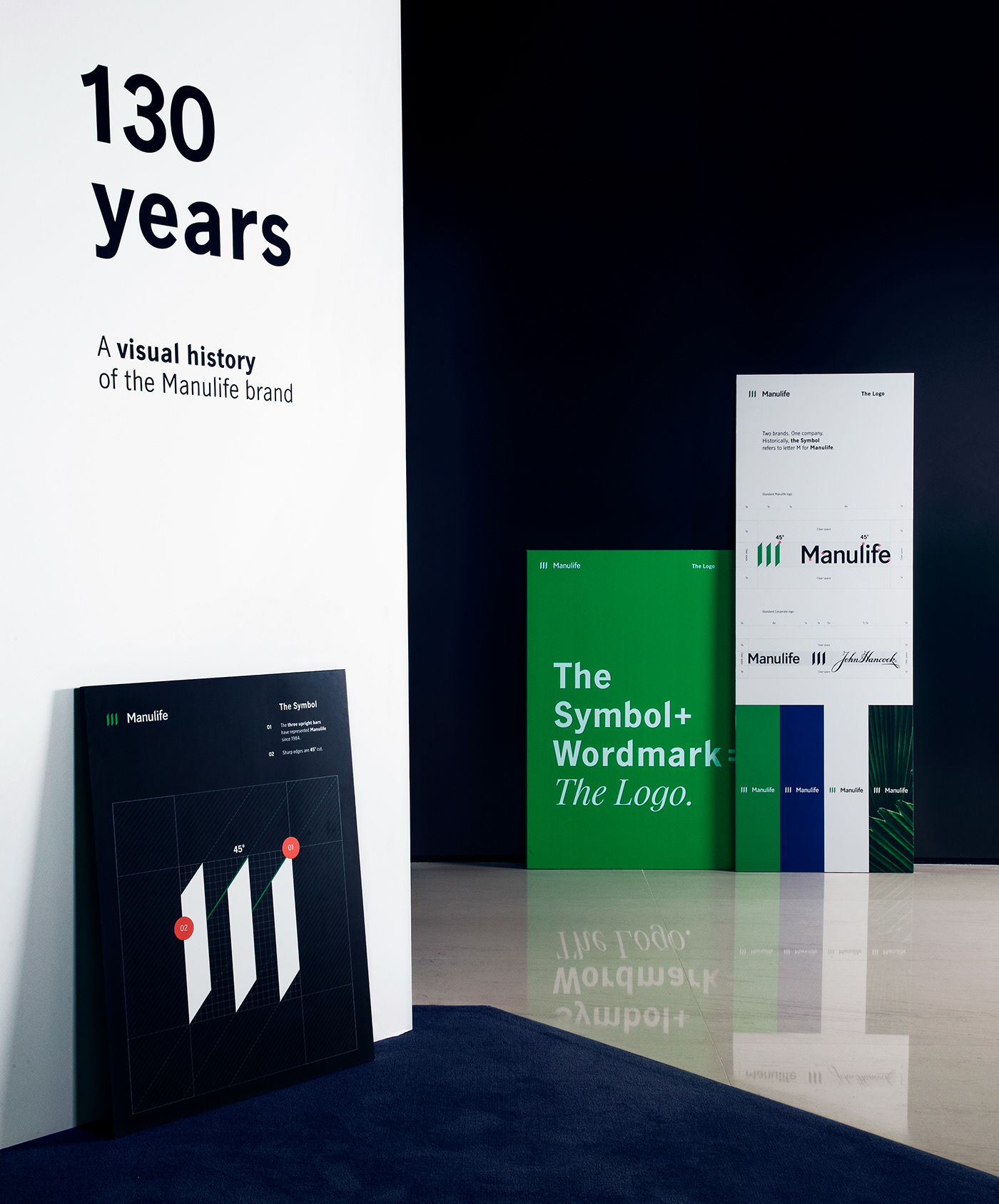
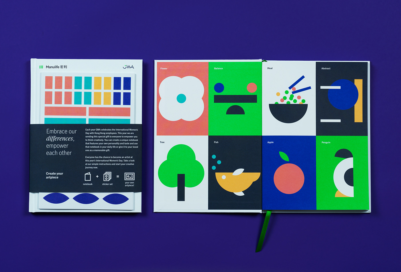
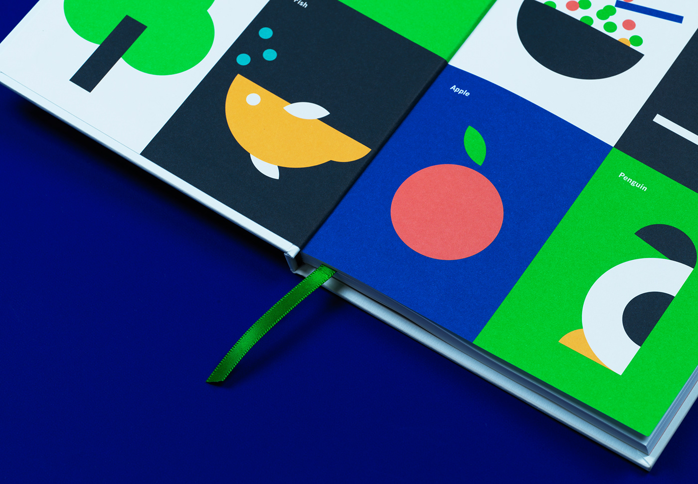
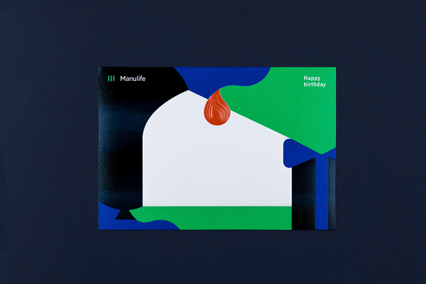
Fighting complexity
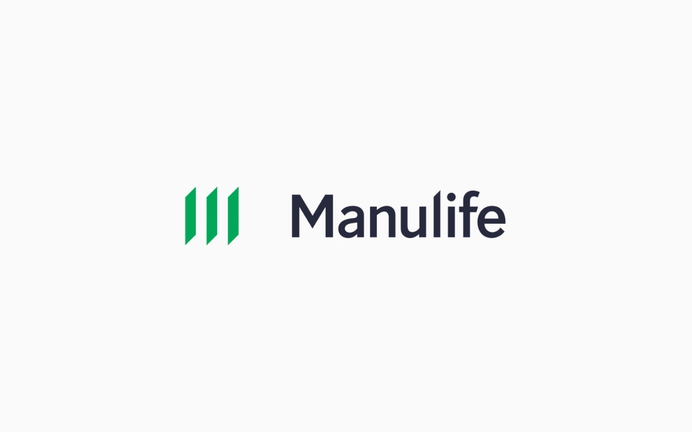
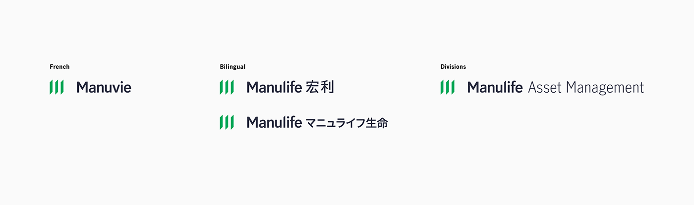
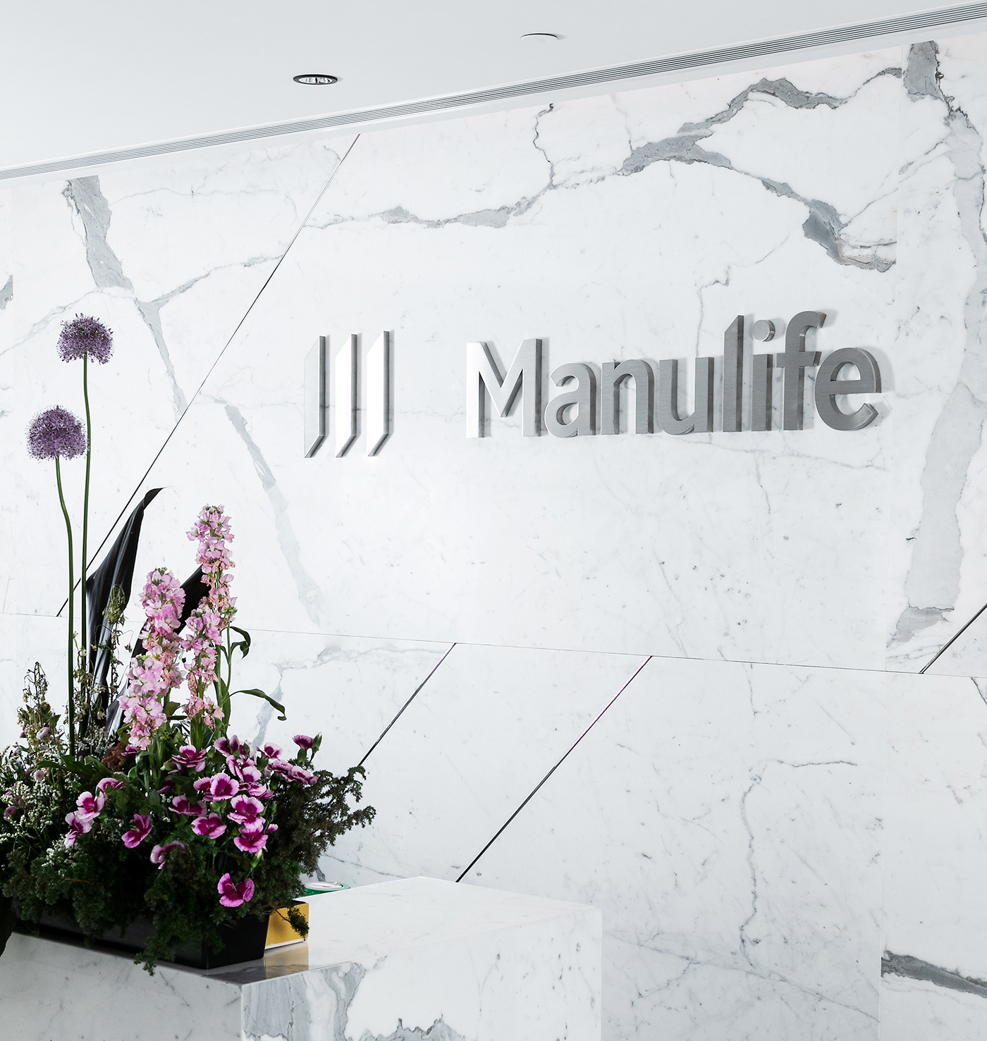
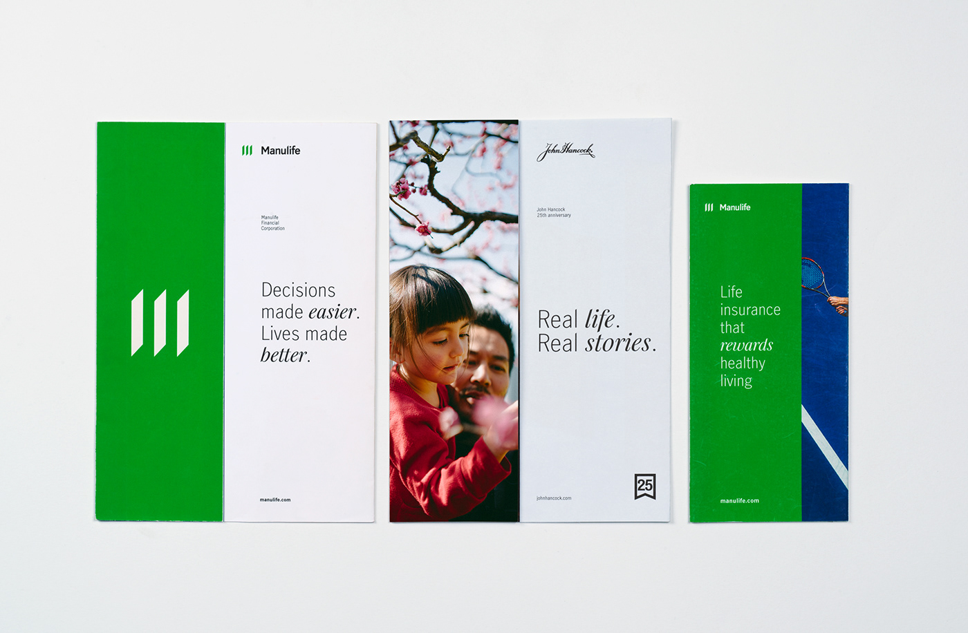
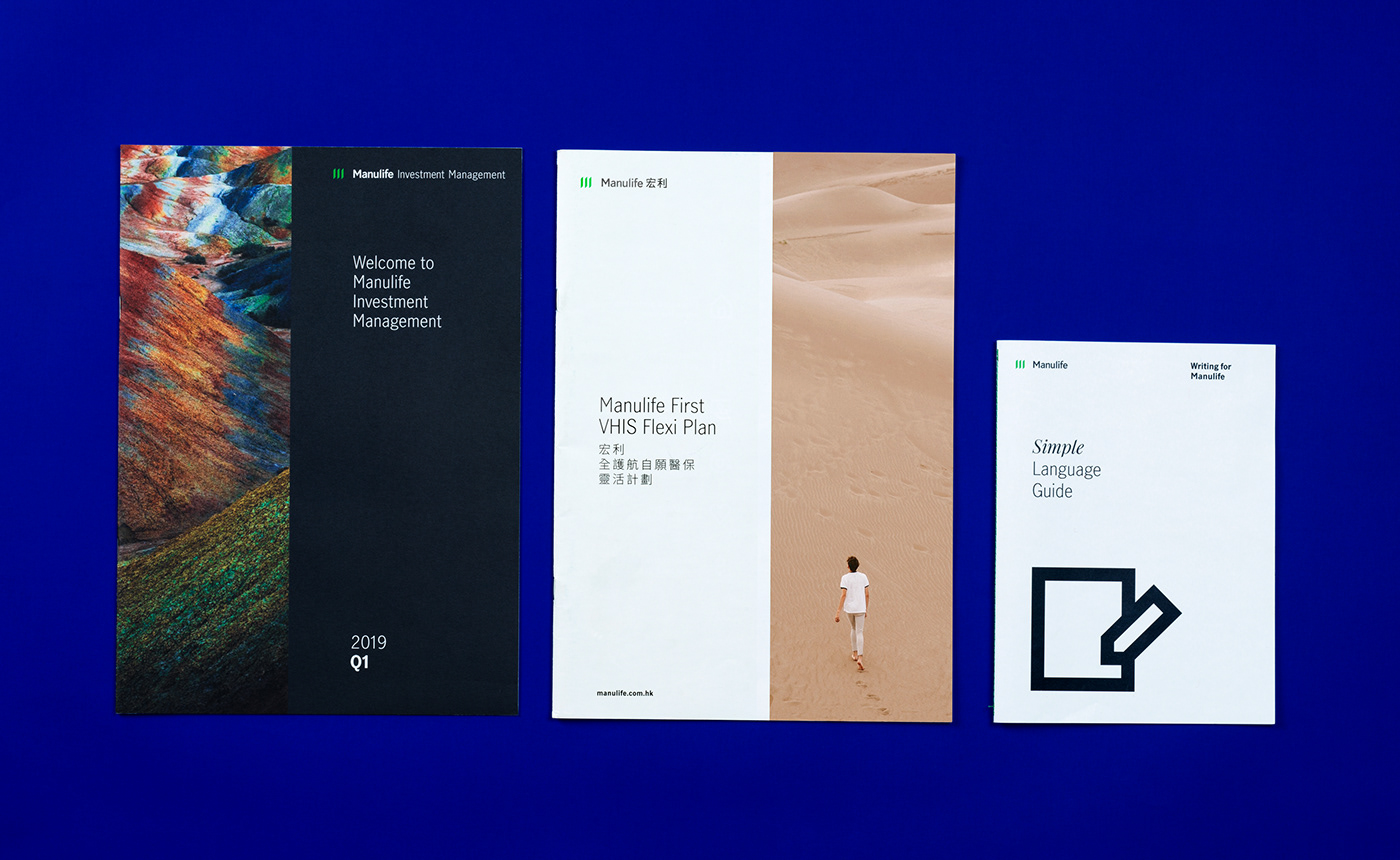
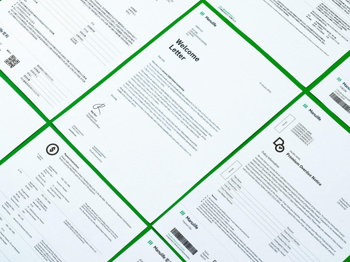
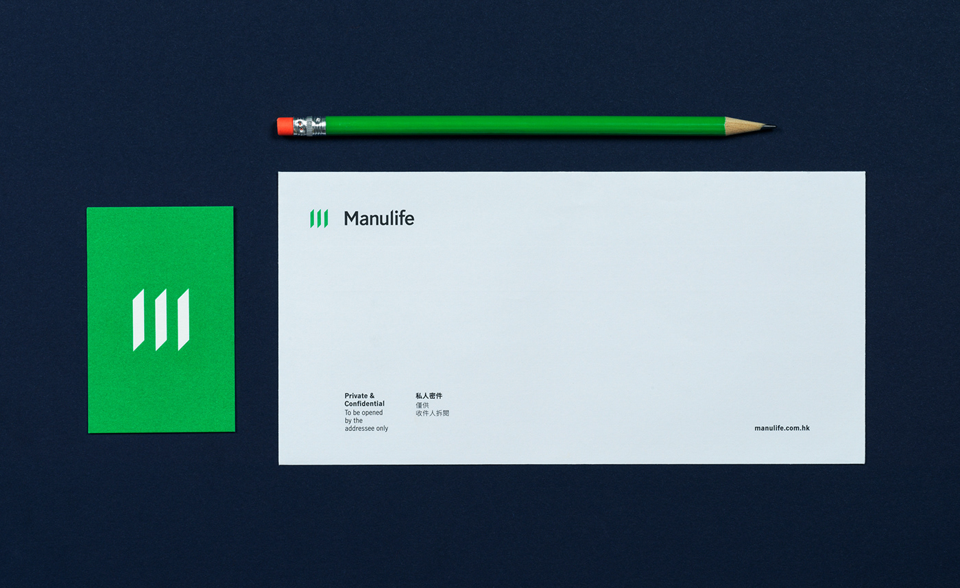
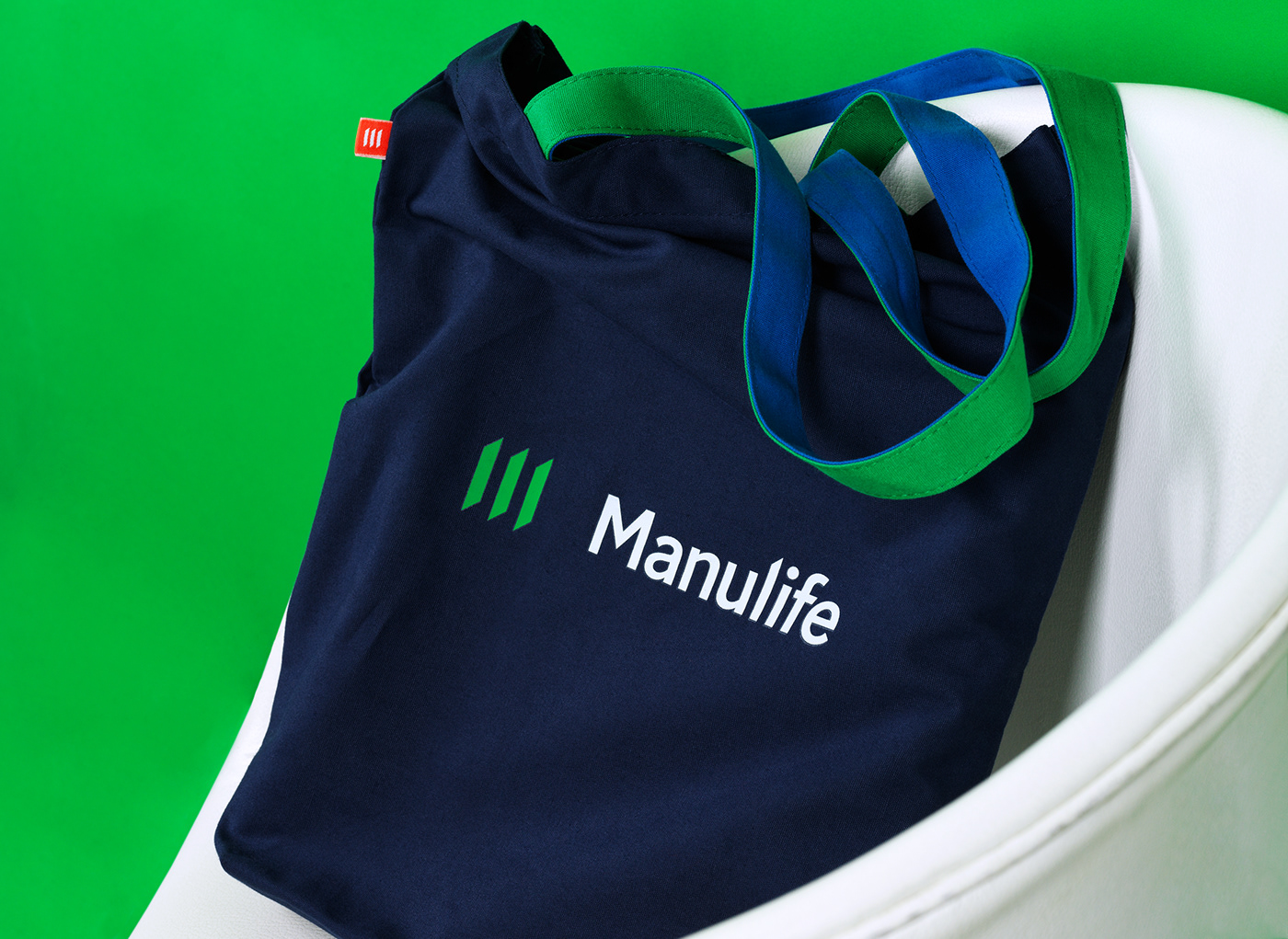
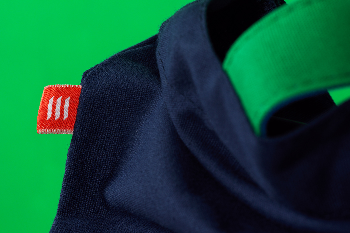
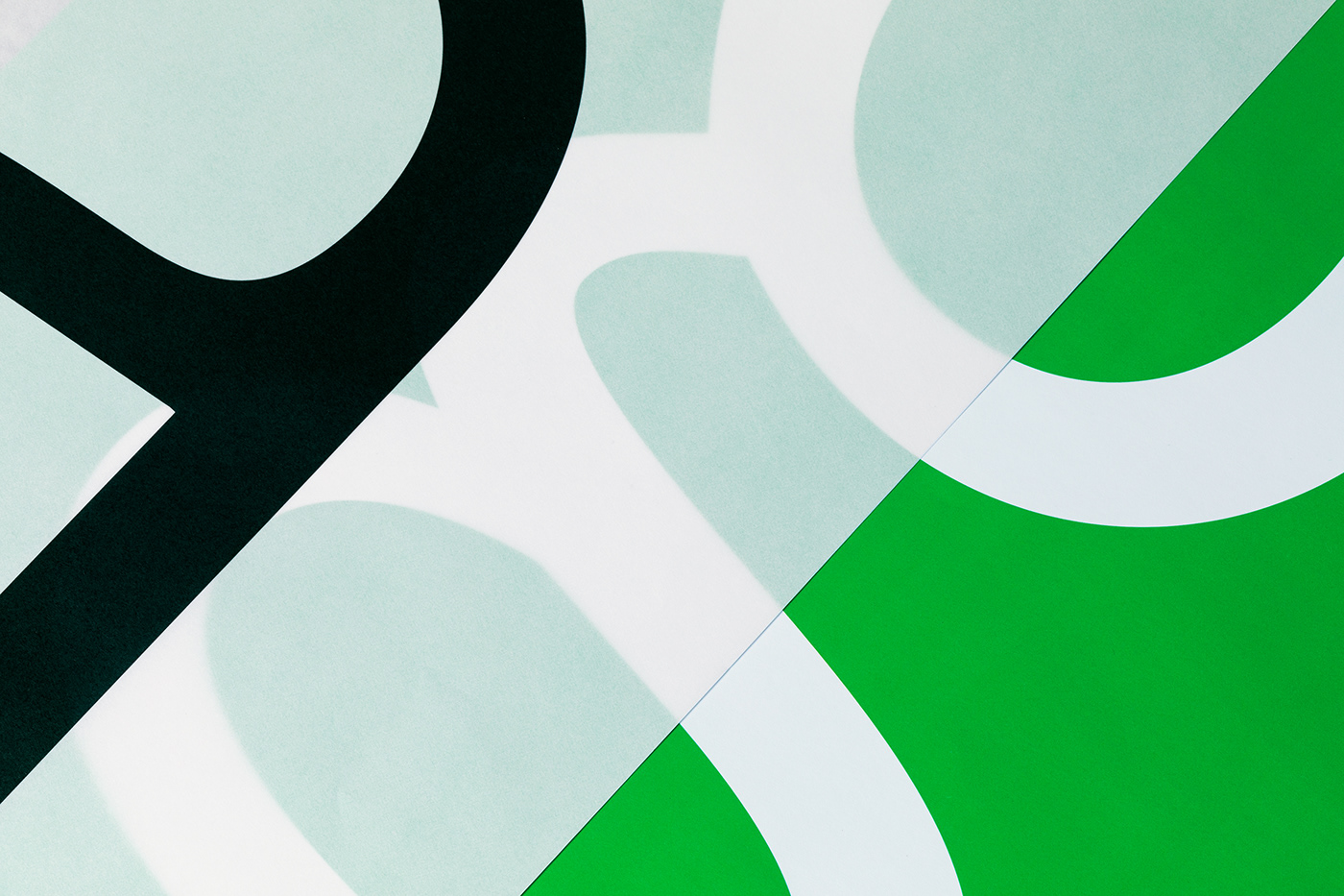
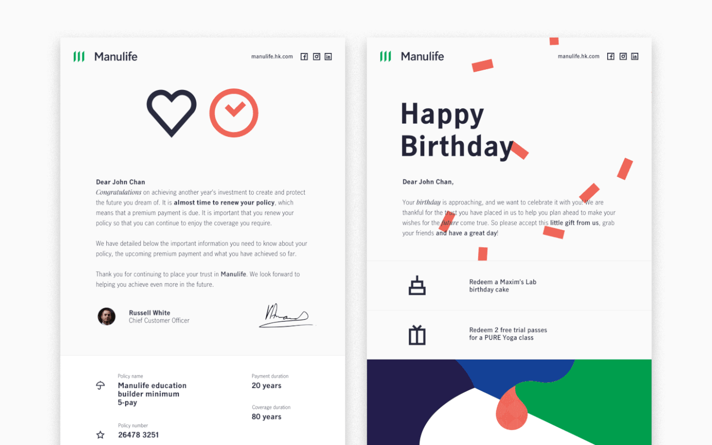
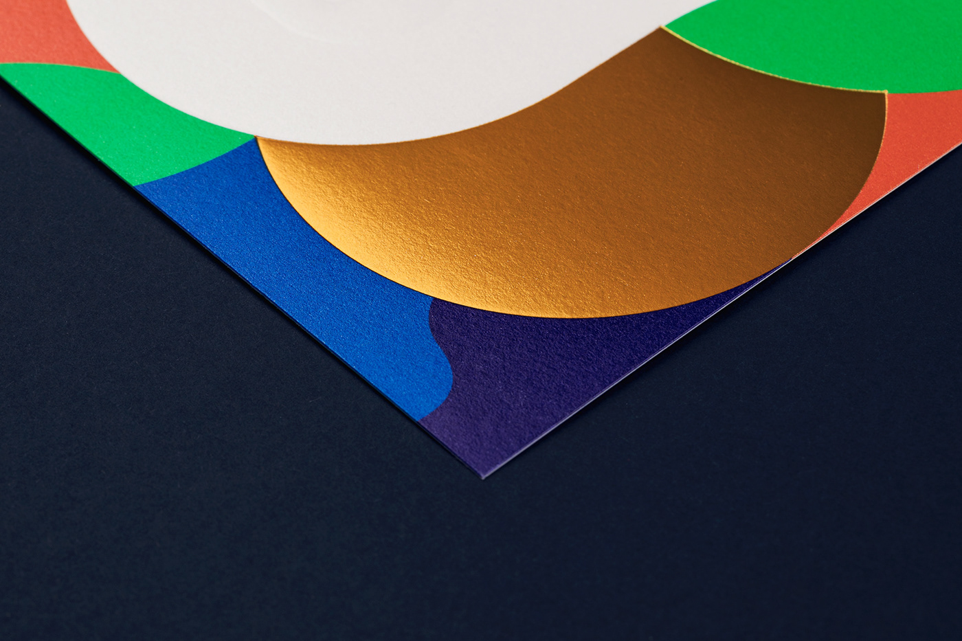
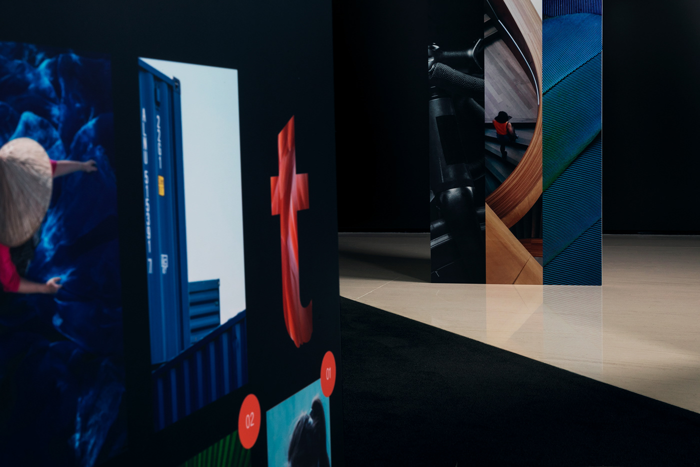
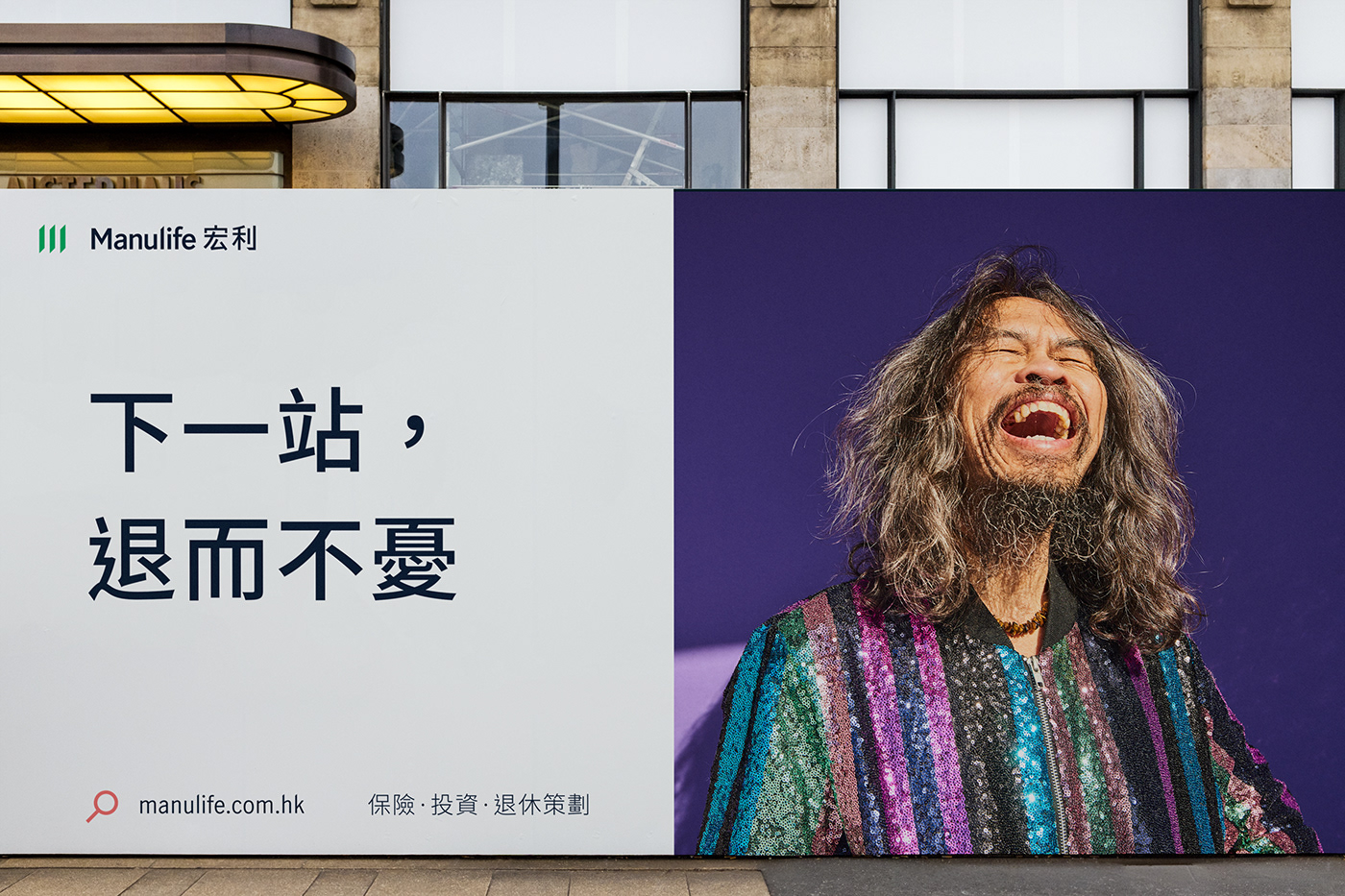
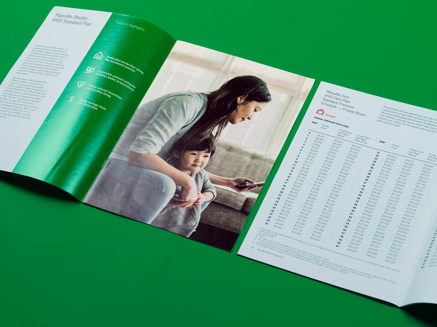
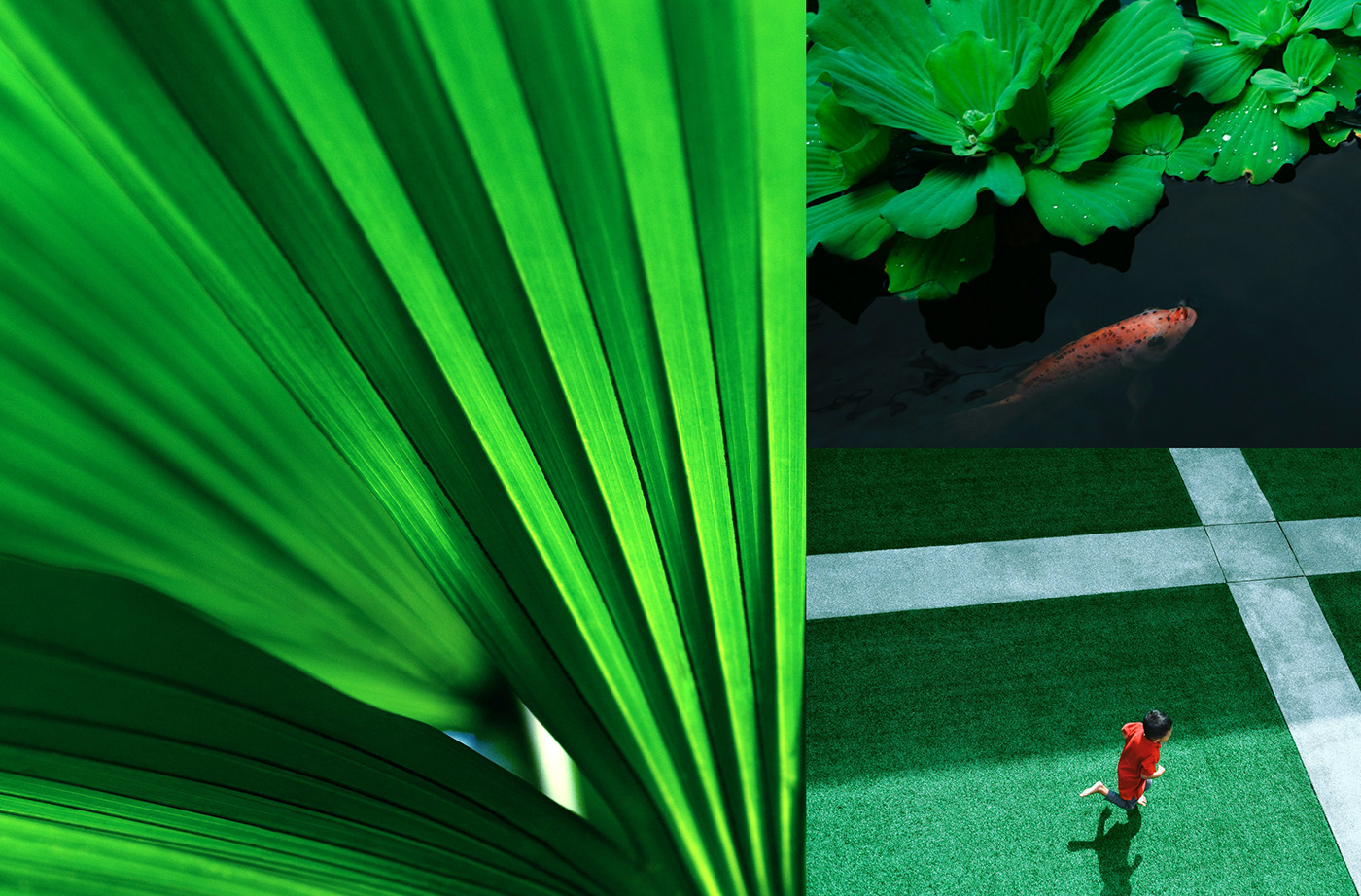
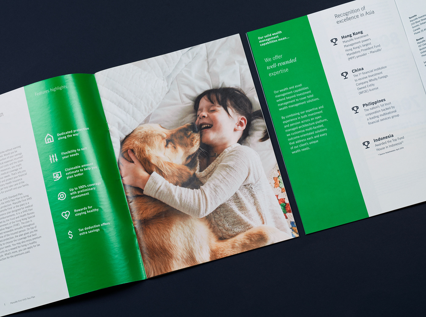
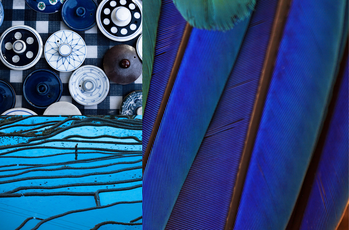
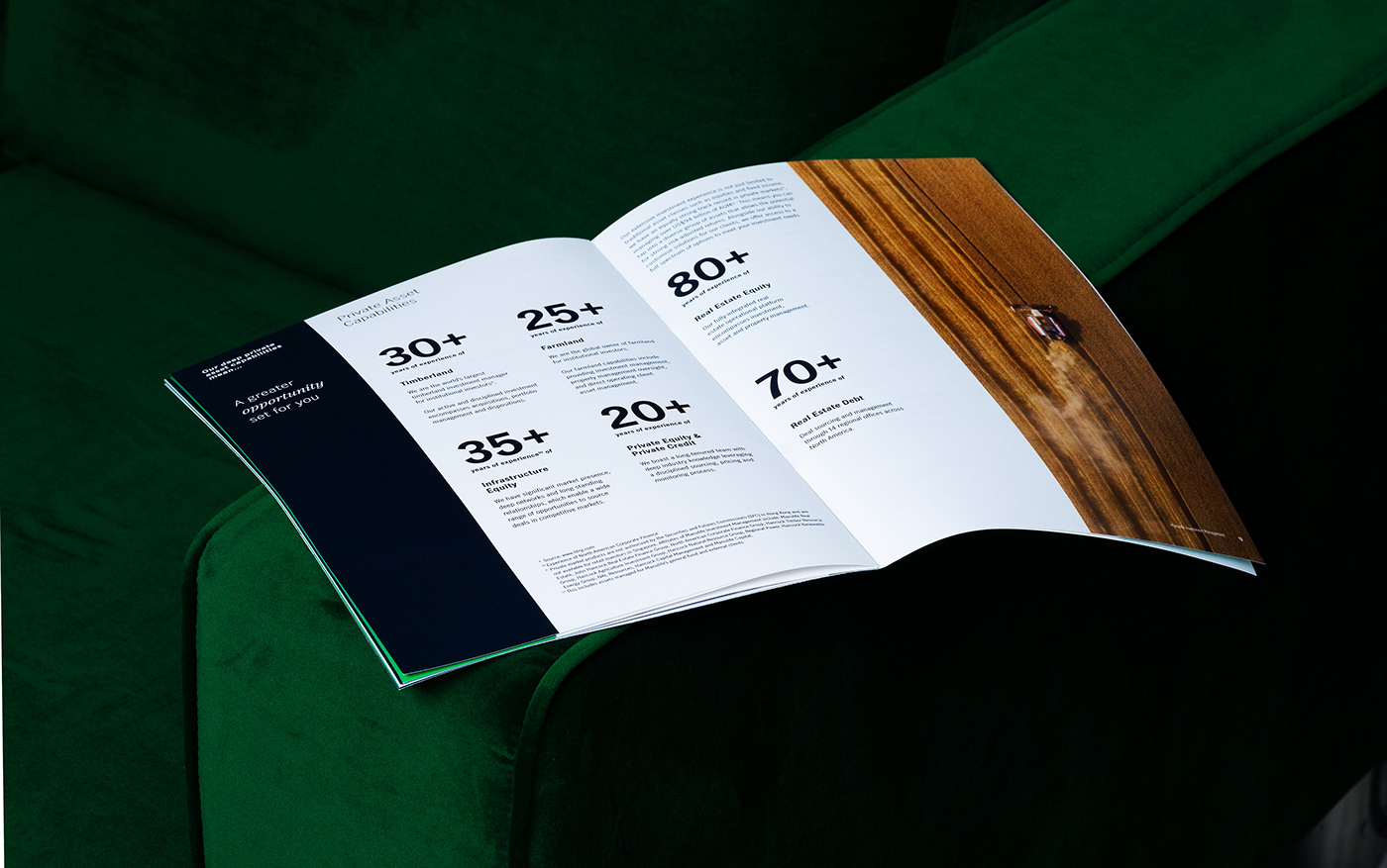
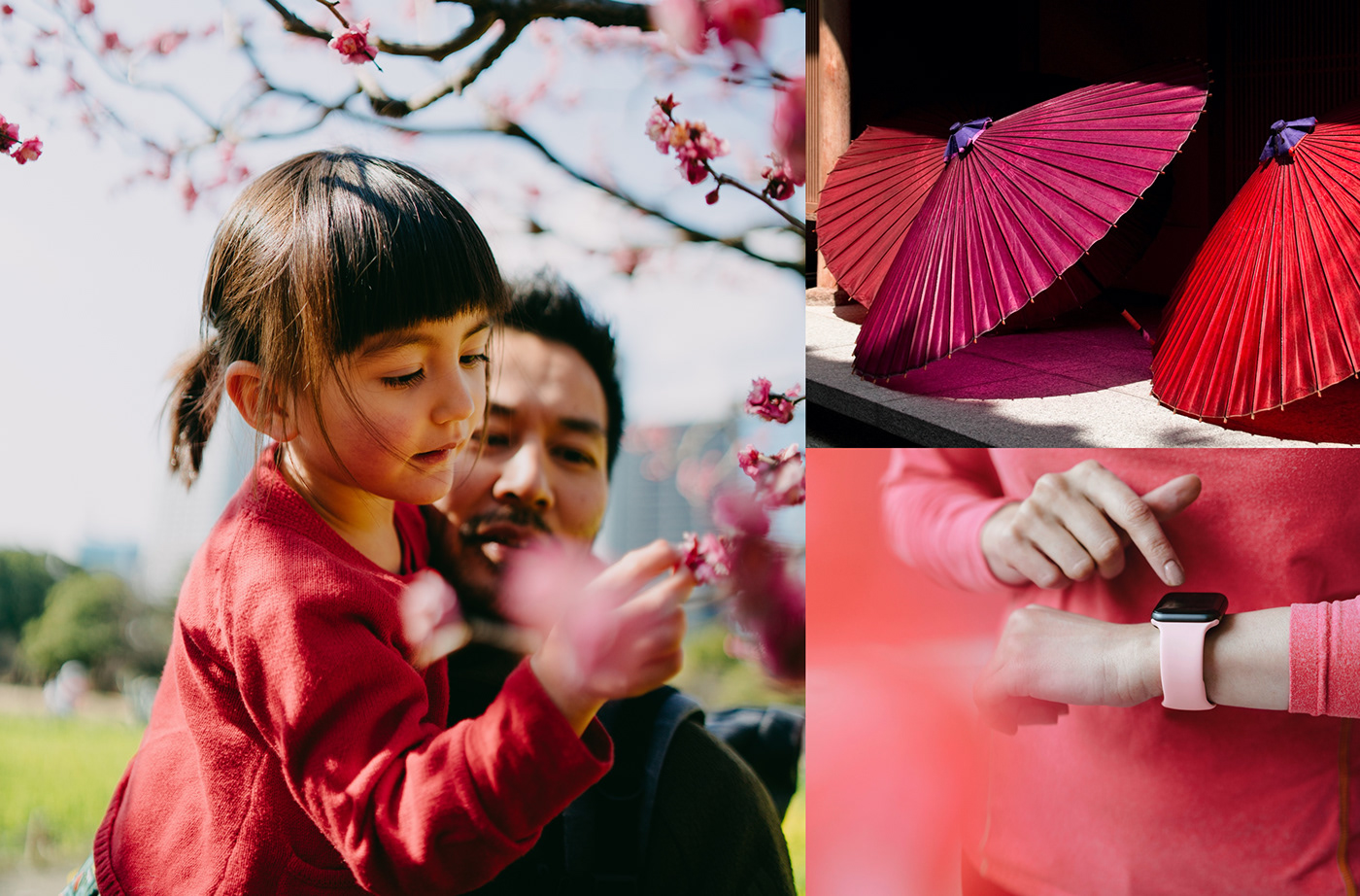
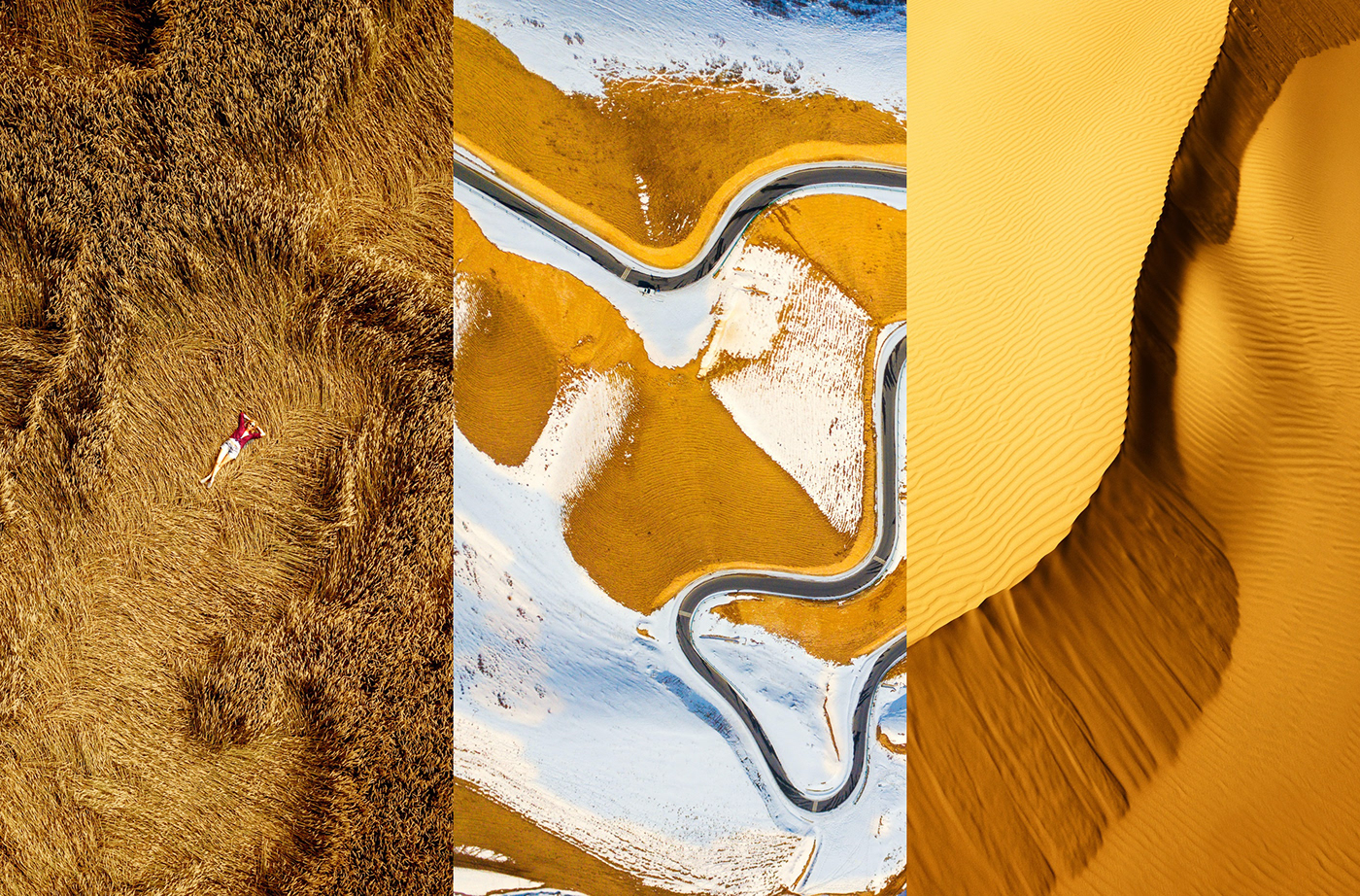
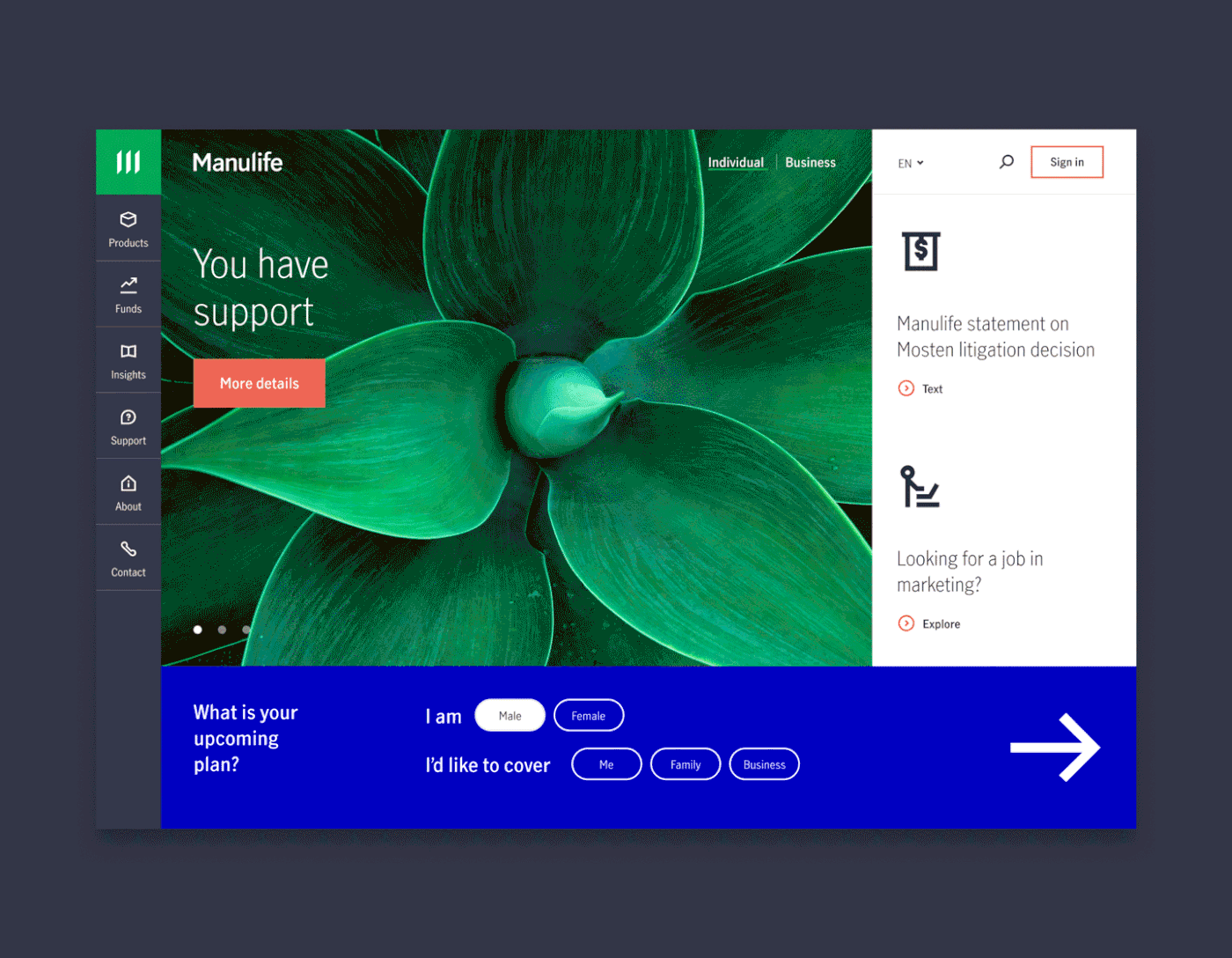
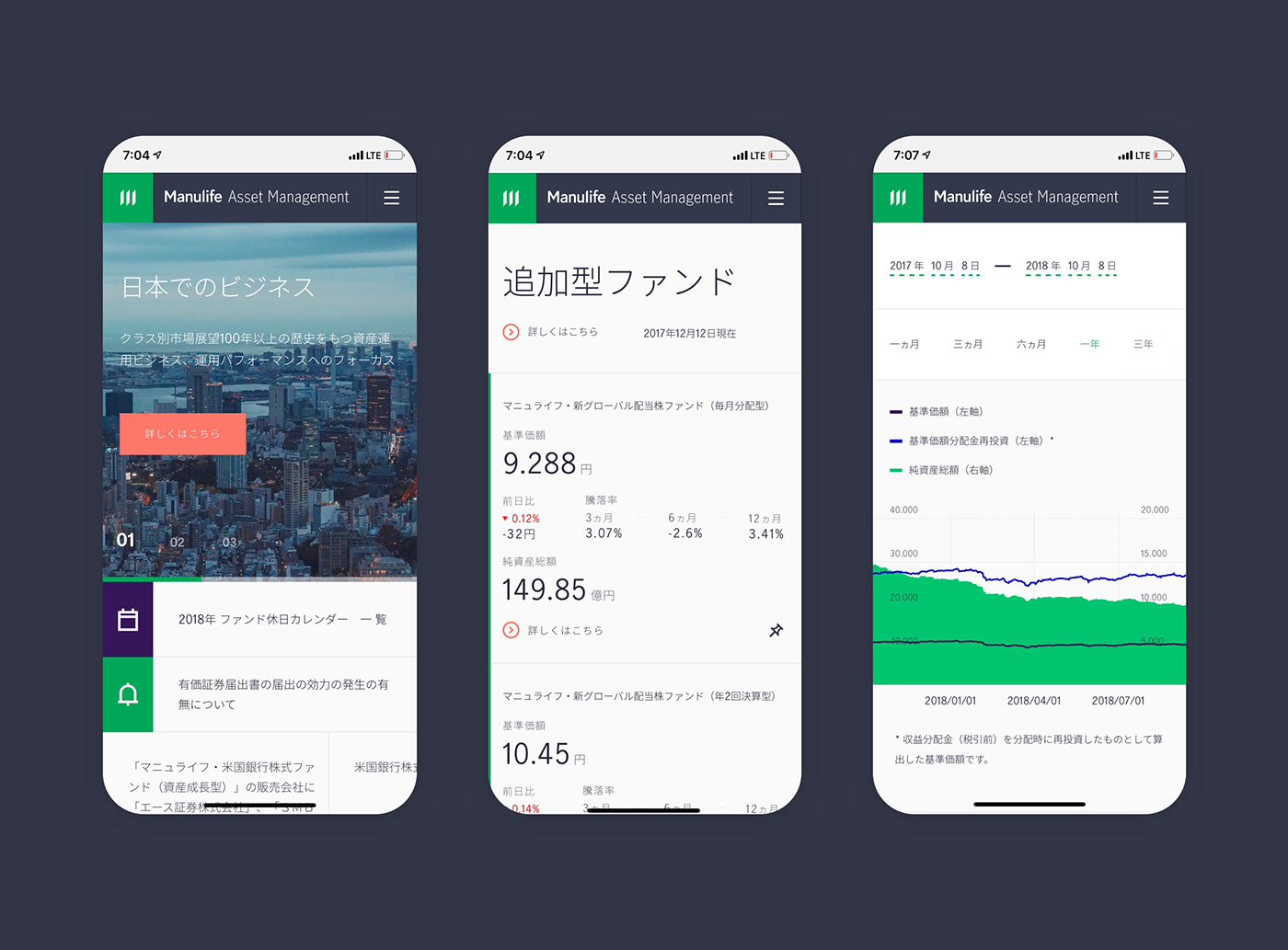
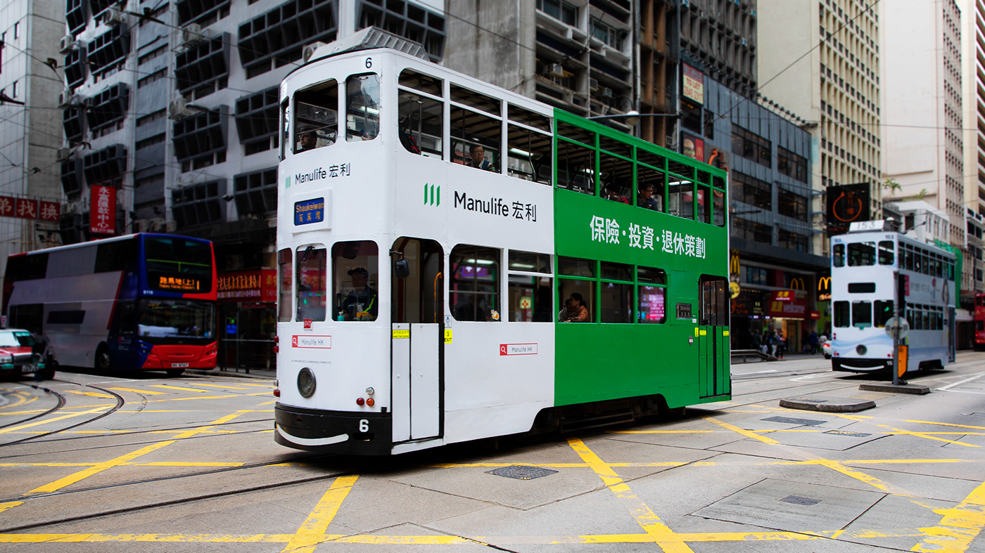
Insurance market tends to be overcomplicated. That is why the new visual identity of Manulife is a move of international company towards non-corporate look and feel with clean design that helps customers make decisions easier. The main motive of the change is duality of Manulife: a quality of being both rational and emotional, a financial institution and a well-being provider. It directs identities of multiple national divisions, sub-brands and all internal as well as external visual communications.
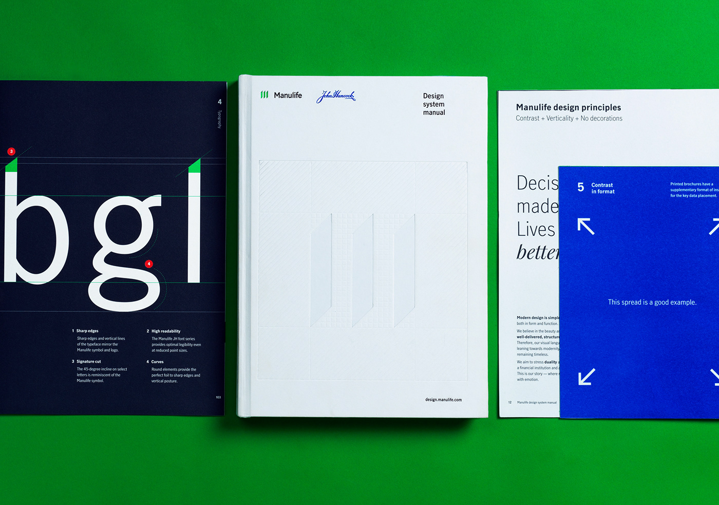
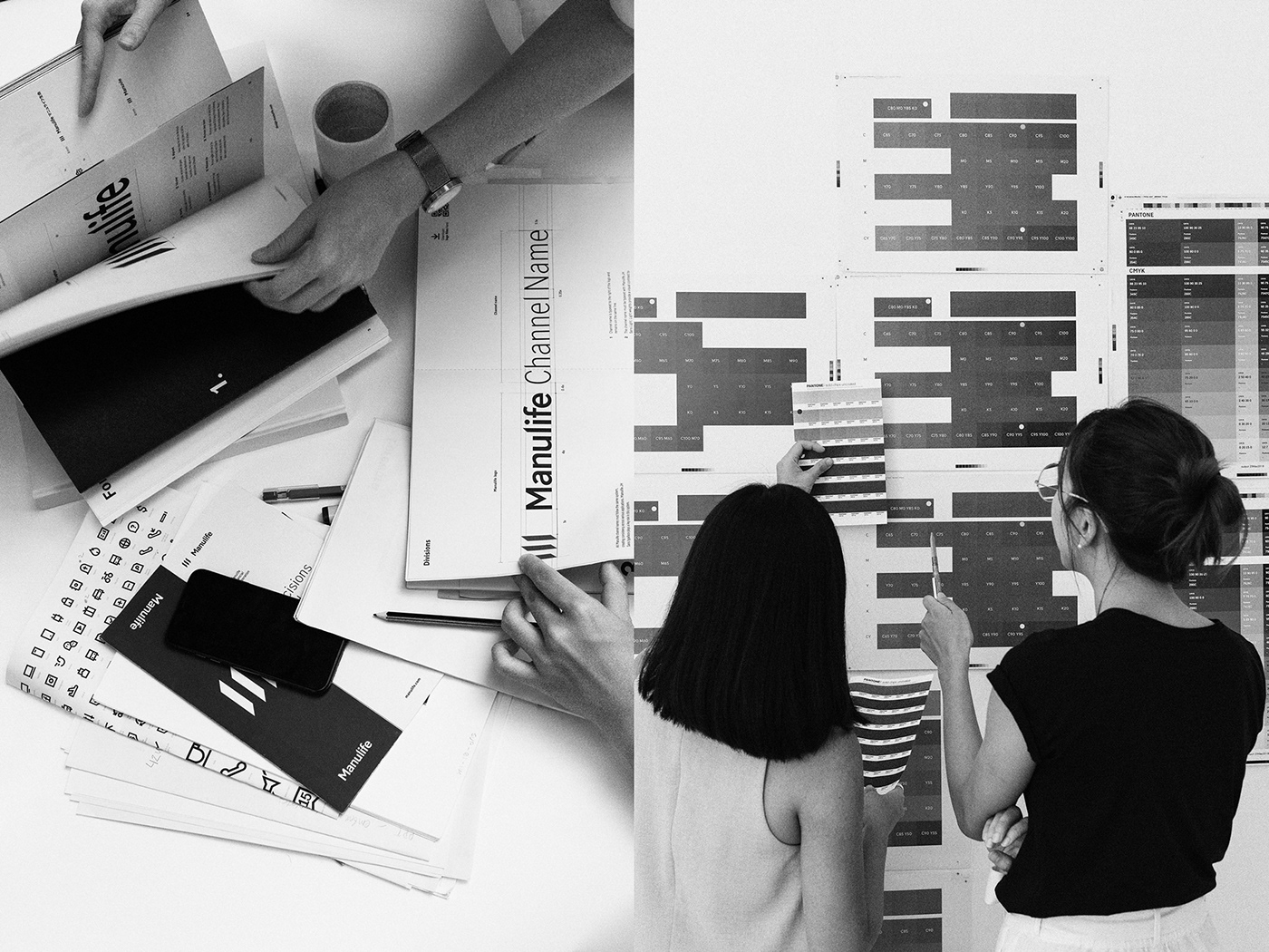
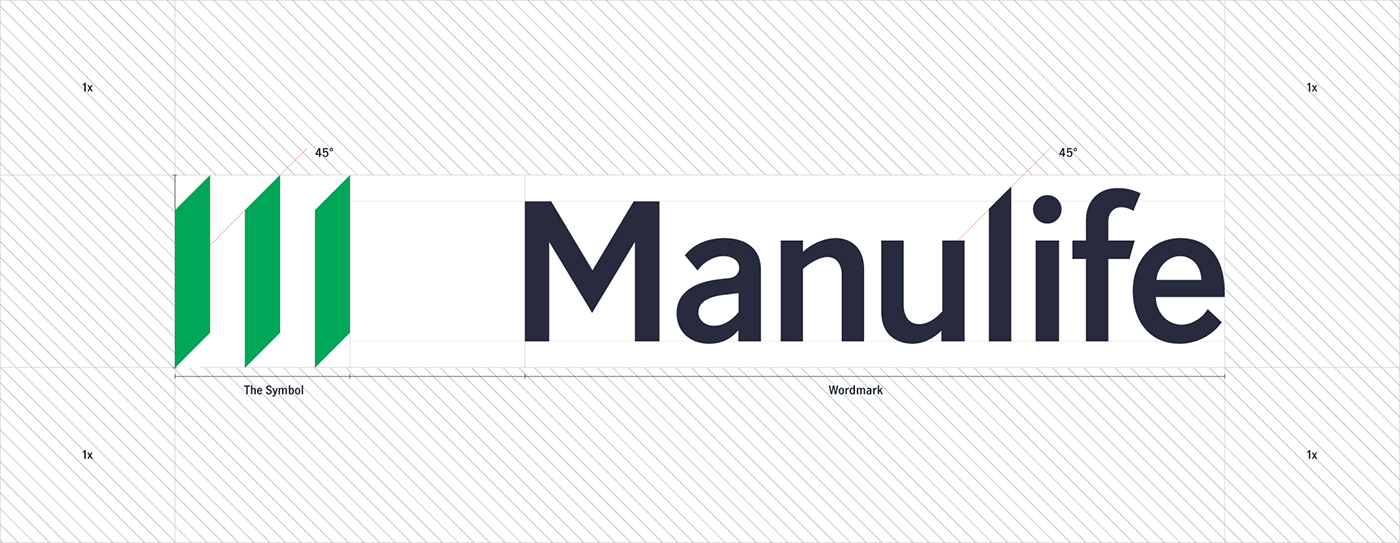
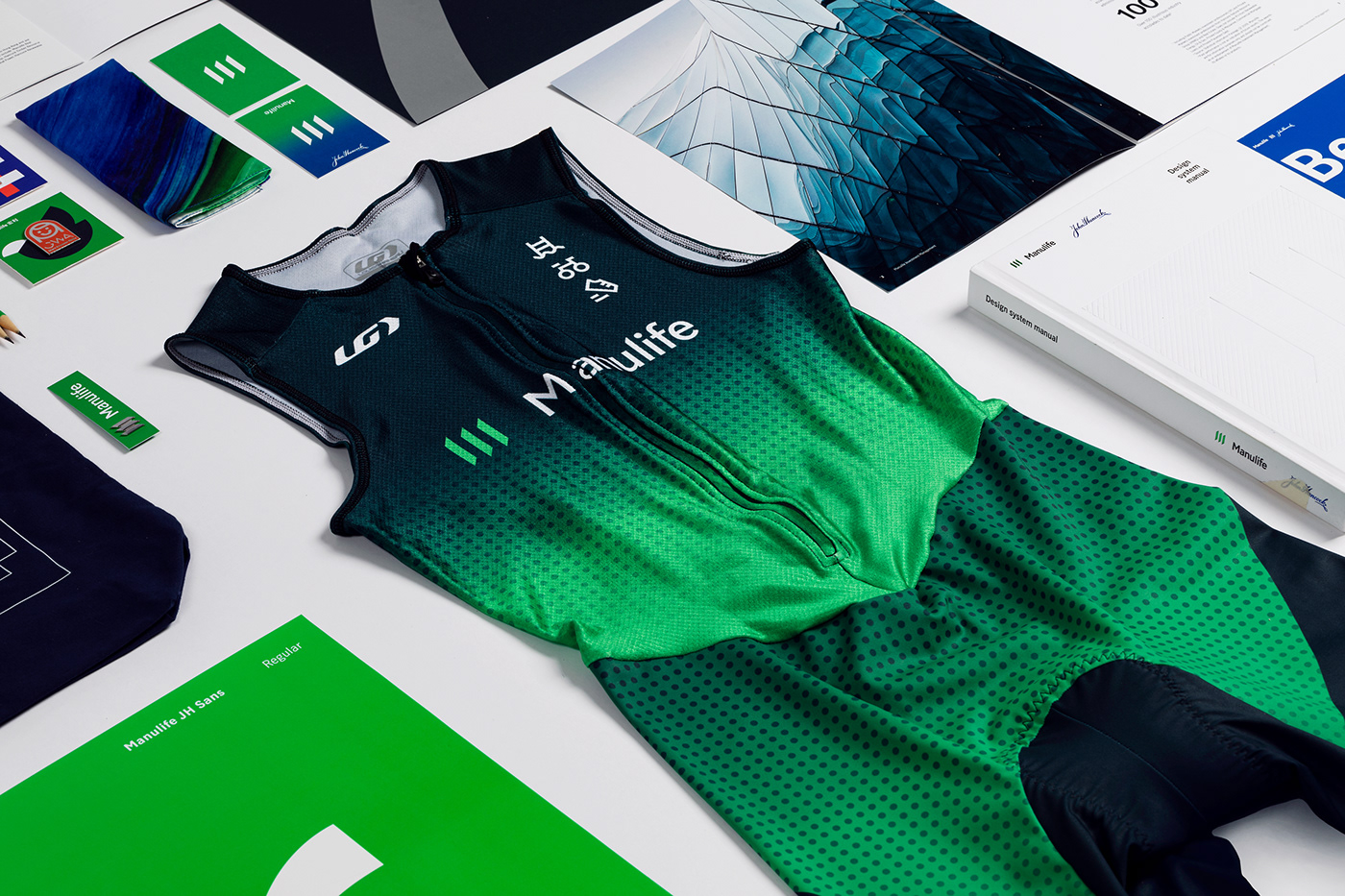
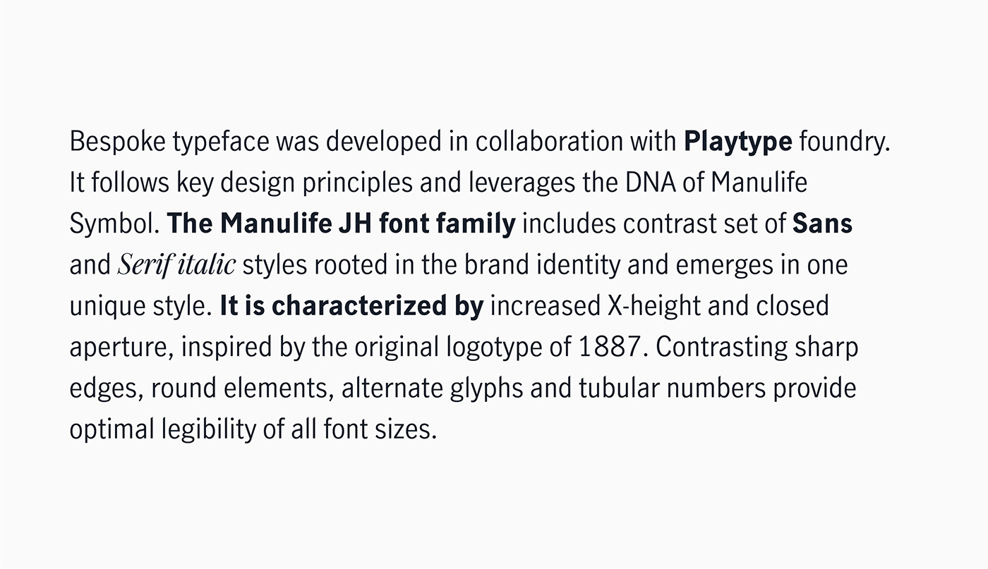
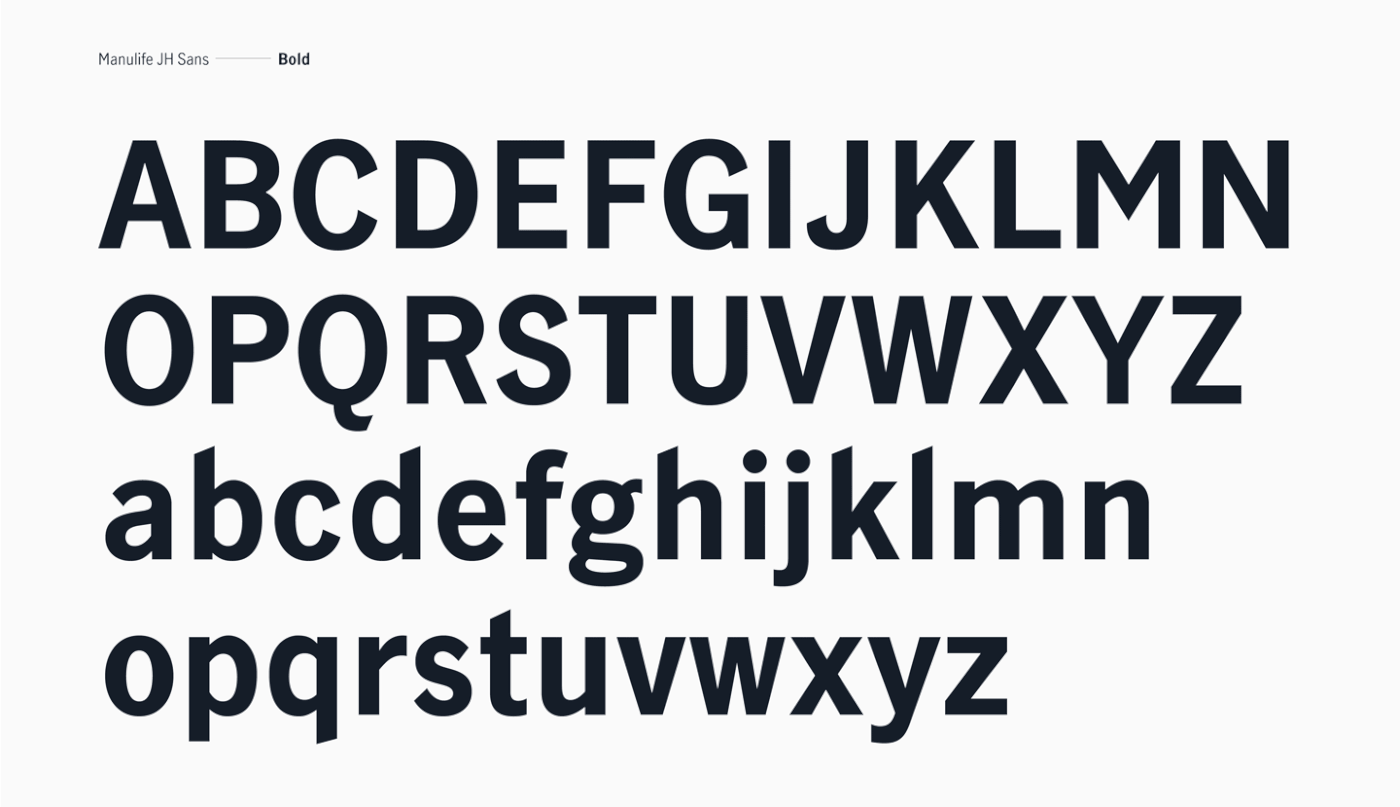
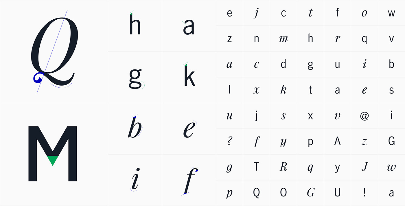
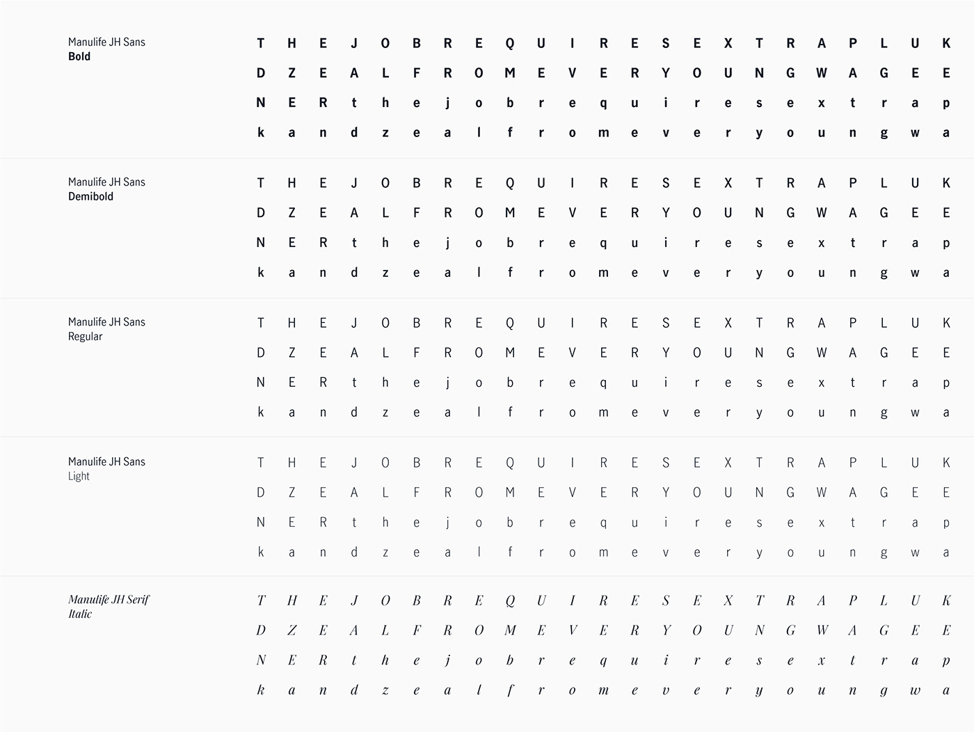
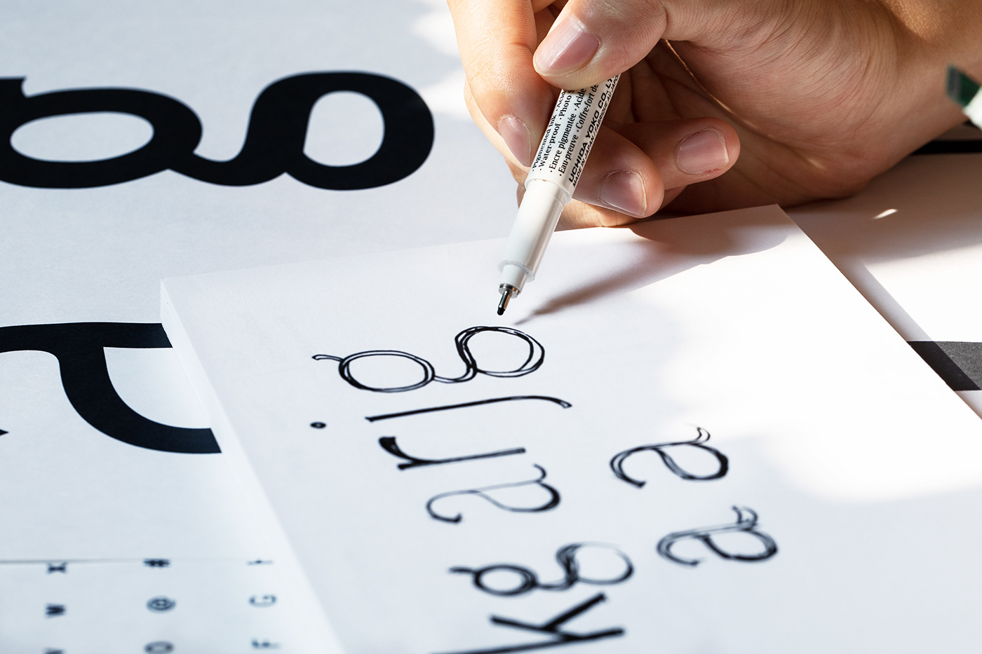
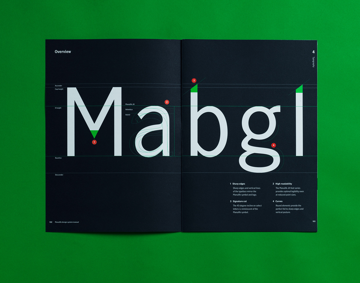
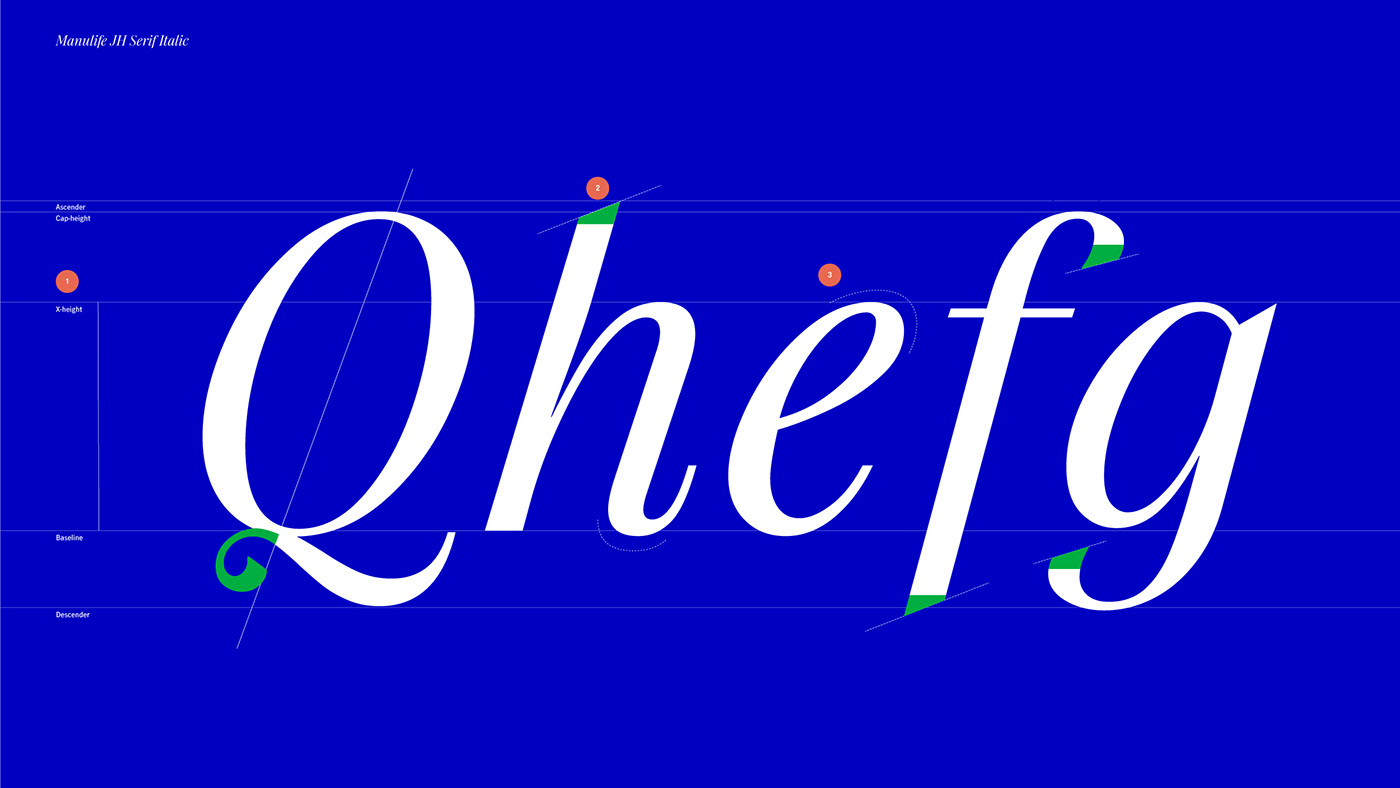
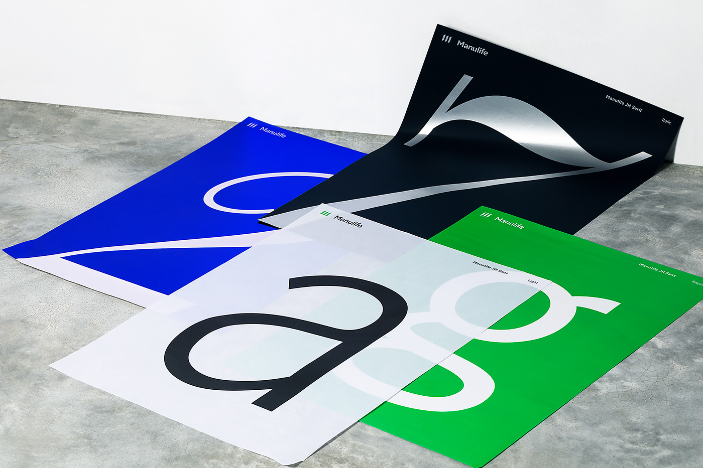
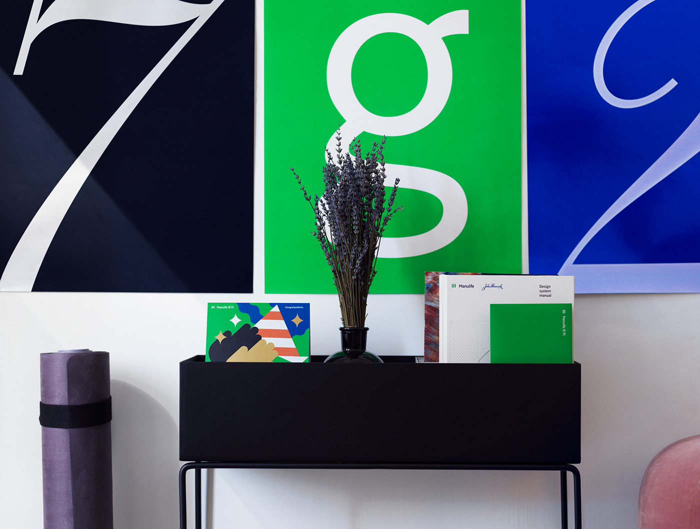
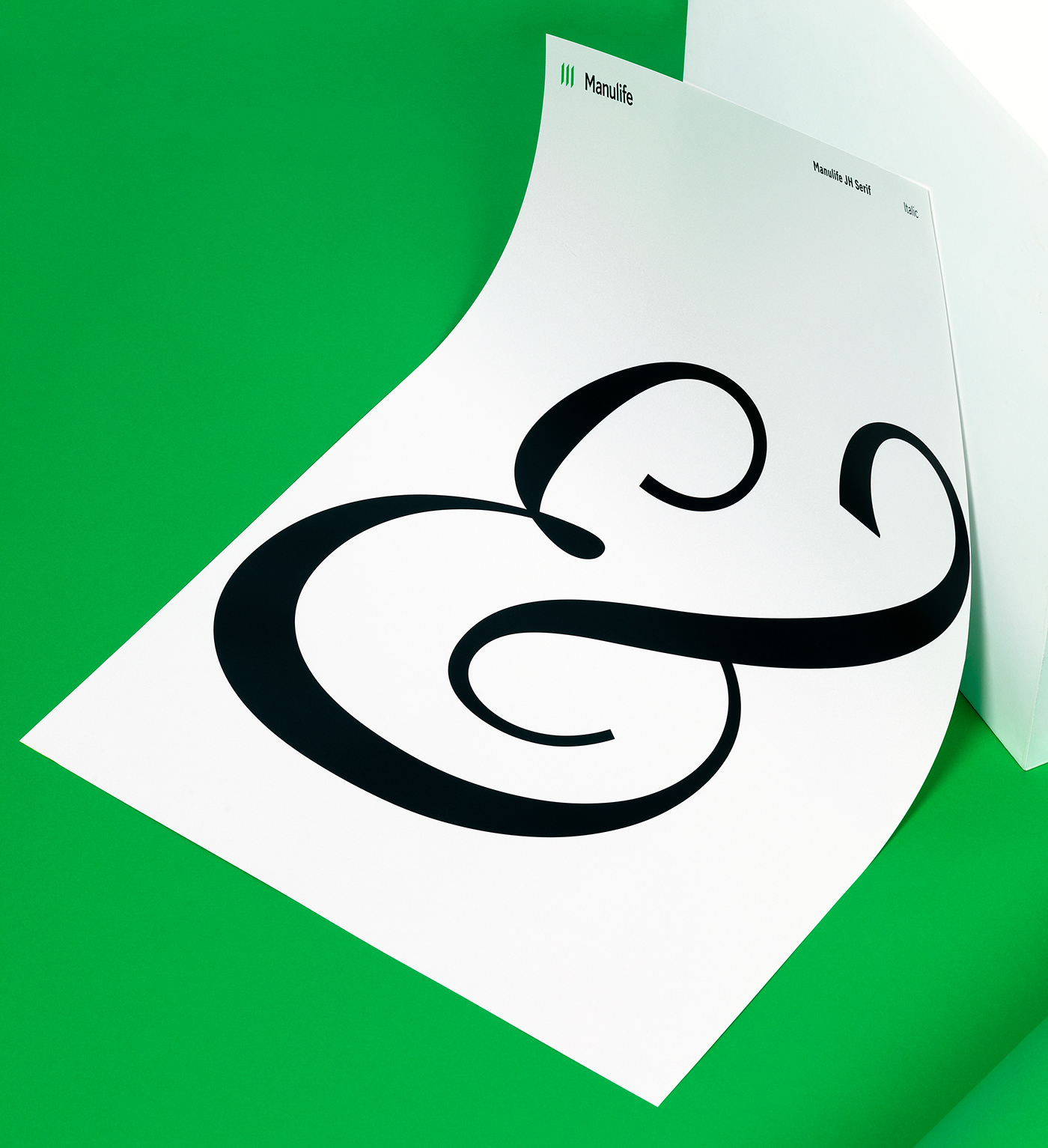
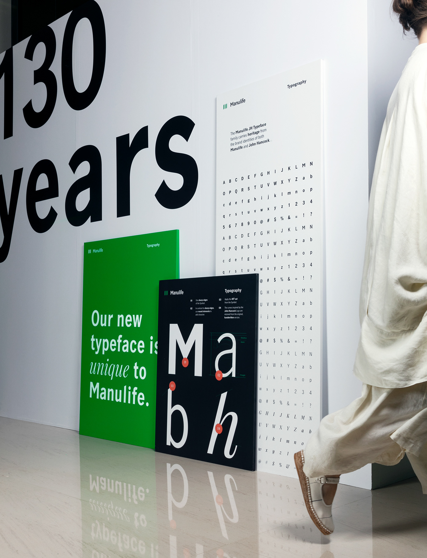
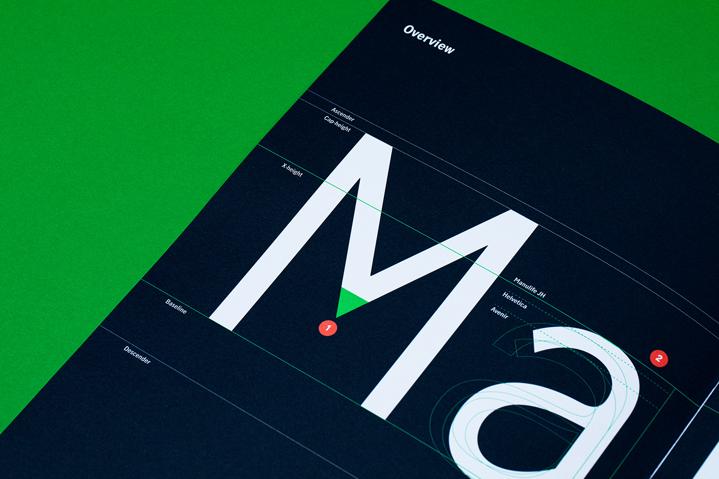
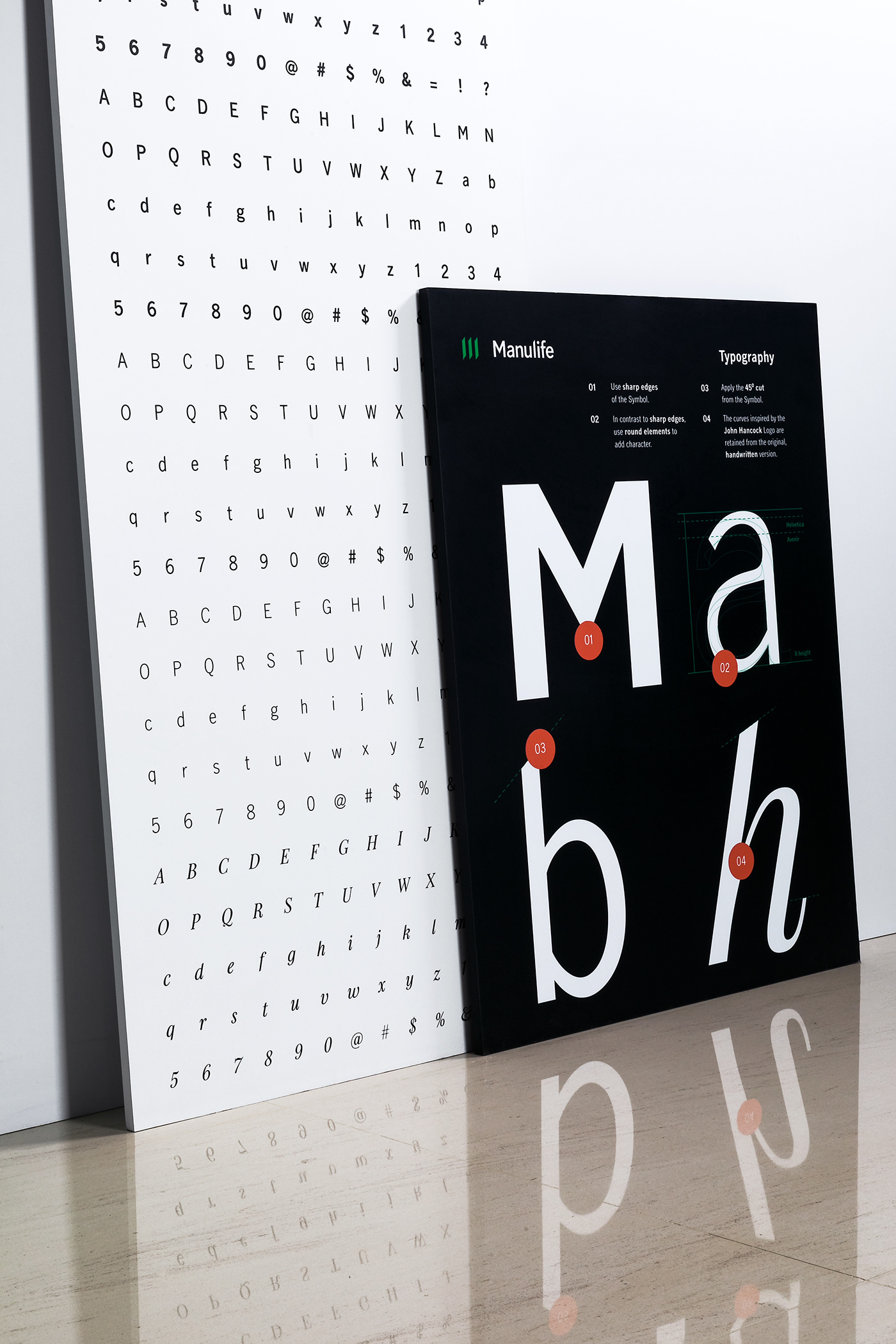
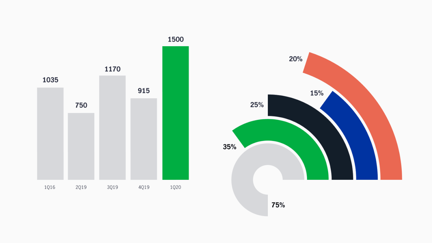
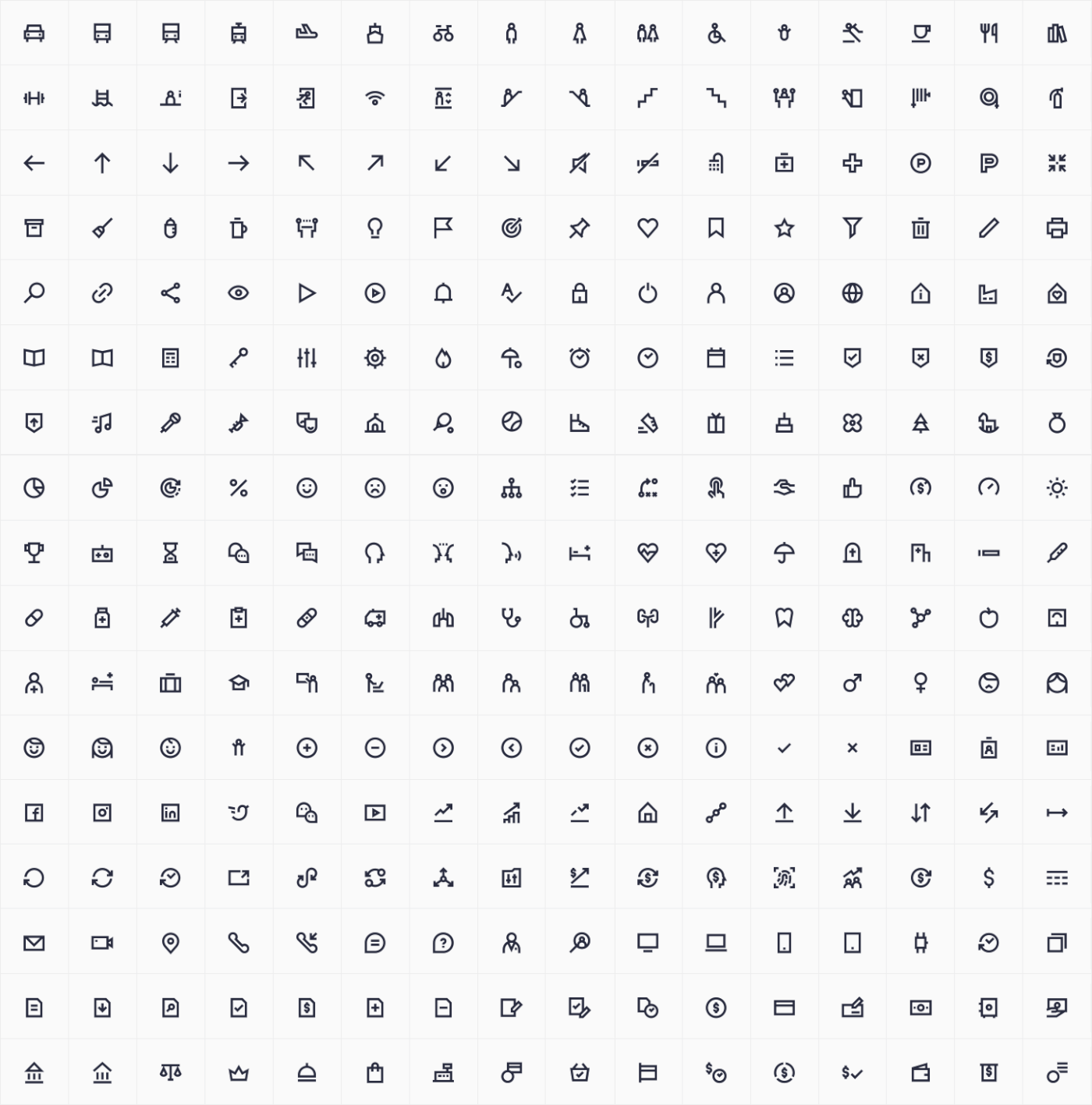
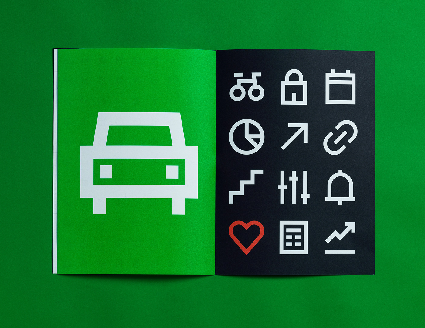
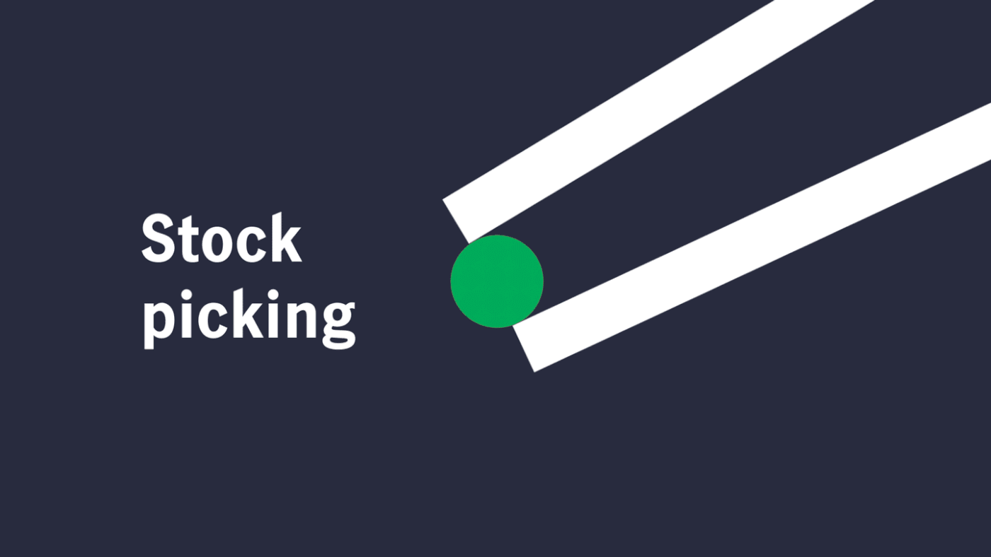
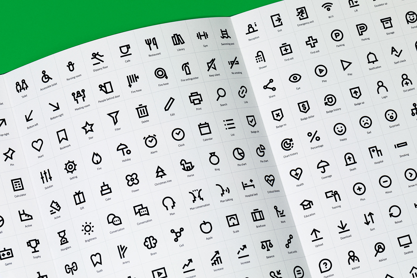
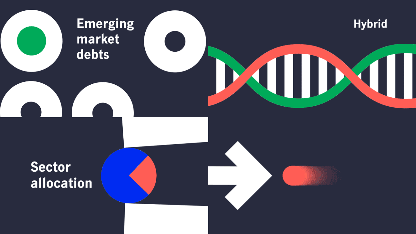
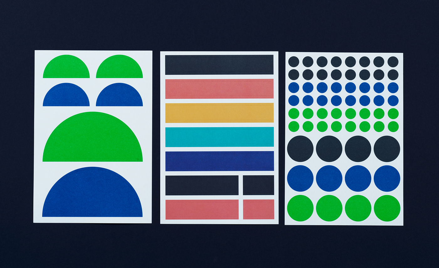
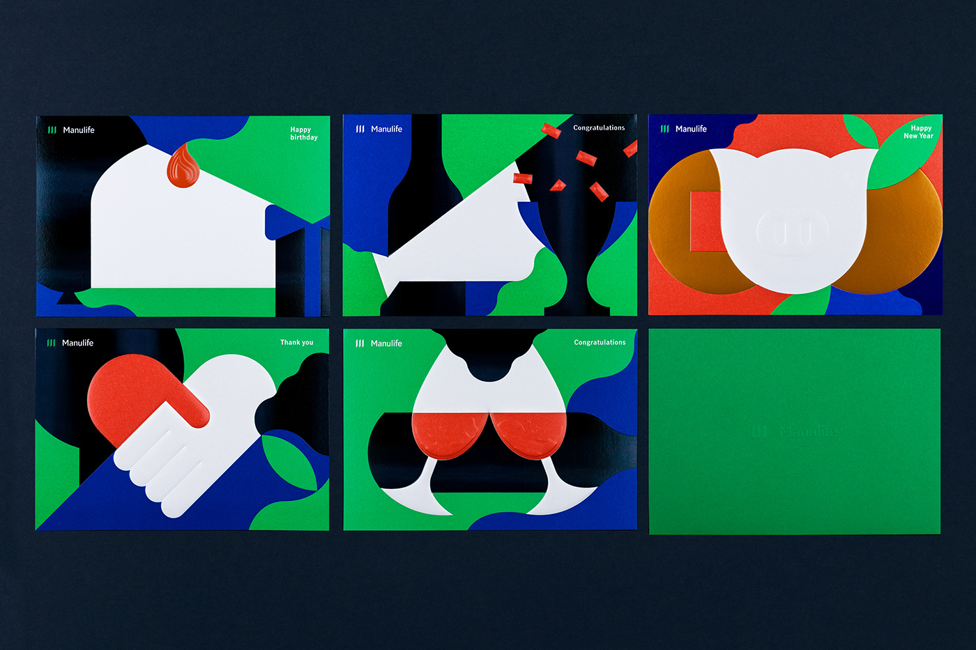
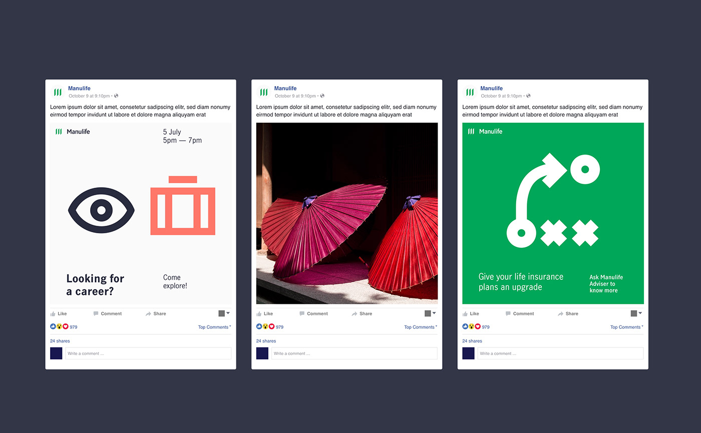
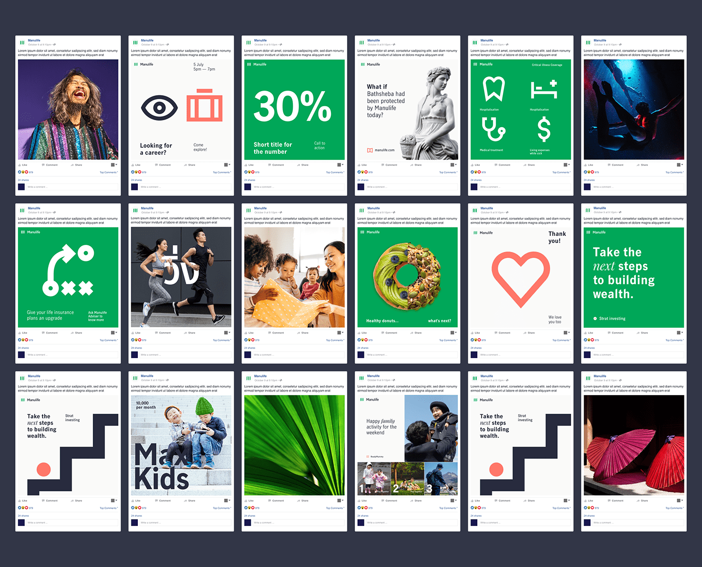
We have worked closely with Manulife global and regional teams across markets for two years: from design principles to logotype and grid system, colour swatches, hundreds of icons and illustrations. And finally, to a bespoke typeface, created in collaboration with Playtype foundry.
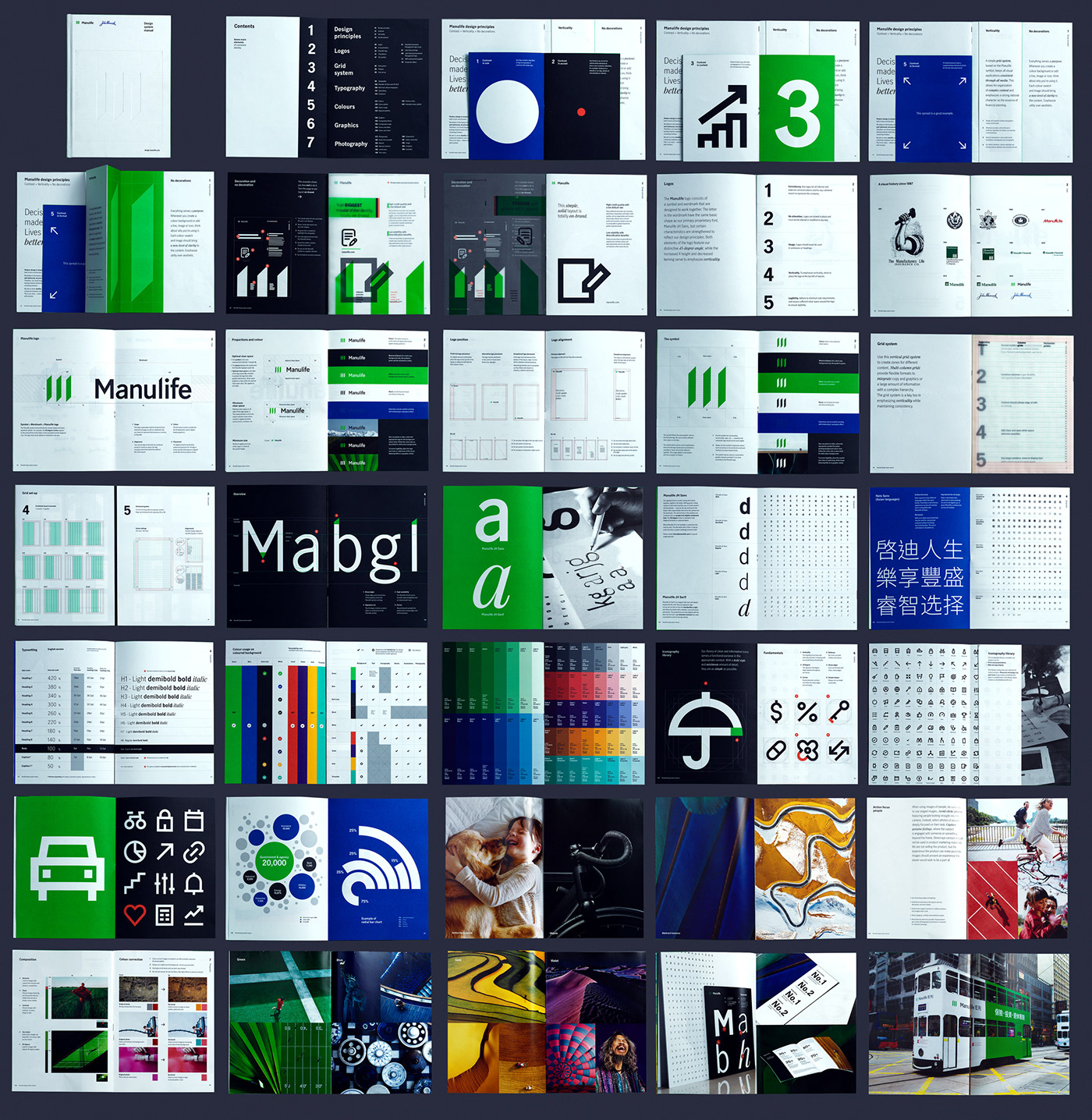
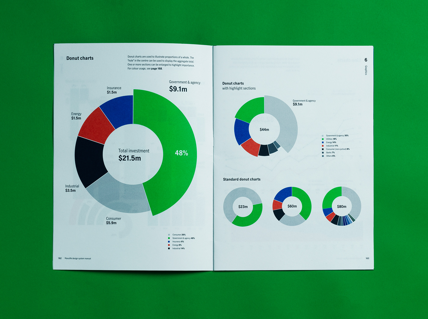
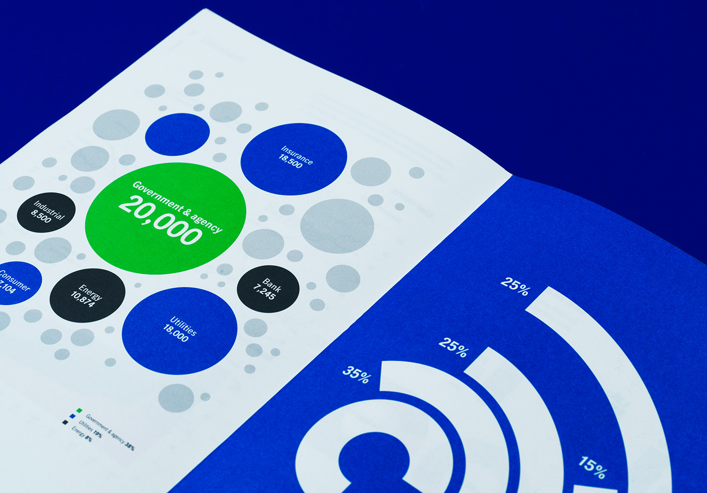
It is all amplified with comprehensive design manual that aims to not just set the brand standard but also to educate the best design practice.
2018-2019


.Oddity Studio
2018 — 2020
Core team
Creative Director: Alice Mourou
Art Directors: Gus Cheung, Rosalie Chan, Nikita Shchukin
Designers: John Yu, Alan Wa Lun, DinYam
Account director: Kirill Runkov
Photography: Nikita Shchukin, Alice Mourou
If you want to post about the project, please let us know at hello@odditystudio.com


