

THE PROJECT
Last summer, I was asked to create a short Explainer Video for E-Butler,
an all-in-one app that allows users to book service providers in no time.
Below is a look into the process of putting together this colorful project.
Enjoy!

FINAL EXPLAINER VIDEOS
We ended up making two video ads; the full 50 second video,
as well as a super short 15 second version based on the first.
SHORT VERSION
Client: E-Butler
STB, Illustration, Animation: Dinos&Teacups
STB, Illustration, Animation: Dinos&Teacups

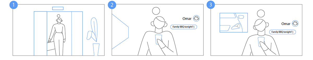
STORYBOARD
50 seconds is quite tight, and with so much information to pack in there,
puzzling a script and storyboard together was definitely a fun challenge.


ILLUSTRATION
-
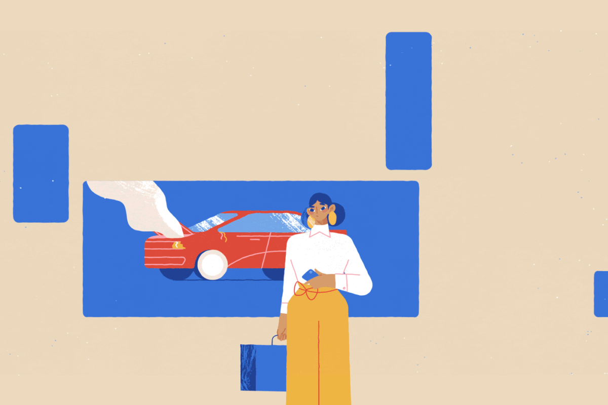
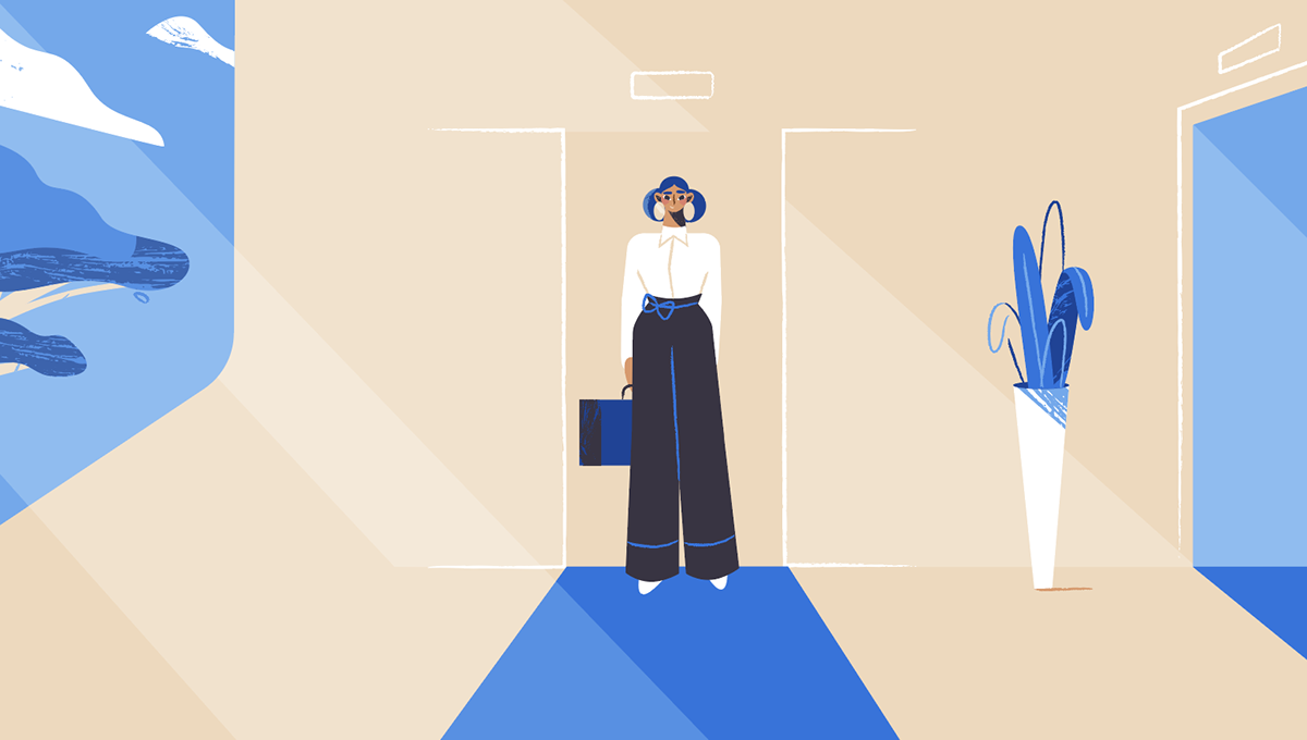
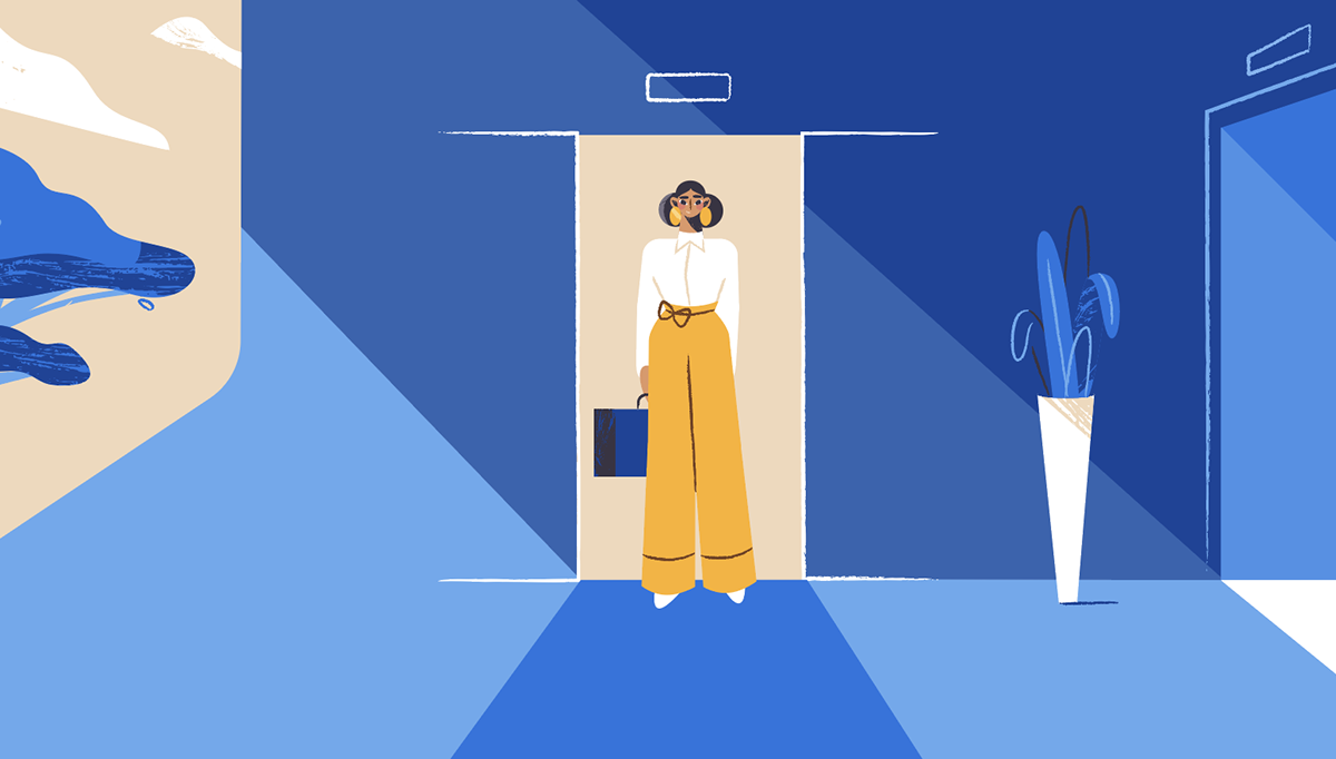
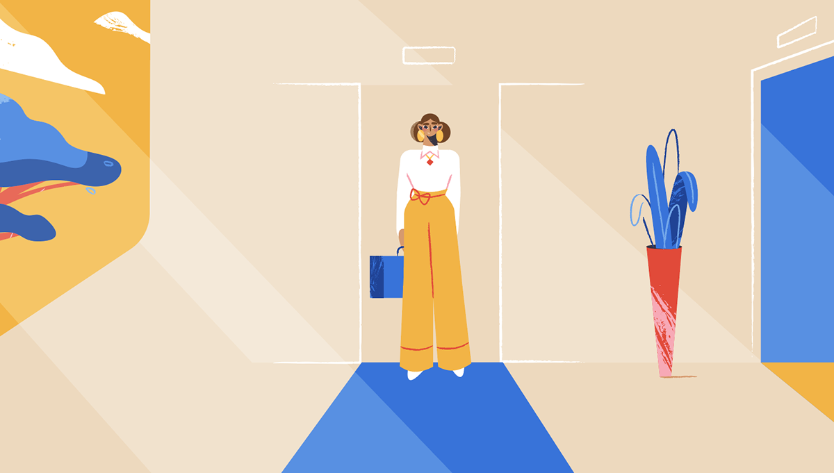
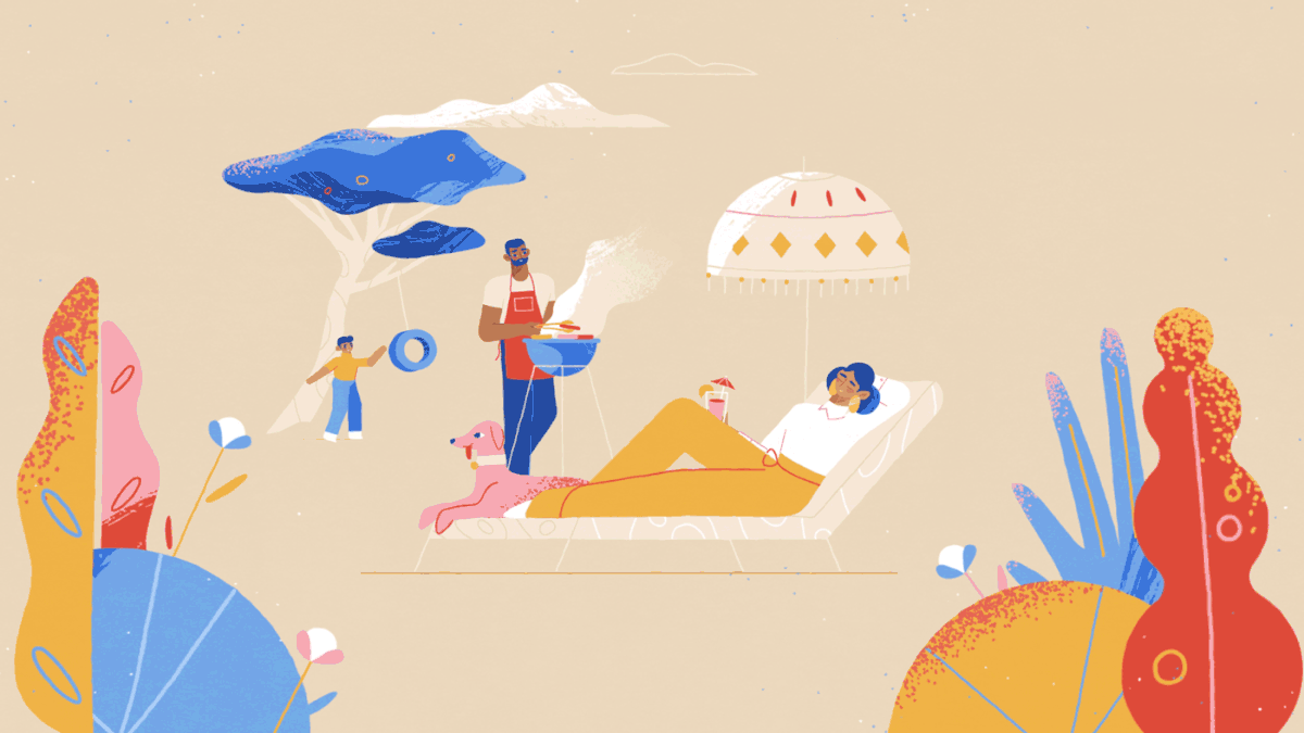
COLOR PALETTE
The starting point for the color palette was the E-Butler logo;
a strong deep blue. The website was also pretty set on that blue,
so I wanted to keep it at the center of the palette, while balancing
it out with some warmer desert tones like beige, yellow and red.


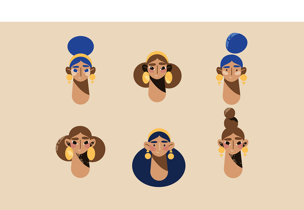
CHARACTER DESIGN
While writing the script and putting together the storyboard,
it was clear we wanted an actual butler to present the app.
And with E-Butler's most typical user being busy moms,
I started developing those two main characters first.


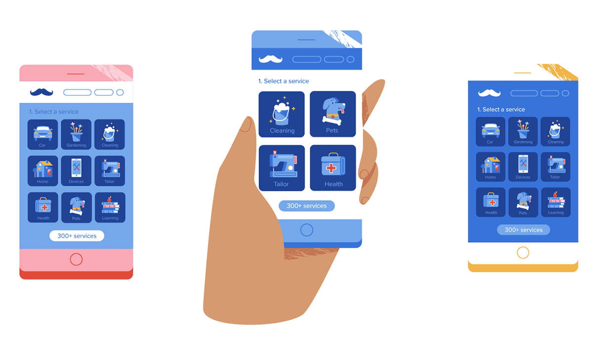
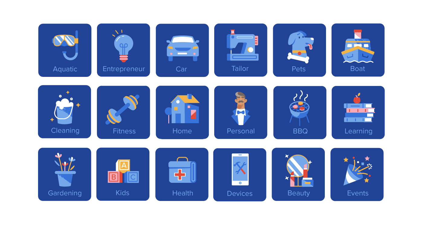
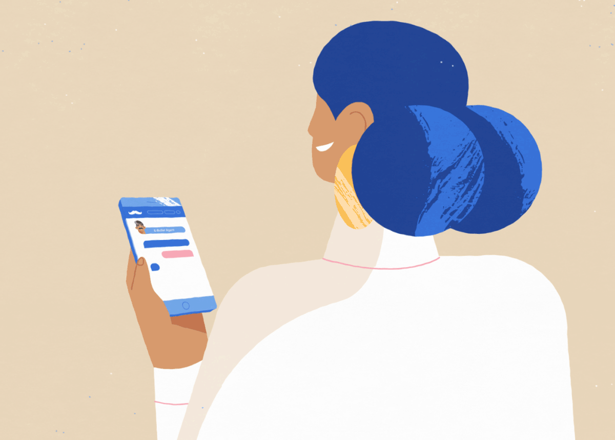
ILLUSTRATED APP
I often find it tricky to turn an existing app into its illustrated "equivalent",
but this one was particularly nice to adapt, as we decided it would be best to
just recreate the existing icons in the same style as the rest of my illustrations.

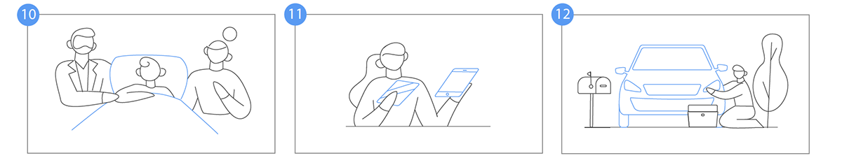
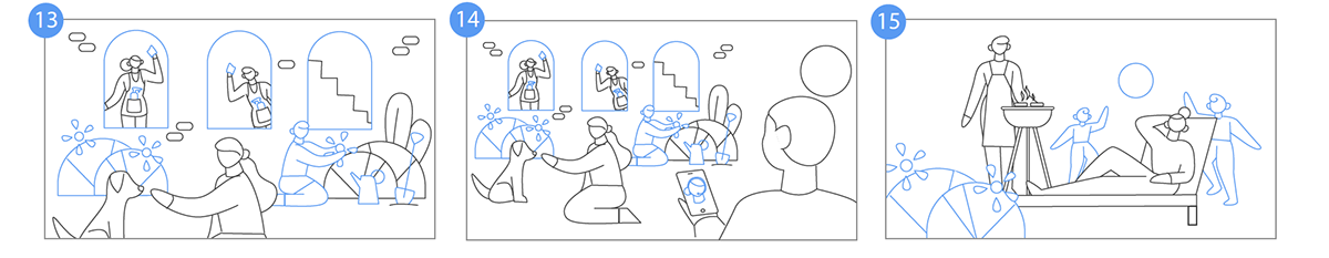
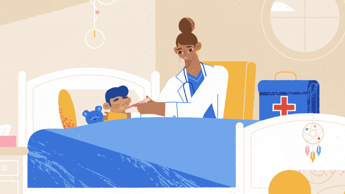
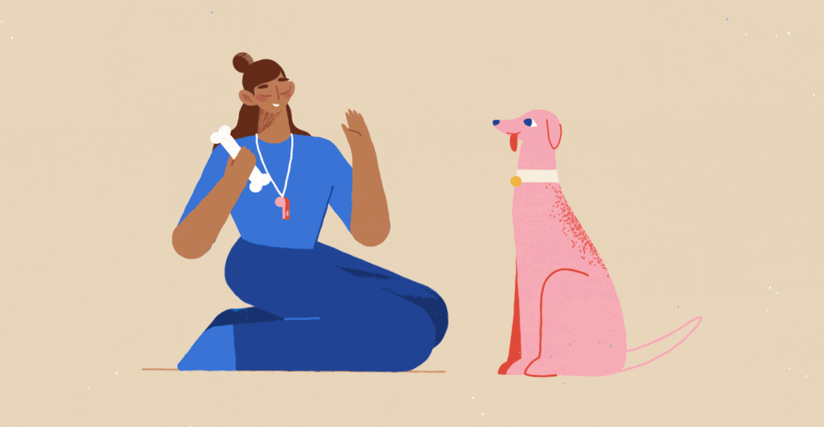
ANIMATION
Because there was a lot to fit into this 50 second video,
I tried to keep the scene transitions as snappy as possible,
without lingering too much on cam movements or morphs.
Below are some shots from the full video, hope you like them!


Thank you!


