


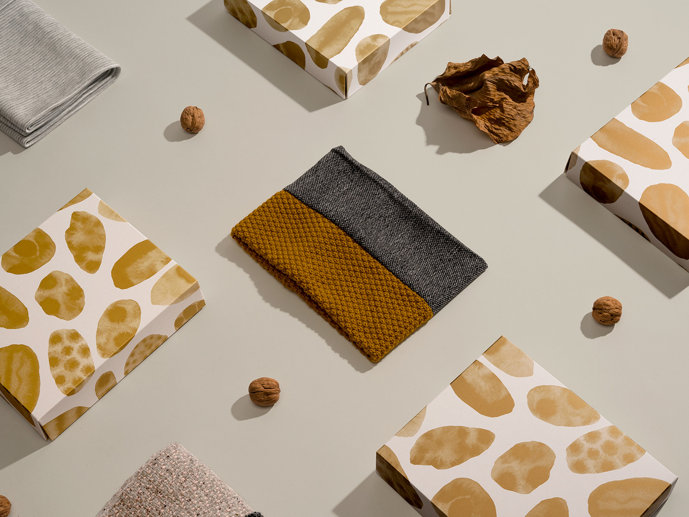


Nou Moscada, a fashion brand local to Barcelona, commissioned us to create self-assemble packaging for their beloved handkerchief.
We decided that the box should feel special but operate with simplicity – an item that could be kept and utilised for another purpose rather than get recycled after one use.
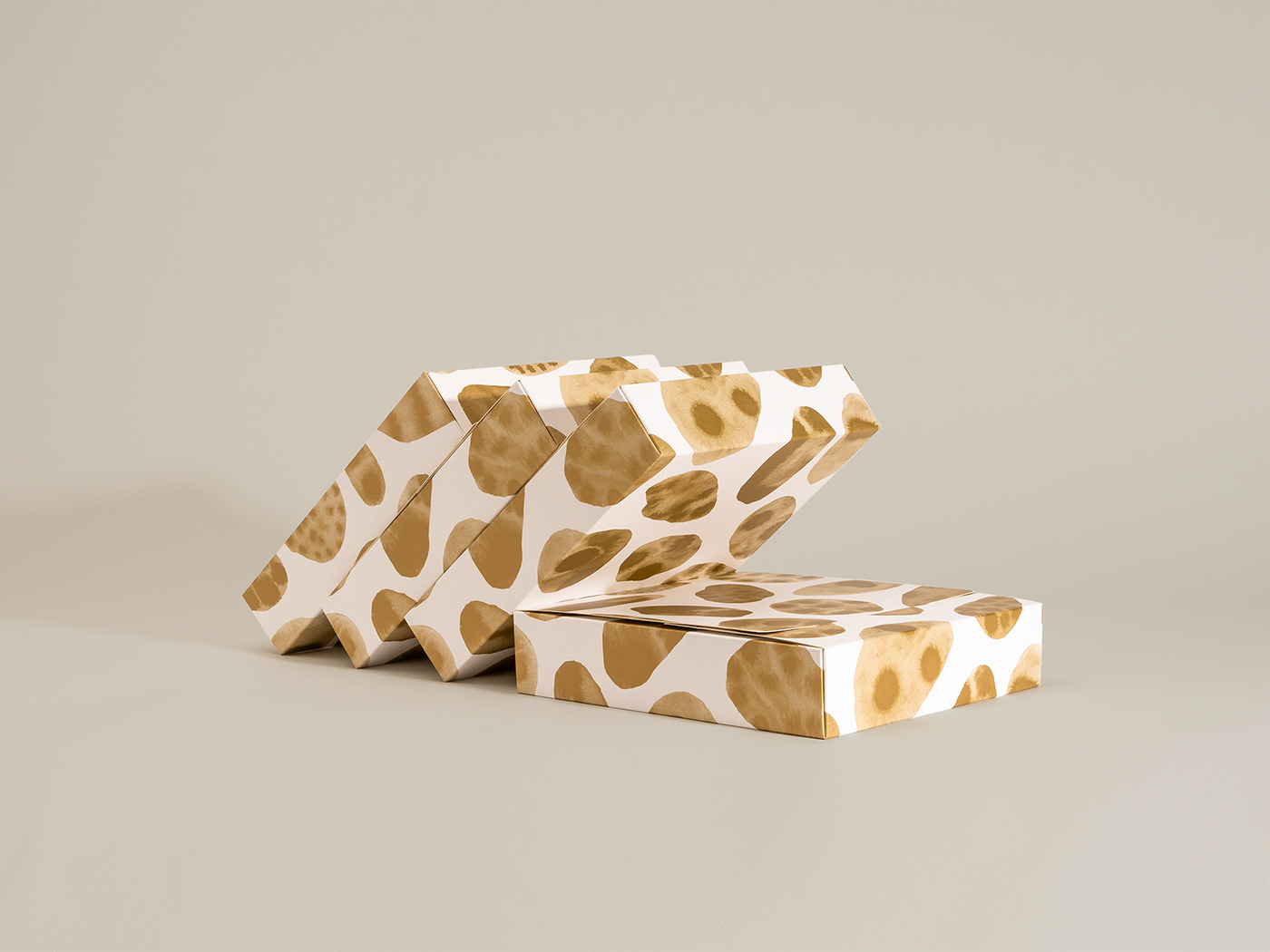
The company name means ‘nutmeg’ in Catalan so we used this as our starting point for the box design. Organic shapes illustrated with Chinese ink and printed with Gold Pantone gave the packaging a premium quality the brand desired.
An additional detail we wanted to focus on was the design and it’s form, rather than brand awareness. This resulted in the brand logo and product information being printed on the interior of the box, maintaining a clean exterior and adding a sense of mystery and surprise for the recipient.
This approach has now been adapted by Nou Moscada for future designs, with a different artist invited to design a box for each new handkerchief.


