


The Criterion Collection is a distribution company that has brought film enthusiasts important classic and contemporary films from around the world since 1984. In 2019, they launched The Criterion Channel, an online streaming service dedicated to bringing those films to viewers at home.
The Criterion Channel has quickly become one of my favorite streaming services, allowing fellow film lovers and I the opportunity to watch otherwise hard to find classic films, shorts, and more. Because I love and use the service so often, I've also come across some awkward UX/UI hiccups. As a personal project, I decided to update and redesign some portions of the website to make its use easier and more enjoyable.
The above video shows the scrolling animation that would greet viewers on the front page of the website. The current design requires users to click on the different sections––The Movies You Want, Thematically Presented, and Download the Apps––in order to read more about them. In my design, I thought it was important to keep text justification consistent and have all of the information on one page to get rid of the need for so much clicking.


The new Sign Up and Sign In pages now feature a still from Twin Peaks: Fire Walk With Me, a popular film in the Collection. Rather than linking to a different page with a totally different design, these pages follow a more consistent grid system, type use, and button style that is further used throughout the website. This updated design helps maintain the website’s integrity and style.


Although not much is different in terms of layout from their current design, I made changes to the way film titles, release years, directors, and timestamps would be displayed on the Now Playing page (above left). There is now also a progress bar at the bottom of each thumbnail showing how much a user has watched. The Criterion Collection is also known for its breathtaking exclusive DVD/Blu-ray cover artwork, some of which is used on
the website already. However not every film is given a designed thumbnail cover, something I felt does them a great disservice, especially when services like Netflix goes as far to make custom thumbnails depending on
the user. For this reason, I created the four thumbnails under Continue Watching, creating more harmony across the page.
There is now also a Watchlist tab, leading to a page (above right) where users can see films they’ve started watching as well as all of the content that they’ve added to their list.


One of the biggest changes to the design is the new Search and Advanced Filter functions (above right). Getting rid of the All Films page from the current website, which is where the Filter function is housed, these filters are now integrated into search. Using +/- toggles to simplify the menu and choose a filter category and breaking up the long Director list so that you don’t have to scroll down a long list of names, it is now easier to narrow down search results.

Another feature more regularly implemented are individual pages for each film. Using either a still or a specifically designed banner, these pages will give a brief overview of the film including a short description and info about runtime, release date and country, and more. There are also buttons to start watching, add it to your watchlist, view a trailer (if available), and to share to social media.
Below the top bar, there will also be a Related Content carousel, showing related collections, films by the same director, or any other supplementary content.

The player page also gets a facelift with an updated progress bar. Now, it includes buttons to go back/forward 10 seconds, runtime and viewing progress, a volume button, closed captioning, and the usual button to go full or small screen.


Lastly, the Account page has also been updated, now using another film still from Billy Wilder's The Apartment. The page has been simplified, allowing users to switch to different subpages and manage their account, subscriptions, and billing.
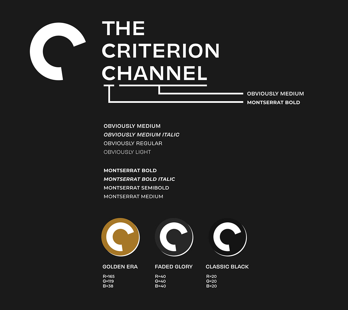
Typefaces & Colors
Thank you for stopping by!


