Onlife.
O Ministério de Jovens Onlife nasceu há cerca de 8 anos com o objetivo de levar sua geração a um relacionamento mais próximo com Deus. O nome Onlife é a junção de 2 palavras: Online e Life (vida, em inglês). Essa junção se deu ao relacionar o fato de termos uma geração que está constantemente conectada às redes sociais com a importância de estarmos conectados à “VIDA”, que é Jesus Cristo, como vemos na Bíblia, em João 14 e 15.
O conceito da marca é representar toda a essência em que é fundamentado o Onlife, reafirmando o motivo pelo qual o Ministério existe, trazendo assim as suas características expressas no símbolo. Essa essência mostra a necessidade de os jovens estarem conectados a Jesus, e o símbolo representa exatamente tal conexão.
The Youth Group Onlife was created about 8 years ago with the purpose of taking young people of its generation to have a closer relationship with God. The name Onlife joins 2 words: Online and Life. This junction is due to the fact that we have a generation increasingly connected to internet, social media etc. and the importance to have a life connected to real "LIFE", that is Jesus Christ, as we see in John 14-15.
The brand concept is to represent the essence of Onlife, reaffirming the reason why it exists and expressing all its characteristics in the symbol. The essence of Onlife is to show the need for young people to be connected to Jesus, and the symbol represents exactly that connection.


Conceito da marca.
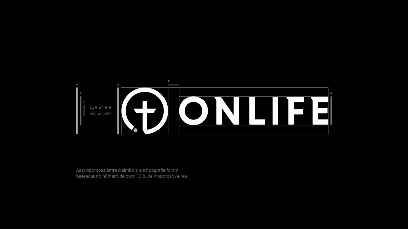
Para a construção do símbolo, foram utilizados 4 conceitos. O primeiro conceito utilizado foi a Conexão, pois o objetivo do Onlife é conectar o maior número de jovens a Jesus. O segundo foi a Cruz vazia, que simboliza Jesus, pois foi nela que Ele se entregou e morreu para que todos nós fossemos salvos por meio daquele sacrifício. O terceiro foi o Jovem, que também representa o Fruto que é gerado por aqueles que estão conectados a Jesus. Por fim, o quarto e último conceito utilizado foi a Proporção Áurea, também conhecida como Número de Ouro, que é para muitos a forma mais precisa para se chegar à sinergia perfeita entre os elementos.
Brand Concept.
4 concepts were used to create the symbol. First, the Connection, since the purpose of Onlife is to connect as many young people as possible to Jesus. Second, the empty Cross, which symbolizes Jesus and his sacrifice to save us. Third, the Young, that also represents the Fruit generated by those who are connected to Jesus. Lastly, the fourth concept was the Golden Ratio, also known as Golden Number, which is the most accurate way to achieve the perfect synergy between the elements.

Cores.
O símbolo foi construído para ser aplicado nas mais diversas cores de fundo, sempre deixando o logotipo com suas cores padrão, preto e branco.
A análise e escolha das cores foram baseadas no livro A Psicologia das Cores, de Eva Heller.
Colors.
The symbol was created to be applied on the most diverse background colors, always leaving the logo in its standard colors: black and white.
The analysis and choice of colors were based on the book The Psychology of Colors, by Eva Heller.

Tipografia.
Para dar uma personalidade ainda maior para a Onlife, foram feitas pequenas alterações na tipografia para deixá-la com uma personalidade mais marcante e com características mais coerentes. Nas letras “F” e “E” foi acrescentado o mesmo detalhe presente na letra “N” da fonte original. Além disso, o kerning (espaçamento entre as letras) foi aumentado e os cantos das letras foram arredondados, tornando a tipografia mais harmônica.
Typography.
A few changes were made to the typography to give Onlife a striking personality and more coherent characteristics. It was added in the letters "F" and "E" the same detail as in the letter "N" of the original font. In addition, the kerning has been increased and the corners of the letters have been rounded, making the typography more harmonious.

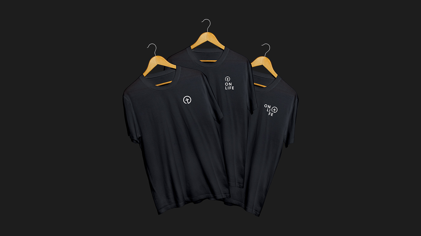
Uma marca modular.
A marca foi construída para ser a mais versátil possível, possibilitando ser aplicada de diversas formas sem perder suas características e personalidade.
Com uma marca modular como a Onlife, toda baseada nas técnicas da Proporção Áurea, podem ser feitas aplicações mudando a posição do símbolo e das letras que compõem o nome, dando mais dinamismo e movimento para a marca.
Veja um exemplo abaixo com todas as variações criadas.
A modular brand.
The brand was created to be as versatile as possible, so it can be applied in different ways without losing its characteristics and personality.
With a modular brand all based on the Golden Ratio techniques, some applications can be made by changing the position of the symbol and the letters that make up the name, giving more dynamism and movement to the brand.
See some examples below with the variations created.