

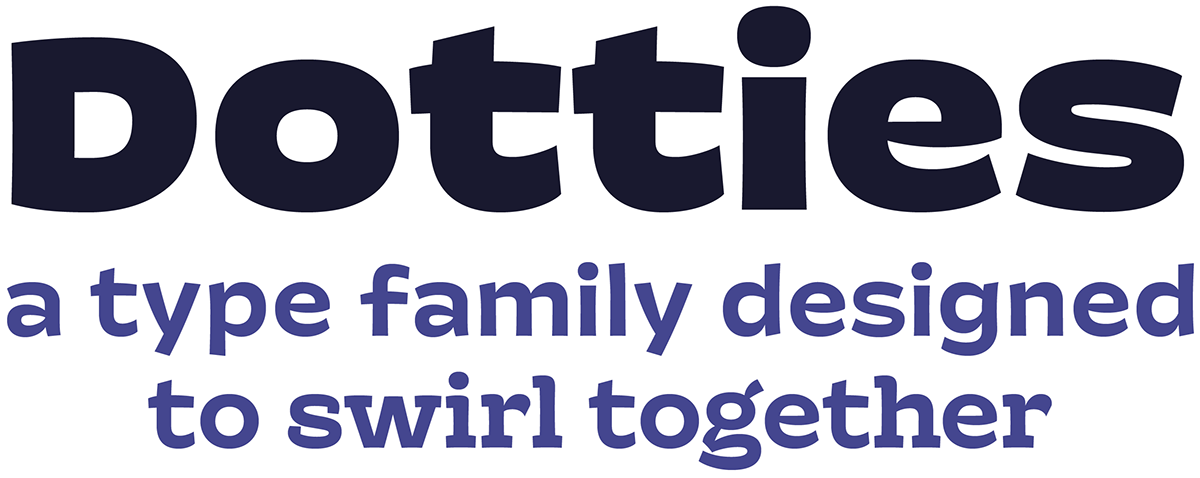

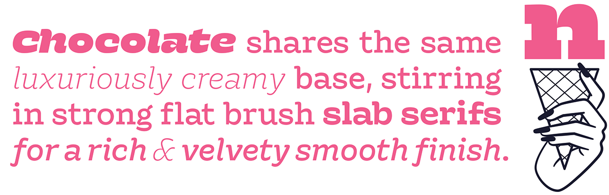
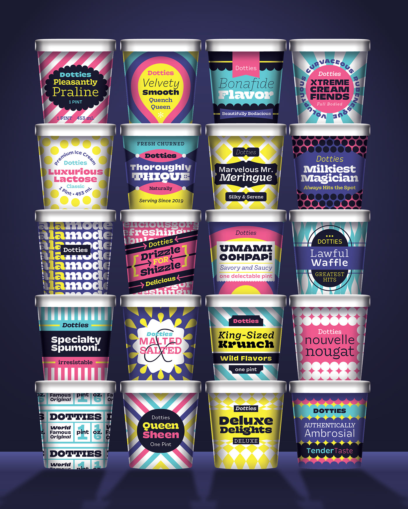
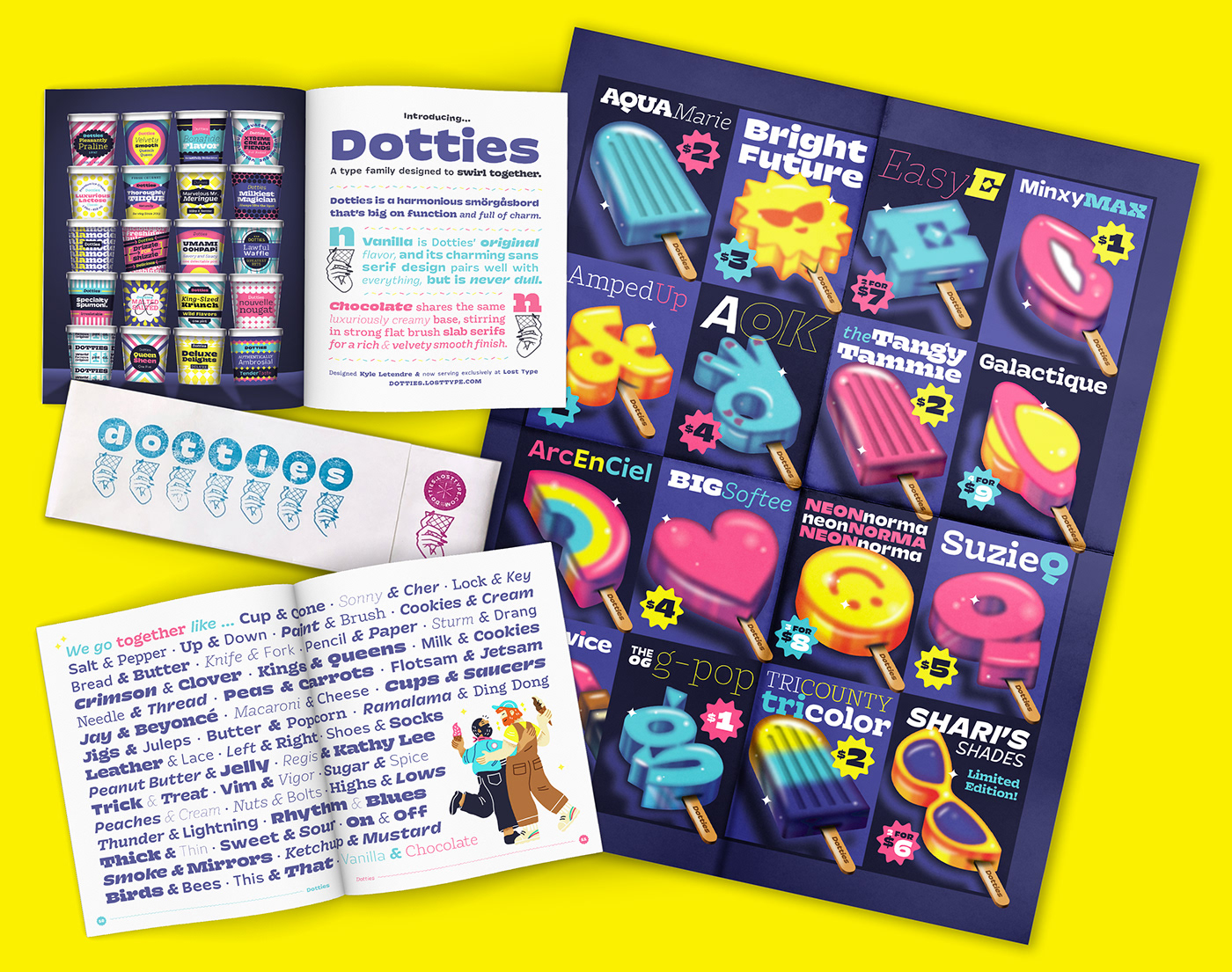
I'm proud to introduce my first commercial type release, Dotties! Inspired by hand-painted signage in the Midwest, Dotties fuses the charm of a small town ice cream shop with the utility of a digital typeface.
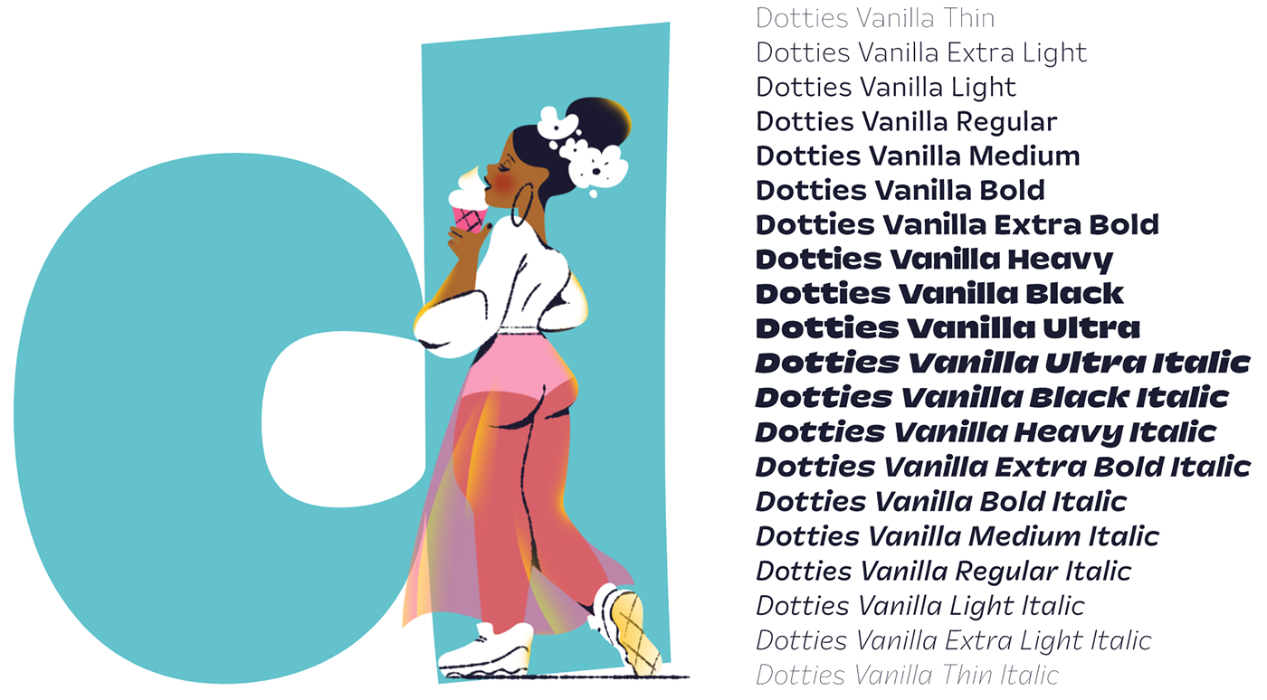
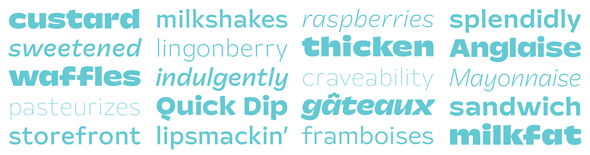
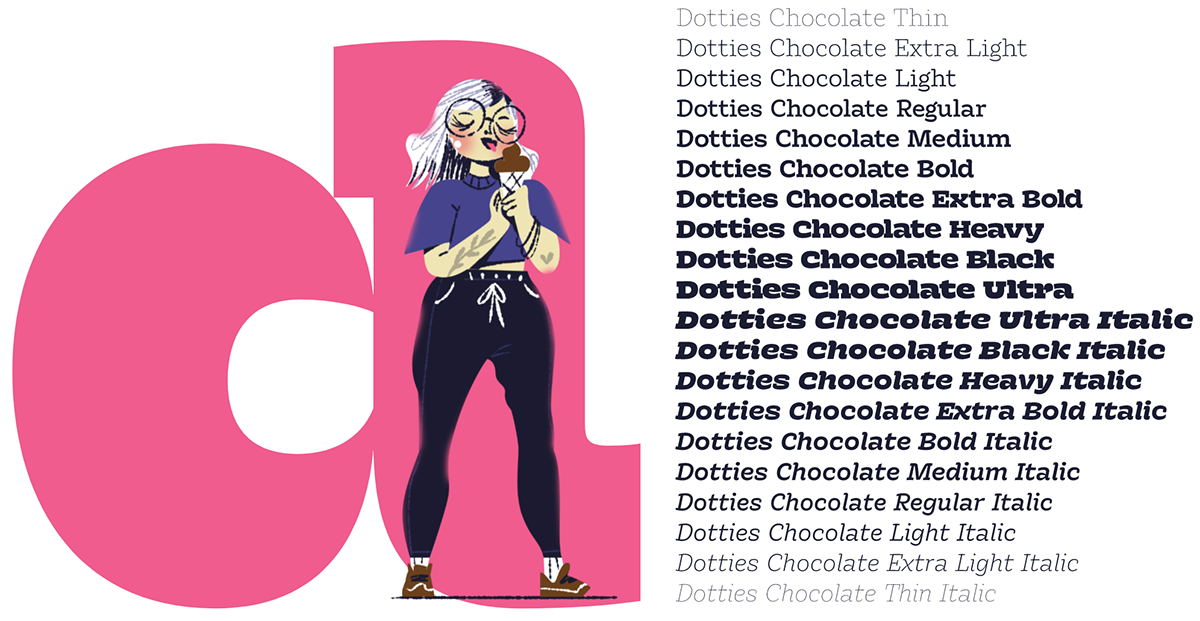
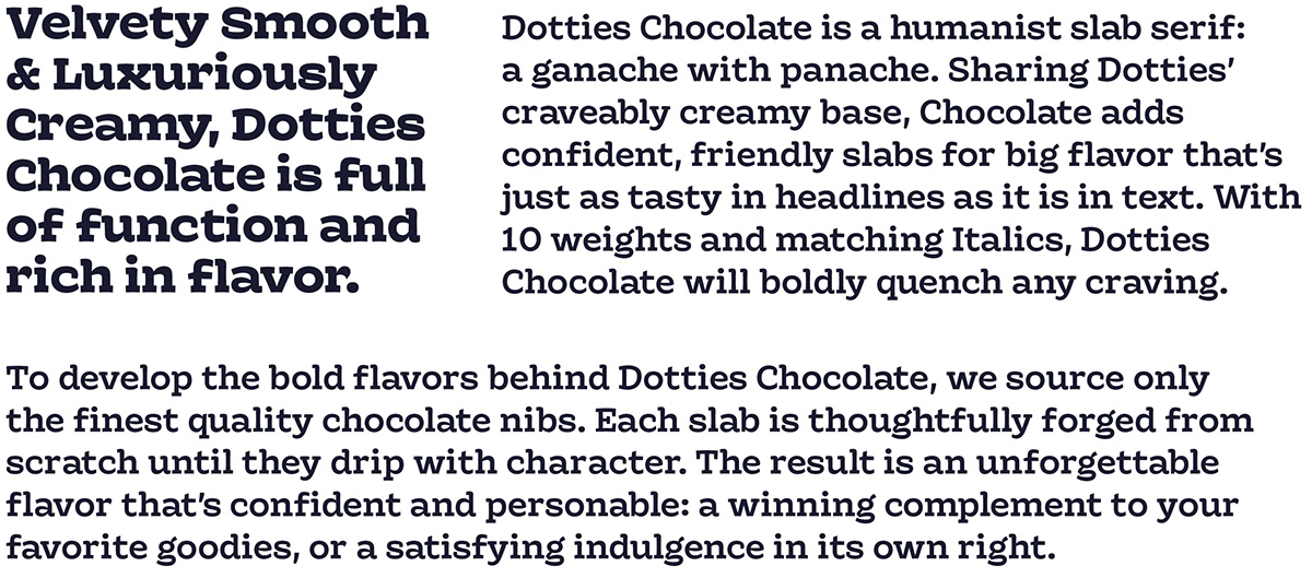
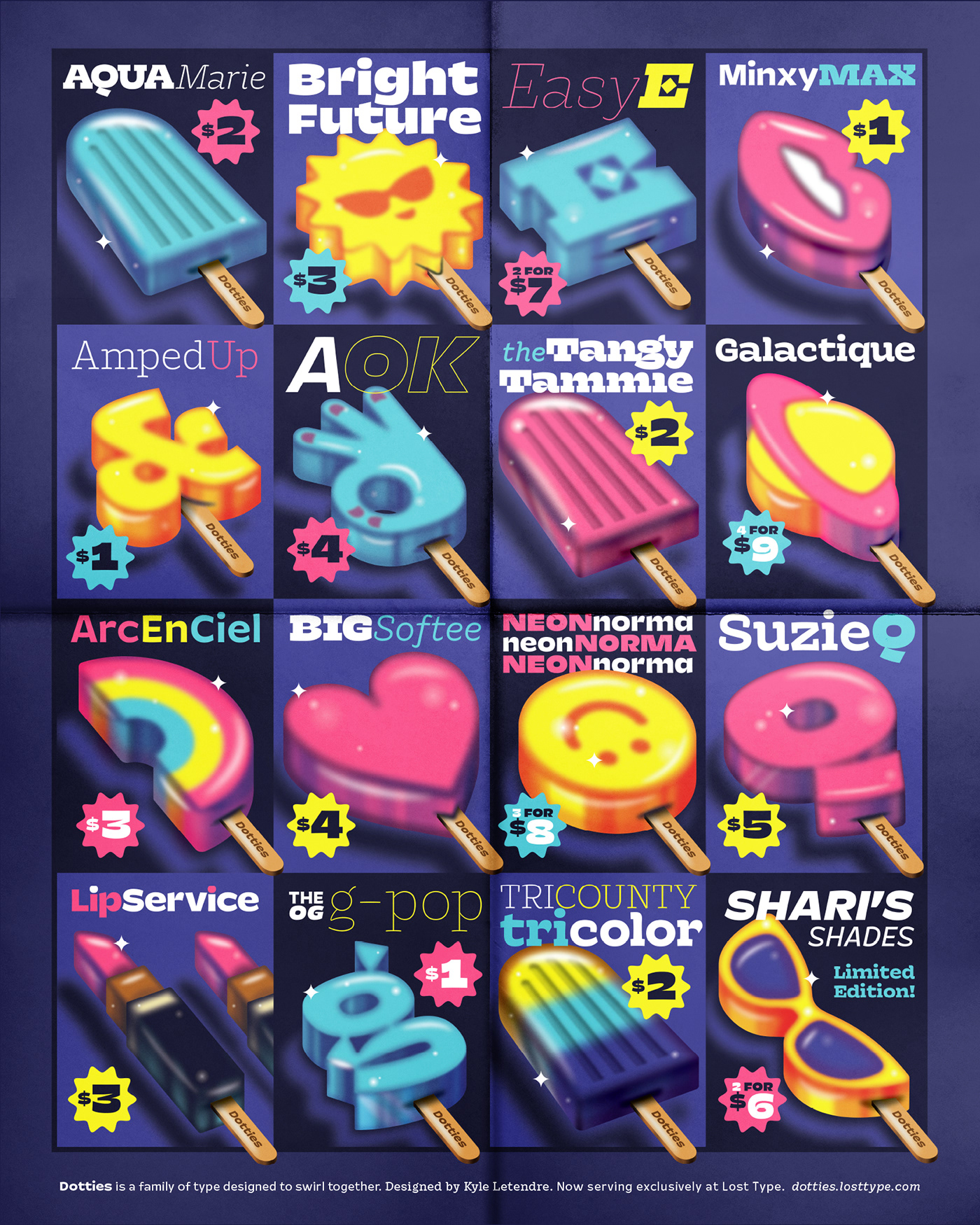
The family is comprised of two complimentary styles: a lively sans called Dotties Vanilla, and a velvety slab named Dotties Chocolate. With shared proportions, punctuation and numerals, Dotties is designed to swirl together like an ice cream dream team. And in 10 weights each, plus matching italics, the family forms a cohesive smörgåsbord of 40 fonts, perfect for any flavor combination.

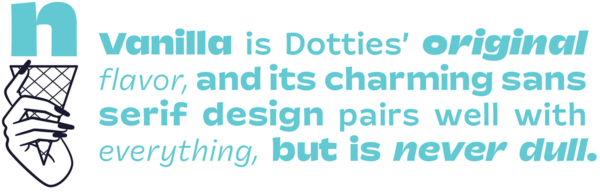


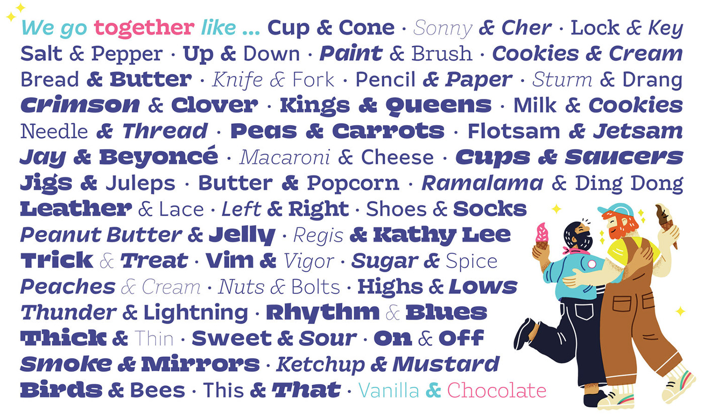
Dotties Vanilla & Chocolate are a real treat together. Like the ice cream flavors they're named after, both styles are delicious on their own. Pair them together for a dreamy typographic swirl cone that's perfect for any size craving.

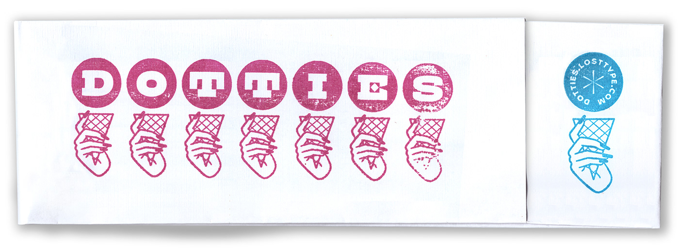
The Dotties specimen ships free to your door when you license a copy of Dotties Vanilla or Chocolate — or both together! Includes a 24-page book with illustrations from Simone Noronha, Ry Macarayan and myself; a 16x20" fold-out popsicle poster; and your own Dotties paper ice cream hat. Designed with help from Danelle Cheney, and beautifully printed by Sun Print in Salt Lake City.


Thank you to Riley Cran & Lost Type, Dave Bailey and Danelle Cheney


