Santander Bank ignites its commitment to progress with a new brand identity
When Ana Botín became Santander Bank’s new Executive Chairman in 2014, the financial brand evolved to address present and near-future challenges, as well as to fulfill its promise of helping both people and businesses prosper. The 160-year-old bank drove this change from within and built a more digital, accessible, friendly, and simple brand identity that would engage all of its audiences.
A comprehensive brand study revealed the brand and business challenges that Santander faced, both locally and globally. A deep analysis of the brand uncovered the extent to which it could evolve along with Santander’s customer experience.
The bank decided to evolve its whole way of being and doing—and a renewed identity was integral to this change.
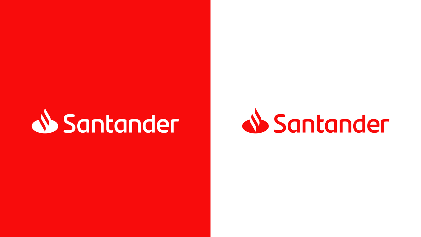
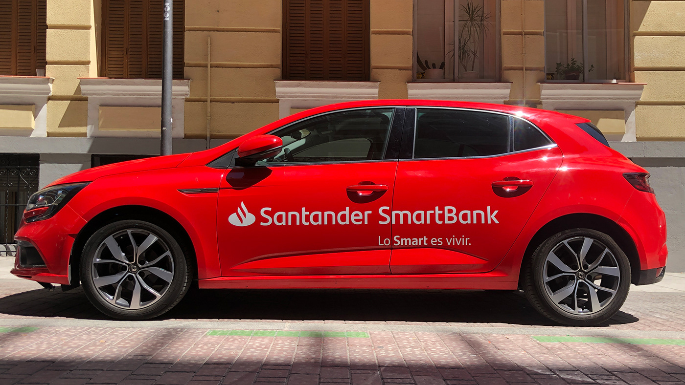
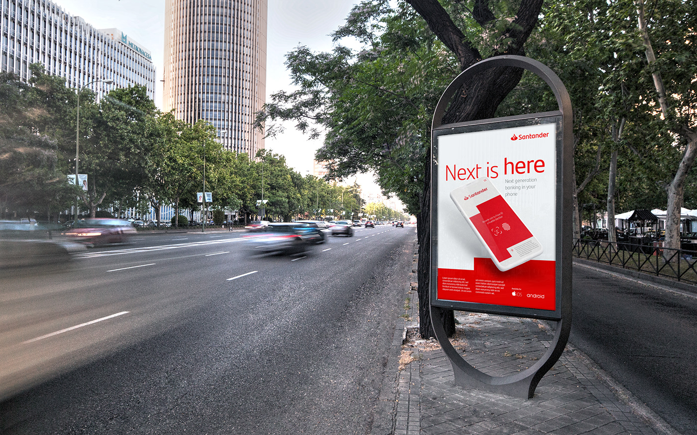
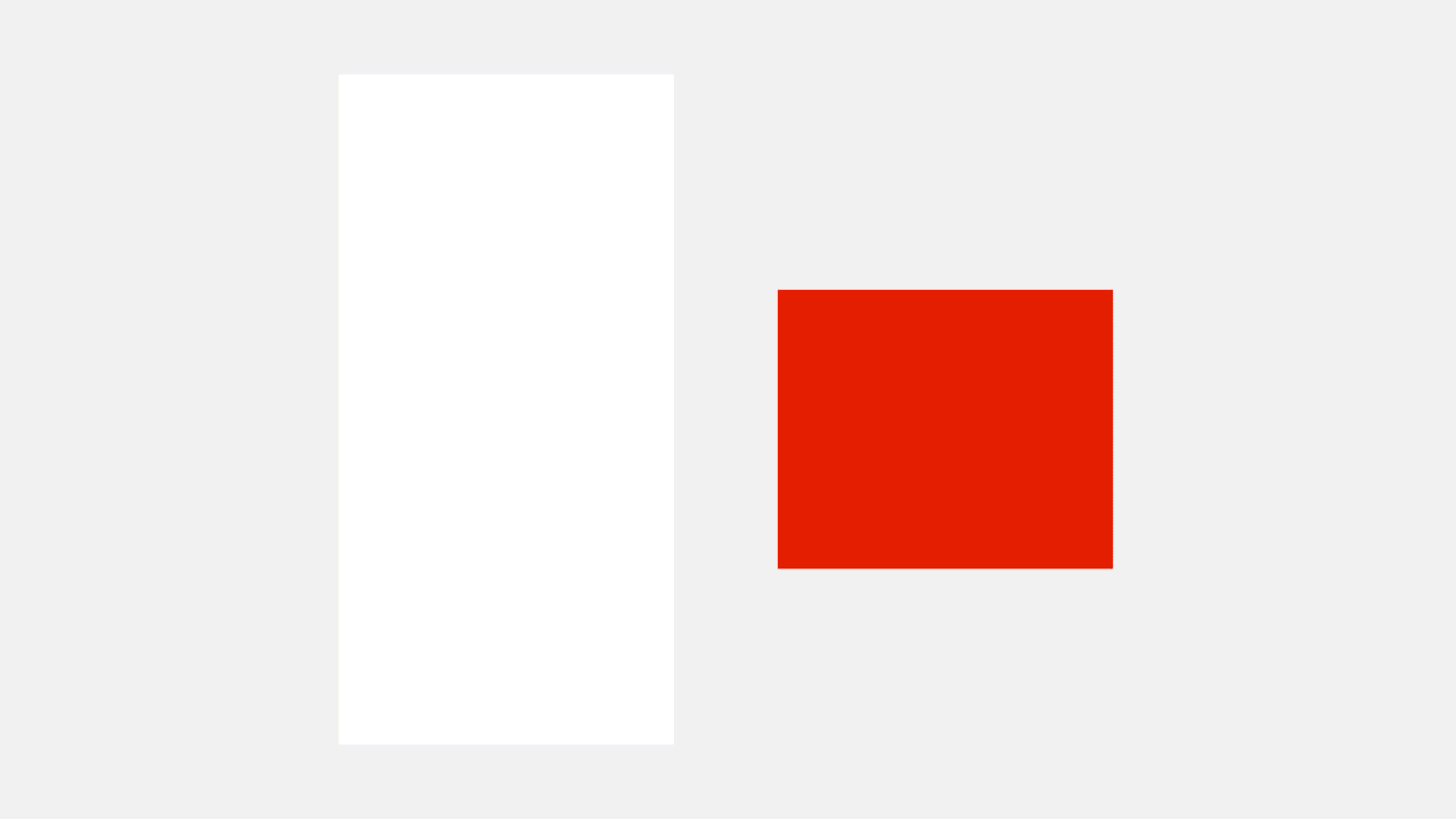
The modernized logo includes custom typography that evokes openness and connection.Santander’s signature red shines even brighter against the white, incorporated as a new primary color, so the user experience gains lightness and simplicity.
A lot of work was put on the visual identity evolution, together with Santander brand team we prototyped and tested several visual solutions for the brand new positioning.
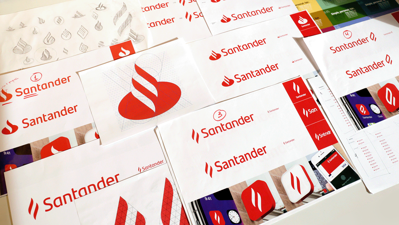
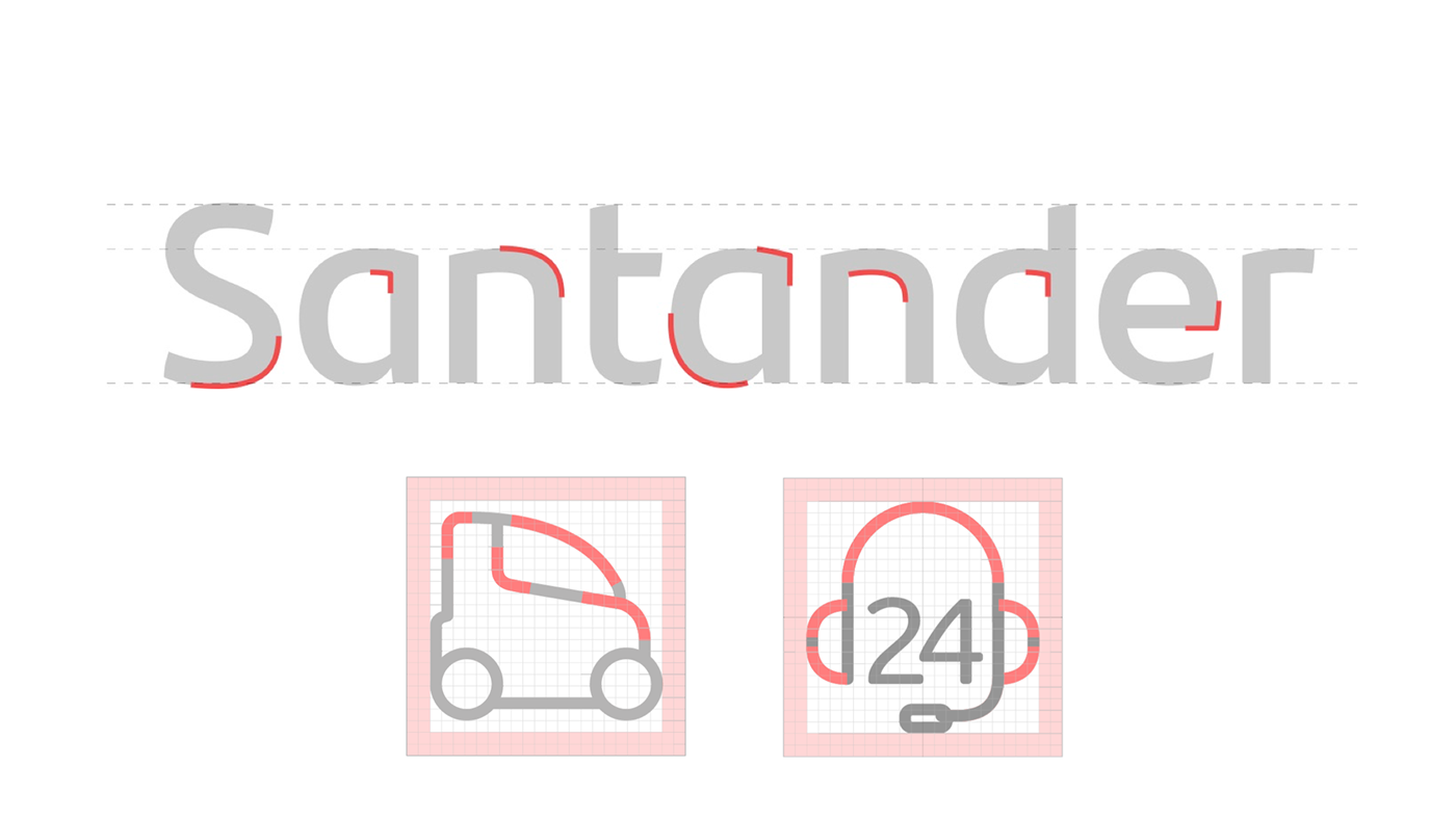
Several trials were made for the wordmark. The chosen option uses single story "a" with no shoulder, making the whole upper part of the wordmark smooth to the eye.
A complete custom typeface was developed specially for the logotype. Santander can keep its business expansion merging or acquiring other banks while keeping consistency on their logotypes.
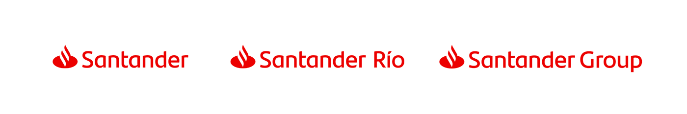
A light weight was also developed, making easier to create and organize sub-brands keeping consistency.

The logo is responsive according with the space available.

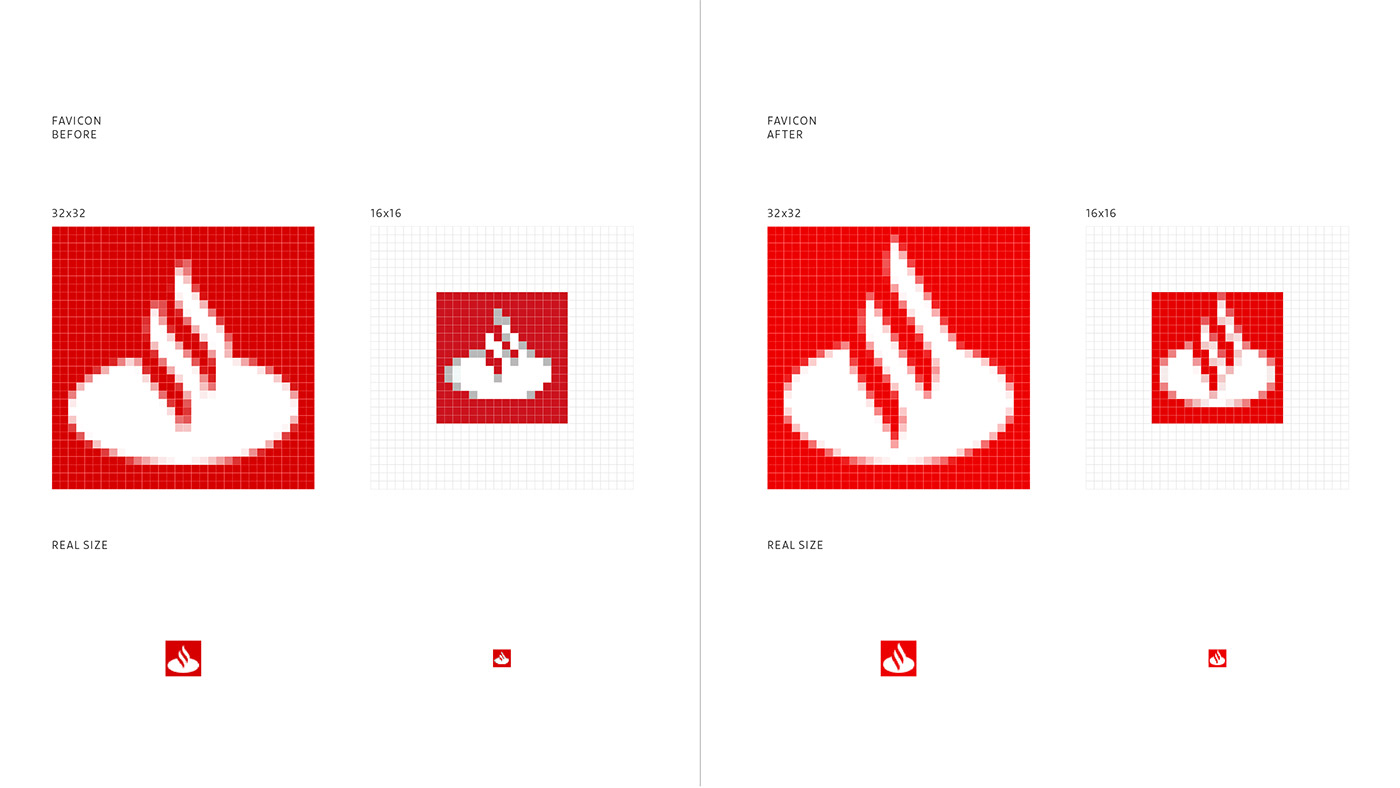
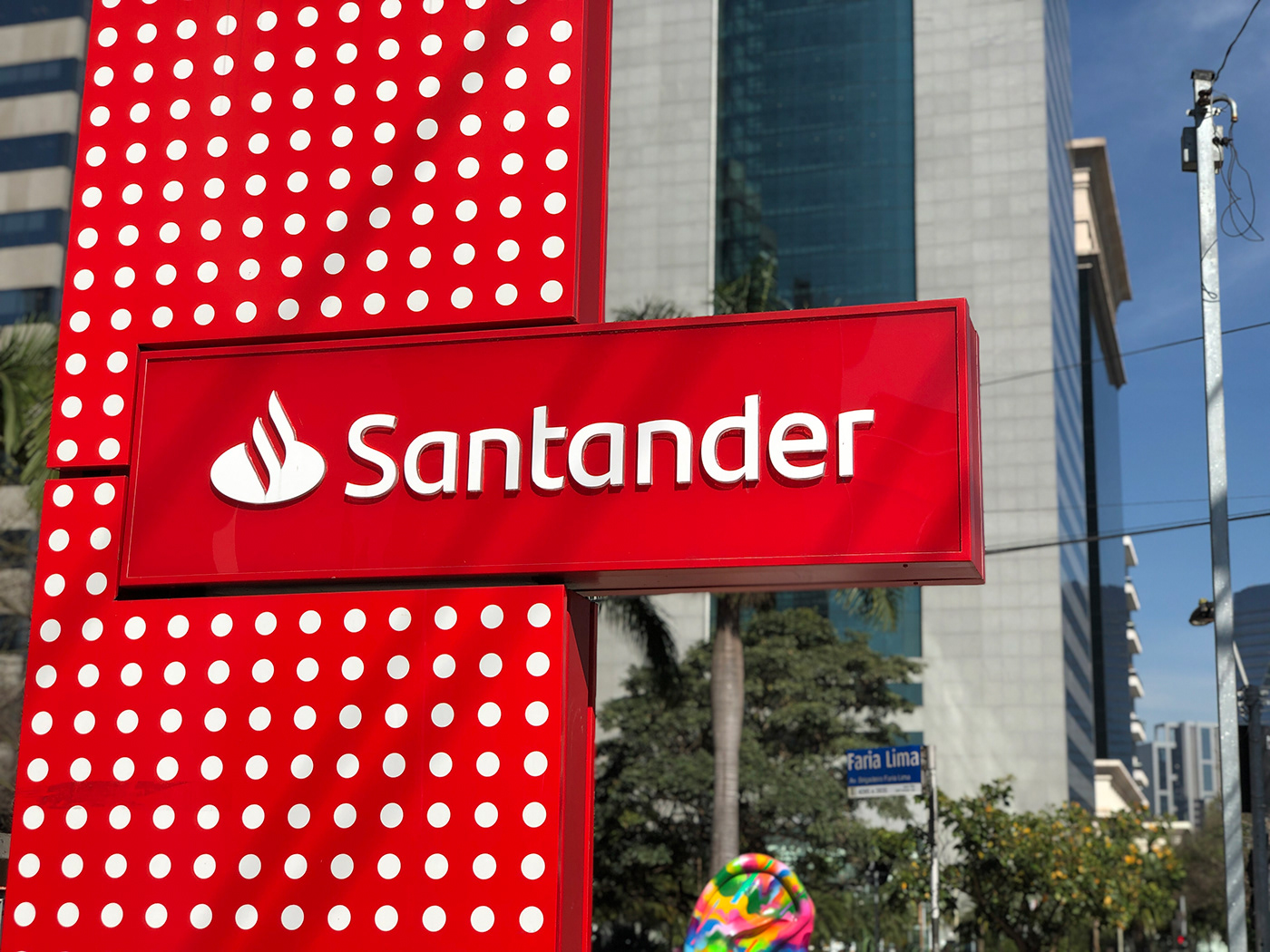
The flame symbol gained prominence in the new graphic treatment, which focused on simplicity and adaptability to any environment or channel.


The flame was optimized for extreme reduction sizes, like the app or favicon.
Besides the logotype typeface, a Headline and Text style were developed together with Monotype, allowing Santander to have a distinctive single voice across the globe.


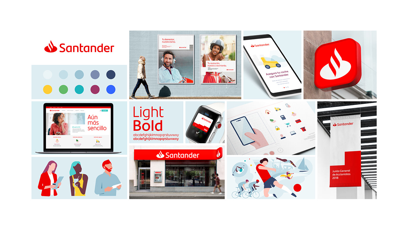
The palette of secondary colors was also expanded and enriched.In order to communicate in a consistent and relevant way both globally and locally, a complete visual universe was developed,

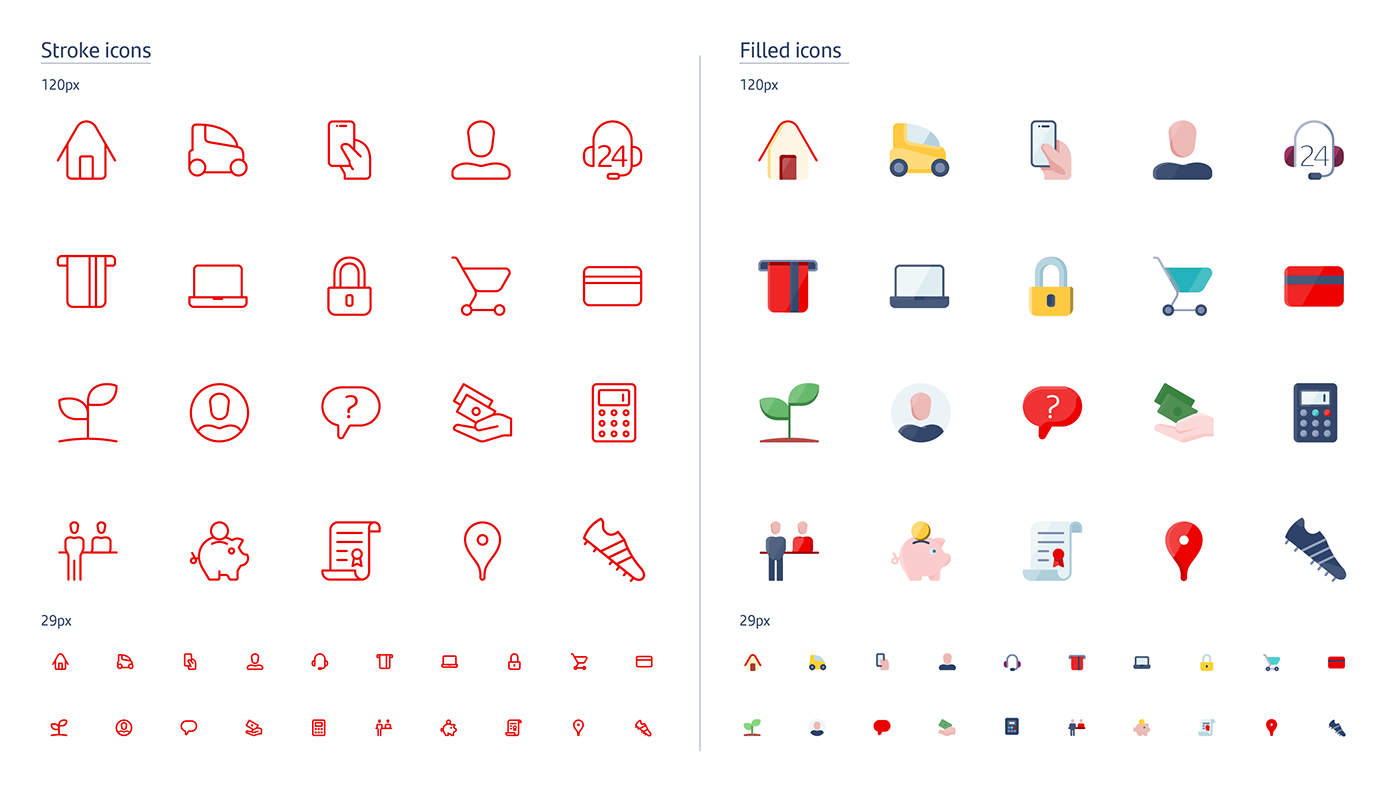
The lines and curves of the logo inspired new icons and illustrations that can be adapted to each of the countries in which Santander operates.


The photographic and audiovisual style was inspired by individuals who look to the future with optimism and by groups of people who work together.

We developed a new graphic resource that consists of shapes that grow and prosper, like stairs, to configure spaces in which everything fits in a rich, flexible, and unmistakable way.


The case was presented by the team in London, at Monotype's Brand Talks 2019 .

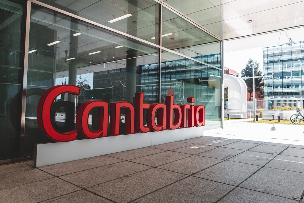
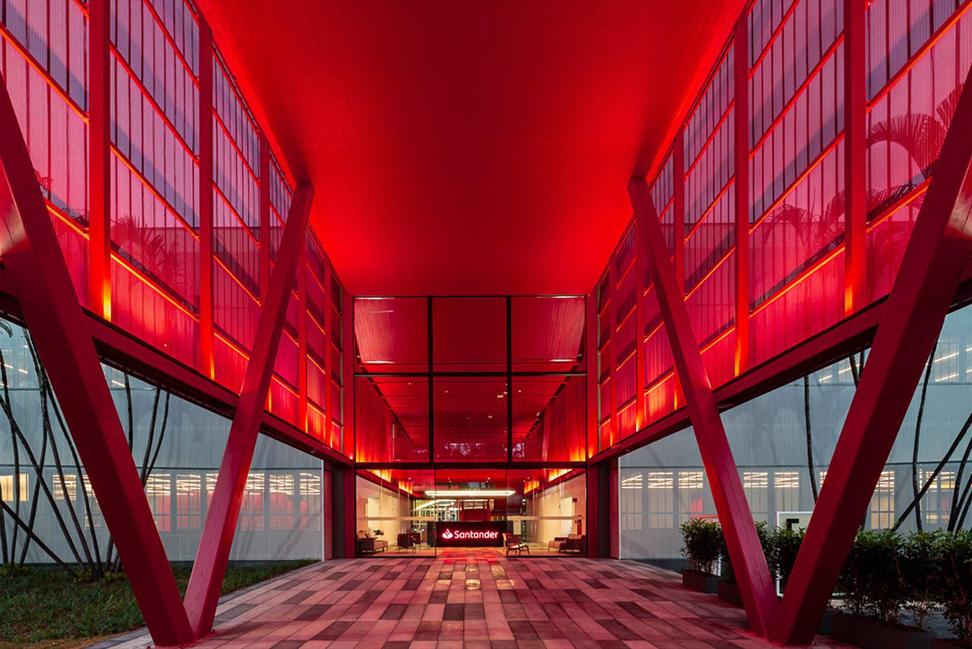
Finally, the brand was implemented across several countries.


Overview of the brand visual assets.