


PLAN B
UX-UI Design and Development of an IOS App
Here is the work in progress of an App I conceptualized, designed and developed from scratch as thesis for an App Development Course I attended to at the Center for the Formation in Information and Communication Technology in Getafe, Madrid, during the year 2019.
THE CONCEPT & THE TARGET
I wanted to create an application about knowledge sharing, a way for people to learn 1 on 1 and connect outside of the virtual world. It would work like a tandem indeed, matching people interested to learn each other skills.
I named it "Plan B" because I intend to target mainly people in their 30's or 40's who might be searching for a career change but don't usually have the time or money to invest into a new Bachelor and prefer the direct approach of a real-life tutor to an online course. This is, therefore, their plan B.
To make it clearer to the user I explained it in four paragraphs in the scroll view at the beginning of the app, as it follows:
"Welcome to your PLAN B!
I know, you're broke, you're most likely working in a call center and your life sucks. Well, I have good news for you! I'll help you find a tutor to learn whatever you like and get out of your cubicle! Follow me!
PLAN B is a COMMUNITY of SKILLED PEOPLE
Are you a MASTER at Lipsinc Battles? Here is your place to shine;) Whatever you excel at, here you can teach your best techniques.
DEMOCRATIC LEARNING. V for VENDETTA would be proud.
In exchange you'll learn from another BPlanner what you always wanted to study and never got the chance, the money or the confidence to do in your life. One on one mentorship for all!
STOP WATCHING NETFLIX! BPlanners are waiting for you to join!
Join our diverse community and start growing. You'll break the roof of your mini-apartment in no time."

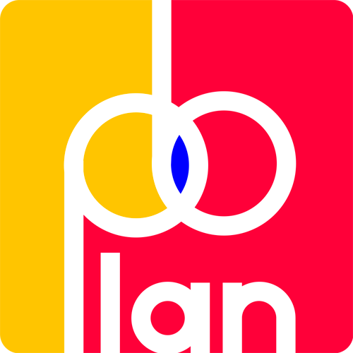
THE LOGO
As a logo for the app I played it on the intersection of the P and the B as if they were circles, representing the area of competence of the two B-Planners which are interchanged during the learning process. As colors I used all strong primary colors to inspire Enthusiasm-Reliability (yellow), Determination (Red) and Empathy-Creativity (Blue).
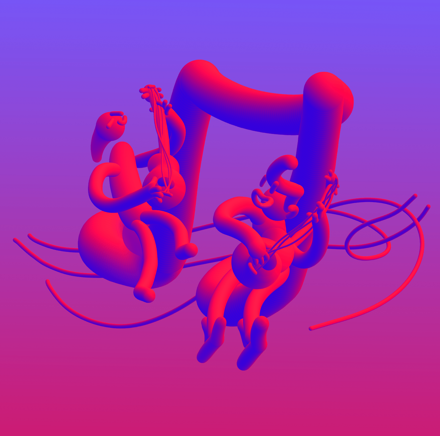
THE ILLUSTRATIONS, OVERALL LAYOUT and UI
I accompanied the texts and the all User Experience with some illustration that highlights the concept as well as setting a playful and creative mood for the app. This is one of the illustrations I created showing two B-Planners (one teaching and the other one learning) playing guitar.
Here below are some samples of Avatars.


The following is a working simulation of the first stages of the app I developed using Swift in Xcode.

Thanks for watching!


