For years I have been both an Essendon supporter and a graphic designer. While I've held the belief that the current logo is one of the best in the AFL; if I were to redesign it what would I do?
To be honest I never really had a good answer until recently. Some contemporary sports logos are pushing away from detailed illustrations and towards simpler designs.
The following is presented not as a design for actual consideration (I would expect this design to be focus grouped out of existence). Rather an excercise in presenting an anti-'sports logo' into a space which typically requires such broad market appeal.


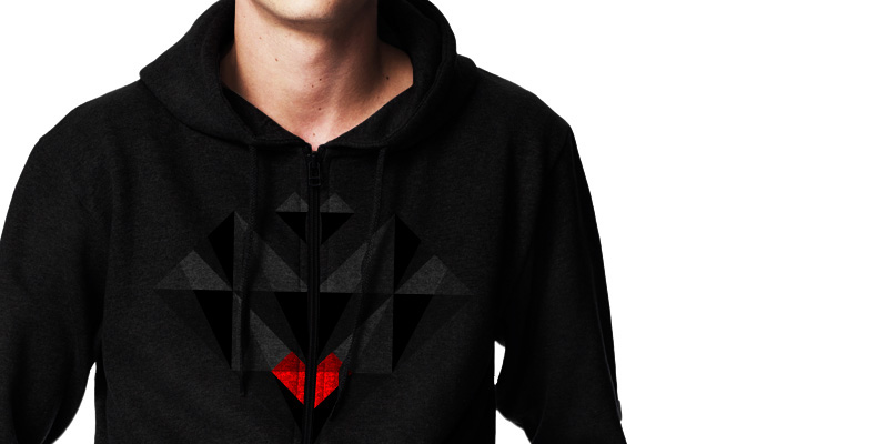
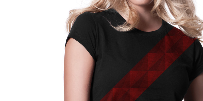
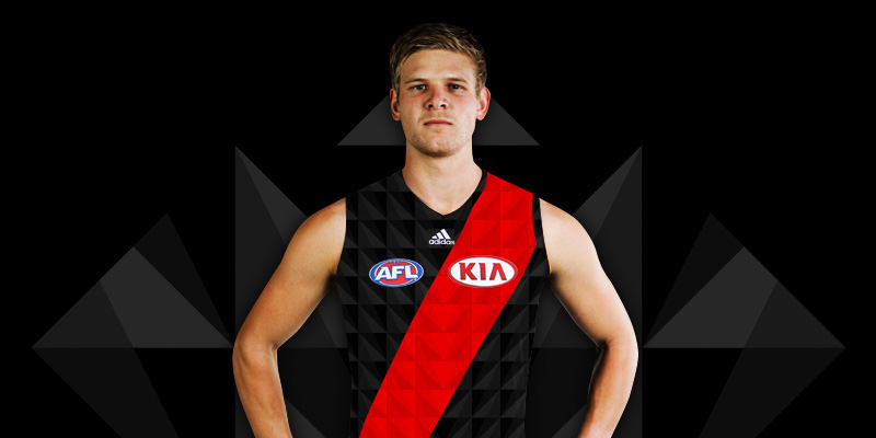
The tesselating 'stealth' panelling pattern fits in with the club's jumper design and could be incorporated into merchandise.


Design Goal 1: Simplify!
The new design should be simple, recognisable, and not at all like existing sports logos. Many sports team logos are overly complex and try to communicate an 'attitude' through the design. Where more contemporary designs are stripped back, focused on clear type and simple iconography.
The main version of the logo design contains the shaded stealth panelling, but a flat version of the design works just as well.

Design Goal 2: Only use club colours.
The current logo uses mid-tone greys which are not present in the club's traditional black and red jumper. The club also uses a version of the logo with a white outline. In a new design I wanted to ensure that only black and red (or very subtle variations of those colours) were used.

This leads to a situation where the main logo presented on black is almost indesciperable. This is both the main reason the design would most certainly be rejected and my favourite application of the logo. That the design is both symbolic of a stealth bomber and stealthy itself.

Rebrand launch special edition jumper.


