
B. Tap Baron
Introduction
Originally called "Bubble Tap", this coffee and dessert cafe in its first year of infancy primely located in the heart of Cambridge approached me to rebrand their shop in order to take it to the next level.
Their concept was to combine bubble waffles from Hong Kong and name them after Cambridge's illustrious scientists.
They greatly required an overhaul of their current logo and desired a brand identity that would propel their brand into becoming a well-known and highly visited attraction within Cambridge that provided a unique setting and experience.


Requirements
Logo Re-design
Brand Collateral
Website Re-design
Menu Re-design
Poster Design
Exterior Frontage Re-design
Design/Business Consultancy
Logo Re-Design and Thought Process
After having done a few sketches after the intial meeting, these were brought over into Photoshop to vectorize. This culminated into about a week or so of drafting a number of different logo options to discuss. The identity of the bubble waffle was very unique and was the main focus in the initial logo design.


Client Feedback
After a bit of feedback, we decided to design a logo concept that would enable the business to branch out into new areas of business and possibly cater to other demographics. In this process, I made the point of establishing Cambridge's academic history as the unique experience that would draw attention.

The name "B. Tap Baron" was coined to represent the tap at which all things beginning with the letter "b" would flow (ie. Batter, Butter, Bubble Waffles, British, etc). Baron was incorporated to give an almost royal distinction. If the business were to franchise, every owner would become the "baron" of a "castle" that was a place of magic and wonder (in this case, a dessert cafe/bar).
We used a sans serif font to distinguish an academic and historic feel in the top part of the logo, and a serif font below to signify the marrying of the two cultures in a unique and modernized twist.
A navy blue was used to signify a young, cool, and hip vibe, while the gold added an element of luxury. The Lion and Dragon crests signified the marriage of the culture of the East and West.
Brand Collateral
With a new colour palette, a new strategy, and a clearer vision, a variety of posters and marketing material was made for the business to use in social media, interior decor, and in interactions with their customers.


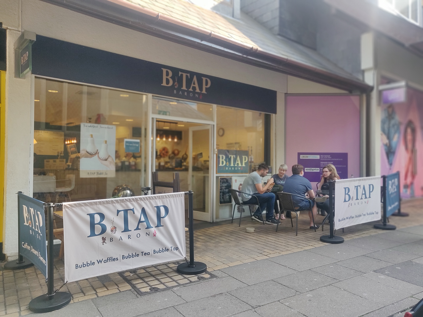
Shop Front Re-Design
The entire shop front was changed to have improved outside seating, cafe barriers, a lightbox, and new signage, all with brand colours.
Website Re-Design
The website went through a drastic transformation to make it more modern and distinct to really enhance the products and brand.
All the changes including the main menu re-design can be viewed at the website: btapbaron.co.uk

Impact
After having spent one year working with B. Tap Baron, their sales, social media engagement, customer retention, and brand direction have steadily improved. The brand is consistently evolving and introducing new ways to compete with the ever-growing cafe industry, but is a leader in what it knows best. I am still in contact with the owners as we have developed a genuine friendship along the year of working together and I wish their brand every success.


