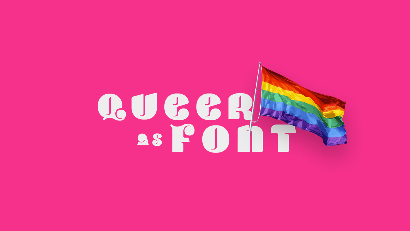
Em 2019 me formei no Curso de Design Gráfico da Univille e, portanto, meu projeto final de bacharelado foi o desenvolvimento de uma tipografia de display para o movimento LGBTQ +. Foi usado 03 procedimentos metodológicos diferentes: de Marconi e Lakatos (1985), como base para a pesquisa e fundamentação teórica; Bürdek (1975) e Buggy (2007) como base para o processo de design e desenvolvimento da tipografia.
Em 2020 o projeto foi premiado como Melhor Design de Tipografia Experimental no Clap Awards (International Iberoamerican Design Awards). Clique aqui para ver a página do prêmio
-
In 2019 I graduated from the Graphic Design Course at Univille, and therefore my final bachelor project was the development of a display typography for the LGBTQ+ movement. I've used 03 different methodology procedures: from Marconi and Lakatos (1985), as a base for the research and theory thesis; Bürdek (1975) and Buggy (2007) as a basis for the design process and development of a typography.
In 2020 the project was awarded as Best Experimental Typography Design at Clap Awards (International Iberoamerican Design Awards). Click here to see the award page.
Process: Bibliographic Research • Problematization • Analysis • Sketching • Refining
Orientation: Profª Drª Isadora B. Dickie and Msc. Haro Schulenburg
Um dos questionamentos iniciais do projeto foi como o design poderia ajudar a dar voz e apoio ao movimento LGBTQ+. Por meio da semiótica e do design como forma de ativismo, o desenvolvimento de uma tipografia poderia fornecer esse auxílio a designers e grupos ativistas LGBTQ +.
Uma tipografia display se caracteriza por ser utilizada em grandes tamanhos, logo os aspectos ergonômicos não são tão importantes quanto os aspectos semióticos. Para isso, foi importante mergulhar nos temas relacionados ao Movimento LGBTQ +, Semiótica, Tipografia até o Design Ativista.
-
An early questioning of the project was how design could help to give voice and support for the LGBTQ + movement. Through semiotics and design as a form of activism, the development of a typography could provide this aid to designers and LGBTQ + activist groups.
A display Typography is characterized by being used in large sizes, so the ergonomic aspects are not so important as the semiotic aspects. For this, it was important to dive into the related topics LGBTQ + Movement, Semiotics, Typography and even Activist Design.
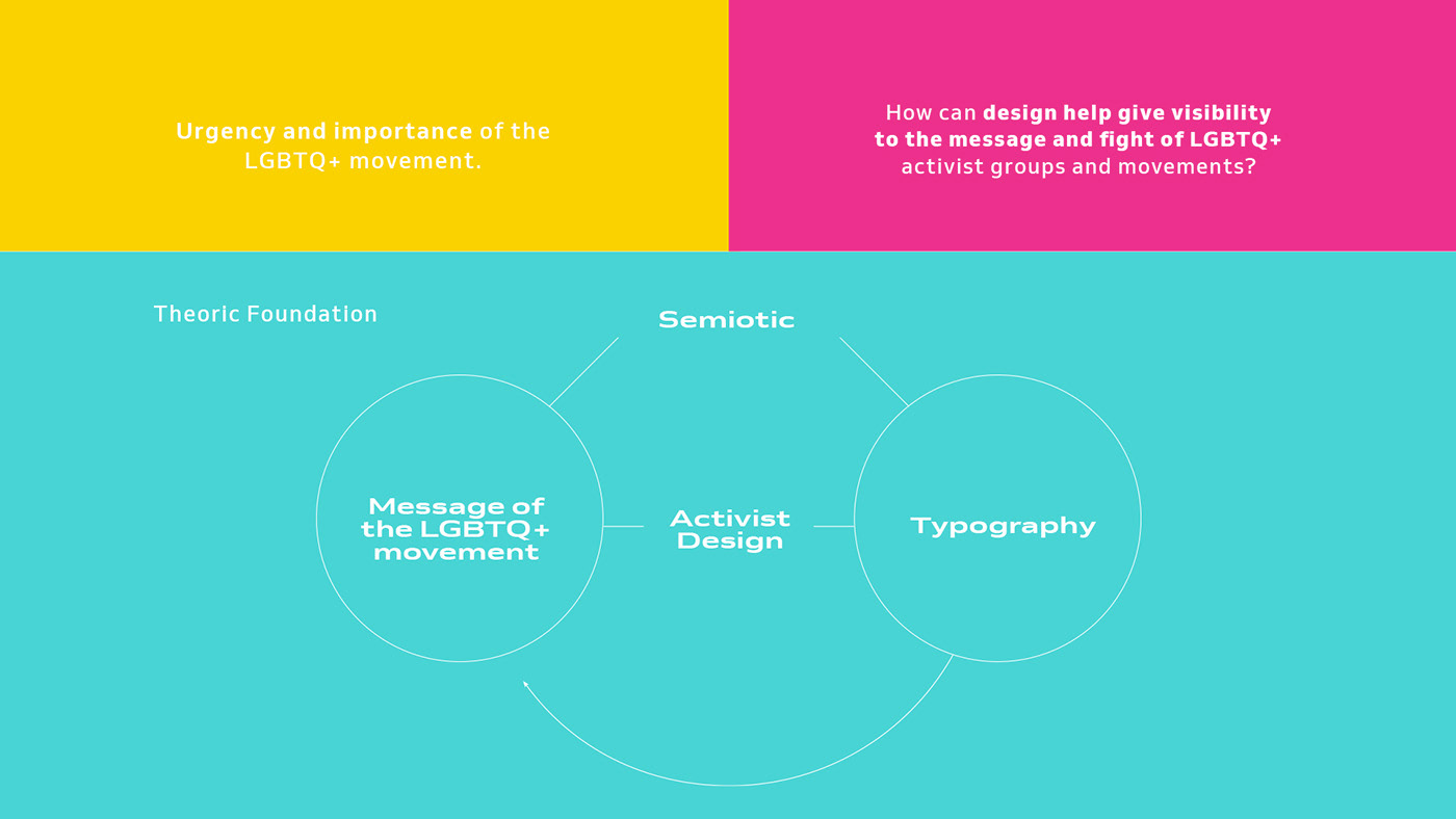
A fundamentação teórica foi extremamente importante para que eu pudesse mergulhar nos tópicos relevantes do projeto. Aprender e descobrir mais sobre o movimento LGBTQ + foi fundamental para entender a necessidade e a importância do design gráfico para o movimento.
Após toda a fundamentação teórica, analisei 20 materiais entre cartazes, design e arte, jornais e também fotos de movimento de rua. Para o projeto foi muito importante uma análise profunda com foco na tipografia e na Semiótica, método proposto por Brisolara (2009).
-
The theoretical foundation was extremely important for me to dive into the important topics of the project. Learning and discovering more about the LGBTQ+ movement was very fundamental to understand the need and importance of graphic design for the movement.
After all the theoretical foundation, I analised 20 materials including poster signs, design and art work, newspapers and also street movement pictures. For the project it was really important a deep analysis focusing on typography and Semiotics, method proposed by Brisolara (2009).

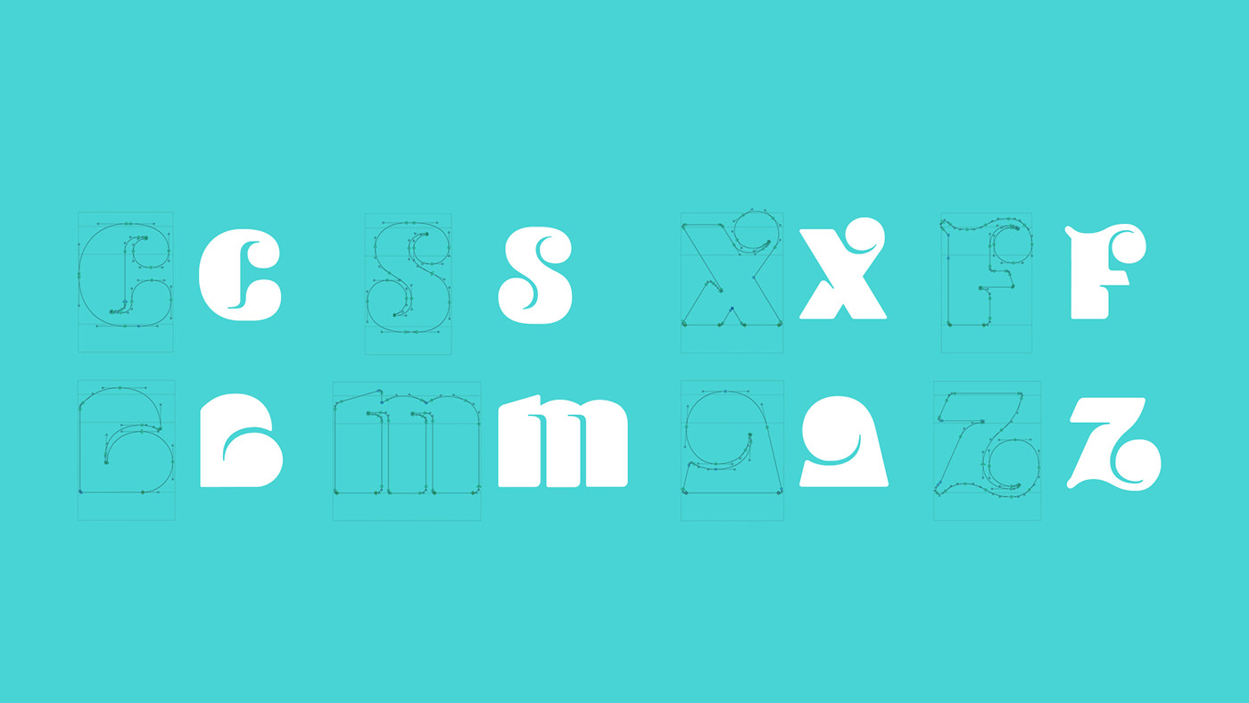
Depois da fundamentação teórica e de todas as análises, comecei a esboçar as ideias que queria implementar na tipografia. Durante a análise, encontrei algumas palavras-chave que foram muito importantes no contexto de Tipos Display LGBTQ +, que foram: Empoderamento, Ativismo e Personalidade. Portanto, esses 3 tópicos foram a base do conceito que eu trouxe para o meu projeto.
-
After the theoretical foundation and all the analysis, I've started to sketch the ideas that I wanted to implement in my typography. During the analysis I found some key words that were really important in the context of LGBTQ+ Display Types, which were: Empowerment, Activism and Personality. So these 3 topics were the base concept that I brought to my project.
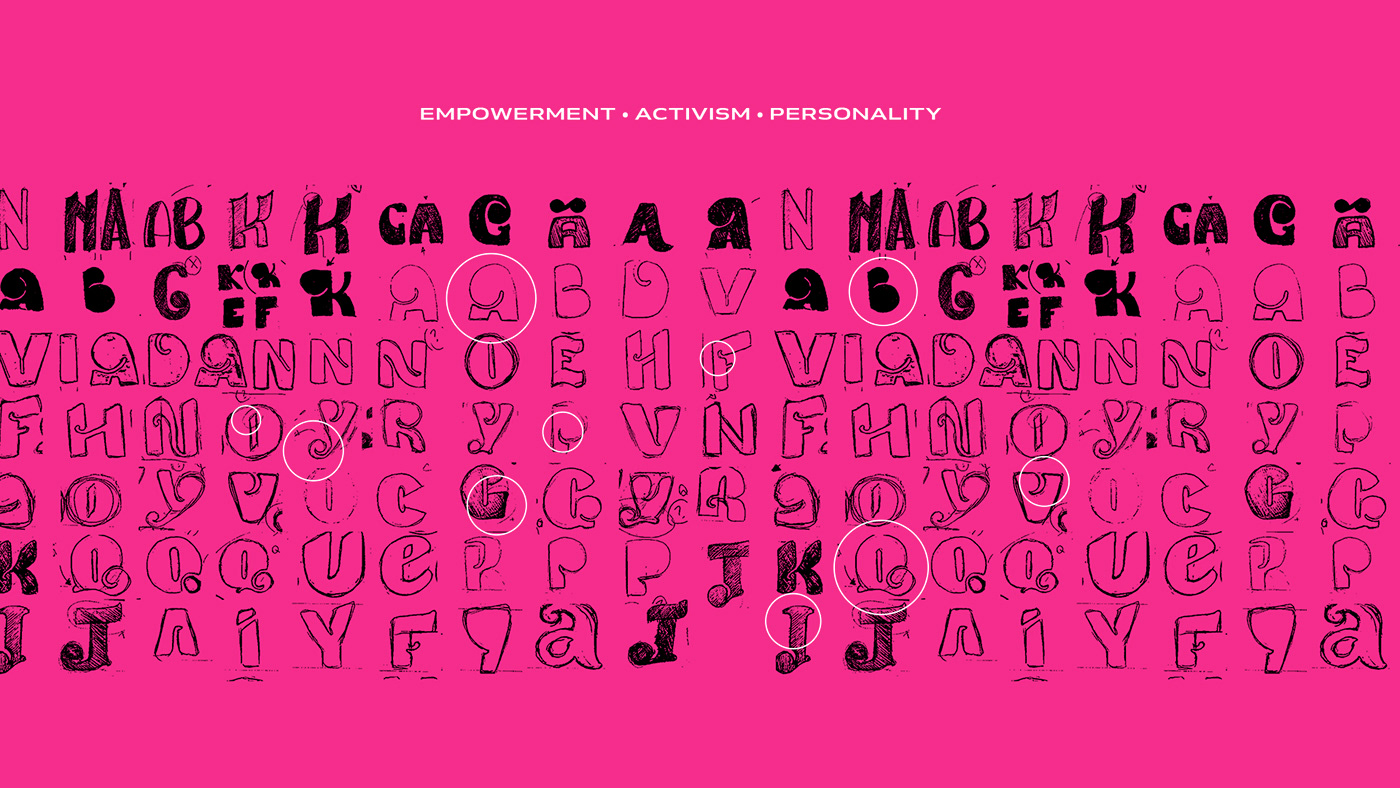
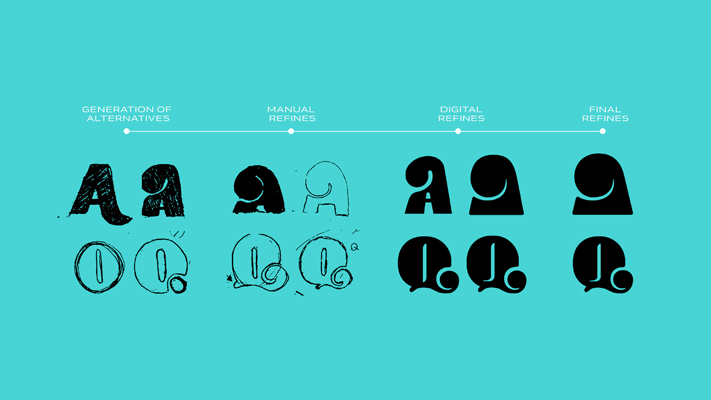
Após mais de 100 rascunhos e alternativas, a seleção foi feita com base nos atributos definidos pelo conceito.
-
After more than 100 sketches of characters and alternatives, the selection was made based on the attributes that I wanted to bring in the concept.

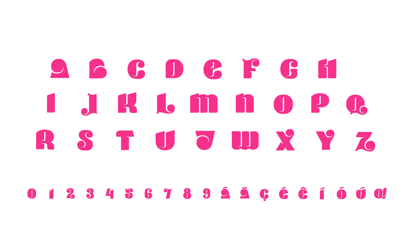
Com uma personalidade de formas únicas, o objetivo da Tipografia surge para se tornar uma ferramenta para artistas, designers, ilustradores e outros cujo objetivo é transmitir a mensagem de empoderamento e ativismo para a comunidade LGBTQ +.
-
With a personality of unique shapes, the goal of the Typography emerges to become a tool for artists, designers, illustrators and others whose purpose is to convey the message of empowerment and activism for the LGBTQ + community.

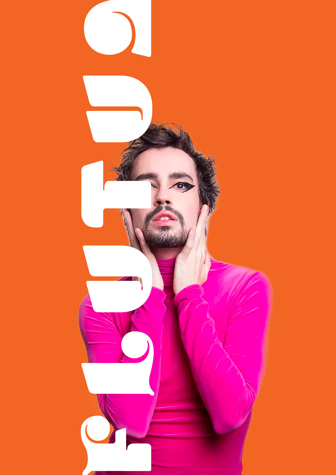
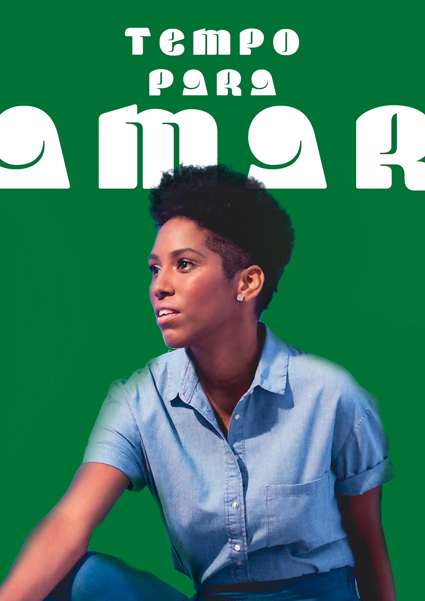
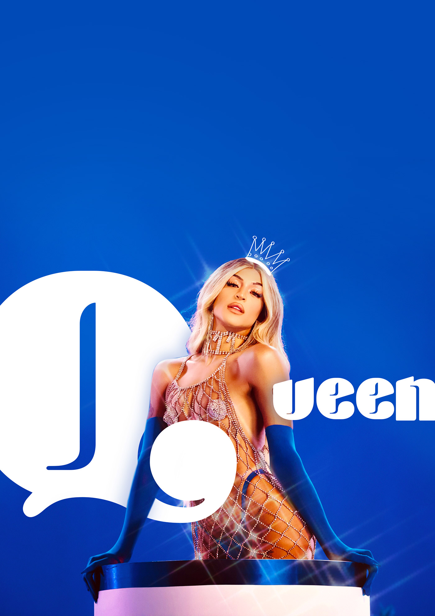
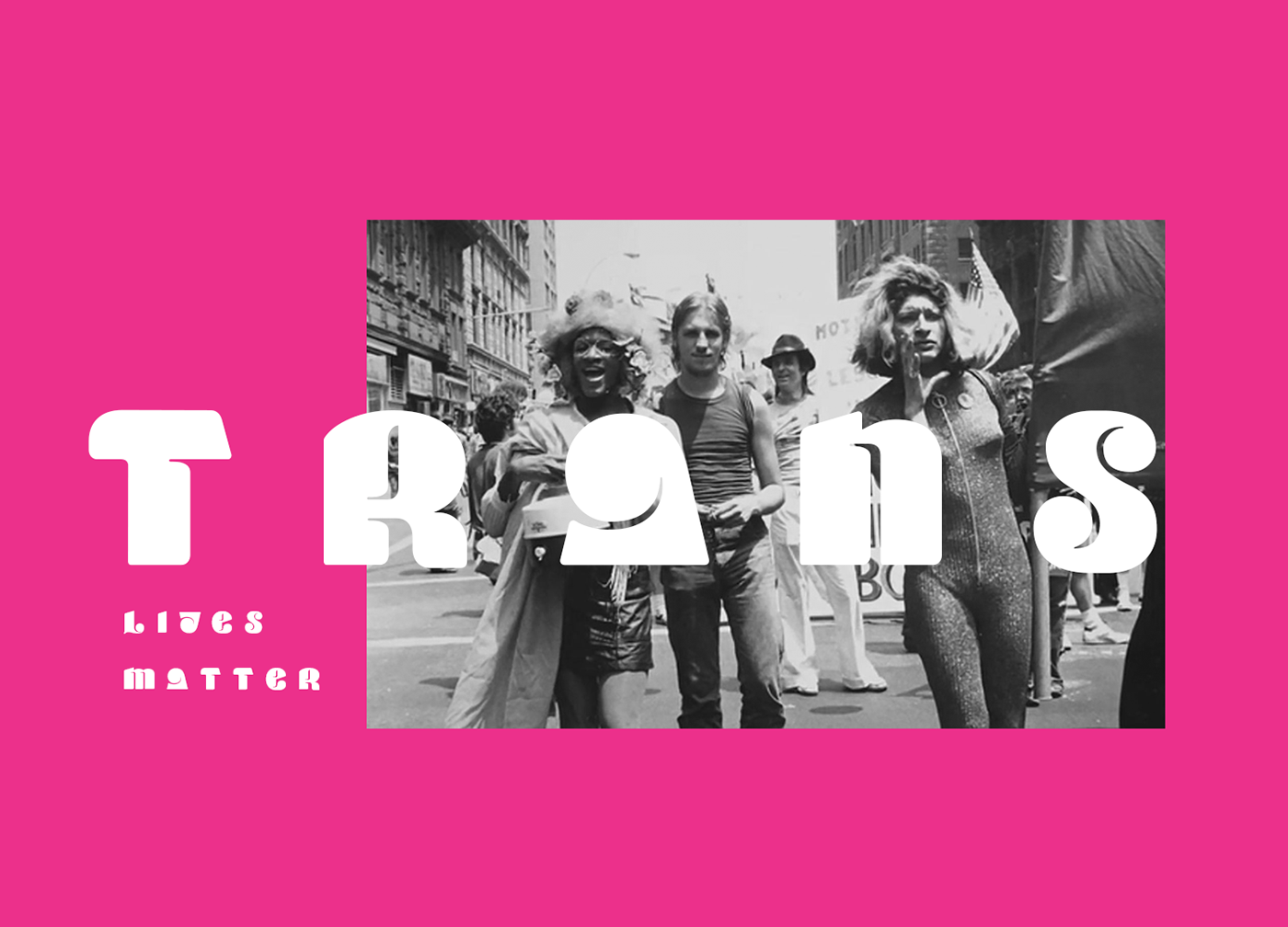
Performance preview in posters and activist signs
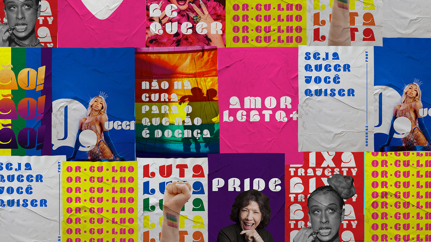
Para a série de cartazes, intitulada “Ícones do Orgulho”, foram utilizadas figuras públicas que são consideradas ícones do empoderamento e da luta pelos direitos LGBTQ +. Foram utilizadas as cores da bandeira do orgulho e também a tipografia desenvolvida, complementando o layout dos cartazes.
-
For the series of test posters, entitled "Icons of Pride", it was used public figures who are considered icons for empowerment and in the fight of LGBTQ + rights. The colors of the pride flag and also the typography were used, complementing the layout of the posters.