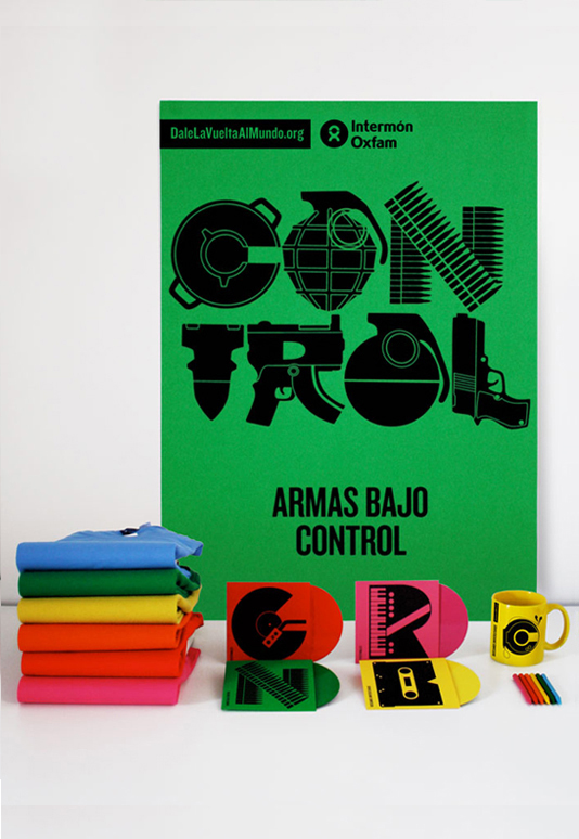
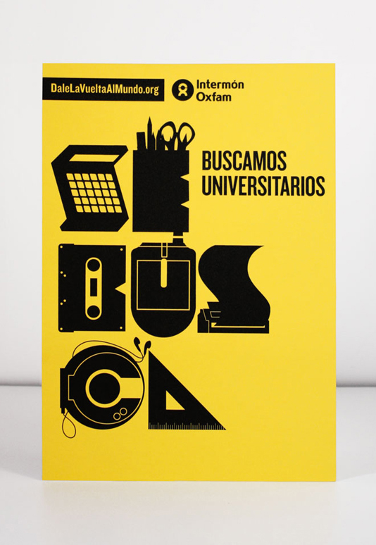
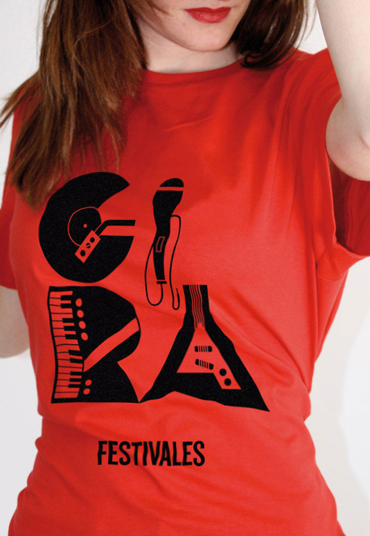
Branding project for Intermón Oxfam, our objective is to renew its image and to create a bigger link between the young ones and Intermón Oxfam. In order to obtain a more visual language, letters become illustrations providing more meaning to words. The letter-illustrations create their own direct and vindicated graphics. Headlines are reduced to one word, thus making communication more direct and quicker. All identity is worked with black ink over colourful paper, creating an economic and easy to produce system.