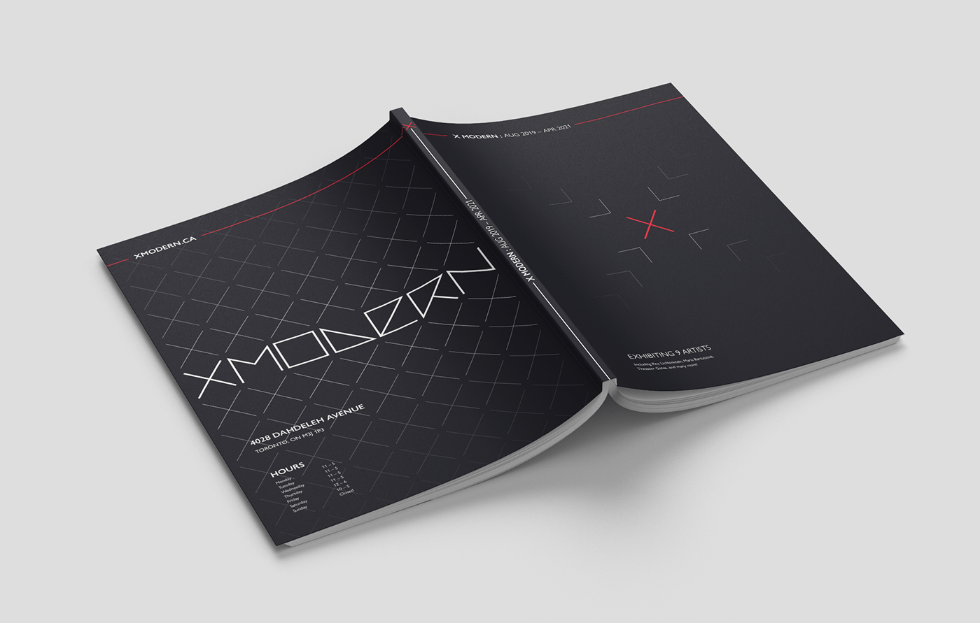
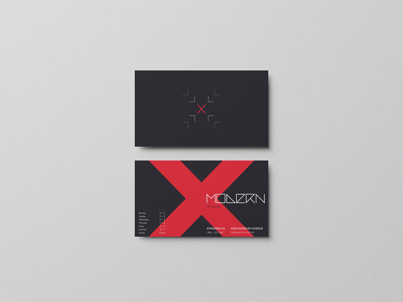
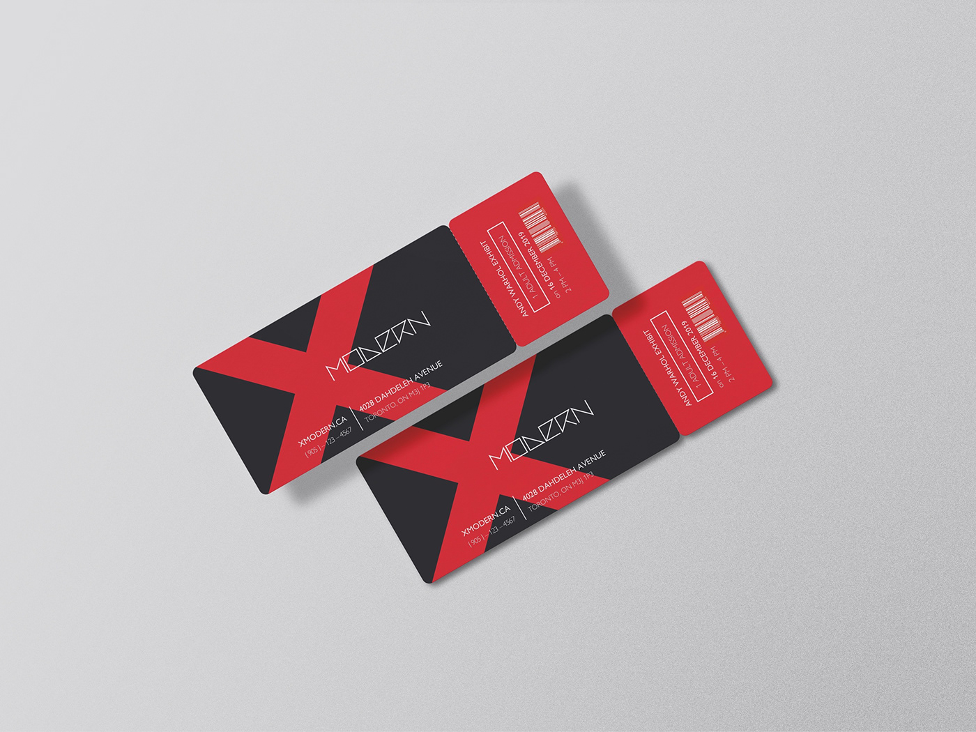
The branding of XModern art gallery began as a university assignment to create a booklet for the imaginary establishment. However, it has grown into more of a fun branding project for the made-up company, including business cards, exhibition tickets, and a storefront sign.
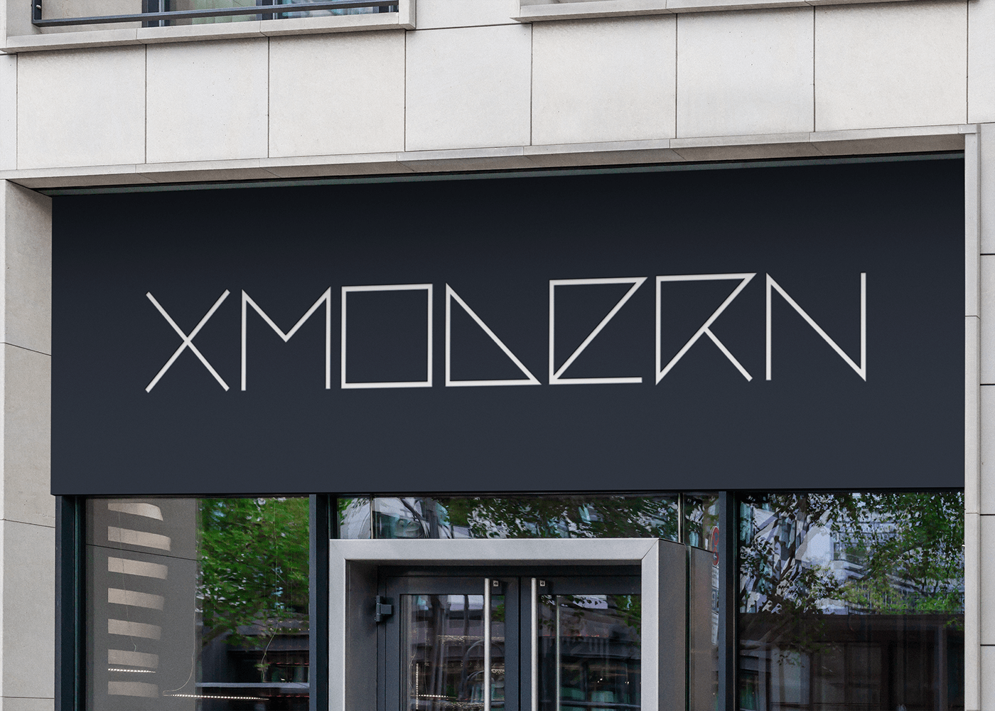
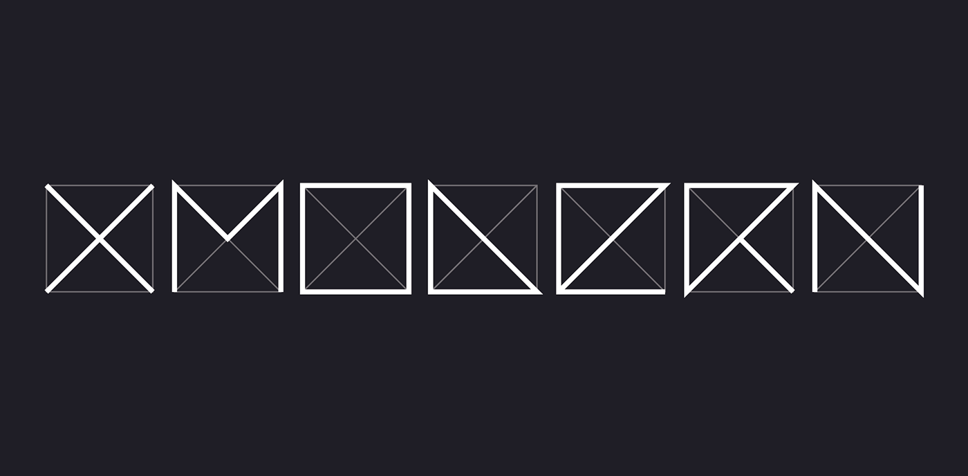
The logo was designed to follow the pathways created by a diagonal cross within a square box, so that each letter is produced with parts of the letter 'X'.
The 'X' is a significant symbol for the company's branding, often emphasized with the colour red (shown in the business cards, tickets, and pamphlet cover).
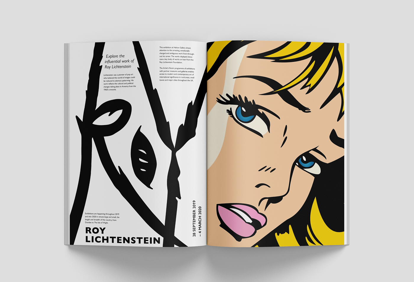
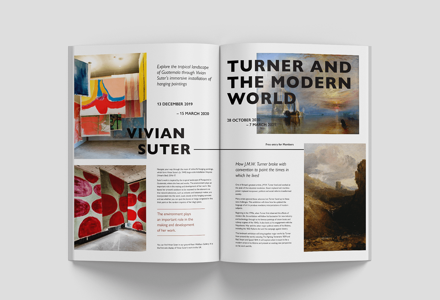
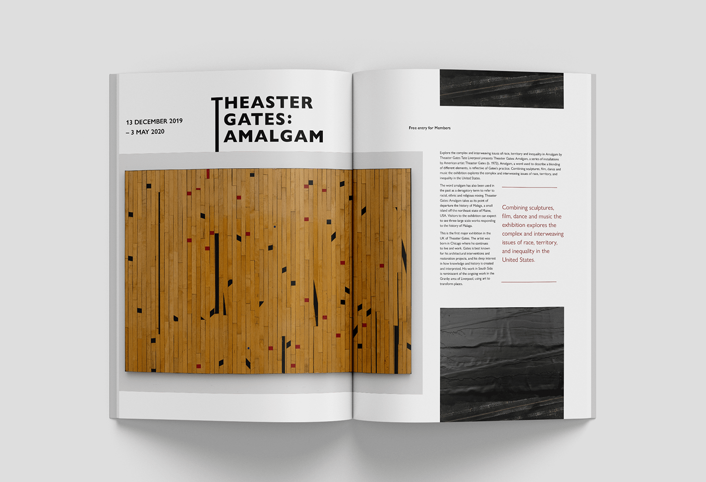
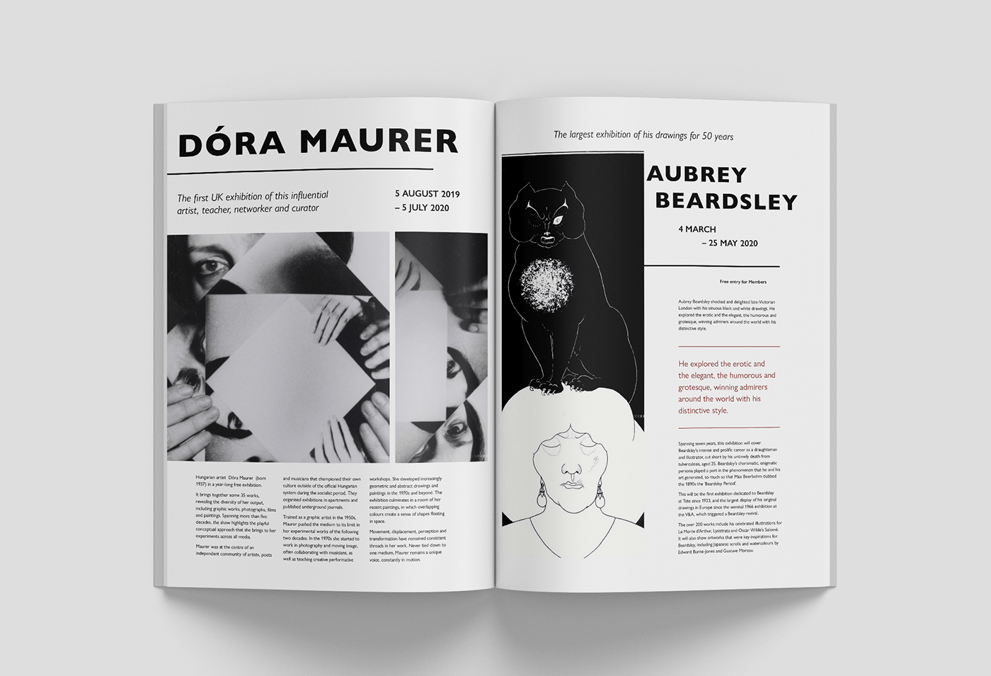
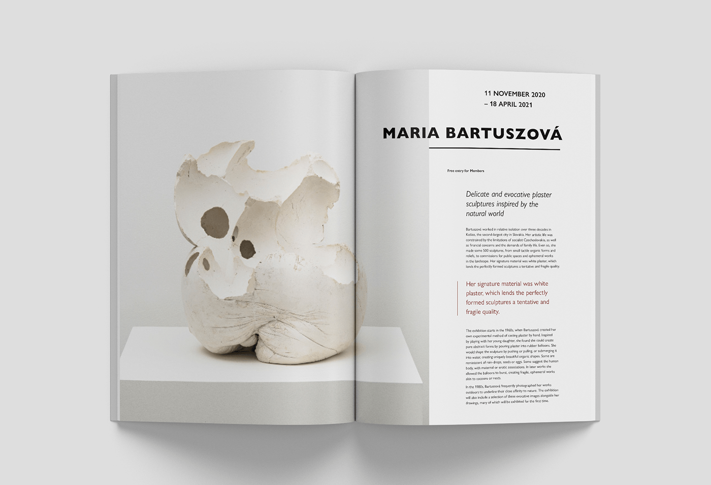
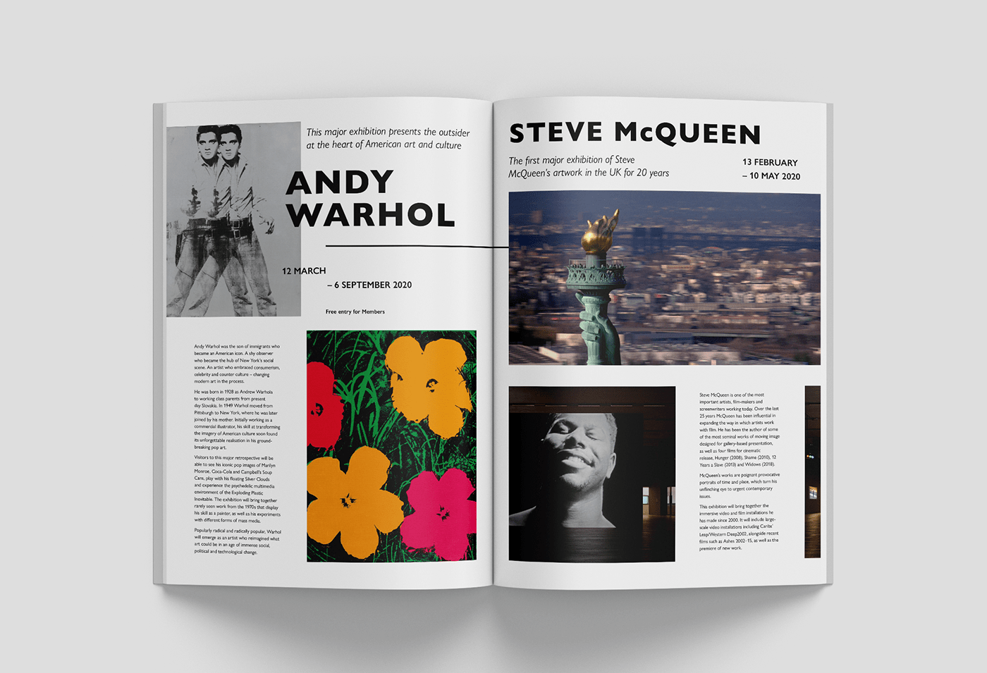
Provided with images and descriptions for nine artists, we were tasked with the creation of a pamphlet for the gallery. The requirements included designing a cover and producing a minimum of eight pages that follow a grid in InDesign. Seven columns are used, repeating the spacing of the logo's seven letters.
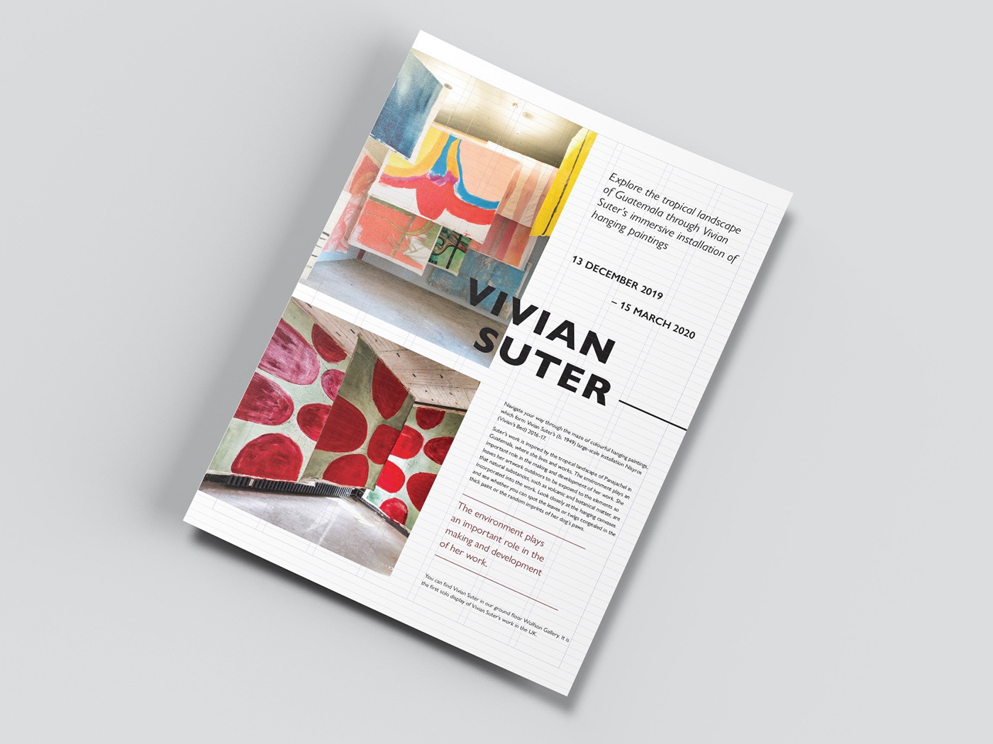
Asides from having to keep within the grid, we were free to experiment with the placement and sizing of both text and imagery.