Hack in the woods festival 2020
I designed the whole image for the festival Hack In The Woods 2020 edition. HITW is the first European festival for developers who code for a better world! For more info: http://www.hackinthewoods.be/
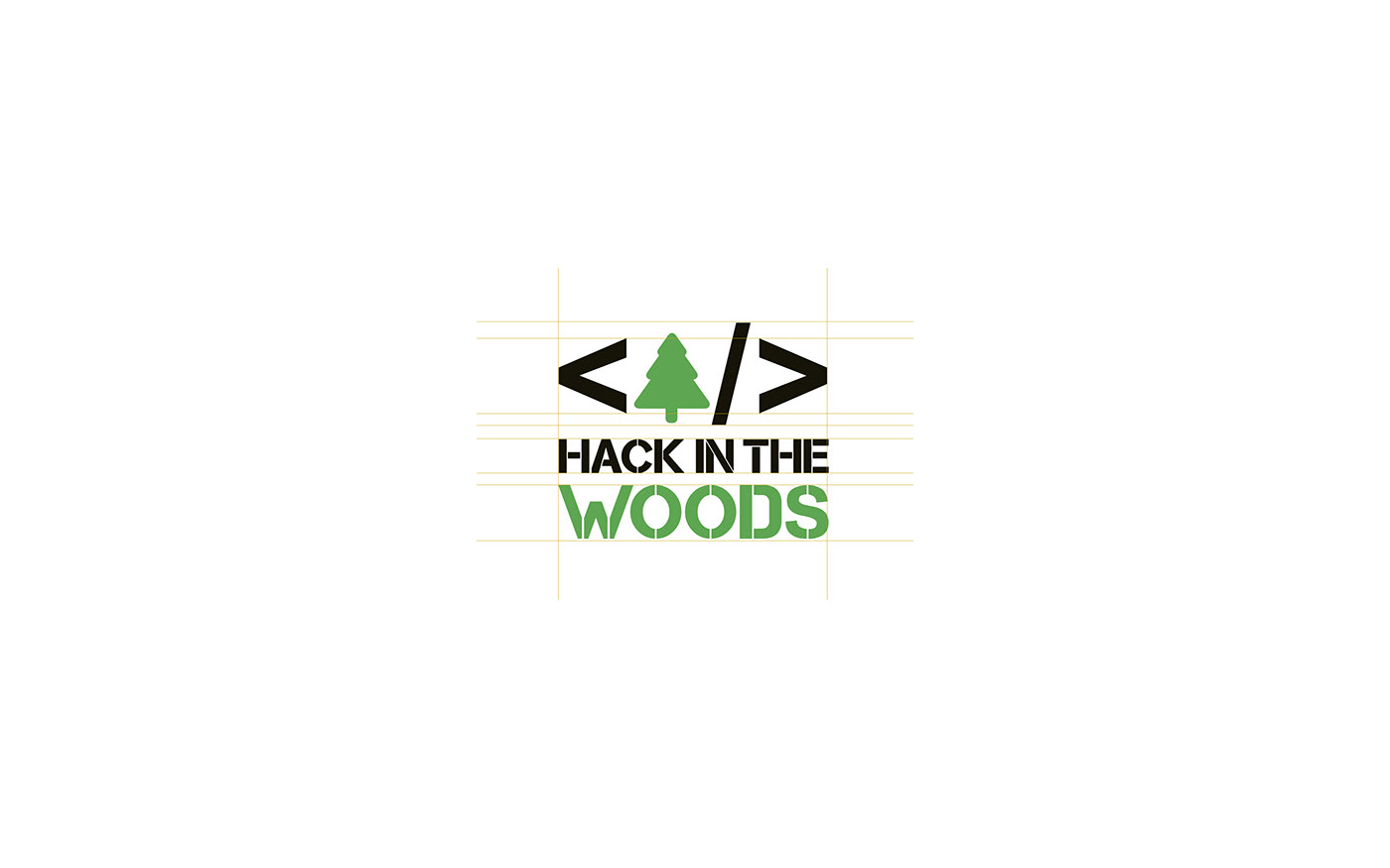
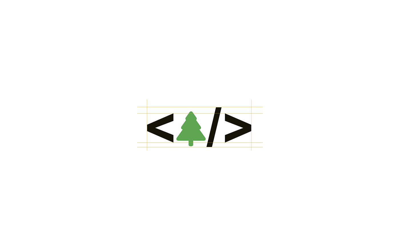
THE LOGOTYPE
The logotype was designed to put the two main ideas of the festival together: as its own name says, technology (coding) and nature (the woods).
As they are two very different concepts, the logotype puts together in perfect armony two different styles: a simpler one to remind the viewer of coding, and a more rustic one to remind the viewer of nature.
THE ISOTYPE
The isotype makes the logotype simpler and it reduces it to only the most graphic part of it.
It is more remindable, easier to repeat without overwhelming the viewer and easier to print in smaller sizes.
It is more remindable, easier to repeat without overwhelming the viewer and easier to print in smaller sizes.
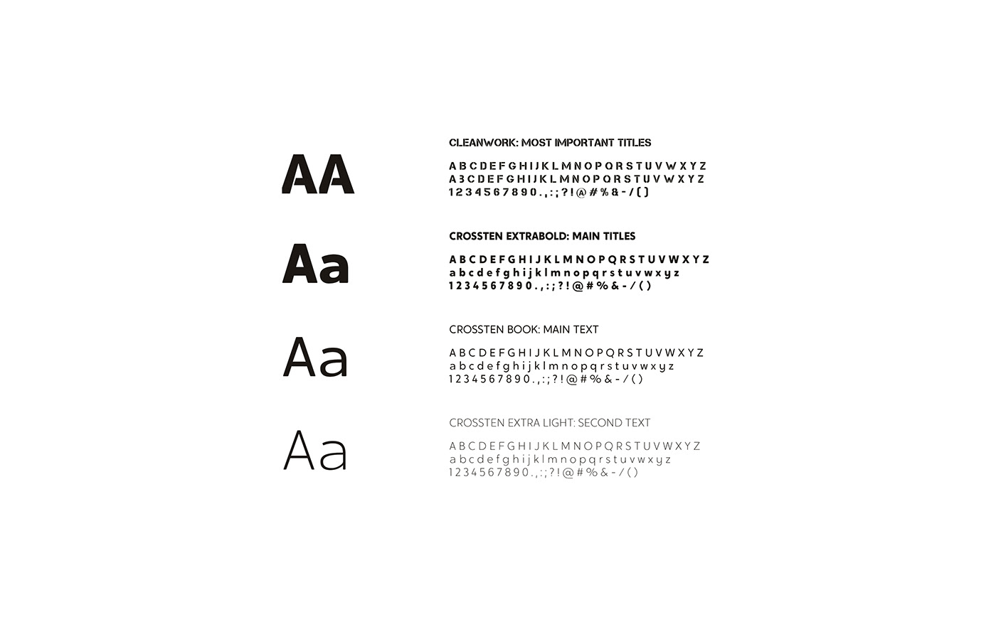
TYPOGRAPHY
As the logotype, two very different typographies has been combined to express the two main different ideas of the festival.
Cleanwork has been chosen to remind the viewer to nature and wood.
Crossten, on the other hand, is a simpler font which will remind the viewer to technology and modernity.
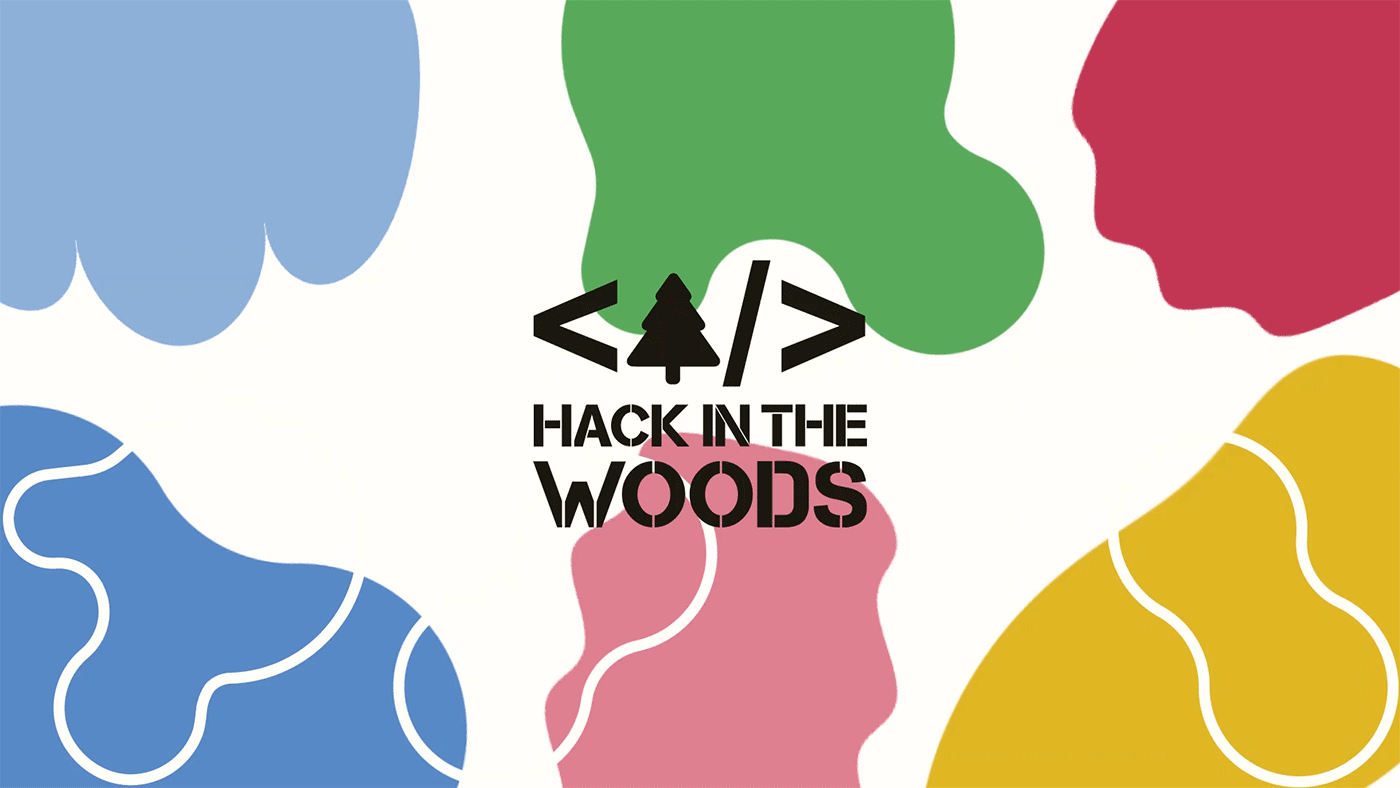
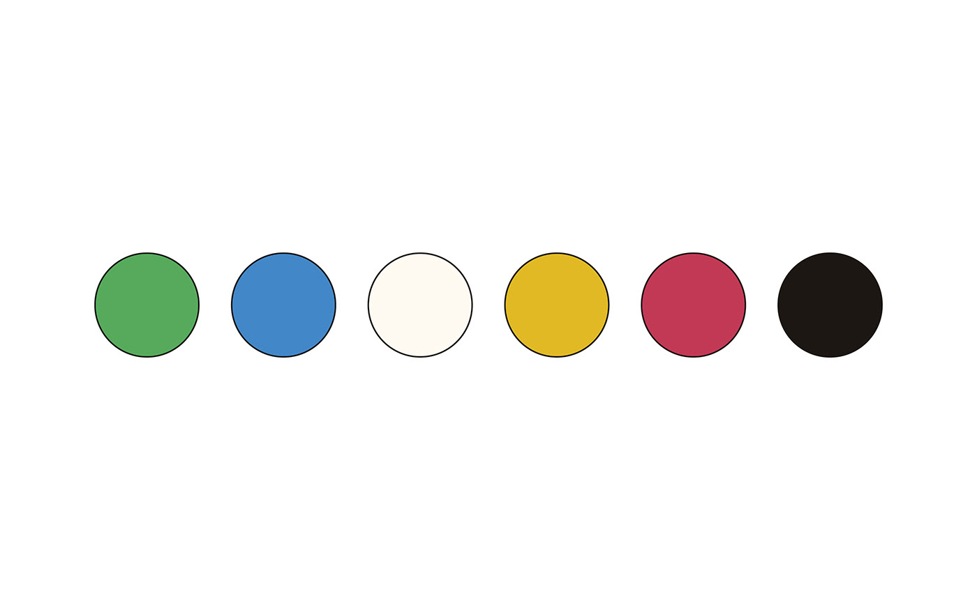
CORPORATE COLORS
2020 ELEMENTS
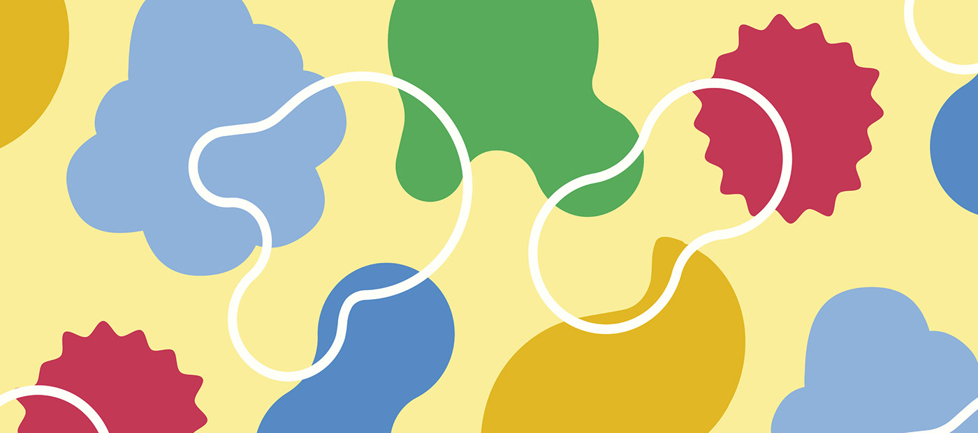
Apart from the tree and the coding elements of the logo, 2020´s edition has its own design and shapes.
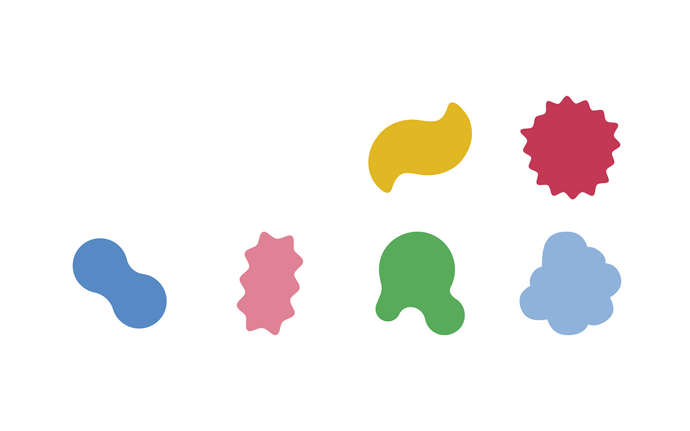
SHAPES
There are 6 different shapes that can be used in all the different colors of the corporate palette.
APPLICATION OF SHAPES
All these shapes can be adapted and applied to different formats.
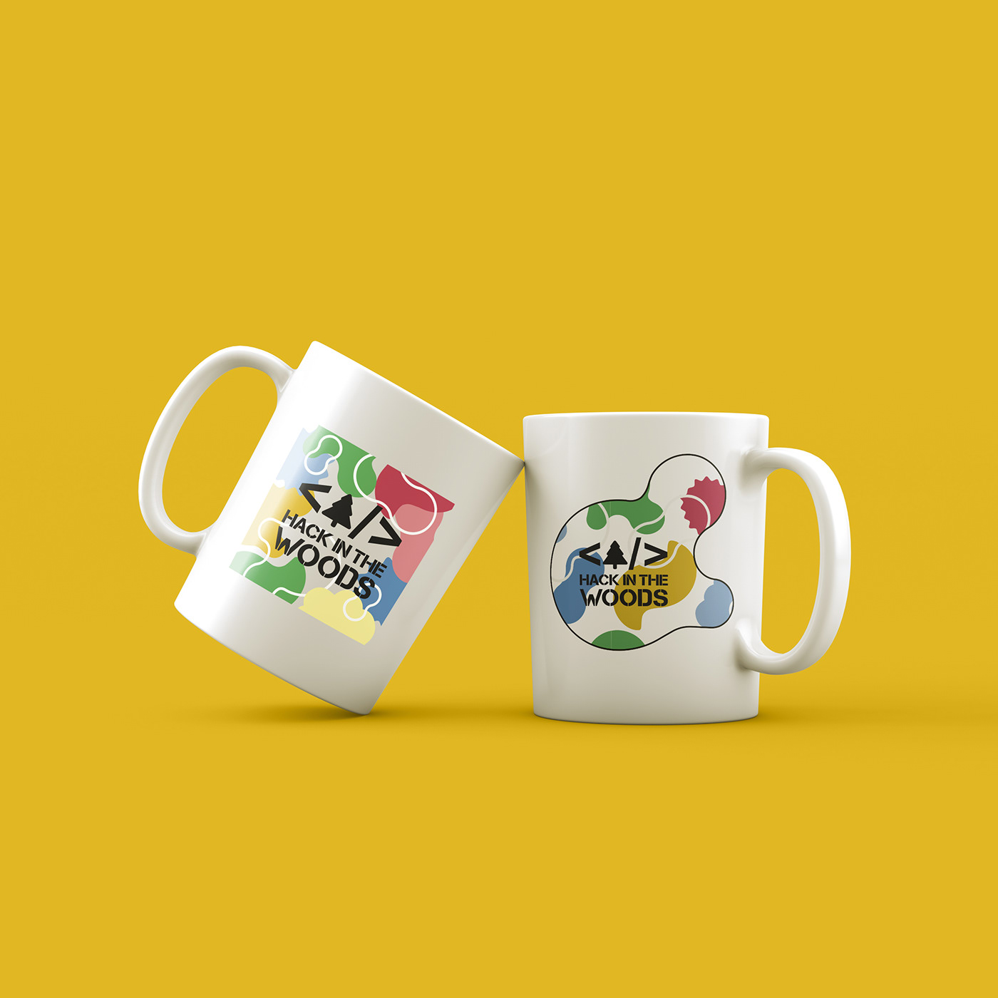
They can be used as frames for photos, for profile pictures, for pins, t-shirts, etc
They can be used as frames for photos, for profile pictures, for pins, t-shirts, etc
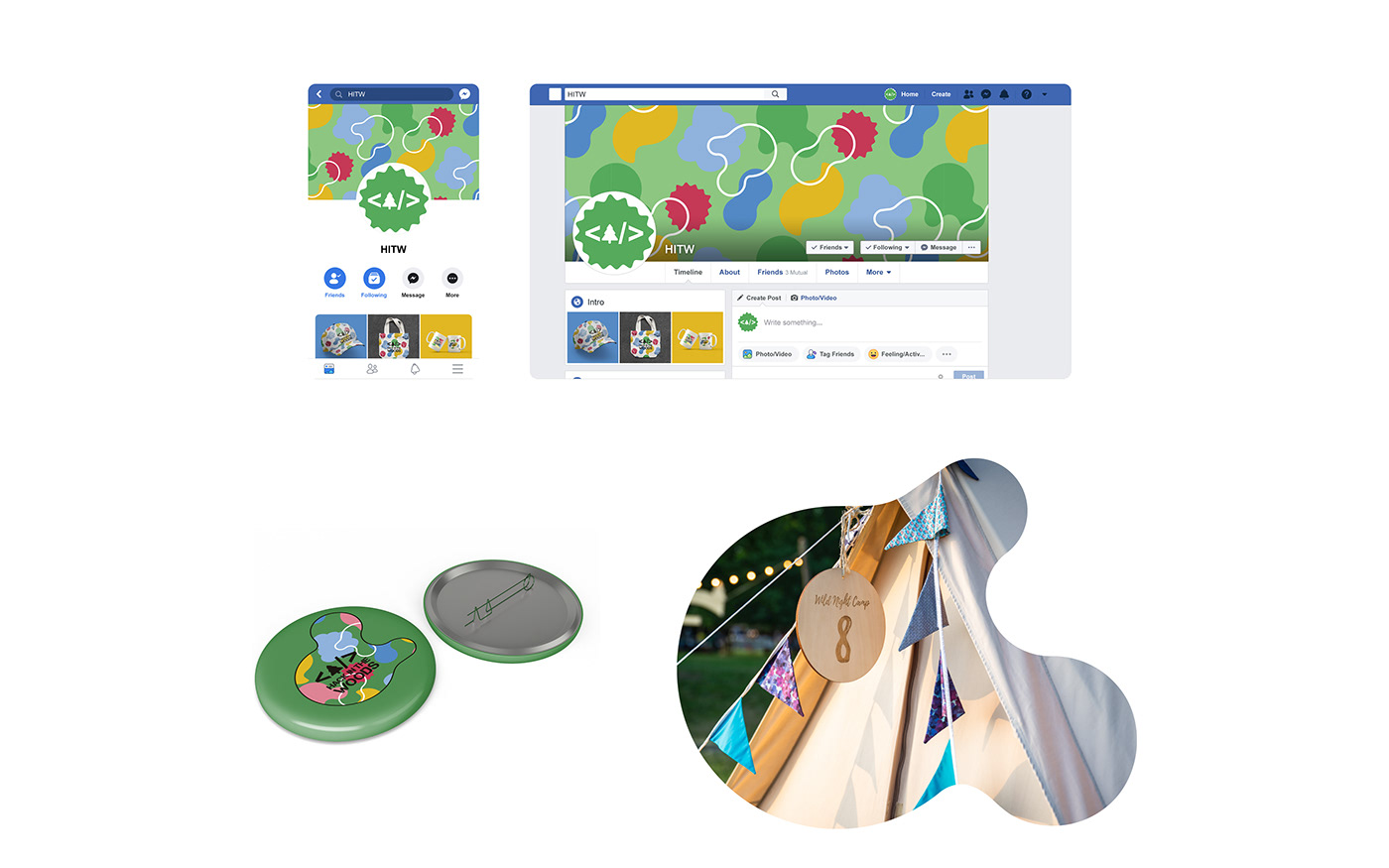
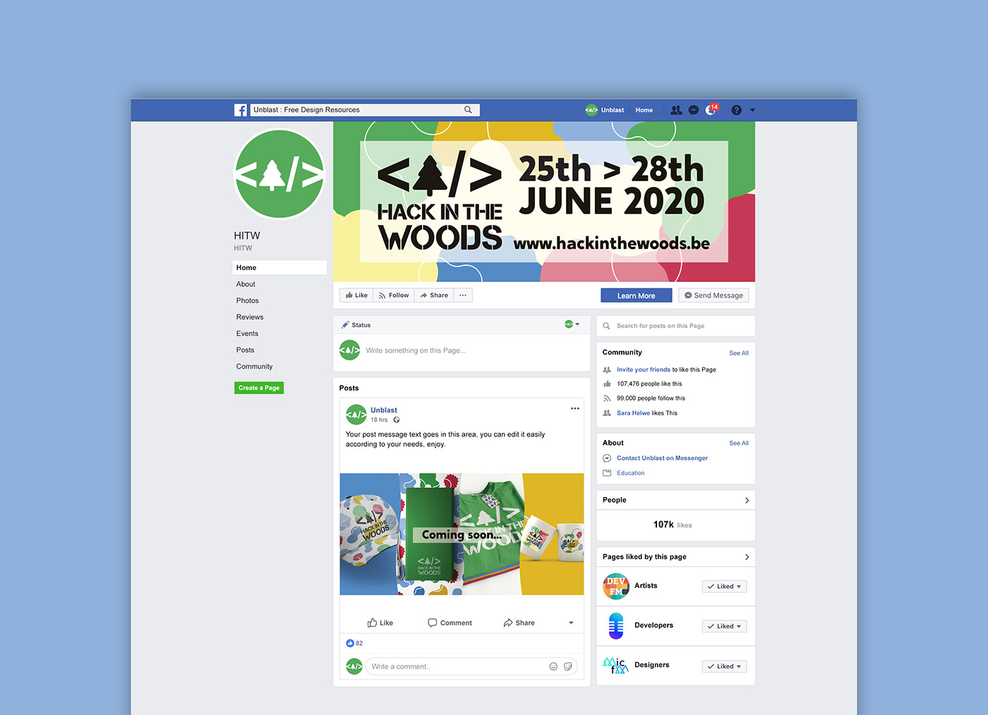
APPLICATION OF IMAGE