AMBITION
The Juice Agency evolved from a design shop with a seven year history of creating award-winning work for some of Canada’s leading advertising and marketing agencies. In 2011, Partners made the bold move to rebrand and become a direct-to-client agency, with the belief that the Juice could plan and execute digital marketing better, cheaper and more transparently.
ACTION
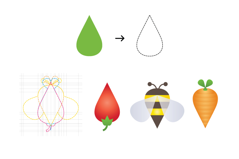
The TJA core brand pillar is constant evolution and change. That believe led to an idea of dynamic, changing one identity; a core shape that could serve as container for different layers of meaning. After exploring several promising options, became obvious that the simple, organic droplet is the shape. It spoke to the brand story better than anything else, and held the potential for a larger identity system.
Recognizing that the logo needs something clean and rigid to lend stability and maturity to the ever-changing, colourful variations of the droplet, the DIN typeface became a logical choice with its neat, technical appearance. However, it was necessary to eventually alter DIN’s “J” in order to improve its relationship with the curve of the droplet. This flipped “J” is also a nod to the innovative solutions company strive to bring to business problems.


IMPACT
Dynamic branding made a lot of exposure for The Juice Agency, it has been featured in numerous books, including Los Logos Volume 6 (Gestalten), Dynamic Identities (BIS Publishers), Dynamic Logo (Dopress), and Creative Business Cards (Send Points). You can also find it featured online at sites like Identity Designed.

Thanks for stopping by!
Feel free to visit my website rocanov.com
Keep in touch by clicking the Follow Link at bottom!

