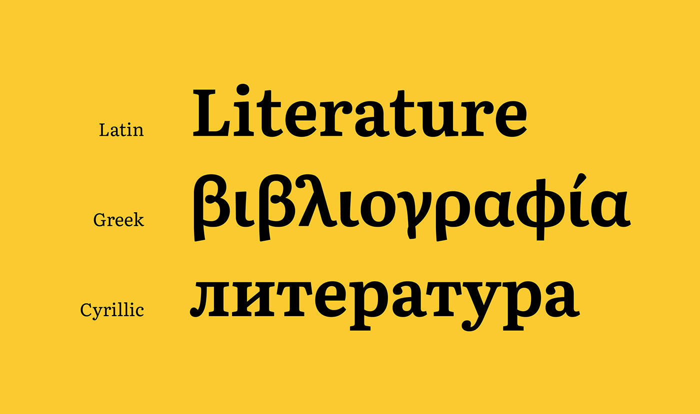
Literata: A proven digital text serif with an arresting upright italic
Now in its third version, Literata is one of the most distinct free font families for digital books. Literata was originally created as the default font family for all Google Play Books, balancing a brandable look for Google with the strict needs of a comfortable reading experience on a wide range of devices with varying screen resolutions and rendering technologies — not an easy task.
TypeTogether solved these problems by designing a familiar roman style (varied texture, slanted stress, and less mechanic structure) paired with an uncommon upright italic that accounts for the inherent limitations of the square pixel grid. Get the entire type family for free!
Type-founding and printing are as much interlinked as digital type and rasterization are. The limitations imposed on type rendering due to coarse grids of
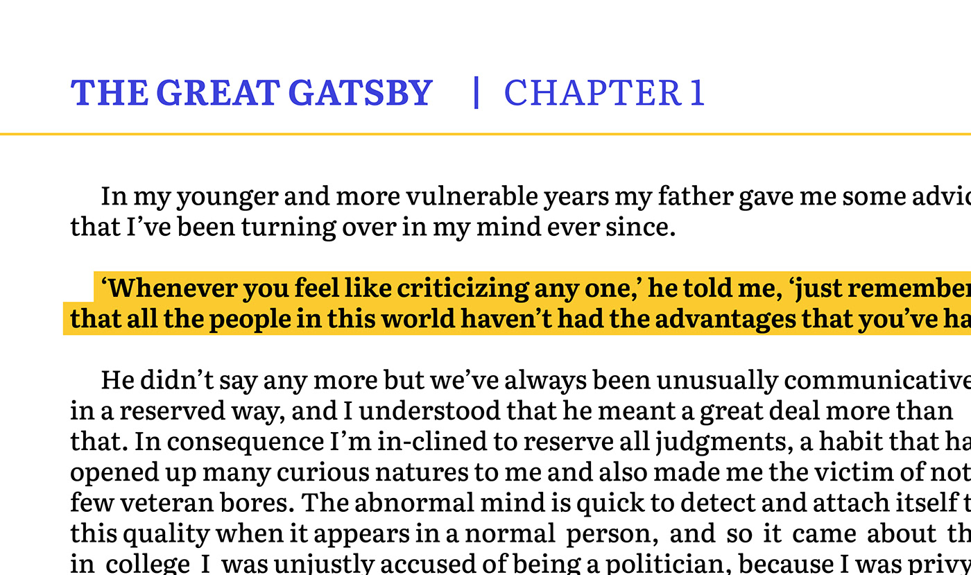
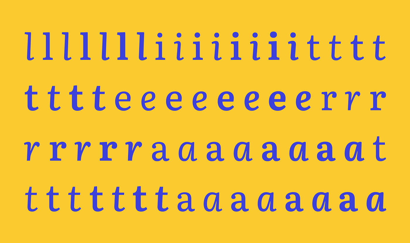
low-resolution screens have therefore affected the way lettershapes look. This became very clear when analysing the typefaces in use in the the market’s most common eBook readers. It came as no surprise that the existing typefaces had a very uniform and almost mechanical feel. This is excellent for rendering purposes, but it does not help with immersive and continuous reading. In other words, they were not fonts meant for book design.
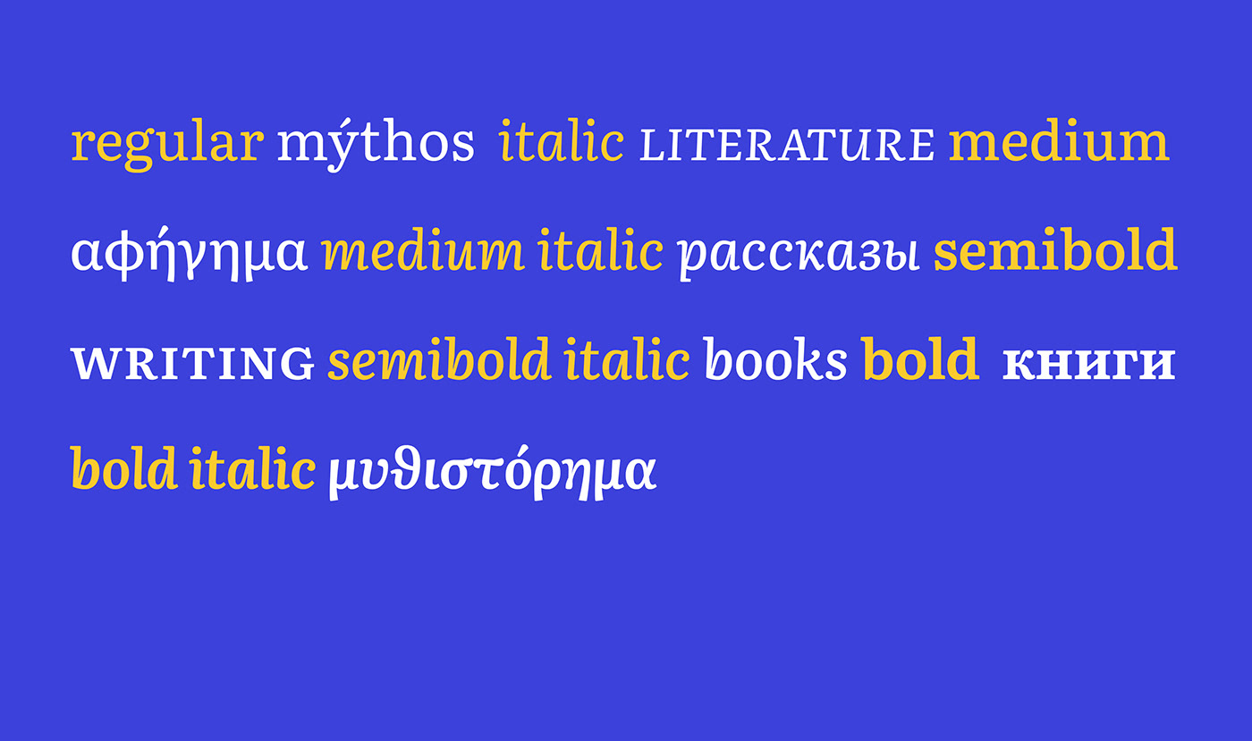
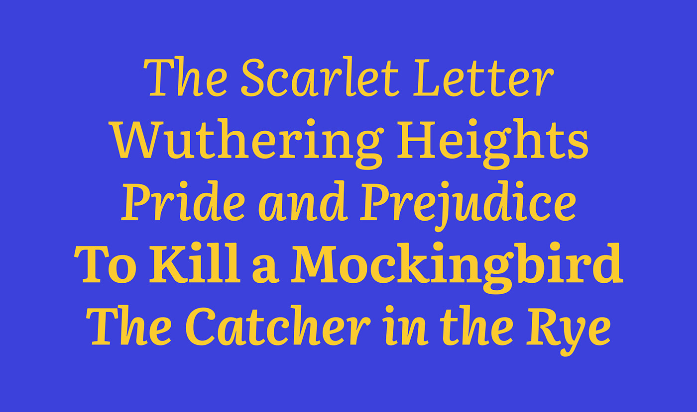
TypeTogether’s counterpart team at Google, led by senior UX designer Addy Lee Beavers, agreed that the desired typeface should have a more interesting and varied texture than other fonts being used in eBooks or ones generally developed for on-screen use. This could be achieved by means of slanted stress, less mechanic letter structure, and varied horizontal proportions of characters. Based on these premises and on an intensive iteration process, TypeTogether arrived at a hybrid solution that took inspiration from both Scotch and oldstyle Roman types. The resulting letterforms create a pleasant organic texture that helps to deliver very good results for ease of reading and comfort.
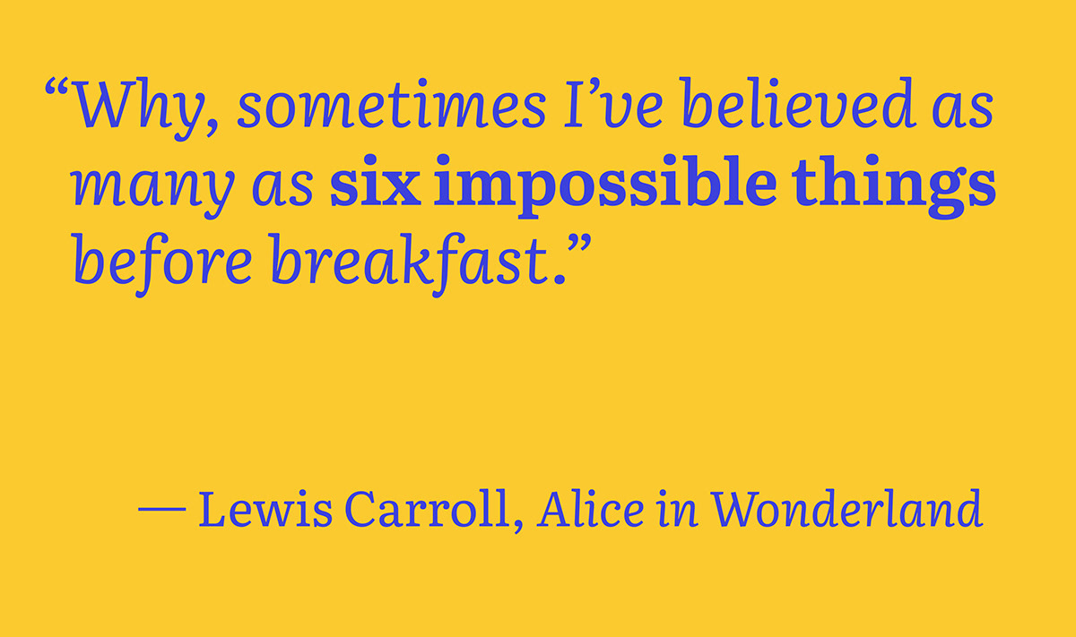
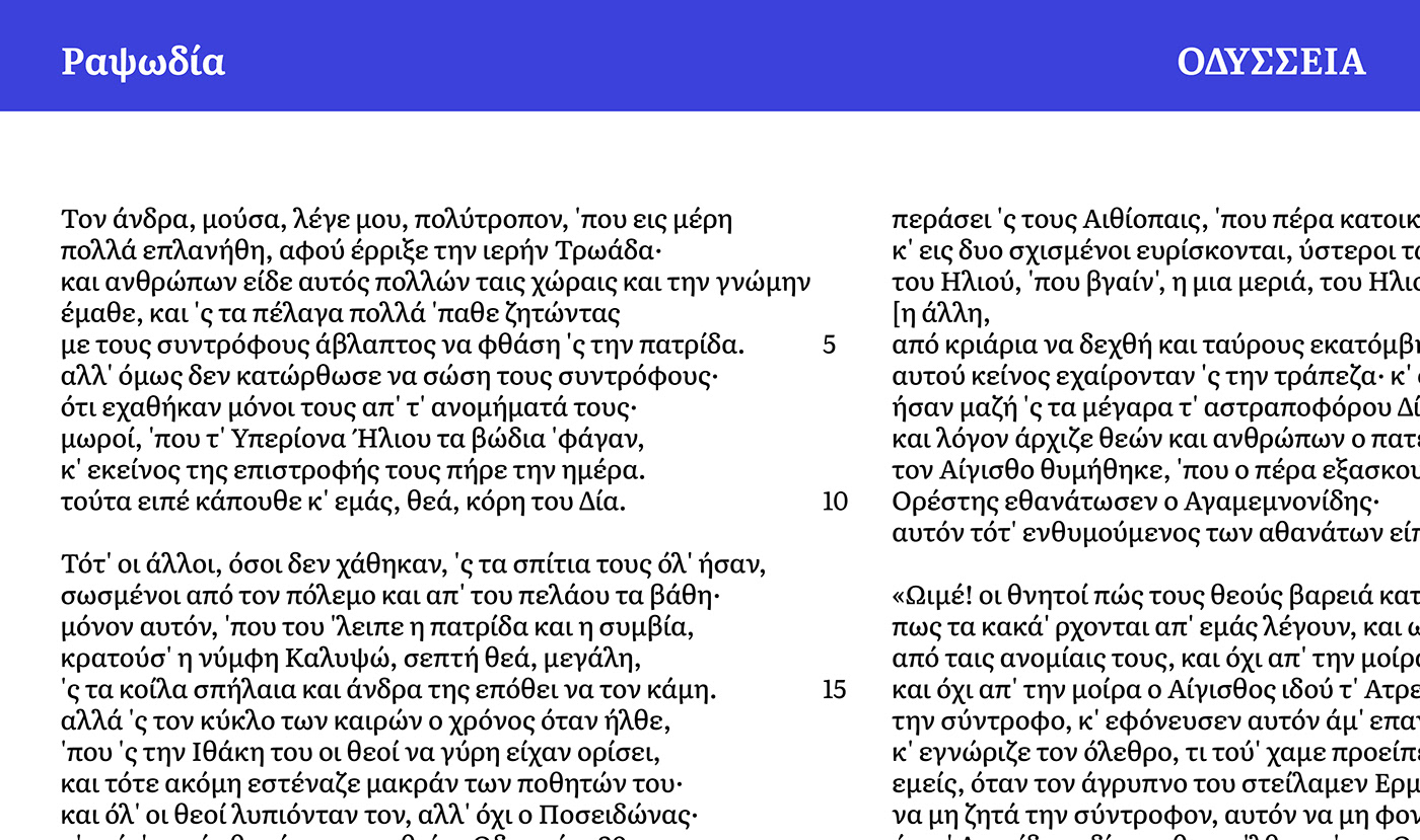
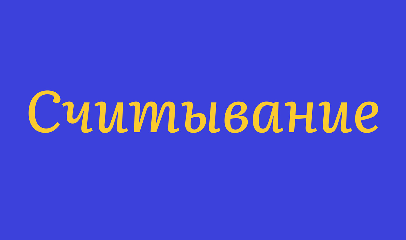
The secondary style is an upright italic, meaning the lettershapes have an italicised construction and no slant to speak of. Albeit rather uncommon in screen fonts, this kind of genre addresses some of the inherent limitations of the square pixel grid. Moreover the resulting unusual italic adds high branding value to Literata, making it unique, recognisable, and easy to remember.
TypeTogether’s counterpart team at Google, led by senior UX designer Addy Lee Beavers, agreed that the desired typeface should have a more interesting and varied texture than other fonts being used in eBooks or ones generally developed for on-screen use. This could be achieved by means of slanted stress, less mechanic letter structure, and varied horizontal proportions of characters. Based on these premises and on an intensive iteration process, TypeTogether arrived at a hybrid solution that took inspiration from both Scotch and oldstyle Roman types. The resulting letterforms create a pleasant organic texture that helps to deliver very good results for ease of reading and comfort.
The secondary style is an upright italic, meaning the lettershapes have an italicised construction and no slant to speak of. Albeit rather uncommon in screen fonts, this kind of genre addresses some of the inherent limitations of the square pixel grid. Moreover the resulting unusual italic adds high branding value to Literata, making it unique, recognisable, and easy to remember.