Smoke On The Water
Southern New Hampshire based Riverside Barbeque Co. brings the North a taste of traditional Southern barbeque. After expanding from take out to full service the menu got a serious upgrade but the branding needed a refresh too. Inspired by a culinary road trip through the South the new direction plays on the culinary heritage of America.
Branding. Web Design, Menu Design, Package Design, Advertising


Drawing off of mid-century American typography, the Interstate font family serves as the foundation for type driven brand assets. Menus, advertising, and packaging feature the same bold type that can be found on way-finding signs across America. This play on American travel culture mirrors the nomadic nature of the restaurant which draws influence from across the U.S.

The menu was designed to be simplistic yet playful and draws from the same typographic base as the branding. Attention to type hierarchy, subtle pops of color, and visual spacing compliment the wide array of barbeque inspired dishes. Printed on untreated paper stock gives a flawed edge effect that gives the menu a rustic feel.


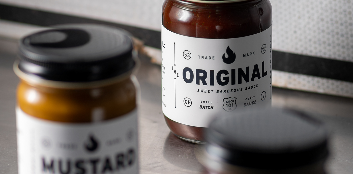
The minimalist typographic label draws the eye with its simplicity. Designed to stand out among the crowd of sauces and dressings the stark black and white logo allows the color of the product to stand out.