Challenge
UX-designers are crucial and highly-demanded specialists. Most good UX-designers are well-paid and do not enter job market, while many people with suspicious skillsets apply to UX positions aiming to get those highly-paid jobs. Being desperate after trying to hire a good UX person for 9 months in a row, we decided to change tactics.
Idea
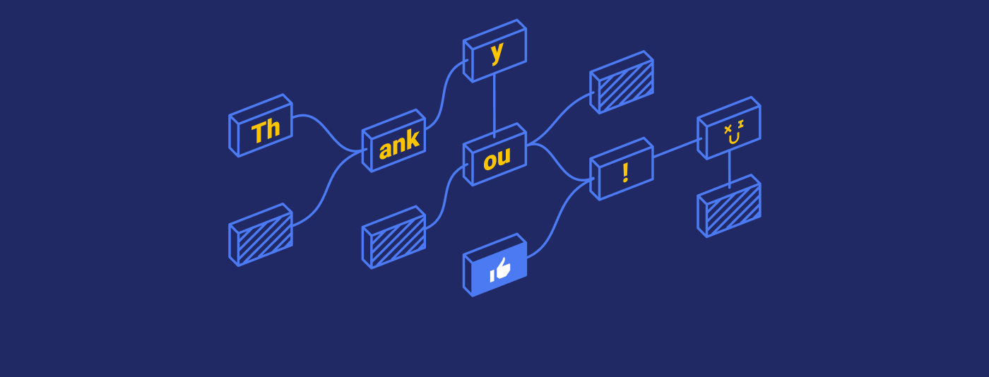
We made UX professionals headhunt themselves by offering them a game they couldn’t resist.
Mechanics
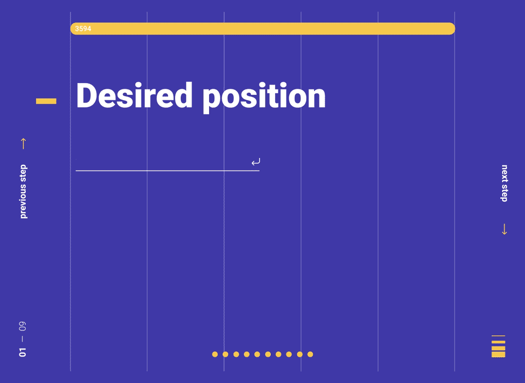
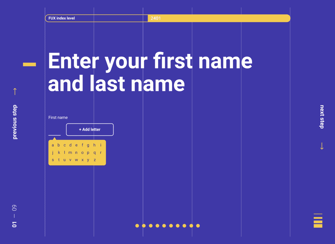
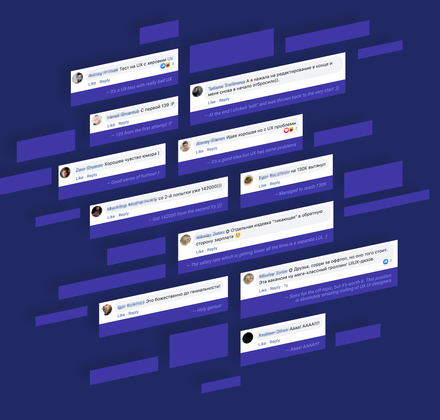
We created a viral application website with a challenging call to action and the worst UX ever. It was so bad that UX perfectionists couldn’t resist going through all the steps and sharing it with colleagues.
It was hard, but our UX achieved:
Vague hintsPainful forms / Randomly curved user journey / Frustrating dialogs / Killing feedback / Unintuitive selectors / Demotivating progress bar


Results
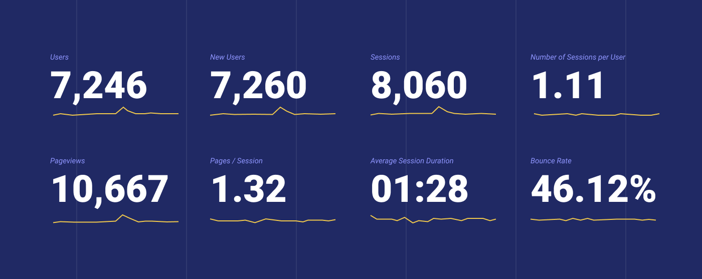
After being posted on just a few accounts and communities, without any paid promotions, our viral site collected about 8000 unique visitors within 3 weeks. An average session duration of 1 minute and 28 seconds proved that most of the visitors completed the whole journey and 300 of them submitted their job applications. One of those candidates got a job with our company.
Production Veeam Software
Creative director Ilya Sokolov
Art director Artem Moskovskiy / Ekaterina Pudanova
Copywriter Olga Makarova
Editor Jacob Browning
Animation Stepan Zykov
Web design Alexey Atapin / Sofia Kochina