


In the design world, its pretty rare to have the chance to work on an airline. Eastern Airlines came to us with an ambitious plan. They were founded in 1926 and were one of the more successful airlines of that decade, along with American and Delta. When they came to us they wanted a clean slate but with the same name. A new airline that focused on the basics and targeted the adventurous spirit. A customer focused on the destination and not the fluff of airline travel.

We found inspiration through our own travel stories, research about the customer we were trying to talk to, and topographic maps that can tell you so much about a place through design. We took that same idea and started to apply it in a logo. Through many iterations we found a way to communicate a topographic map that also represented Eastern Airline’s founding city of Miami, FL. A nice nod to their past without screaming Miami Vice ;)


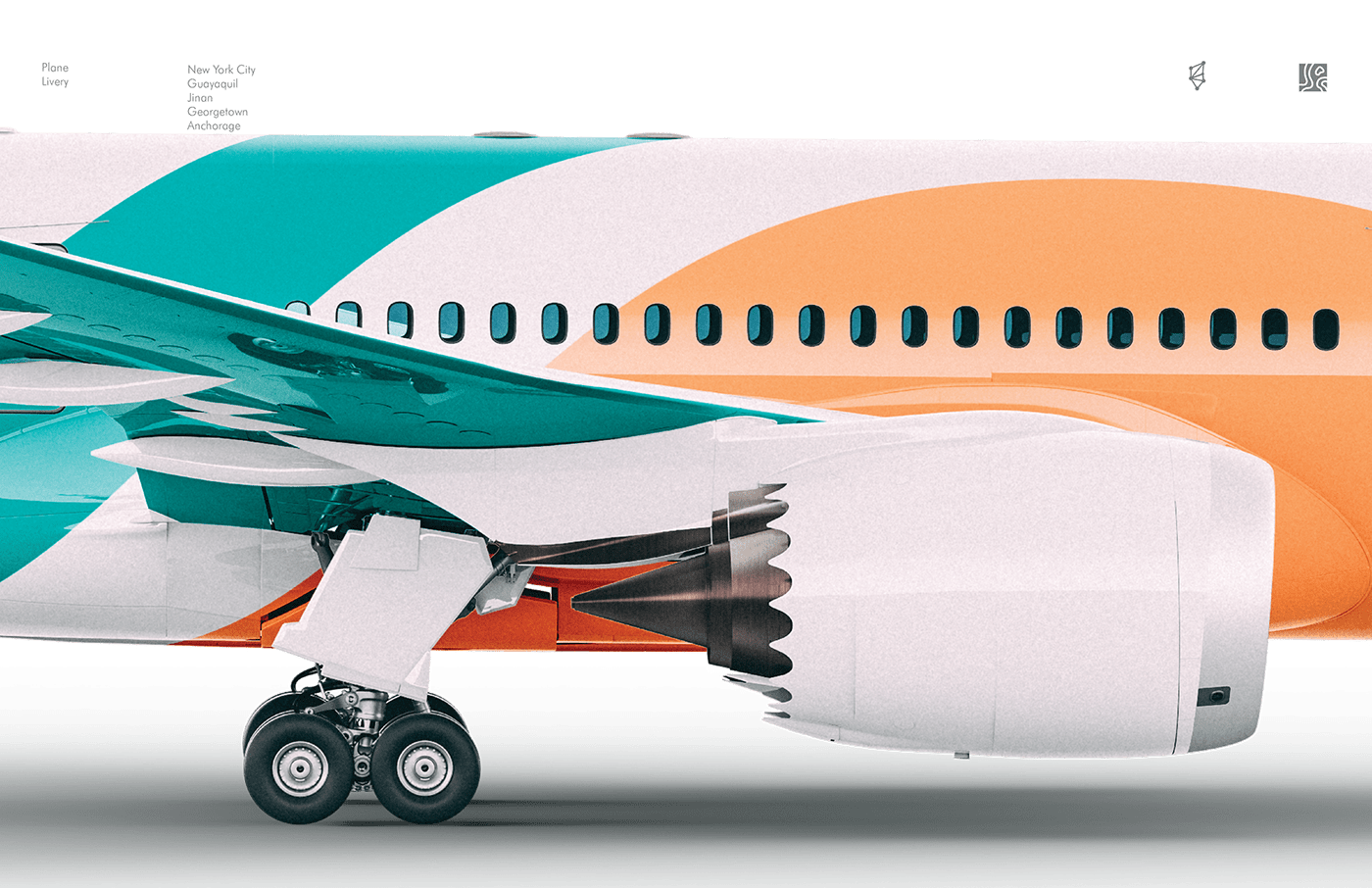


We wanted Eastern’s branding to really mean more than an airline. The aim was to celebrate the places people travel by representing the spirit of the cities Eastern’s routes travel to. So we created a “topographic logo” for the 5 main cities Eastern will fly to. It became a sense of visual pride for each city. Each one had its own unique sub brand. It told the story of the destination by representing the color and topographic shape of the city.


