Make an Aesthetic Design Layout 3 Times
This is my composition assignment in my first-year college class called "Graphic Communications" where I am supposed to adjust the Head, Subheading, Body of text, and images provided, and make an aesthetic layout three different times. I used the design elements and principles when setting up these layouts. Below is what the text and images look like before designing.
In this first layout, I took one of the photos and enlarged it to about half of the page layout so that it would create balance between the photo and the text. I also put the text in close proximity to the photo to increase tension in the layout. The main heading of the layout is located within the image and contrasts with a white color against the background.

In the second page of the first layout, I scaled the image to increase its dominance against the small amount of text at the bottom of the layout .

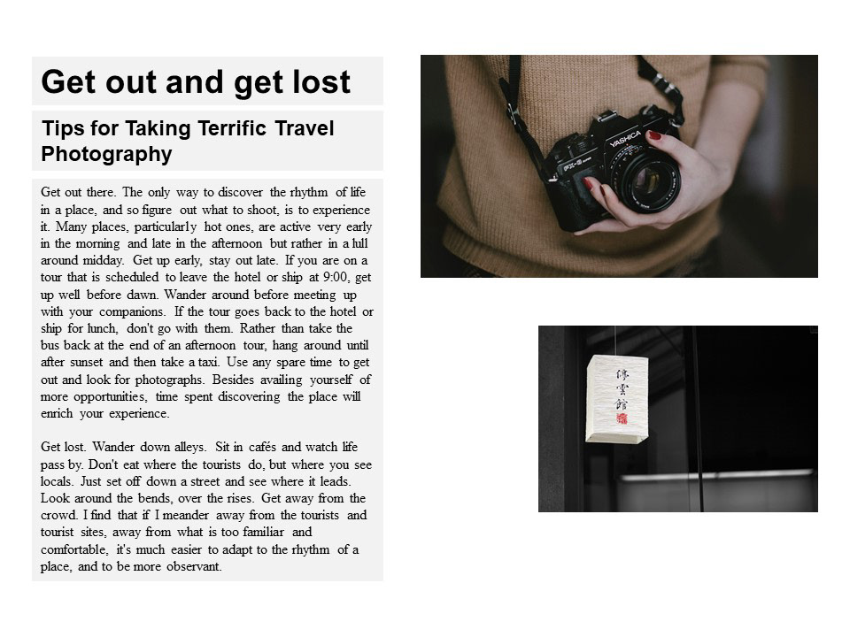
In this second layout, I kept the images and text on the same page, with both having their own side of the layout, creating balance and harmony between the two. I also designed with the rule of thirds in mind, and aligned the main objects in the photos to match intersection points of the rule of thirds.
In this third layout, I enlarge both images to take up the space of the layout. The first page is the title page that establishes the topic of the layout. A light fill around the text helps it stand out from the background image.

Here the main object of the image and the text take up one side of the layout each. The light background surrounding the text helps it stand out against the dark background, and helps give the text more attention from the image.


