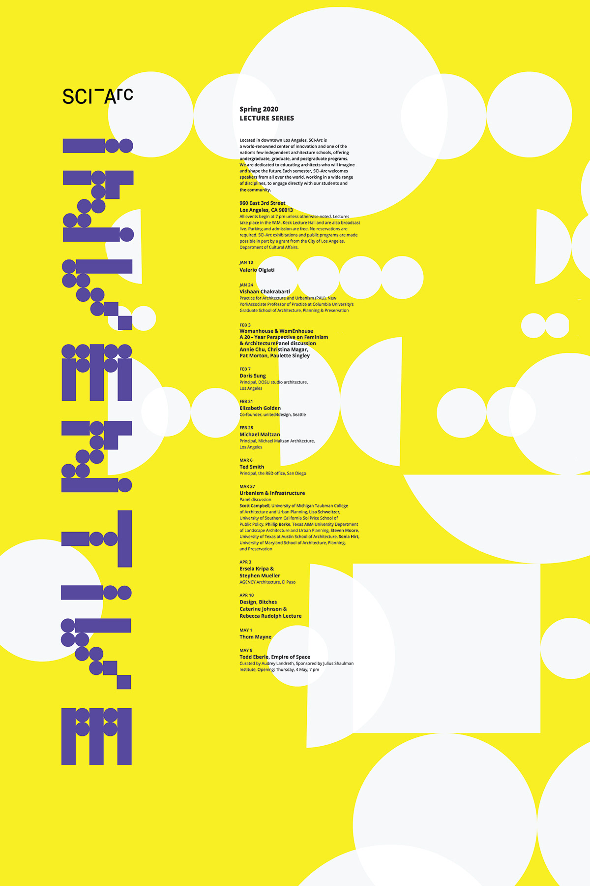
Sci-Arc Poster
Inventive
The goal of this project was to create a 20 x 30 poster for the Sci-Arc Spring 2020
Lecture Series. With that being said, we had to create a modular typeface that would compliment the design of the poster. The typeface I decided to create was based on
a concept of using circles and squares. Next, the name I decided to create for my
typeface was inventive, this title compliments the architectural school, Sci-Arc.
EARLY VERSIONS
Before I decided on the final version of my layout, I experimented with different
positions, colors and sizes to see what felt the best. In doing so, It made me realize
that yellow was the strongest for my background color because it made the rest of
my design pop.

FINAL VERSION
The final version was a combination of all of my previous layouts. With that being said,
I decided that dark purple looked the best for my logo type and that the abstract circles
in the background looked the best white because they did not interfere with the rest
of the design layout.