


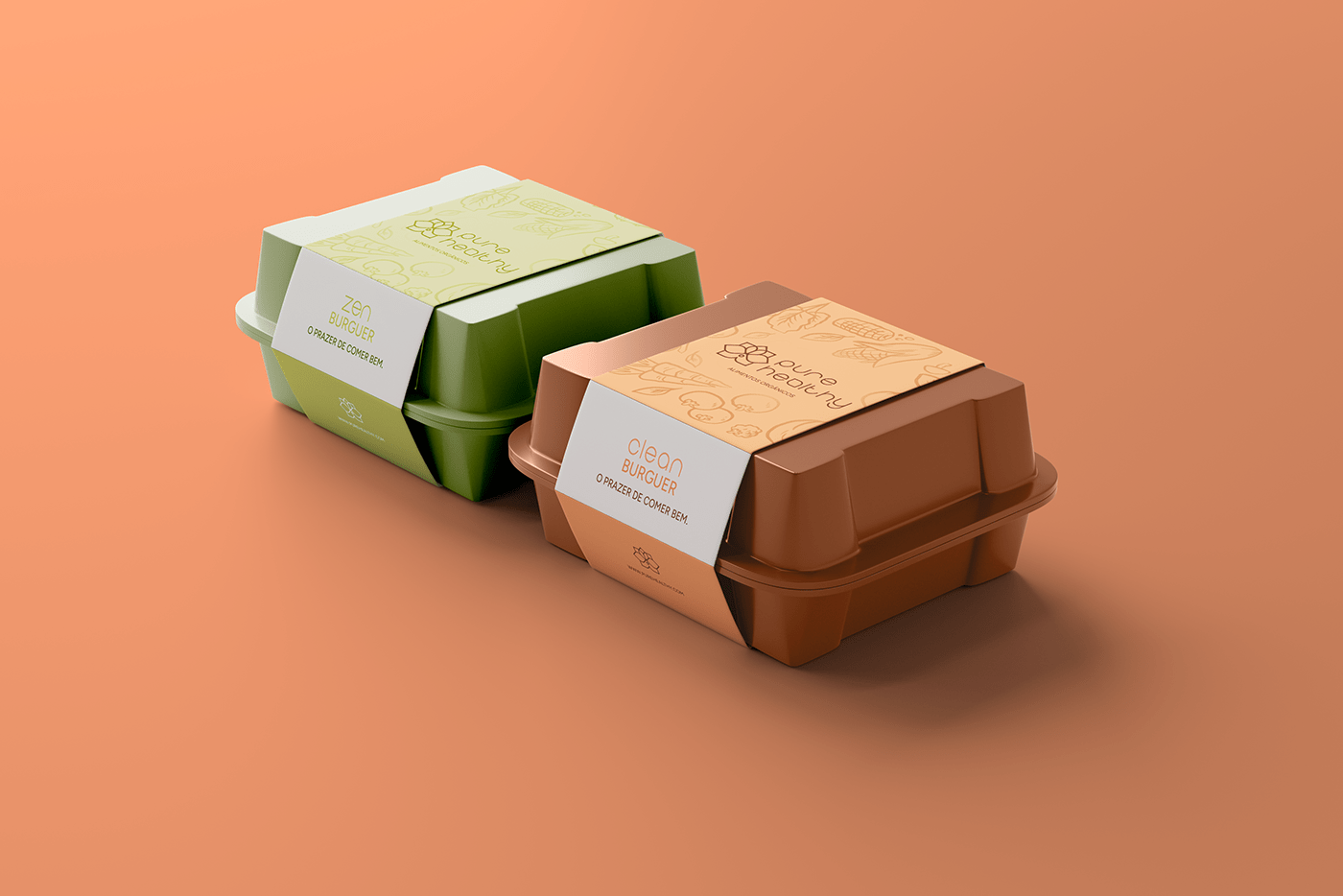
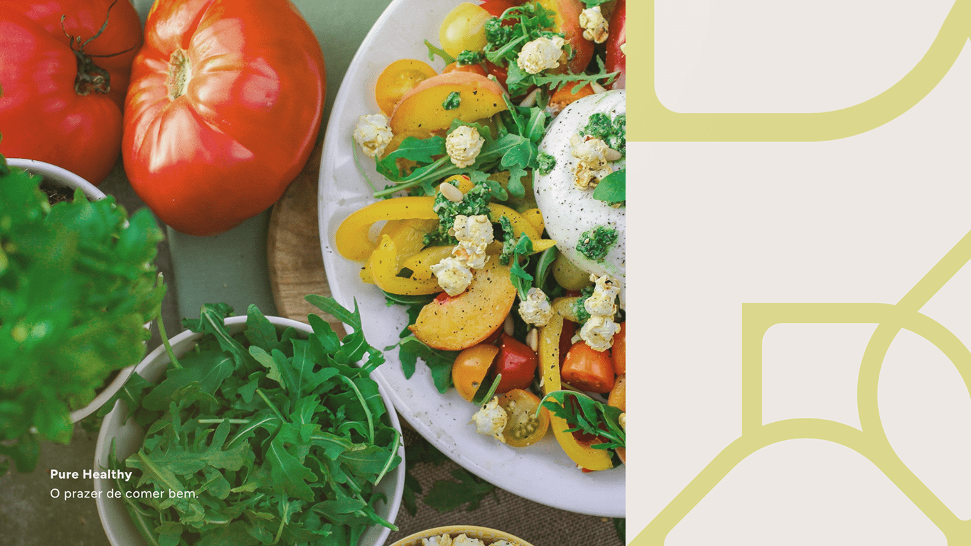
Pure Healthy - Identidade Visual
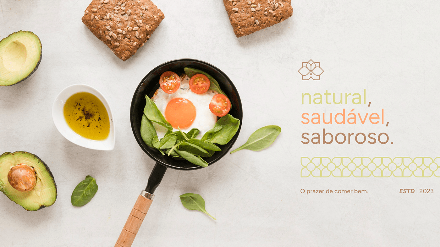
PT-BR | A ideia de criar a Pure Healthy surgiu quando Marcelo percebeu a necessidade de oferecer opções mais saudáveis para as pessoas, sem abrir mão do sabor e da praticidade. Com muito esforço e dedicação, ele transformou a Pure Healthy em uma das principais empresas do mercado de alimentos orgânicos. Através de sua visão inovadora e da busca constante por novas tecnologias, conseguiu criar uma linha de produtos exclusiva e de alta qualidade, que conquistou a confiança dos consumidores.
___
Pure Healthy - Visual Identity
EN | The idea of creating Pure Healthy came about when Marcelo realized the need to offer healthier options to people, without sacrificing taste and practicality. With a lot of effort and dedication, he turned Pure Healthy into one of the main companies in the organic food market. Through its innovative vision and the constant search for new technologies, it managed to create a line of exclusive and high-quality products, which won the trust of consumers.
___
Cliente: Marcos | Serviço: Identidade Visual | Pure Healthy 2023 | Direção de arte / Designer: Jhonzzera | Motion: @dacostadsg

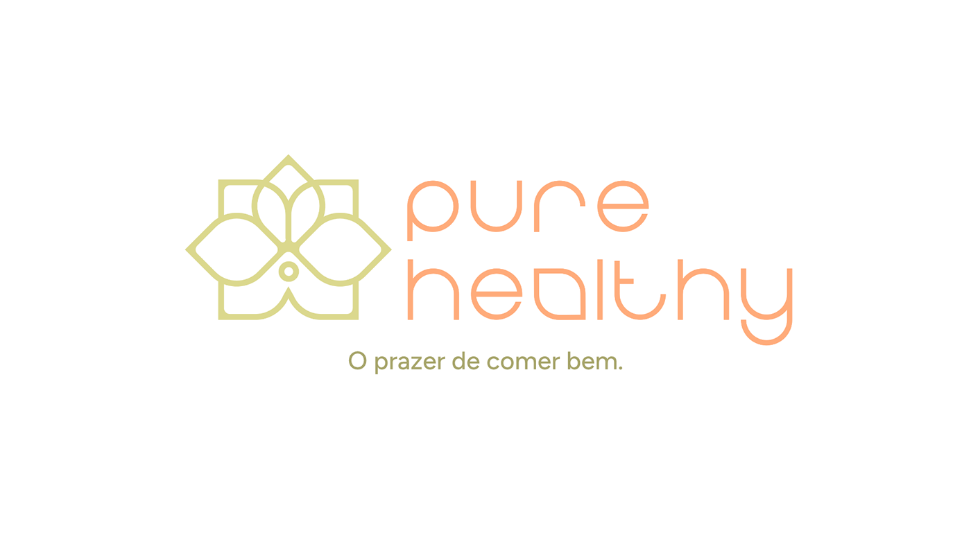


Pure Healthy - Conceito do Isotipo
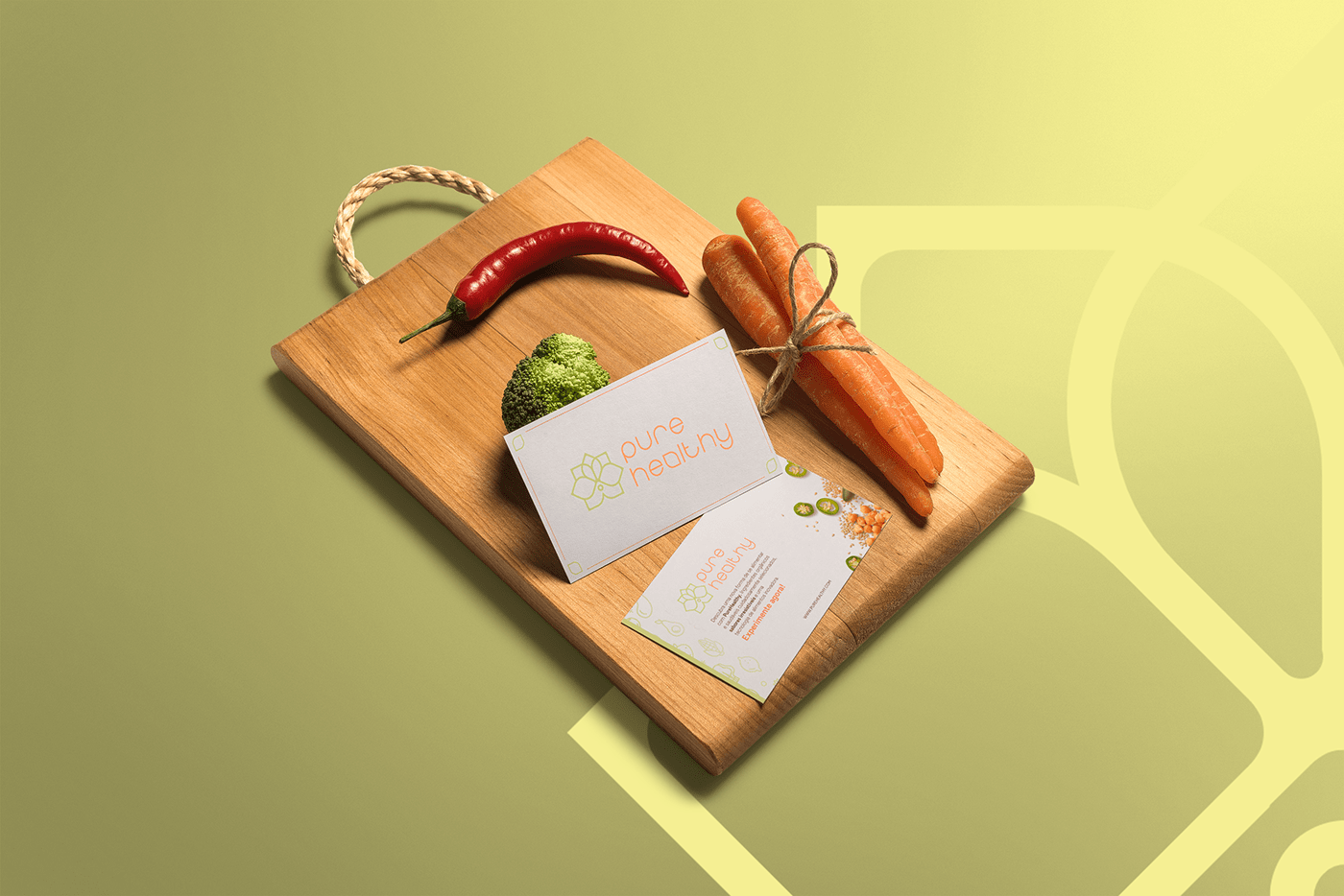
PT-BR | O Isotipo da PureHealthy foi cuidadosamente criada para refletir a essência da marca, que é oferecer produtos orgânicos e saudáveis sem comprometer o sabor. A flor de lótus, formada pelos elementos da folha, flor e círculo, representa a ideia de transformação e renovação, simbolizando a busca pela vida saudável em equilíbrio com a natureza. A folha representa a natureza e a sua capacidade de nutrir e sustentar a vida, enquanto o círculo que representa os grãos simboliza a união entre o corpo e a mente. Tudo isso é refletido no compromisso da marca em escolher apenas ingredientes de qualidade para oferecer a melhor experiência possível aos seus clientes. A base quadrada da logo reforça a ideia de solidez e confiança, transmitindo segurança e credibilidade aos consumidores dos seus produtos.
___
Pure Healthy - Isotype Concept
EN | The PureHealthy isotype was carefully created to reflect the essence of the brand, which is to offer organic and healthy products without compromising on taste. The lotus flower, formed by the elements of the leaf, flower and circle, represents the idea of transformation and renewal, symbolizing the search for a healthy life in balance with nature. The leaf represents nature and its ability to nourish and sustain life, while the circle representing the grains symbolizes the union between body and mind. All of this is reflected in the brand's commitment to choosing only quality ingredients to offer the best possible experience to its customers. The square base of the logo reinforces the idea of solidity and trust, transmitting security and credibility to consumers of its products.
___

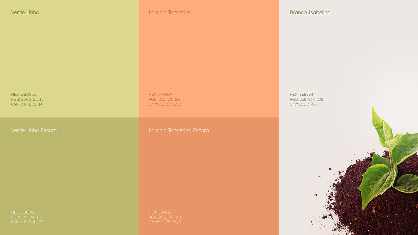
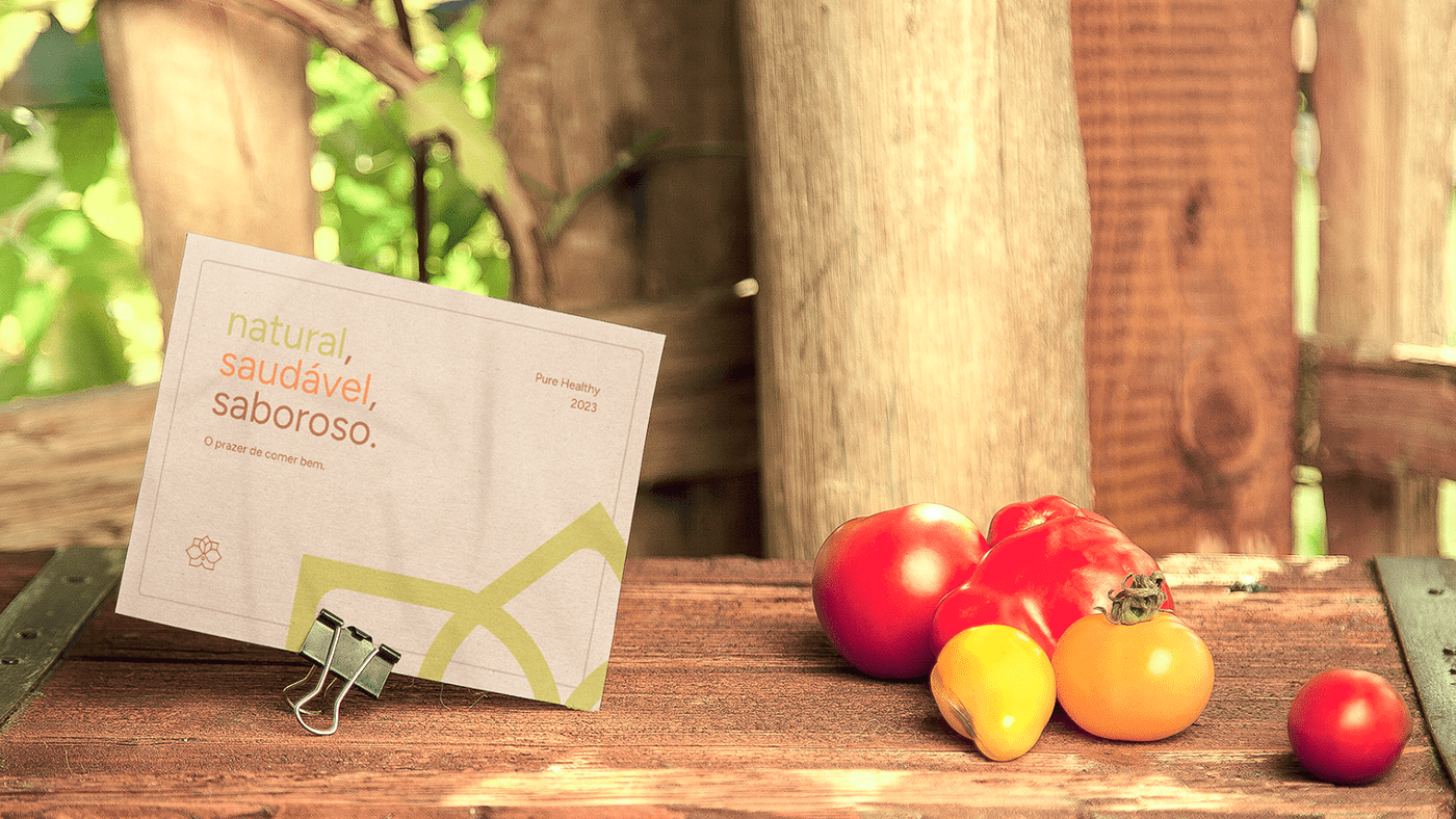
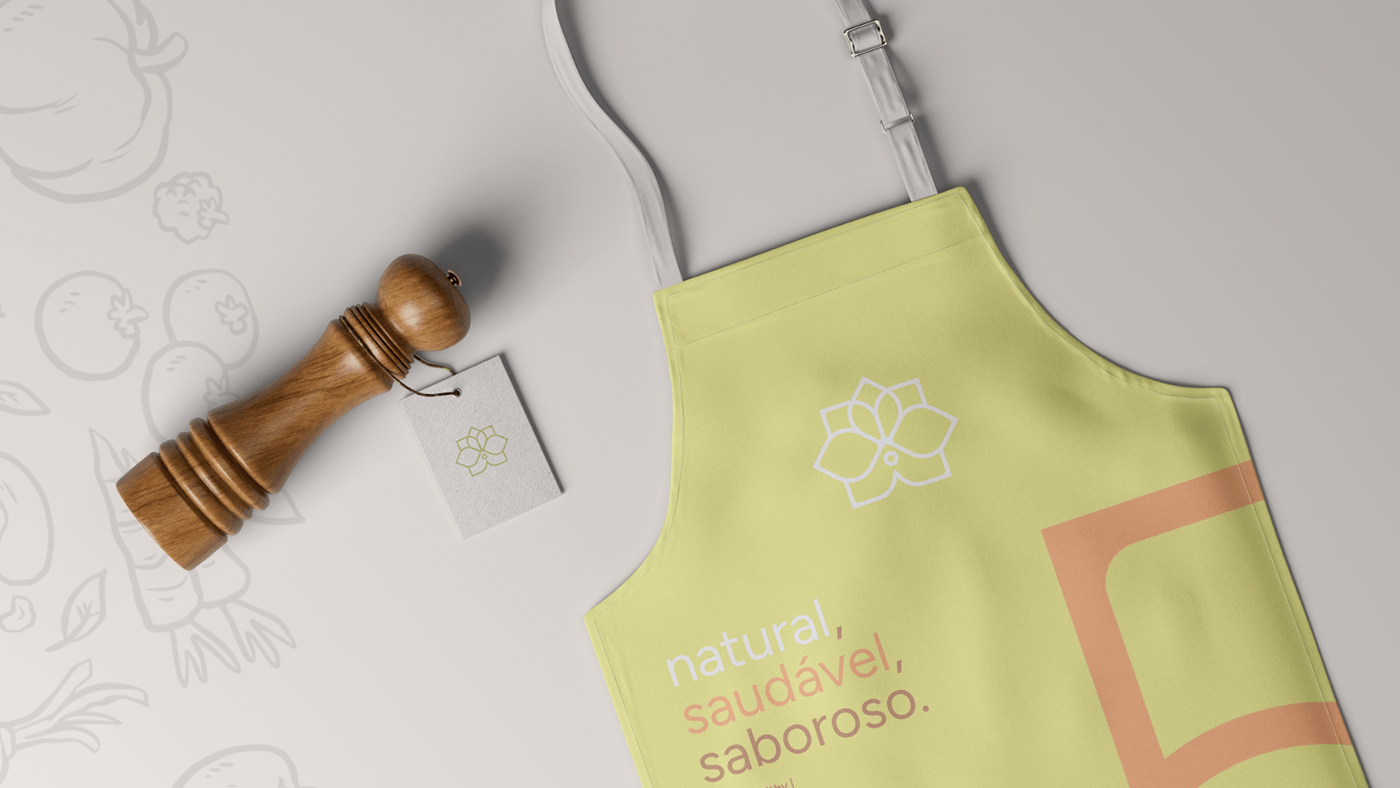
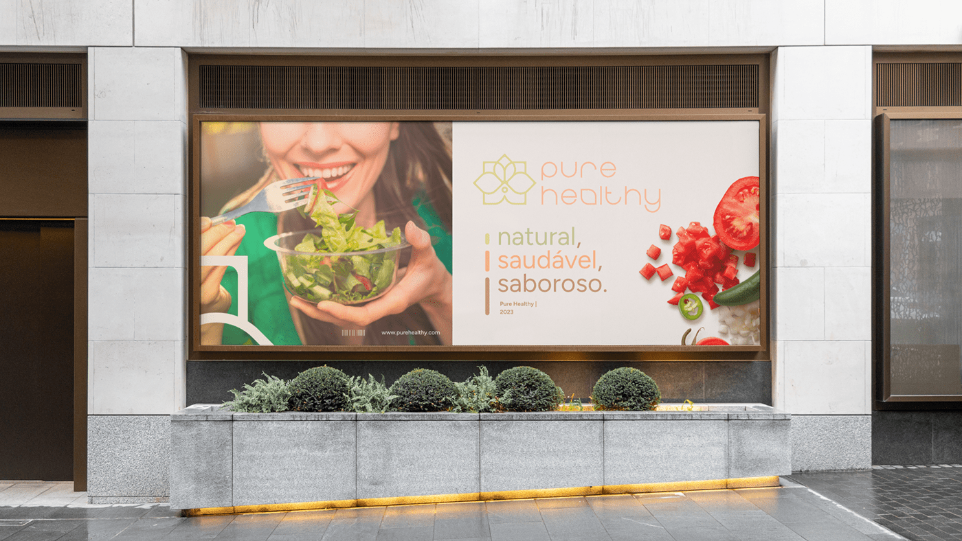
Pure Healthy - Paleta de Cores
PT-BR | A escolha das cores para a identidade visual da Pure Healthy foi cuidadosamente pensada para transmitir a ideia de alimentos orgânicos, saudáveis e sustentáveis. O verde linho foi escolhido por representar a natureza e a frescura dos alimentos orgânicos, enquanto o laranja tangerina simboliza a energia e a vitalidade que esses alimentos proporcionam. Já o branco isabelina com um tom mais leve é utilizado como background para trazer um ar de pureza e simplicidade, além de destacar as cores principais da marca. Todas essas cores juntas formam uma combinação harmônica e atraente, reforçando a mensagem da Pure Healthy de que é possível comer de forma saudável e sustentável sem abrir mão do sabor e prazer de uma boa alimentação..
___
Pure Healthy - Color Pallet
EN | The choice of colors for Pure Healthy's visual identity was carefully thought out to convey the idea of organic, healthy and sustainable food. Linen green was chosen because it represents the nature and freshness of organic foods, while tangerine orange symbolizes the energy and vitality that these foods provide. Elizabethan white, with a lighter tone, is used as a background to bring an air of purity and simplicity, in addition to highlighting the main colors of the brand. All these colors together form a harmonic and attractive combination, reinforcing Pure Healthy's message that it is possible to eat in a healthy and sustainable way without giving up the taste and pleasure of good food.
___

Pure Healthy - Tipografia
PT-BR | A escolha das fontes Eight One e Figtree na identidade visual da marca tem um propósito muito claro. A Eight One transmite a modernidade e a simplicidade que a marca busca transmitir em seus produtos e serviços, enquanto a Figtree traz a ideia de natureza e rusticidade, relacionando-se com a ideia de produtos orgânicos e naturais. Juntas, as fontes criam uma harmonia visual que reflete a missão da marca em oferecer produtos de qualidade, com sabor incrível e respeito à natureza.
___
Pure Healthy - Tipography
EN | The choice of Eight One and Figtree fonts in the brand's visual identity has a very clear purpose. Eight One conveys the modernity and simplicity that the brand seeks to convey in its products and services, while Figtree brings the idea of nature and rusticity, relating to the idea of organic and natural products. Together, the fonts create a visual harmony that reflects the brand's mission to offer quality products, with incredible flavor and respect for nature.
___


Obrigado pela sua visita!
PT-BR | Obrigado por visitar o meu portfólio! Foi uma honra ter você por aqui. Espero que tenha gostado do que viu e que tenha encontrado inspiração em meus trabalhos. Fique à vontade para continuar acompanhando meu trabalho e, se precisar de algum projeto, não hesite em entrar em contato. Até breve!
___
Thanks for your visit!
EN | Thanks for visiting my portfolio! It was an honor to have you here. I hope you liked what you saw and that you found inspiration in my works. Feel free to keep following my work and if you need a project, don't hesitate to contact me. See you soon!
___
Cliente: Marcos | Serviço: Identidade Visual | Pure Healthy 2023 | Direção de arte / Designer: Jhonzzera | Motion: @dacostadsg


