

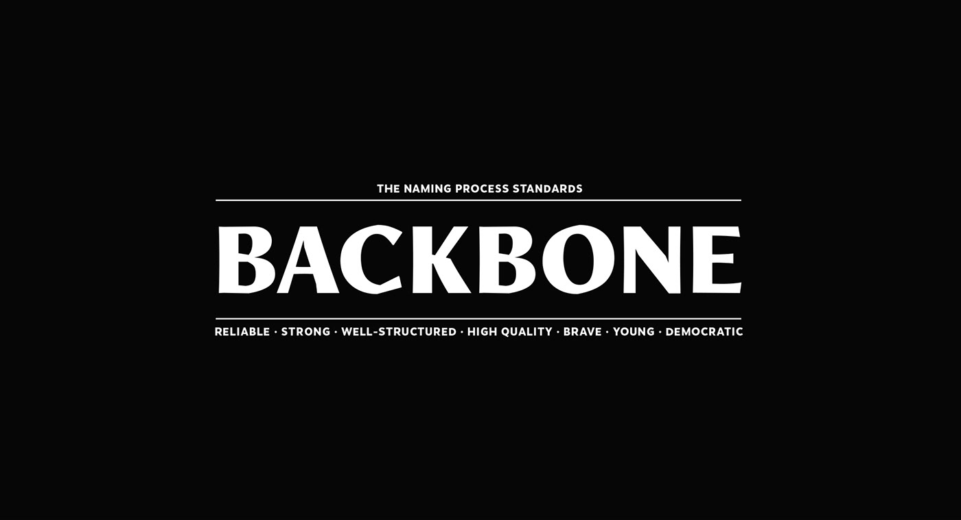
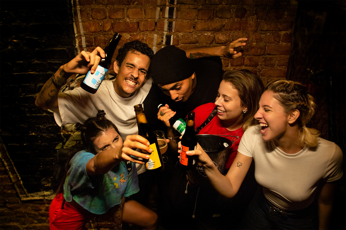
Young, strong and democratic. Backbone brewery comes to the shelves ready to break boundaries between craft and mass market beers.
We went for a brand that would look bold and innovative for young customers, but also reliable for more mature audiences.
Given that the craft beer market in Brazil is recent and incipient, the partners saw an opportunity to fill the gap between the new and expensive breweries and the big old established ones.
Naming the brand was the first step of the strategy process. A strong, well-structured and purpose driven name was required, but it was equally necessary for the name to sound cool, international and stand out among its competitors. It should also be register proof and visually appealing to go on the logo.
With all this in mind, Backbone was chosen on a long list of possibilities.

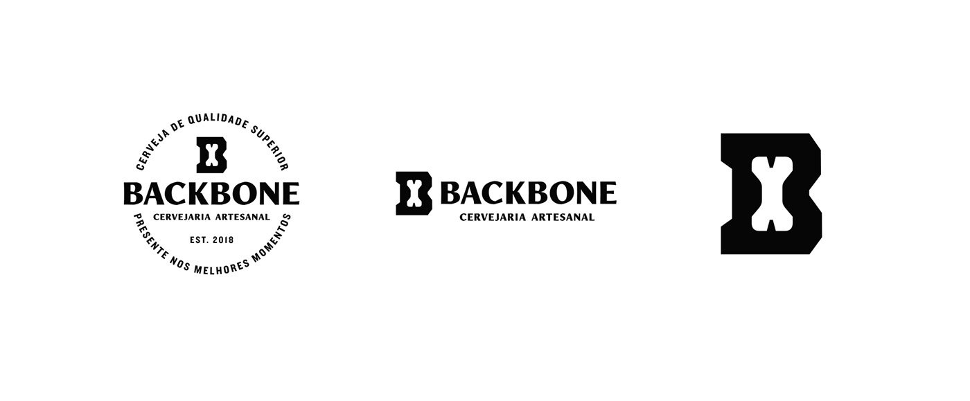
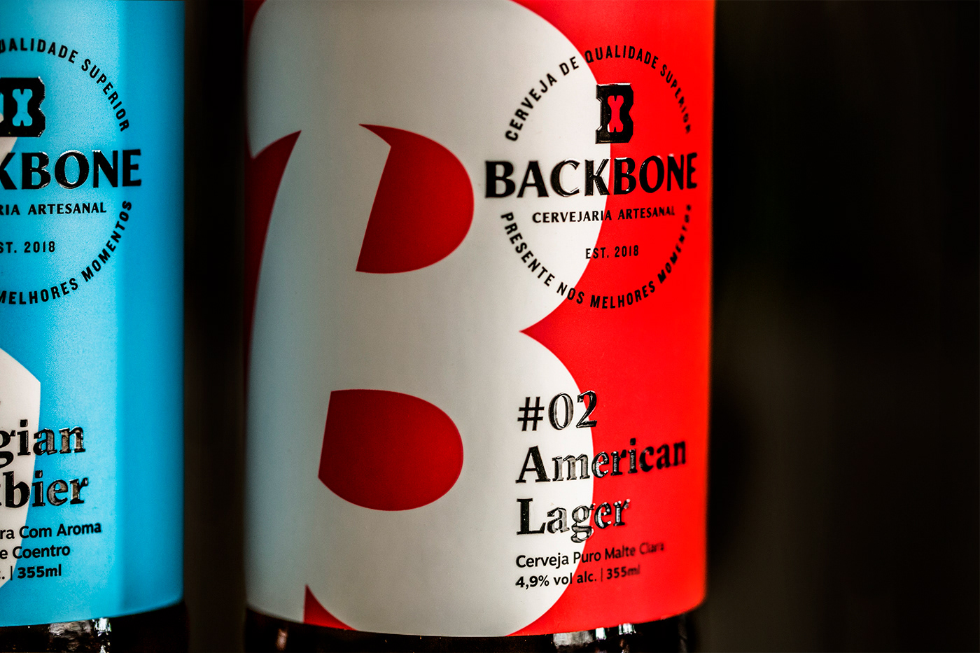
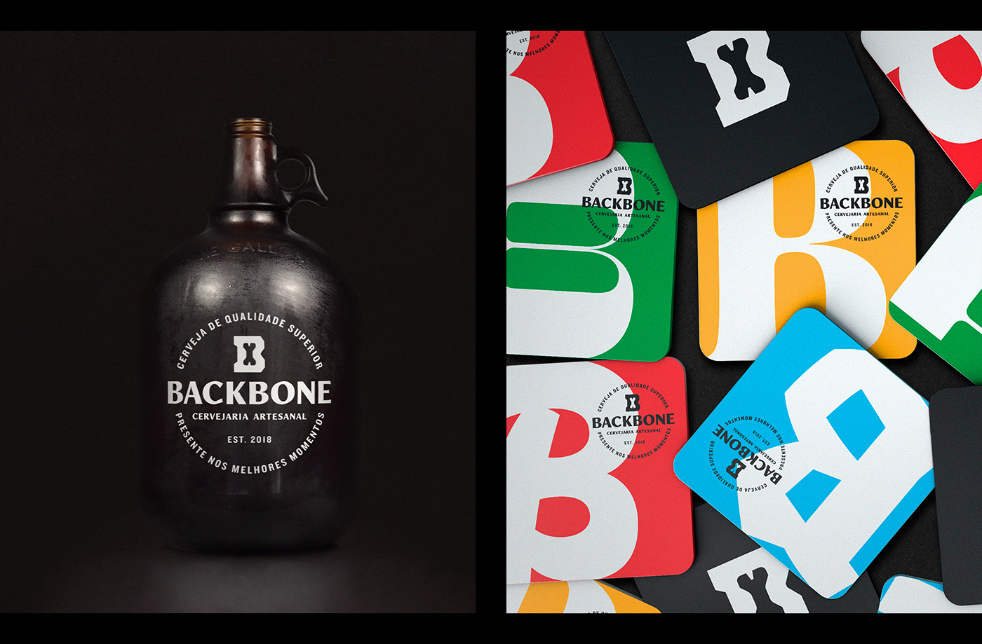
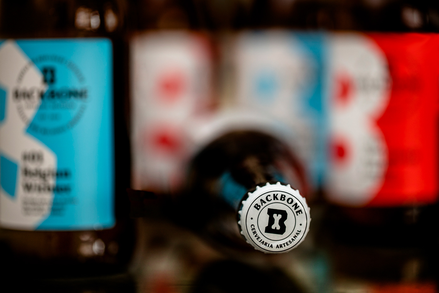
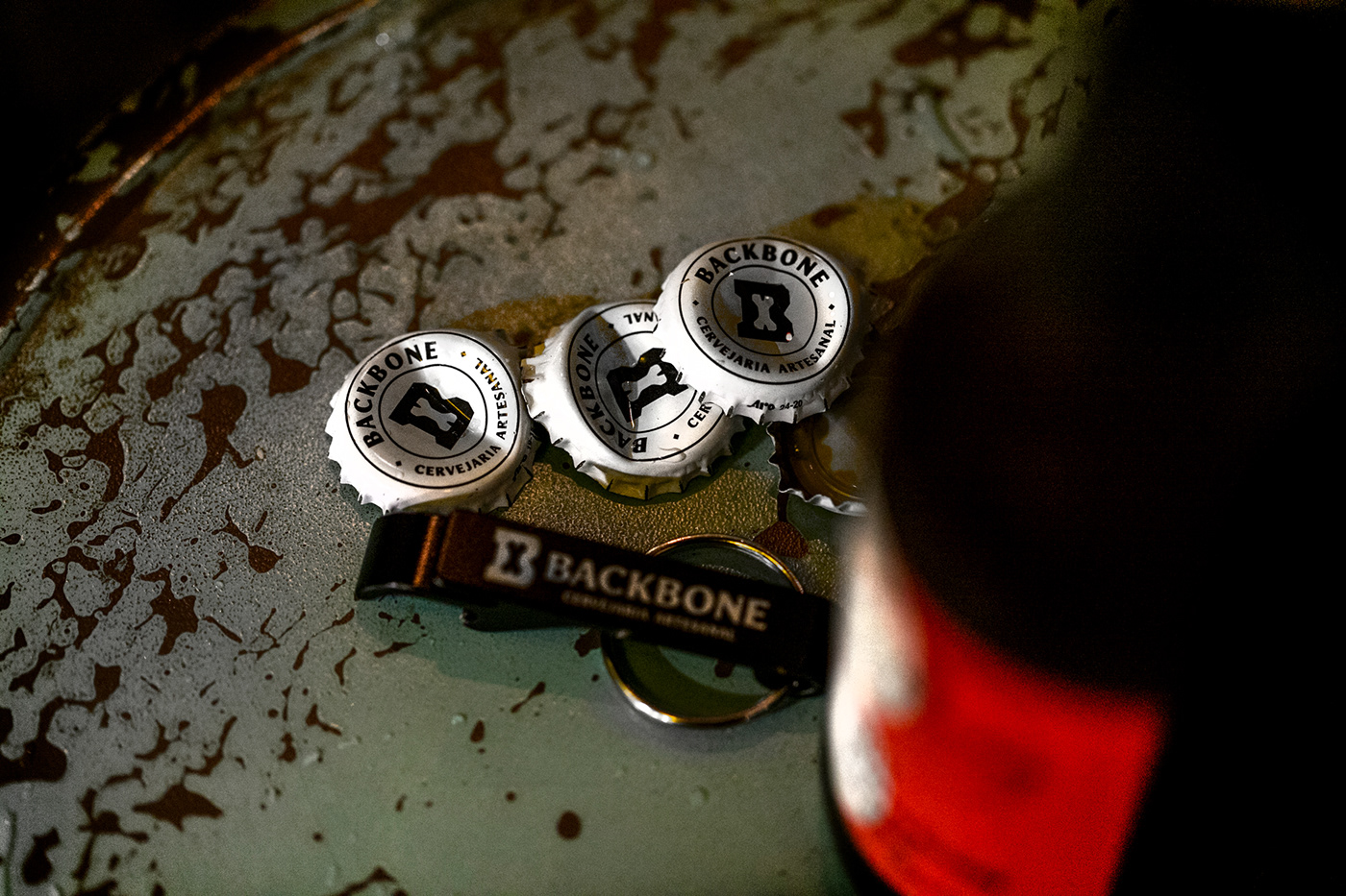
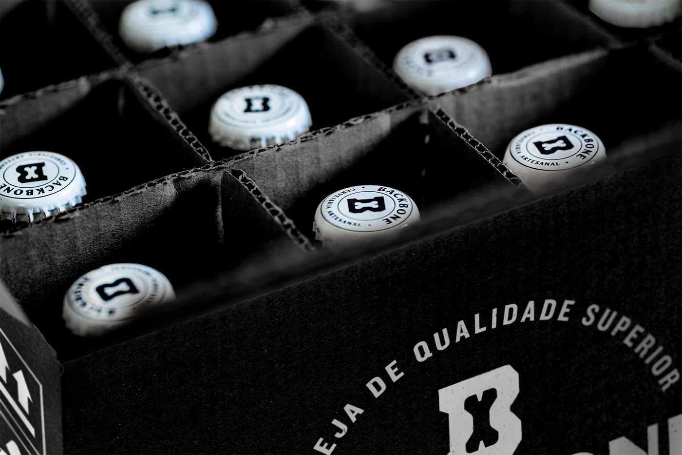
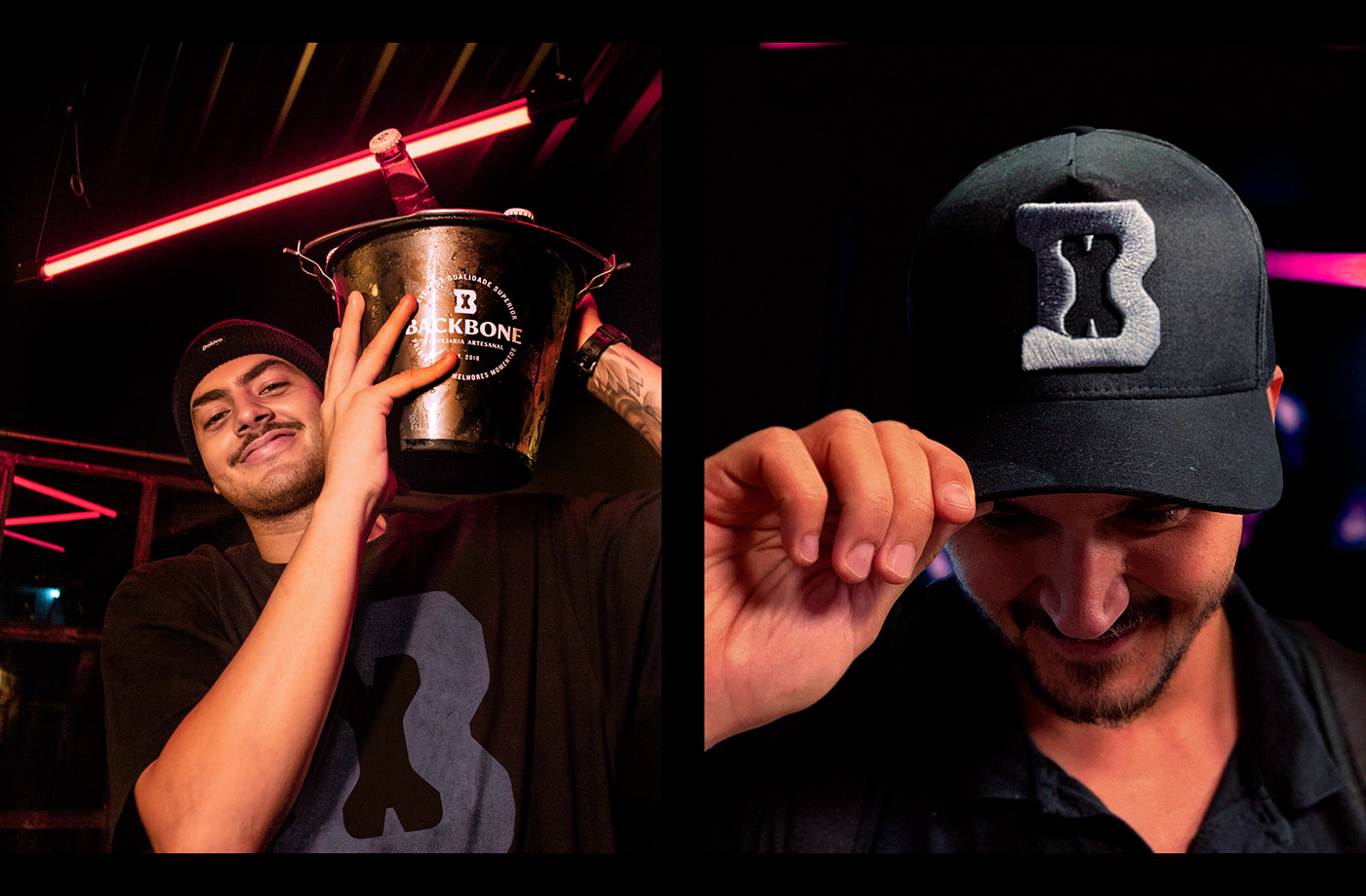
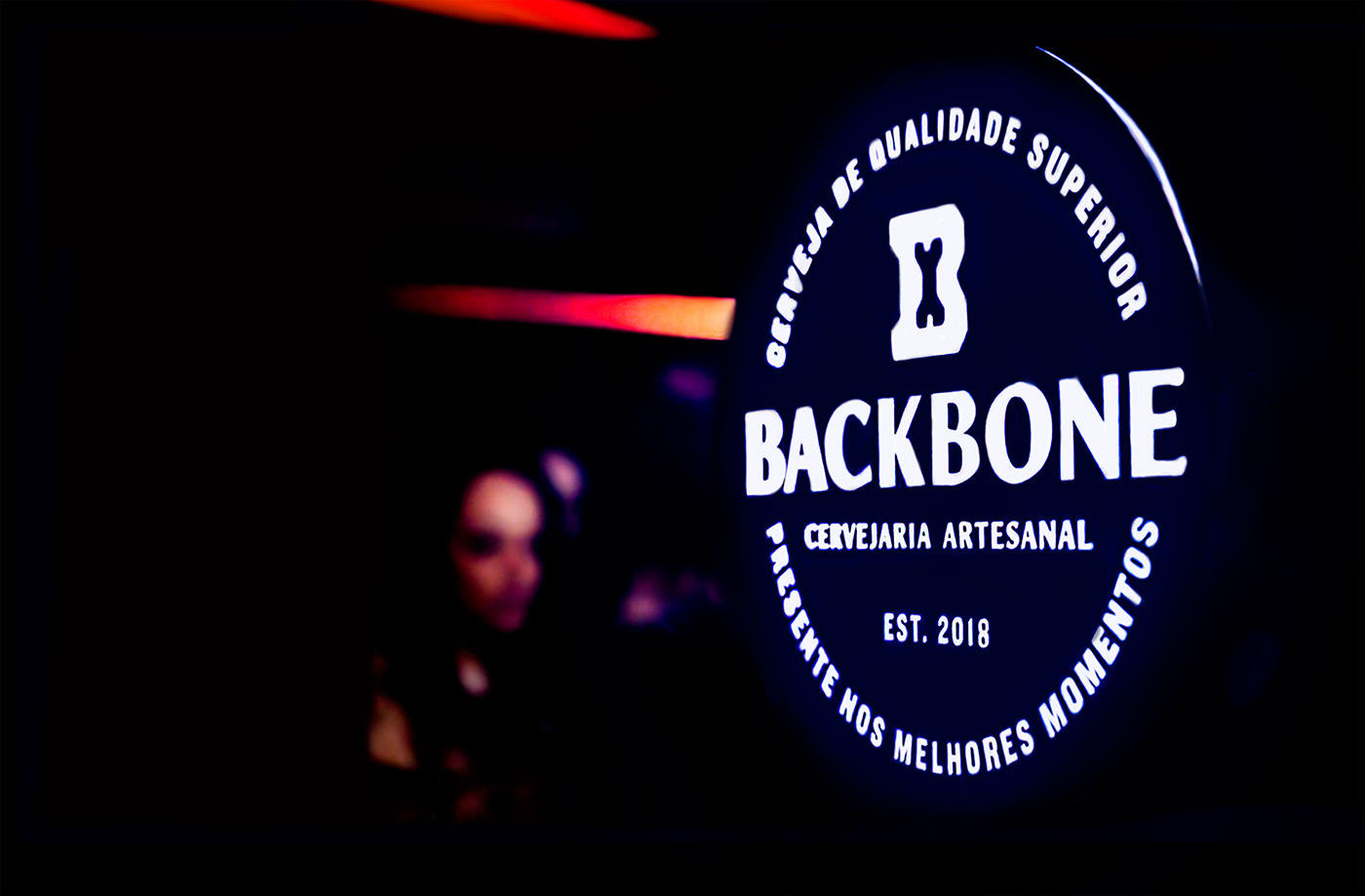
The symbol we designed to identify the brand is simple and strong: a sharp B with a bone inside. GT Sectra, by Grili Type, was chosen as the primary typeface of the visual identity, especially because of its beautiful curves and sharp angles, balacing reliability and quality. For the logotype we modified Sectra into a "sans" version.
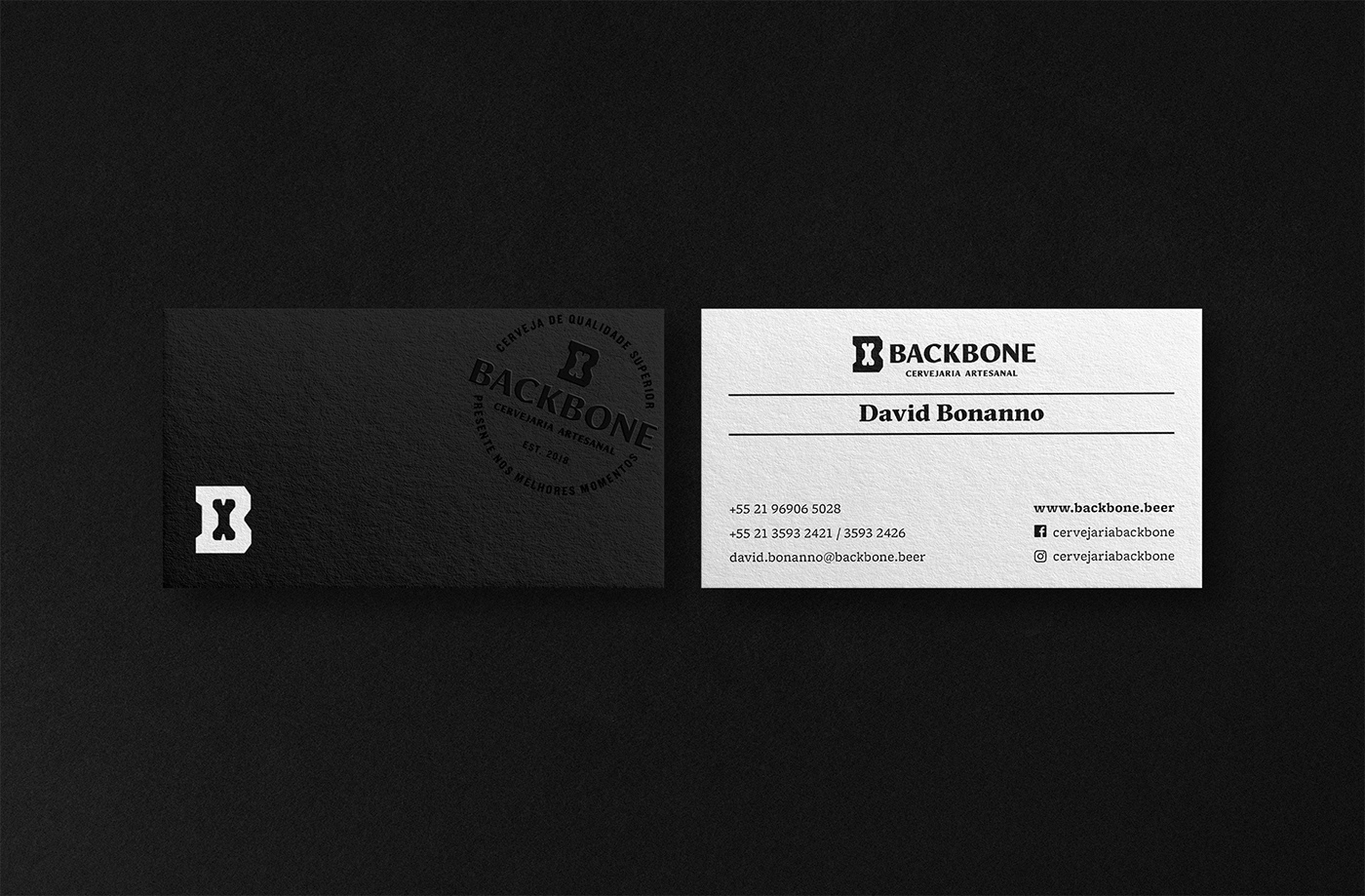
Pairing with Sectra, we used Hoefler's Knockout to build the seal version of the logo. And for the secondary typeface, applied in body copy we choose Freight Micro, designed by Garage Fonts.
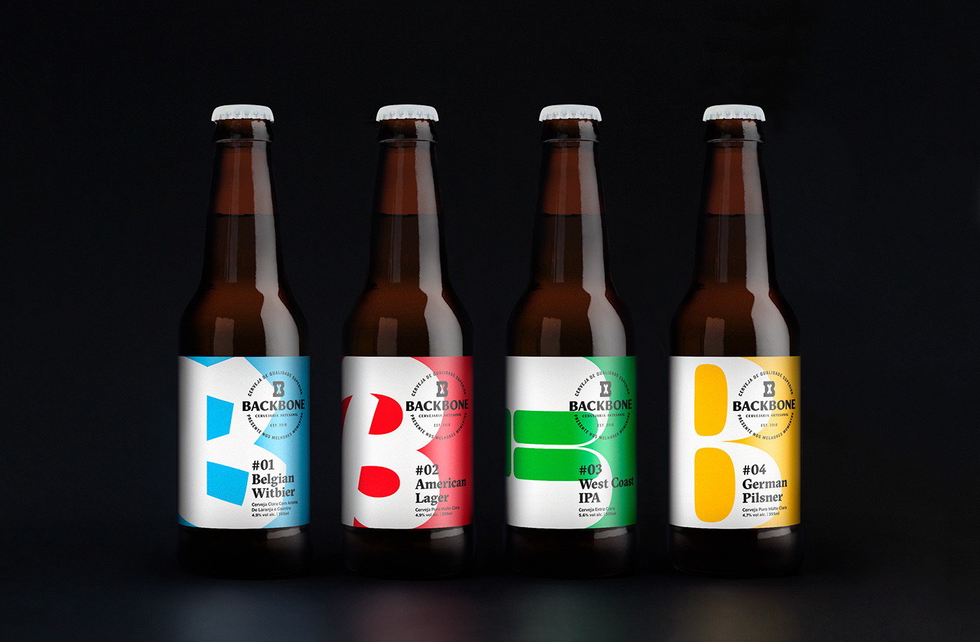
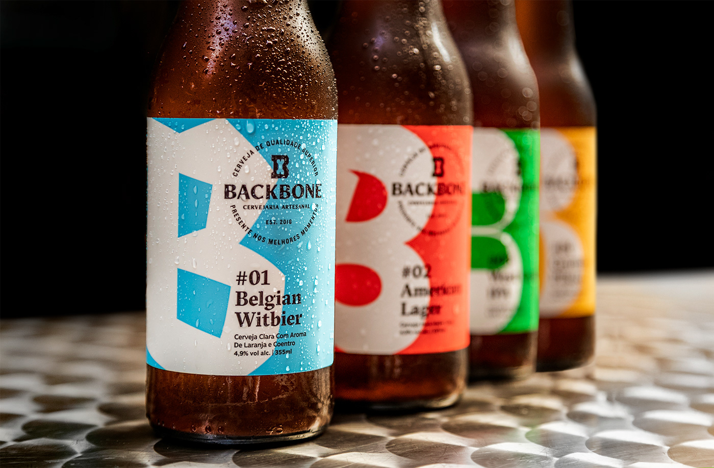
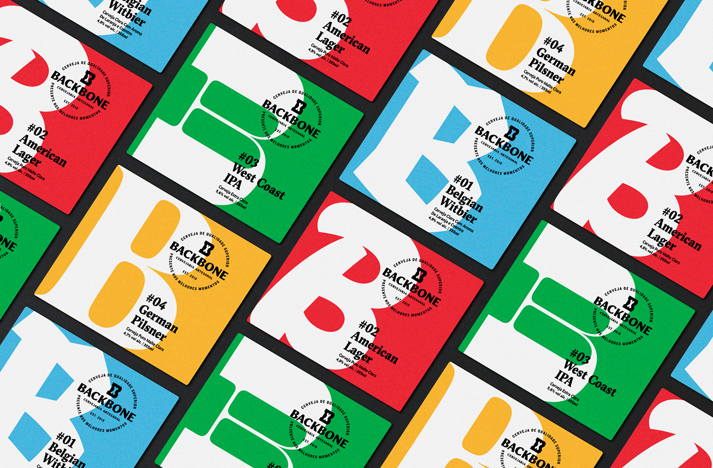
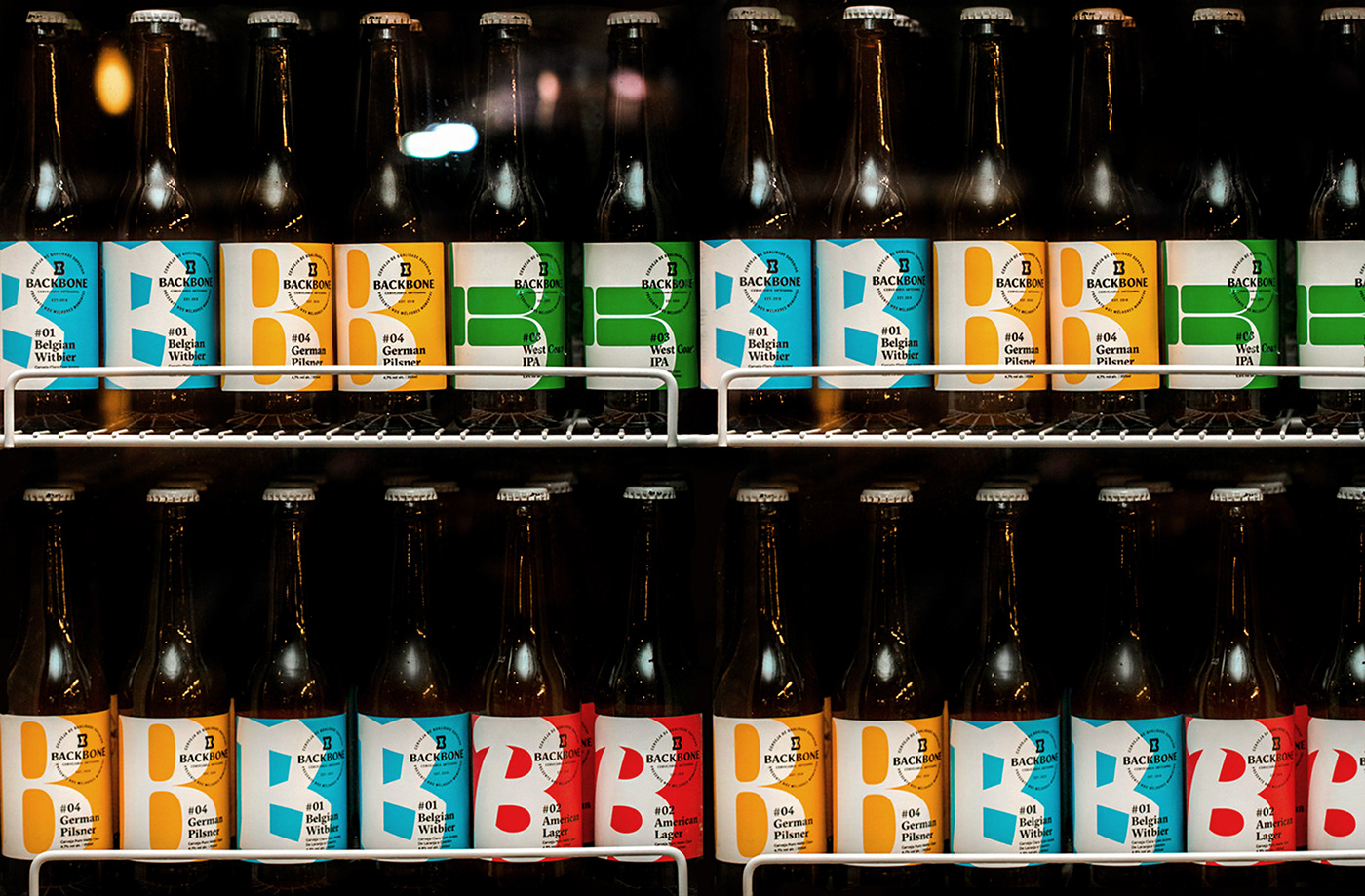
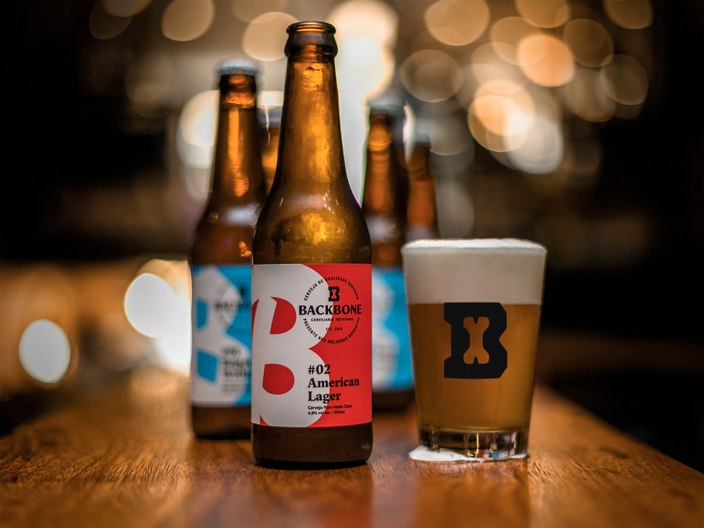
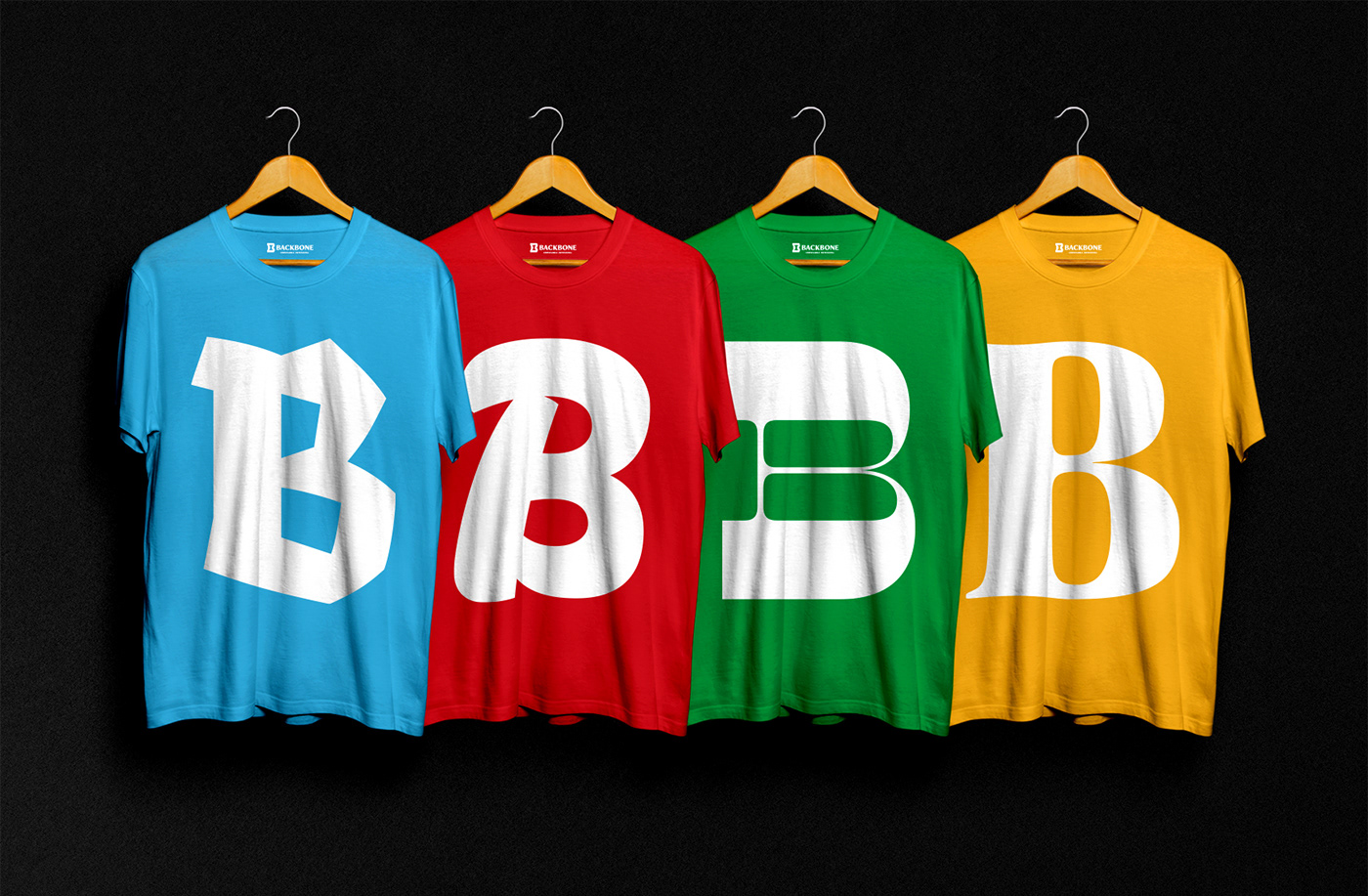
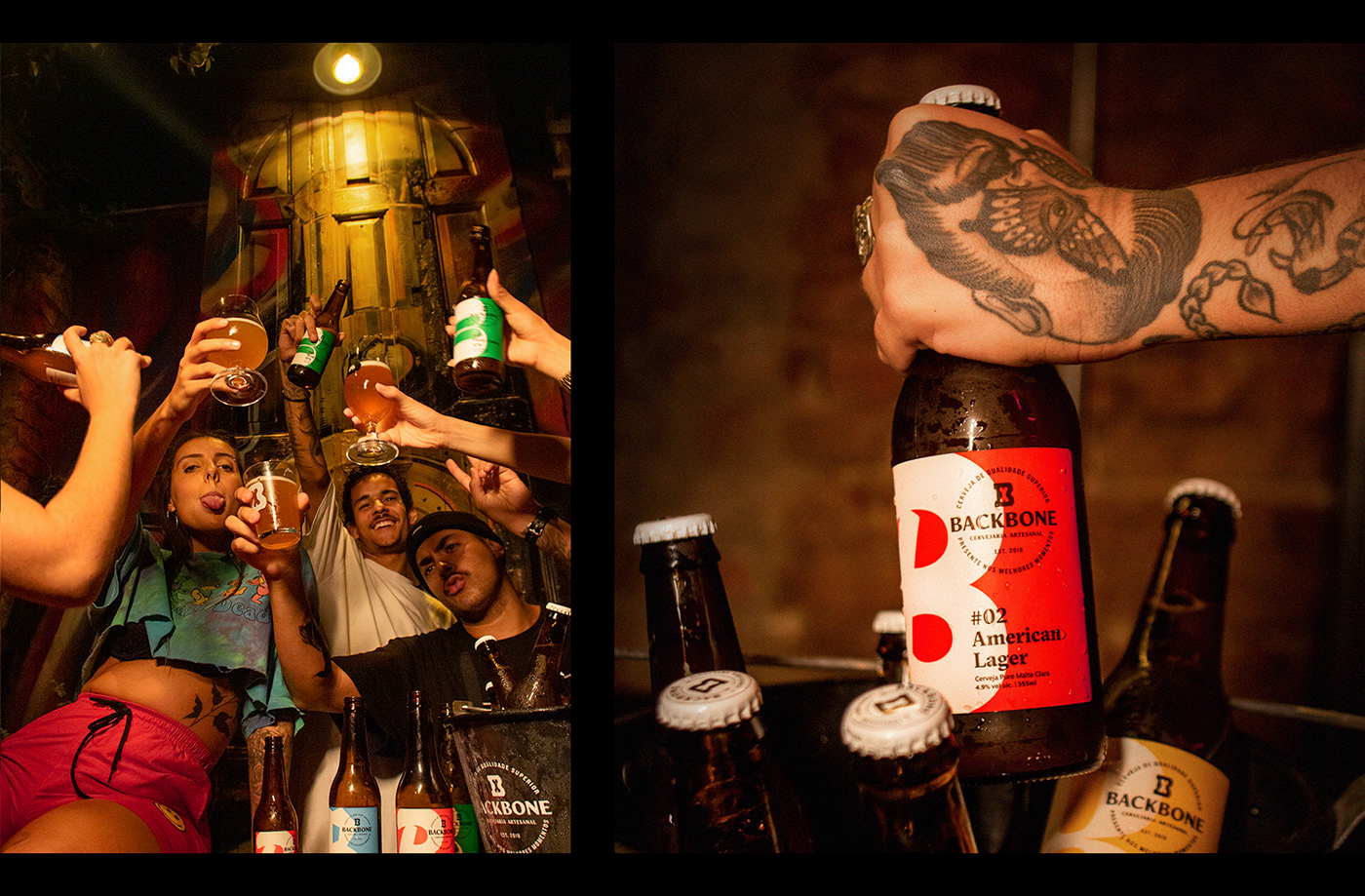
The labels really needed to catch the eye on the shelves. So we chose a simple background with a pantone color to identify each beer. Since the letter B is so present on the brand name, we decided to use it to tell apart the labels. Each B is designed especially for the label it is on, telling the origin of the beer style.
For the Belgian Witbier, we went for a fraktur-like B, inspired by the calligraphy present on the classical monk's brewhouses.
The American Lager B refers to the sign painting craft, giving the label the handmade and fresh feel we were looking.
For the West Coast IPA, we decided to go with a reverse-contrast B, a characteristic commonly saw on vintage western movies.
Finally, for the German Pilsner, we went for a simple and contrasted serif B. This was chosen to tell straight the well-rounded efficiency of the it's classical German style.
Together, the four labels make an interesting family, with the colorful background and a B suited to represent the beer style origin.

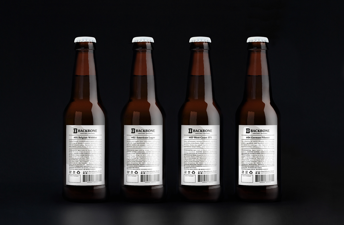
The back label was built to resemble a classic newspaper editorial, to give it a classic clean look, with the B designed for each label appearing as a watermark, evoking once again the feeling that is a joyful, but very strong and reliable Brand.
Credits
Creative Direction: Gabriel Mesoma
Design: Rodrigo Saiani, Carlos Mignot, Ana Laura Ferraz, Gabriel Menezes.
Strategy & Naming: Rodrigo Saiani, Carlos Mignot, Ana Laura Ferraz, Gabriel Mesoma.
Photo shoot: Marcello Cavalcanti, Lucas Gama


