PROJECT INFORMATION
This project from 2019 were I should make a redesign of "Odder Dyreklinik's" Website. There official website ist really unclear and unmanageable. Just overall is the design really bad. So I started designen a new one and tried making it more modern and suitable for this day and age, more professional and reassuring to the user.
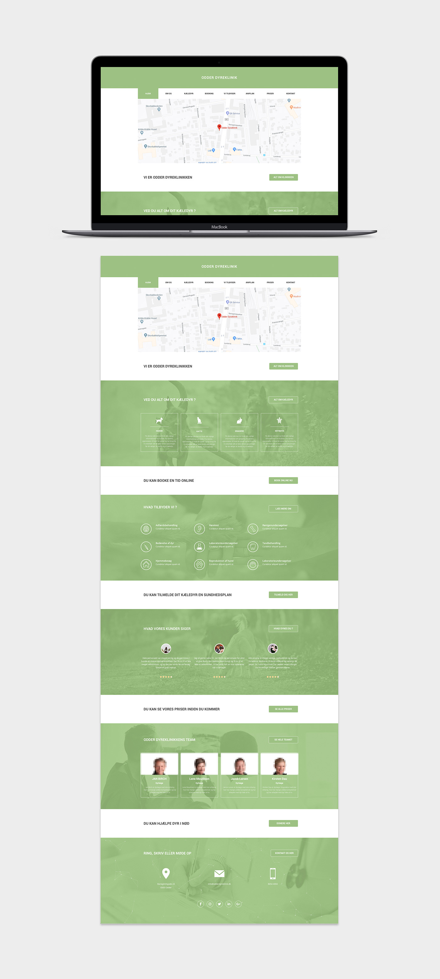
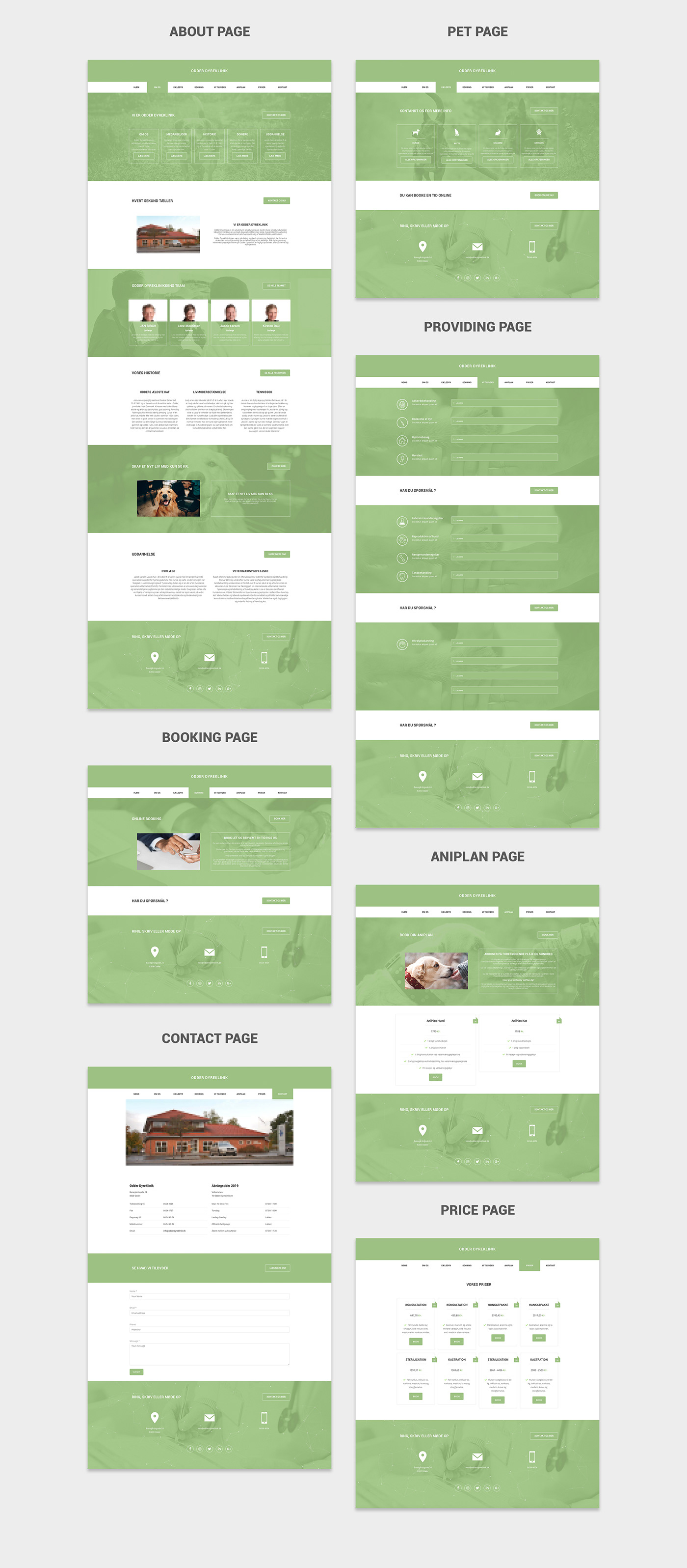
ALL SITES
The website consists of a total of 25 pages. You can see the 8 main pages down below.
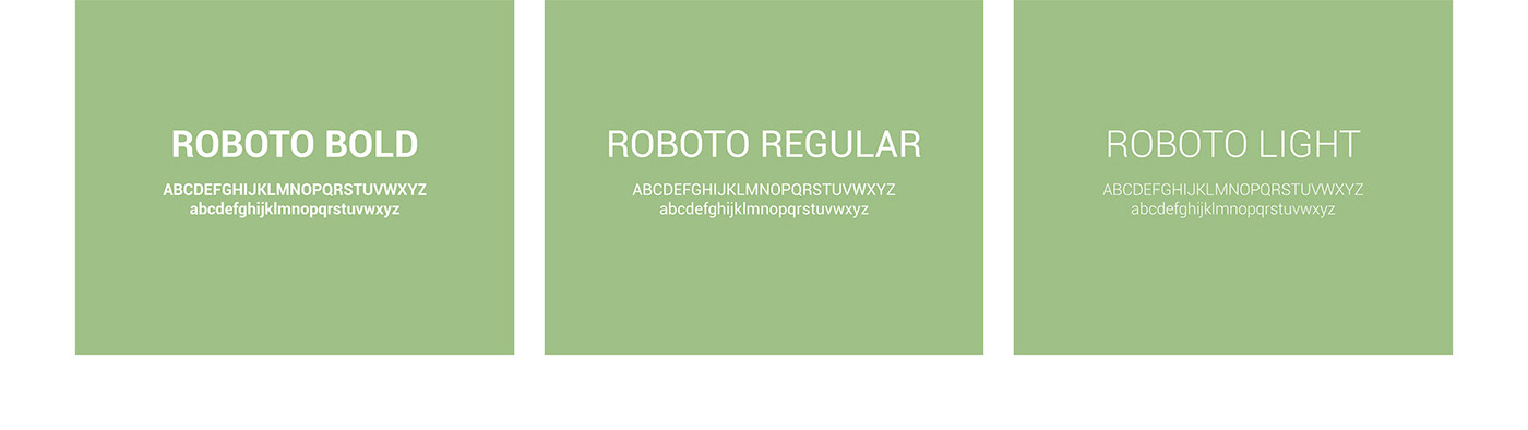
FONT - ROBOTO
I choose the font "Roboto" cause their logo is made of this font and it's on of the best fonts for web use.
ILLUSTRATIONS
I made illustrations for the one page, not only to write what they offer but to show it to the consumer. especially because some words were a bit complicated and could lead to lack of understanding.

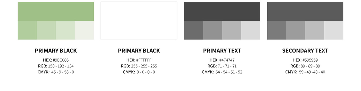
COLOR SCHEME
I primarily used a soft green for this project, as green gives a very strong impression of safety and is very reassuring for the eye. And since it was one of my main goals to reassure the user, was this the perfect choice.