


P R O J E C T
Sego Kelir
S C O P E
Branding
Illustration
Y E A R
2019
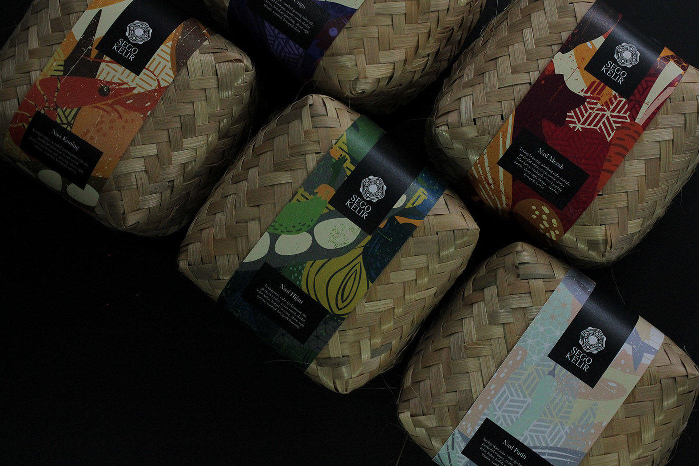
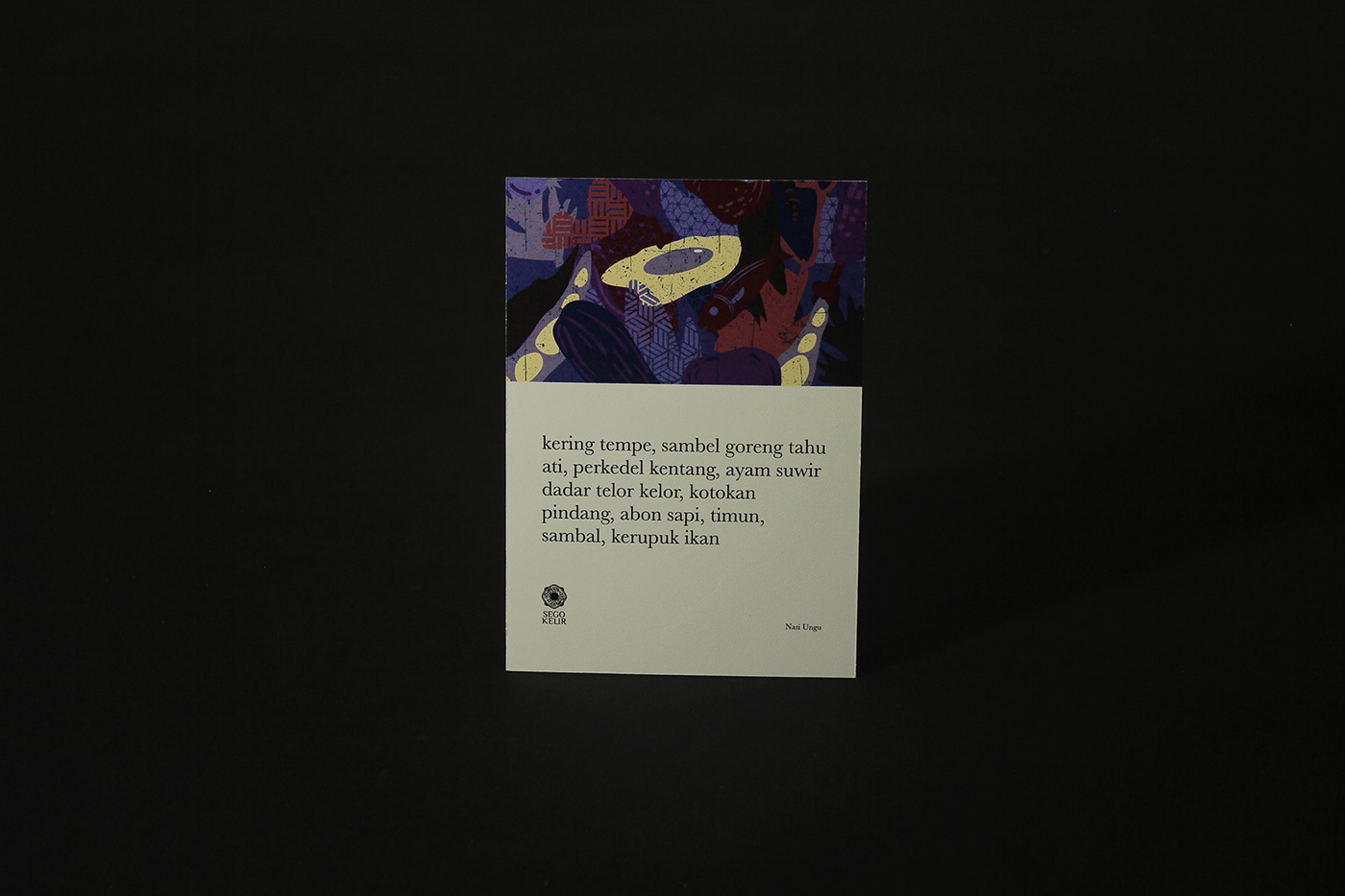
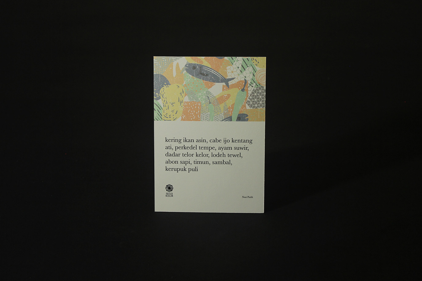
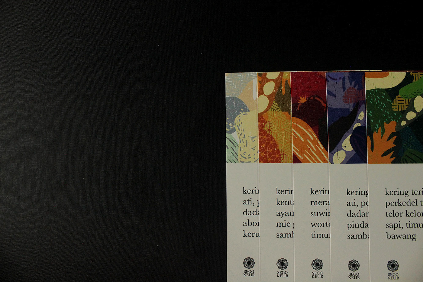
Sego Kelir is rice with various color choices according to taste and uses traditional packaging called besek.
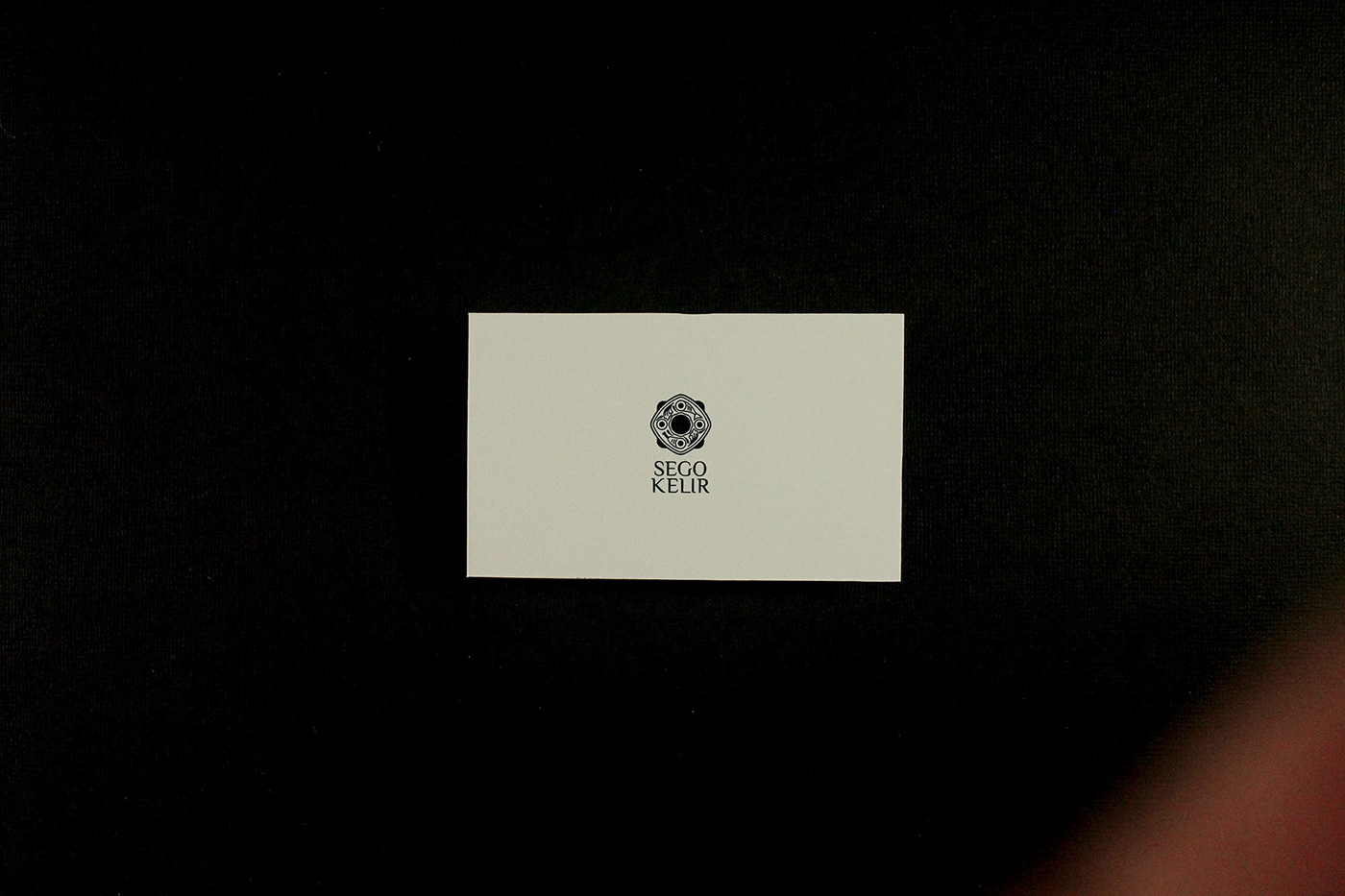
The logogram from Sego Kelir itself is inspired by the square bamboo (besek) packaging as the basis for forming the logo. Along with the contents of rice to reinforce visual elements.
With an abstract illustration approach and combined with traditional elements, present contemporary packaging and visuals.


C R E D I T S
Creative Direction / Bayu Prasetya
Creative Direction / Bayu Prasetya
Art Direction / Irwan Faizin
Design / Elfa Santoso & Irwan Faizin
Photography / Elfa Santoso
Photography / Elfa Santoso
S O C I A L M E D I A
Instagram
C O N T A C T
kronotipestudio@gmail.com
C O N T A C T
kronotipestudio@gmail.com


