

Samantha Hope Photography Portfolio
The purpose of this brief is to design a digital presentation to promote the type of work we want to produce in the future. As I am a photographer I decided to create a portfolio presentation.
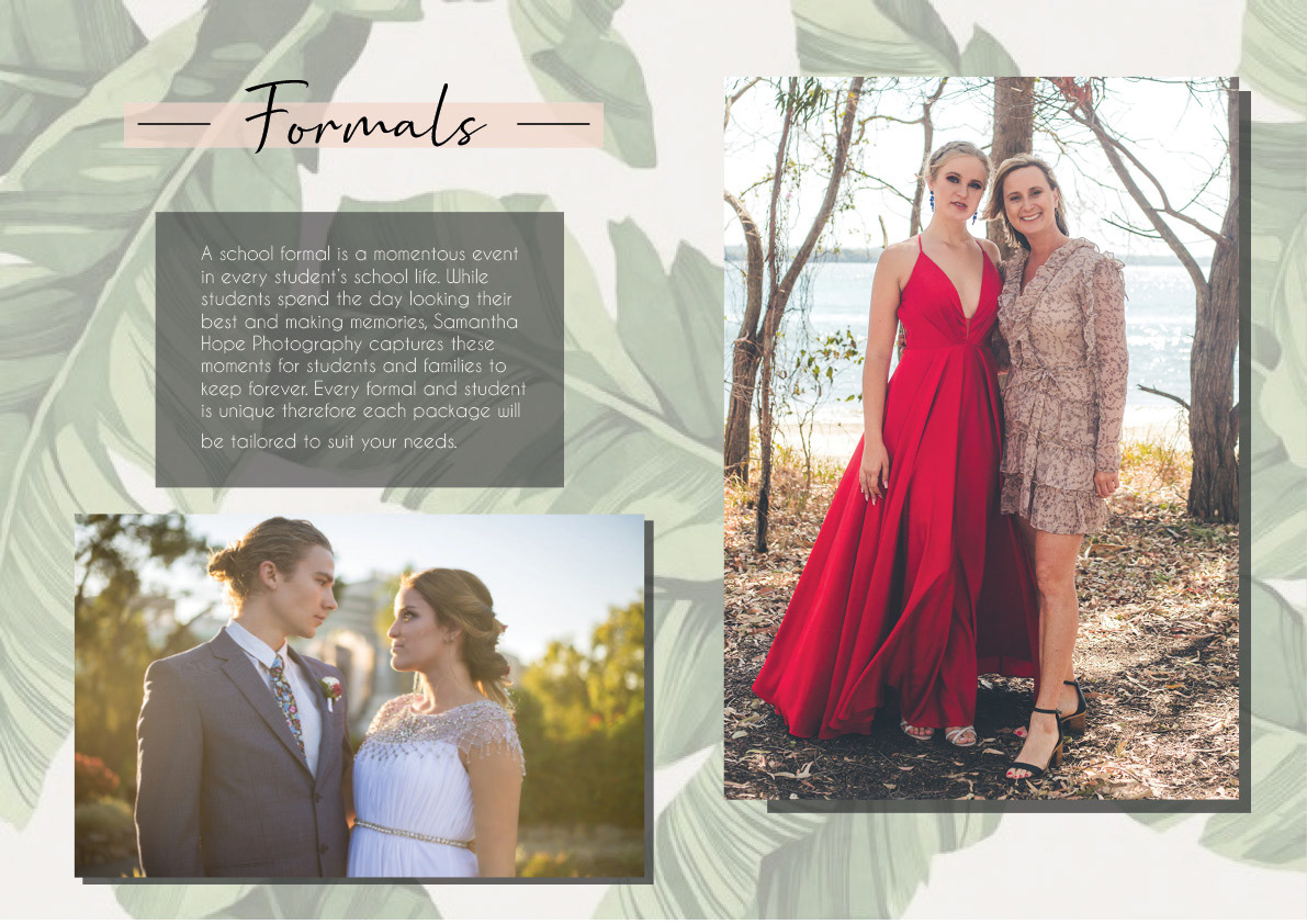
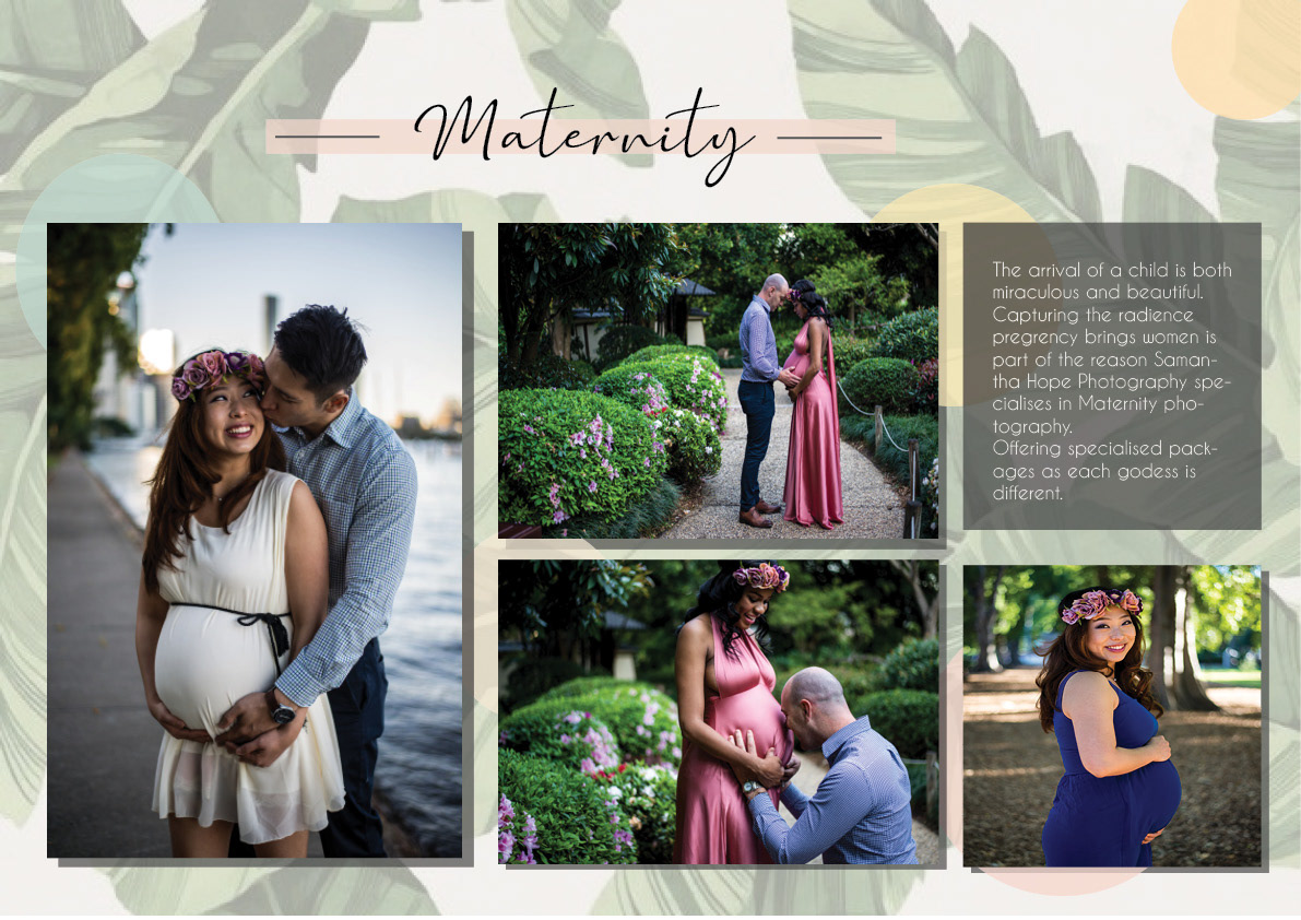
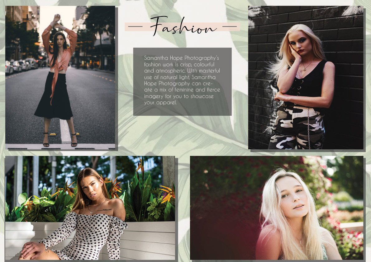
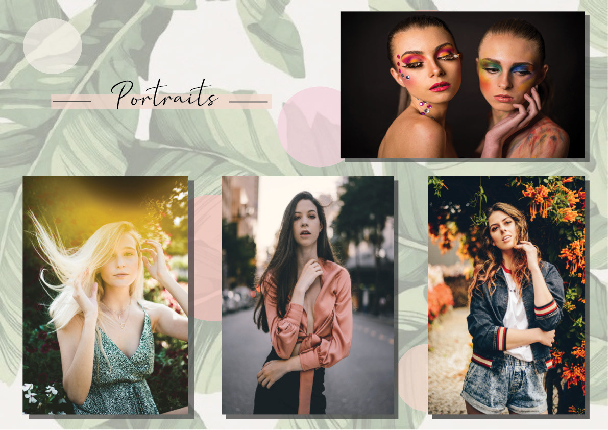
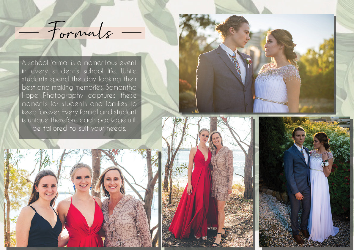
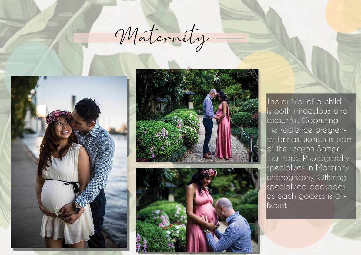
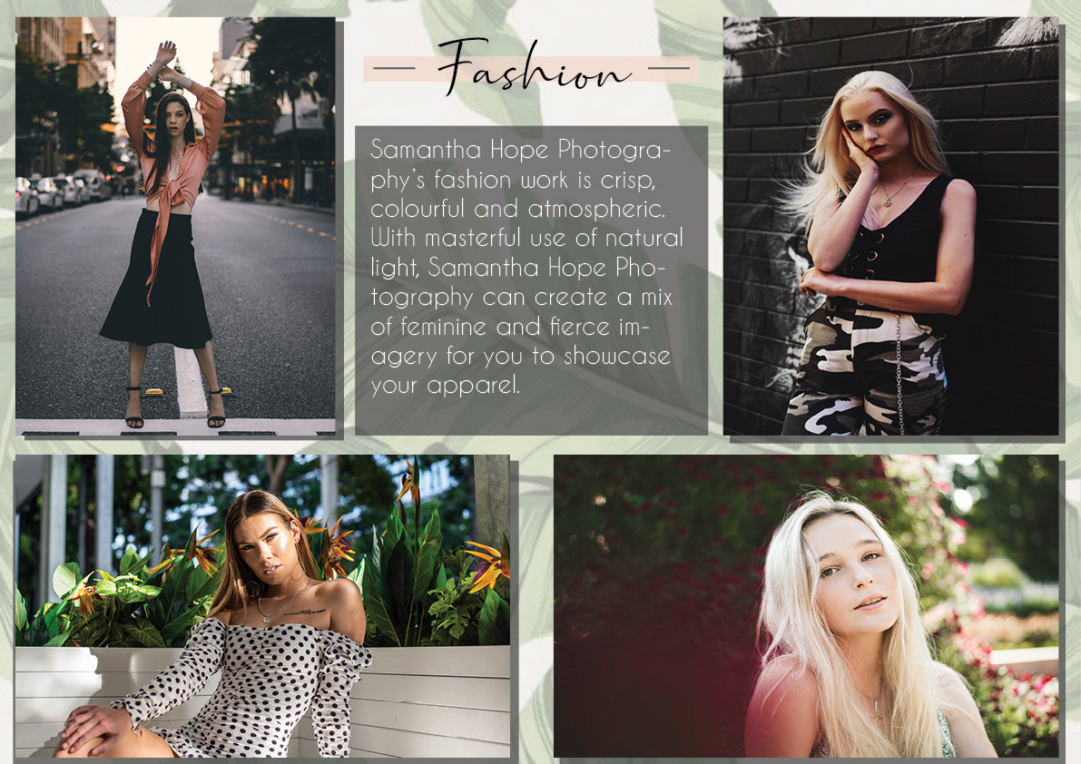
I wanted to showcase 4 main categories, fashion, portraits, maternity and formals, in my presentation while keeping consistency. I decided to go for a green and peach colour palette with a hint of black. I picked a flora background of green palm leaves and turned the opacity down so it wasn’t a vibrant. The hints of black are in the main titles and drop shadows and the peach colours were used in the circle motif and as a thin banner behind the titles. I chose multi-coloured pastel colours for the maternity page to tie in with the theme of children and babies. For me this was visually appealing but sticking with peach circles would help more with consistency.
I wanted to showcase 4 main categories, fashion, portraits, maternity and formals, in my presentation while keeping consistency. I decided to go for a green and peach colour palette with a hint of black. I picked a flora background of green palm leaves and turned the opacity down so it wasn’t a vibrant. The hints of black are in the main titles and drop shadows and the peach colours were used in the circle motif and as a thin banner behind the titles. I chose multi-coloured pastel colours for the maternity page to tie in with the theme of children and babies. For me this was visually appealing but sticking with peach circles would help more with consistency.
In the first version I struggled with aligning text so I didn’t create orphan words or hyphenated words. I also had trouble with aligning images and giving them padding. In the final version I gave the text some padding and made the font smaller to resolve the prior issues. I changed the layout of the Portraits page after some feedback in class. As the titles on all previous pages were in the top corner it was distracting for viewers to look somewhere new for the title. I gave the images on all pages some padding and aligned them in grid formats. I removed some of the images from the Formals page to make the grid format coheres better.
I feel my portfolio meets the brief and accurately reflects the quality of my work and what services I offer.
I feel my portfolio meets the brief and accurately reflects the quality of my work and what services I offer.
Final Version

First Version


Planning & Curation


Design Brief


