BIANCO
BRANDING
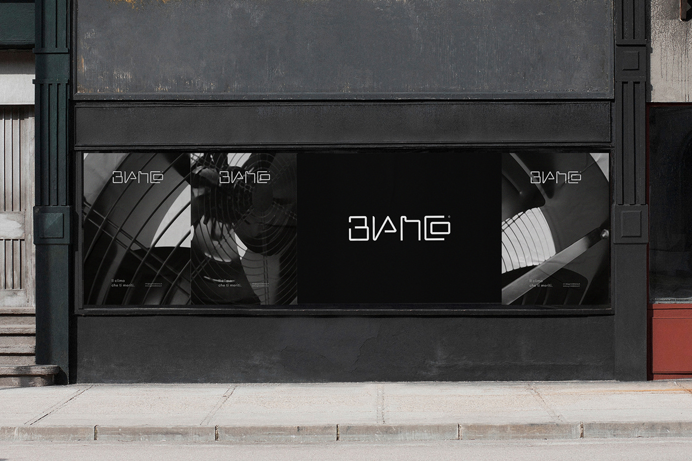
Bianco is a company that works to consulting the best solutions for the comfort of environments in private and public spaces. The new image of it outlines a more responsible attitude towards people that pay attention not only to the quality of the offered services but also to a good presentation of the interlocutor. Originally the company name was Agenzia Bianco but now has lost the suffix and it’s only Bianco. The design of the logotype is inspired by the paths of the air ducts and the result is an absolutely personal and unmistakable lettering. But Bianco stands for white in the Italian language and this color reveals the maximum expression when combined with the black; this is why the corporate branding is characterized by this chromatic duality and nothing else. Bianco is no longer just a name, it’s a brand that wants to become a hallmark of guarantee and promote the current eco-sustainability topic.
GRAPHIC DESIGNER: SILVIO GIROLAMO
YEAR: 2019