

AUTHENTIC FAST-FOOD RESTAURANT IN TRADITIONAL RUSSIAN LUBOK STYLE.
RETAIL DESIGN FAMILY - retail design, strategy
ANDREW VISHNIAKOV - creative conception, visual merchandising, art direction
MARINA RUSANOVA - illustration
ANTON PROKOFIEF - food design, brand chief
JENIA SHARAPOVA - architecture
IBP GROUP - product owner
COMPLETION - 2018
LOCATION - St.Petersburg, RUSSIA

ABOUT PROJECT
Tsar Pishka is a fast-food chain located in St. Petersburg Russia. A distinctive feature of these restaurants is the presence on the menu of Russian traditional dishes optimized for consumption on the go. The main product on the menu is Pishka, and is served in different versions of serving and with different fillings.
The Retail Design Family team worked for 6 months on this project. At the moment, the restaurant chain Tsar Pishka is developing as a franchise, gaining increasing popularity.

LUBOK STYLE
Lubok (lubok picture, lubok sheet, a sweatsheet, a simpler) is a type of graphics, a signature image, distinguished by the simplicity and accessibility of images. Originally a kind of folk art. Performed in the technique of woodcuts, copper engravings, lithographs and was supplemented with hand-painting.
For lubok are characterized by simplicity of technology, laconic visual means (rough stroke, bright coloring). Often the lubok contains a detailed narration with explanatory inscriptions and additional to the main (explaining, complementary) images.
The lubok was made as follows: the artist applied a pencil drawing on a fake board (lube), then on this drawing with a knife made a deepening of those places that should remain white. The painted board under the press left on paper the black contours of the painting. Printed in this way on gray cheap paper were called paintings-stonics. They took the snares to special artels. In the 19th century, there were special artels in the suburban and Vladimir villages, which were engaged in the coloring of lubok. Women and children were engaged in coloring luboks.
Due to its clarity and orientation to the "broad masses" lubok was used as a means of agitation.

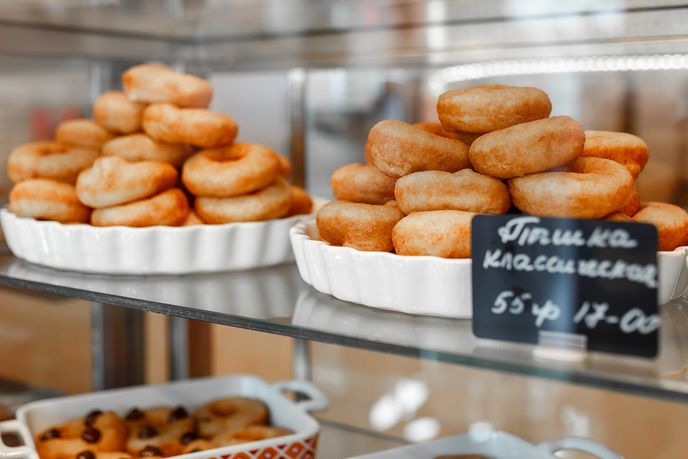
MENU AND PISHKA
A local variety of doughnuts. In the old days in Russia, Pishka was called any products from the dough, fried in oil. Pishka are especially popular in St. Petersburg. This dish is very popular with tourists.


Marina Rusanova embodied the idea of the Product team in the traditional Lubok technique. Marina Rusanova is a recognized master of Lubka all over the world. Her works are on display in galleries and private collections around the world.


VISUAL IDENTITY
Creating the concept of visual identity, the project team tried to convey the authenticity of Lubok's style in the elements and compositions. The plot of the images was designed based on the marketing strategy and preferences of the audience. The owner of the brand sought to convey the value of Russian culture and the need to preserve identity despite global trends such as Loft, Eclecticism, Minimalism. Tsar Pishka is popular with tourists and visitors to St. Petersburg.


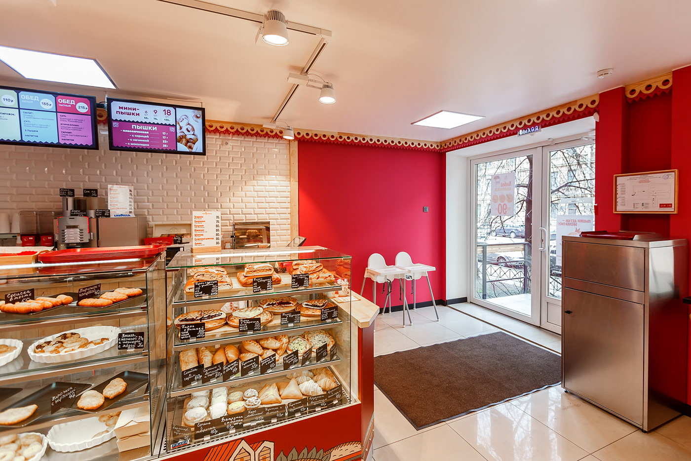
VISUAL MERCHANDISING / DECORATION / FIXTURE
Retail Design Family experts designed three loyauts model of visual merchandising: exterior, interior of the trading hall. location of goods on the trading equipment. It was important to take into account the purchasing missions and the scheme of movement of buyers in the space to create a comfortable environment.


If you ever visit St. Petersburg be sure to visit the Tsar Pishka!


