
Châtelet, Musical Theater of Paris new visual identity system
In 2019, the iconic Théâtre Musical de Paris Châtelet reopened its doors
after two years of renovation and outdoor events. For the theater, this meant a curtain raiser that marks a new phase with a new managing team.
after two years of renovation and outdoor events. For the theater, this meant a curtain raiser that marks a new phase with a new managing team.
The primary aim was to create coherence in the identity of the theater and to enhance its visibility. And thus, to develop the popularity of the brand ‘Châtelet’.
The challenge also included the creation of an extendable brand identity system for the theater, given that the previous identity left little room for modification for the internal teams. The goal is to make it a theater for all Parisians, whether old or new to the theater scene.
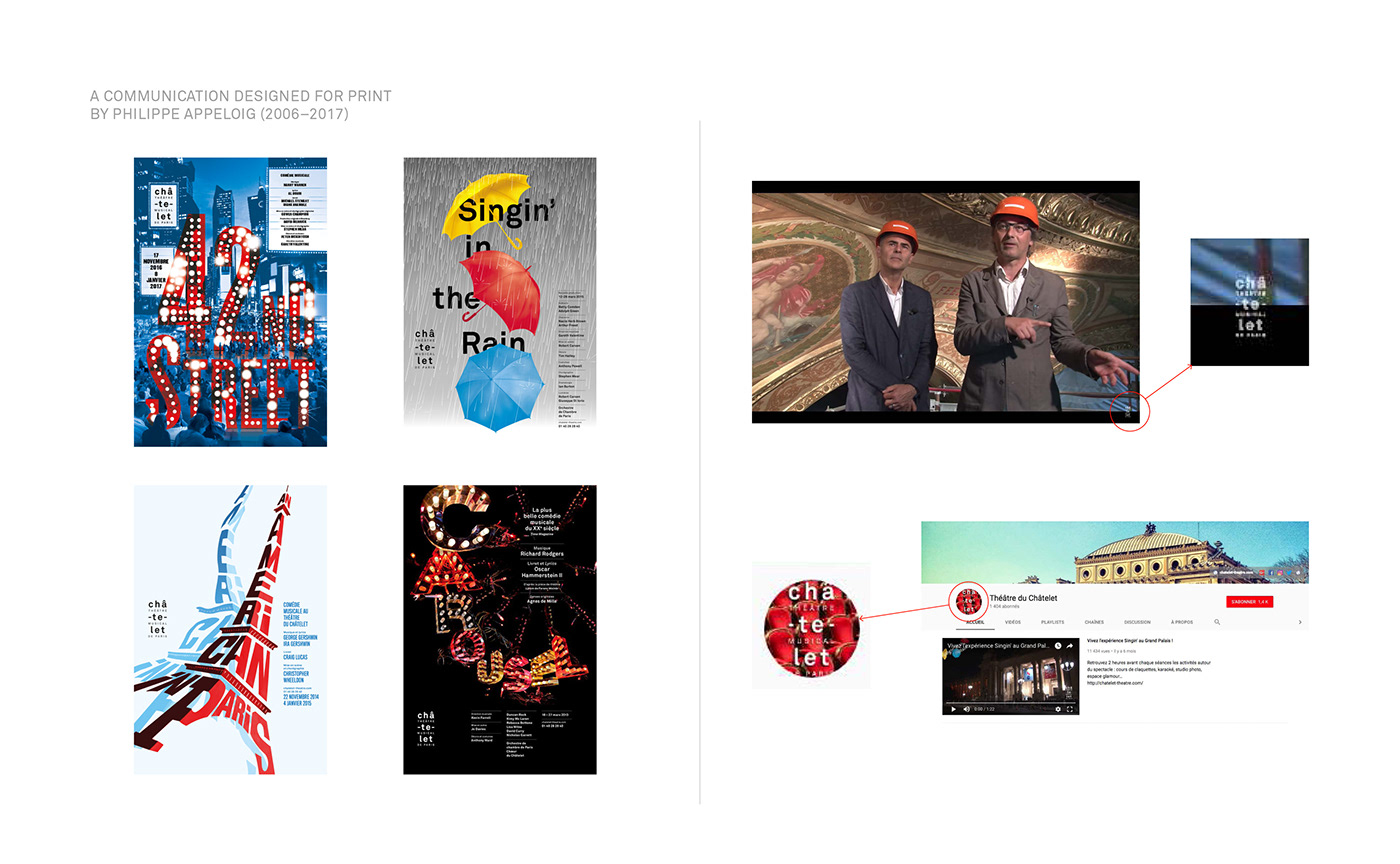
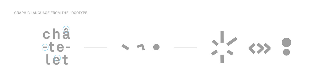
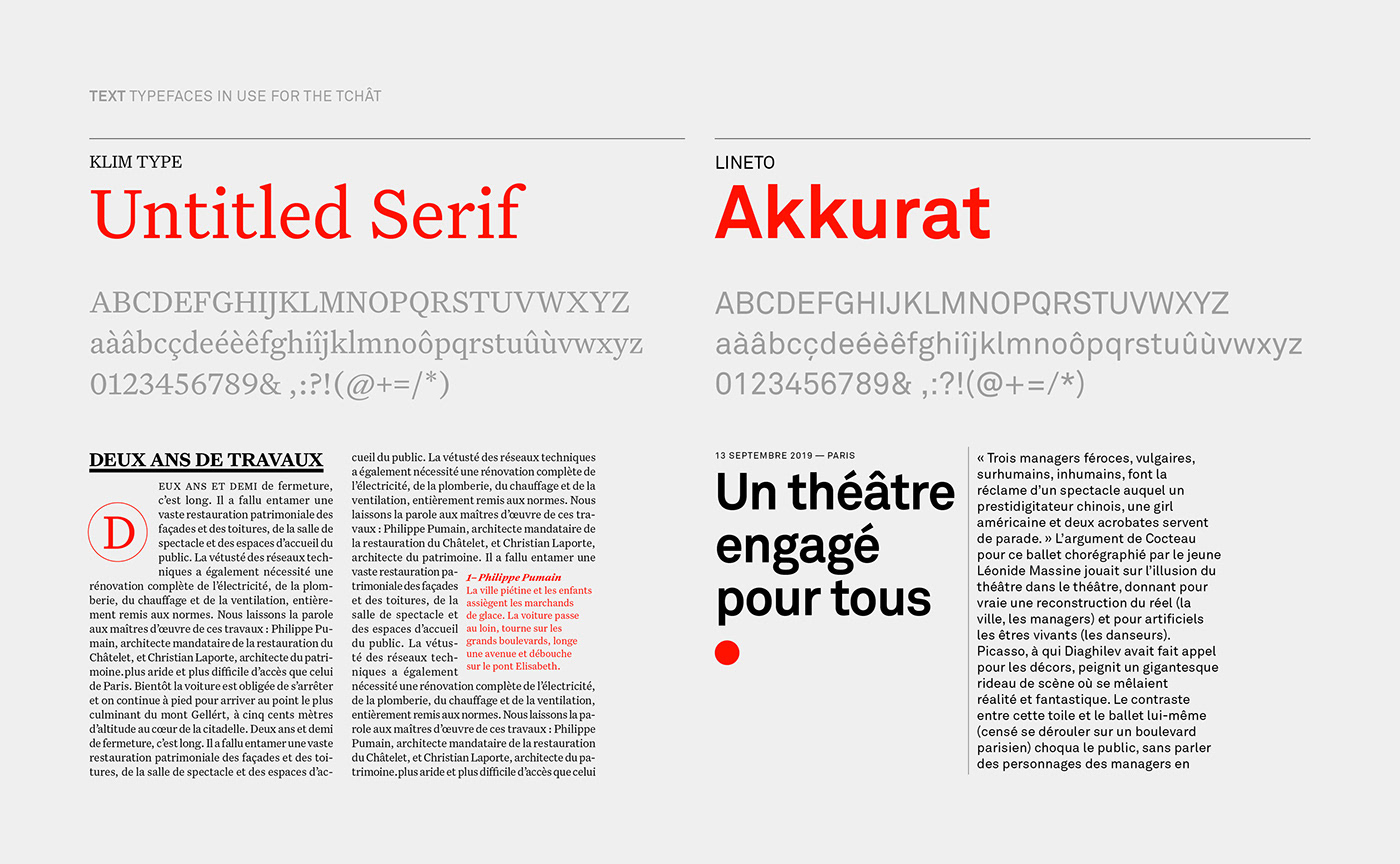
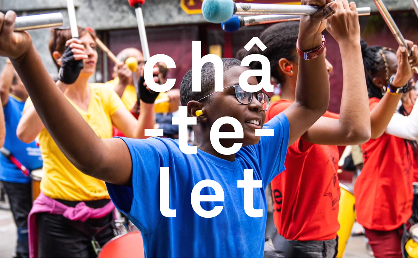
The original logotype of Châtelet was designed 12 years ago by Philippe Apeloig. Today, this logotype has acquired a symbolic status in the cultural landscape. Although having a very strong and well-known identity, the logo lacked prominence in the totality of the theater’s communication. Its subdued presence on poster campaigns hindered the visibility of the ‘Châtelet’ brand.
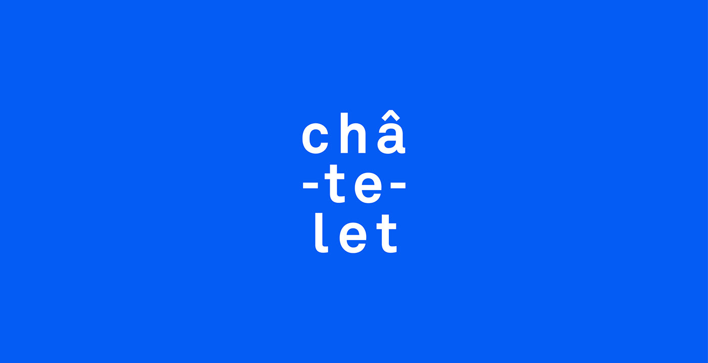
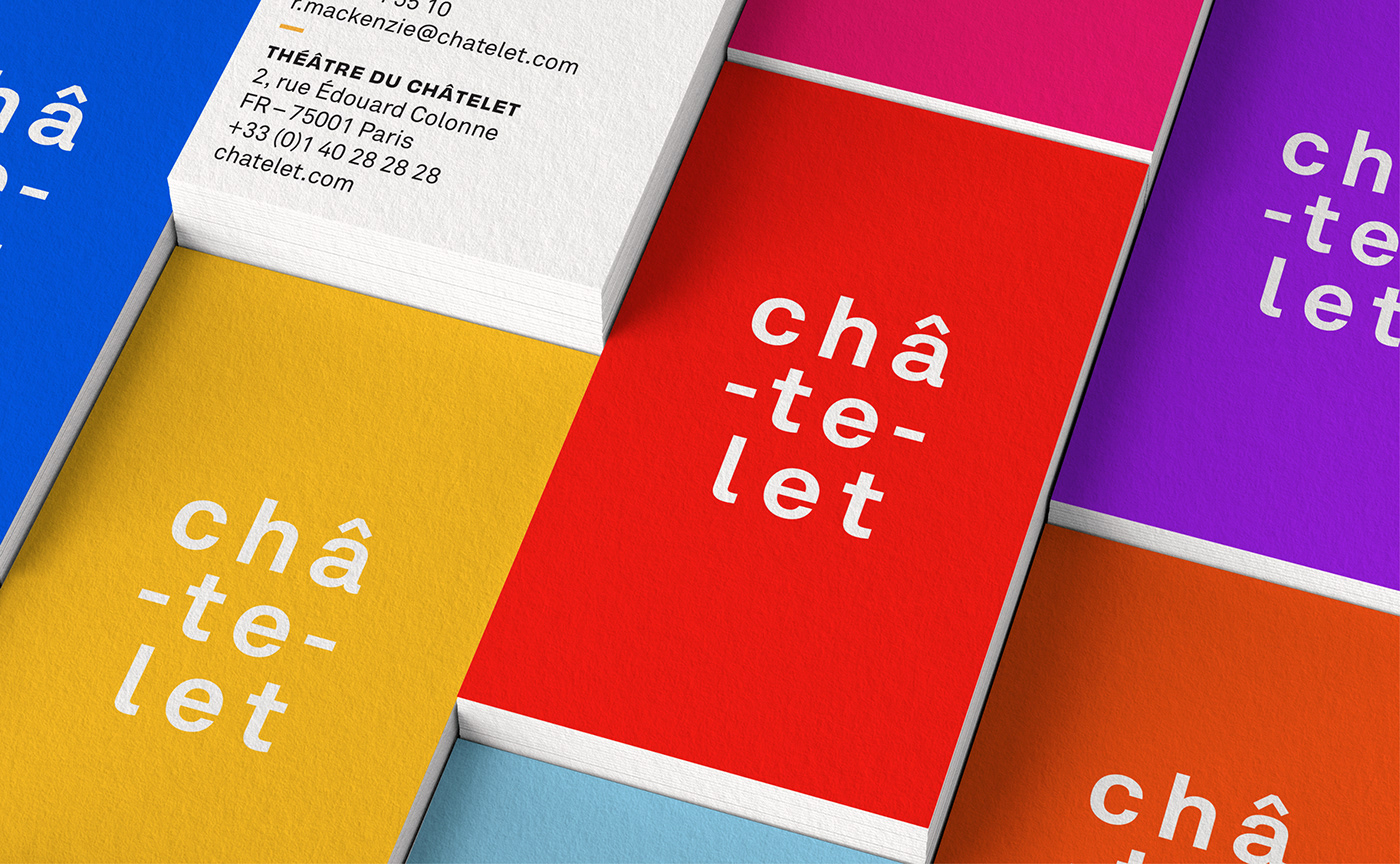
Retaining this logotype in the new brand identity was a non-negotiable. Being split in three lines, the word « Châ-te-let » is simultaneously read as a sound and an image. Due to its peculiar typographic composition, the hyphens of the logotype hint at the connections between the arts, music, perspectives
and cultures.
and cultures.
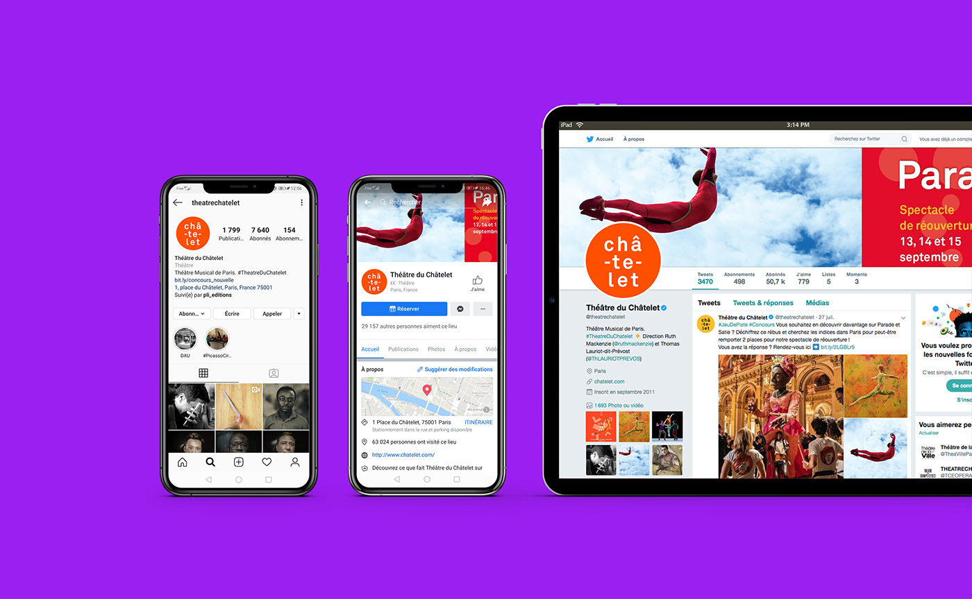
Chatelet theater brand identity goes digital first
The brief from the theater was very precise: the identity needs to be reimagined so as to be more flexible and adaptable to various digital touchpoints. The previous identity lacked this flexibility as it was primarily intended for posters and printed communications. This strong technological constraint directed our design decisions, leading to simple and efficient visual solutions.
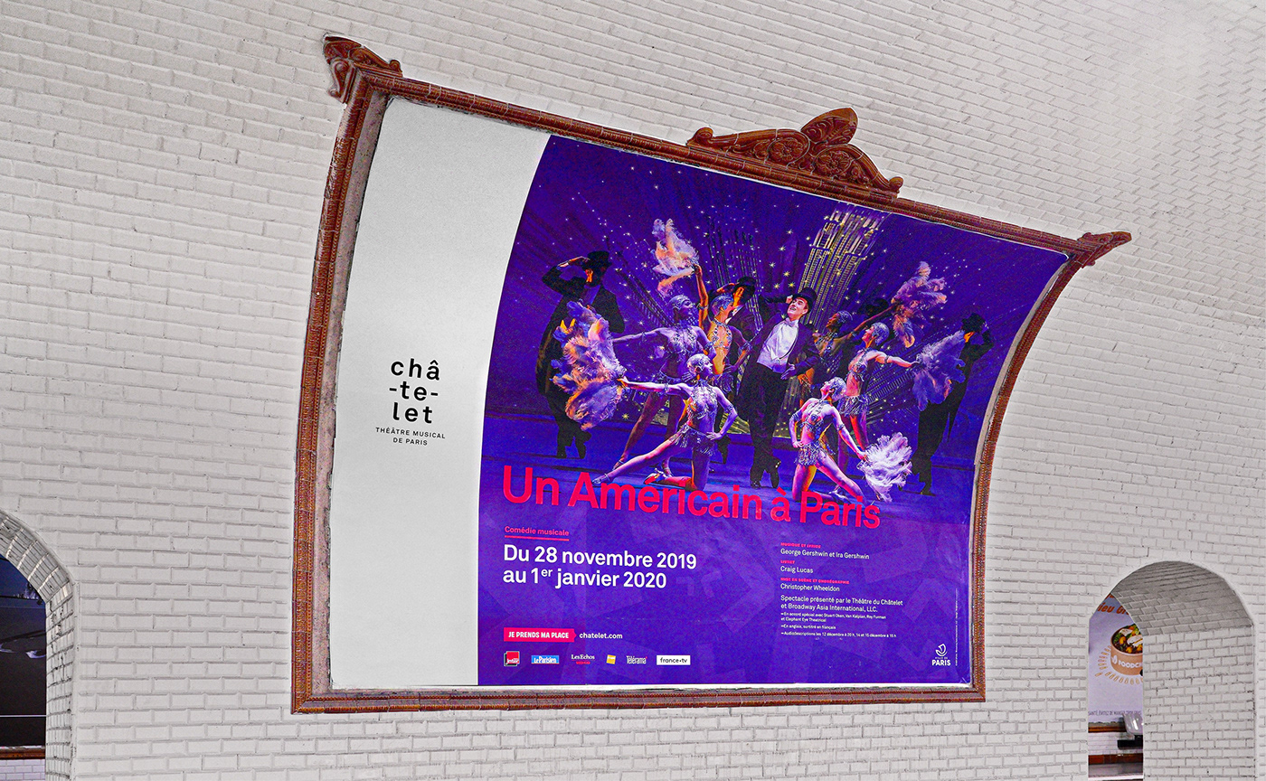
The Châtelet theater intended to establish its presence in the digital era: be it with the new digital displays at the entrance of the theater or the complete redesign of their website.
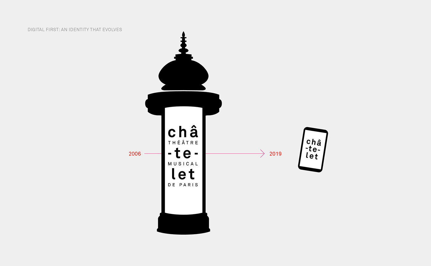
It is this digital first optimisation that inspired the simplified version of the logo.
This optimized logotype is suitable for digital displays and revamps the previous logo while still retaining its rhythmic and sonic concept.
It is this digital first optimisation that inspired the simplified version of the logo.
This optimized logotype is suitable for digital displays and revamps the previous logo while still retaining its rhythmic and sonic concept.
The ubiquity of the theater allows the logotype to be separated from its tagline without affecting its recognizability. This modification also resolves online display constraints, thus creating a logo that is legible at all sizes. By readjusting the logotype to work on screens, we added responsiveness to the identity, allowing for applications in motion design, social media and various other content platforms in the most cohesive manner possible in the theater’s communication.


A Simplified logo to unleash more fun and potential
A simplification that revitalises the brand and increases its potential for adaptability. Just as Parisians don’t call Centre Pompidou by its official name, but call it the « Beaubourg » instead, in a similar fashion, they don’t go to the « Théatre Musical de Paris », everyone goes to the « Châ-te-let ».
This idea was a part of a larger strategic and gradual overhaul that intends to popularise the image of the place and create a sense of ownership towards it. Not updating its communication strategy meant that the Théâtre du Châtelet faced the risk of becoming outdated. Whereas implementing this overhaul meant consolidating its existing image and reinforcing the brand to turn it into an iconic benchmark.
Moving the logo to center stage
The first challenge posed by the brand identity redesign and the 2019-2020 season was to give a fresh boost to the identity of the theater, in keeping with the vision of openness, eclecticism and diversity announced for the season.
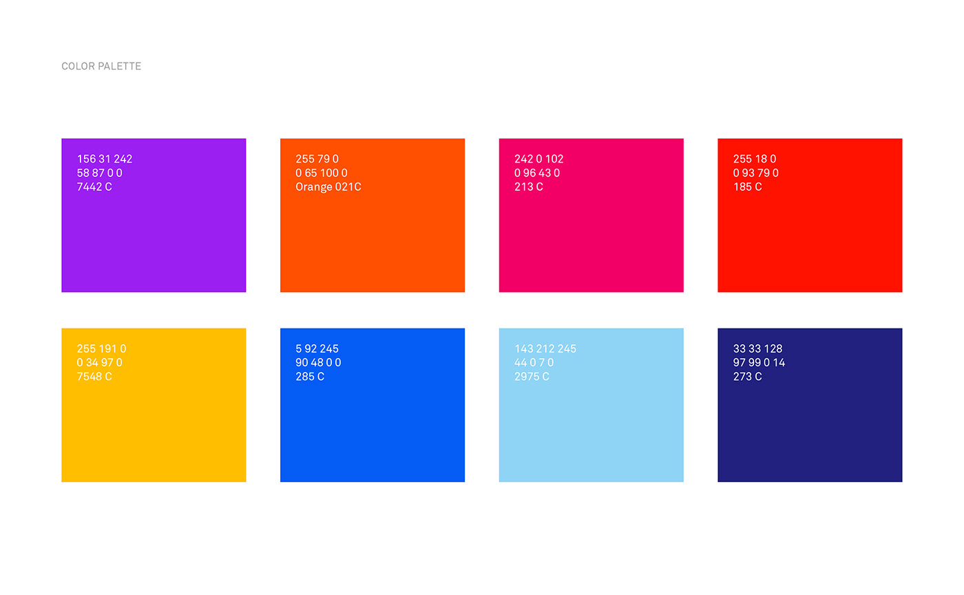
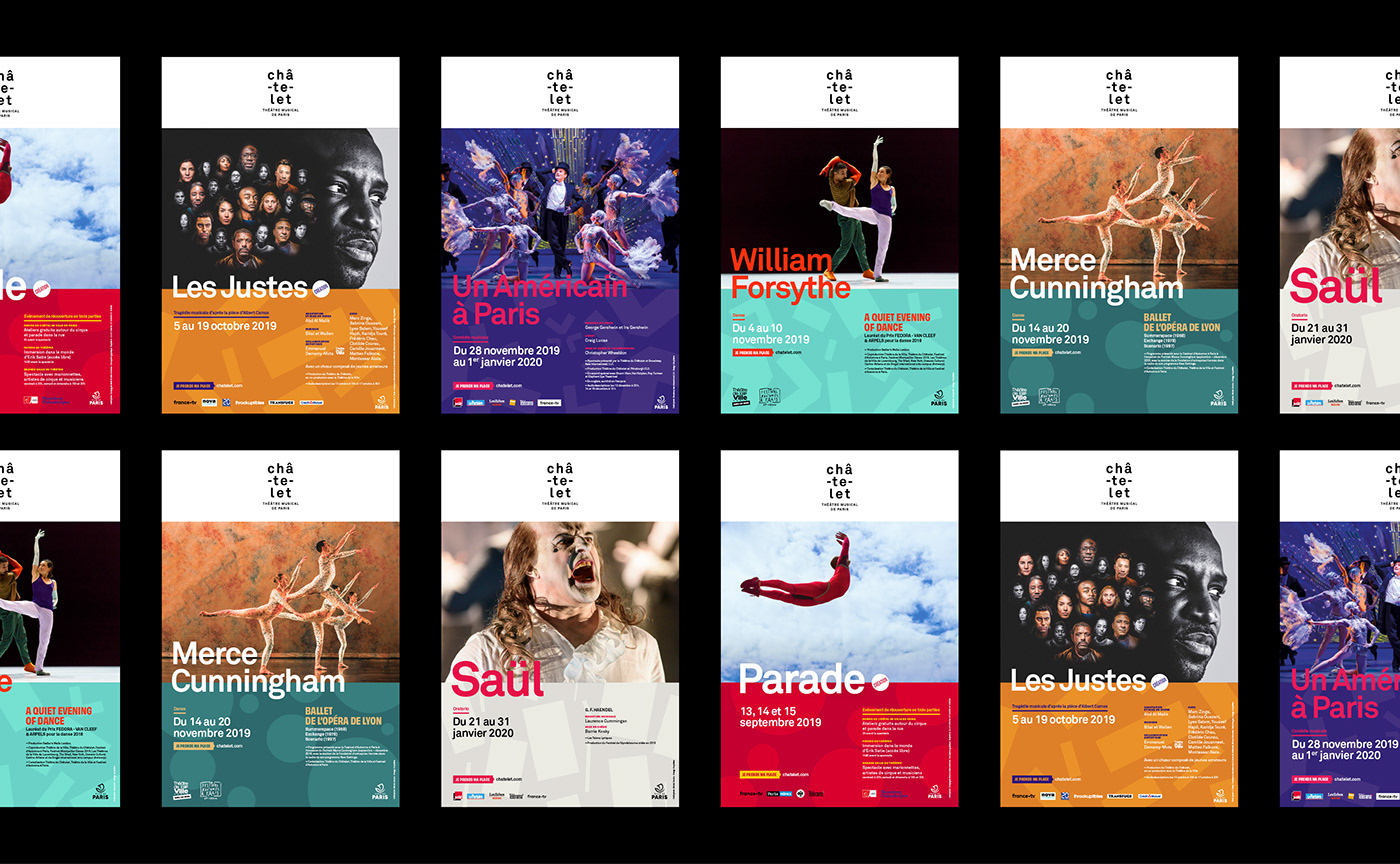
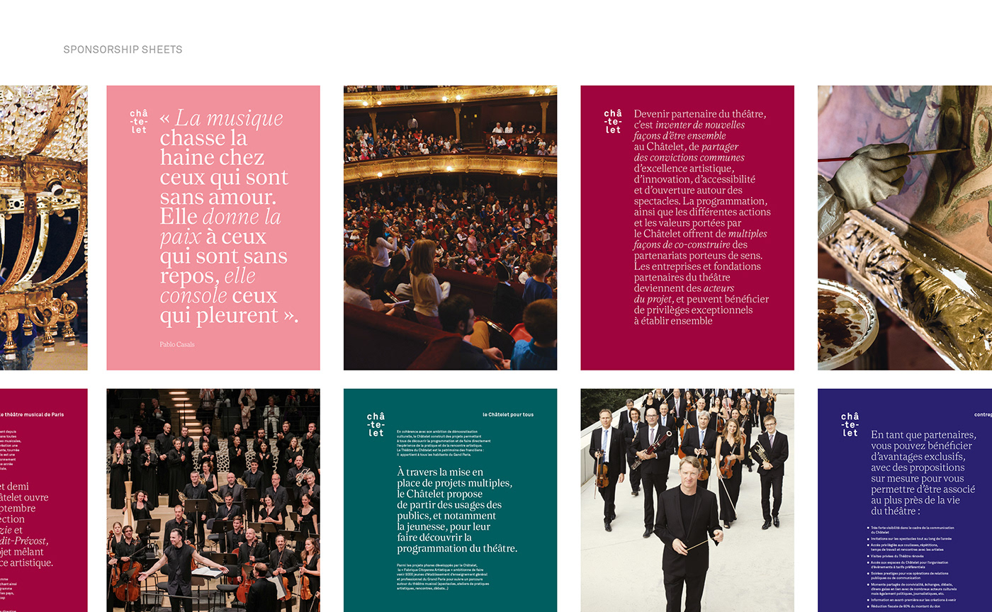
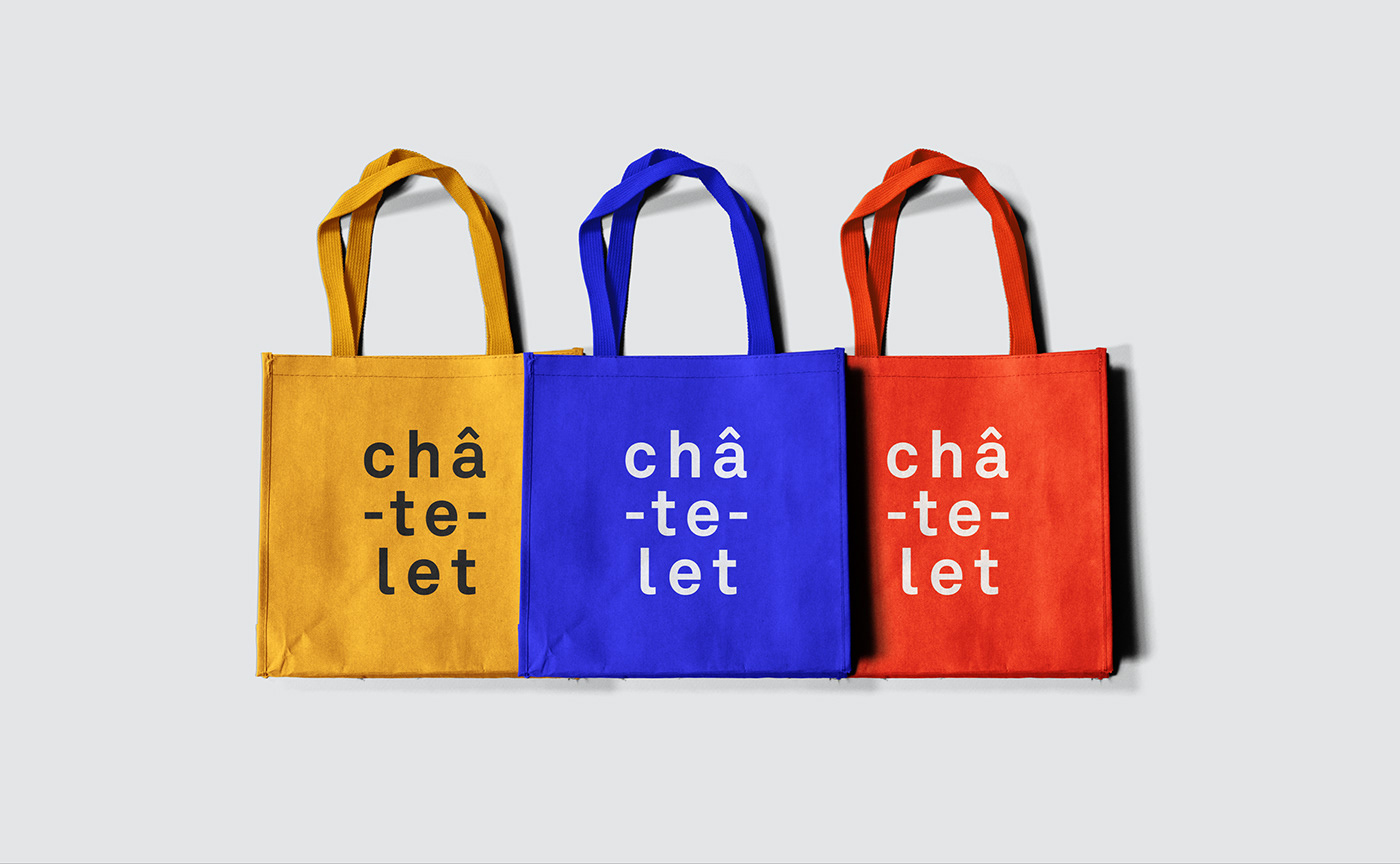
Our response to this challenge was to create a new story around the logo. Just as the hyphens of the logo connect its three syllables, the Théâtre du Châtelet creates connections between the artists and the audience, between people and cultures… The new brand identity is built on playful visual principles that tie everything together and put the identity of the theater on center stage. The dynamic color scheme interacts with the geometric forms derived from the logo: repurposing the circumflex accent, the hyphens, circular forms and so on…

Spotlight on the logo that speaks
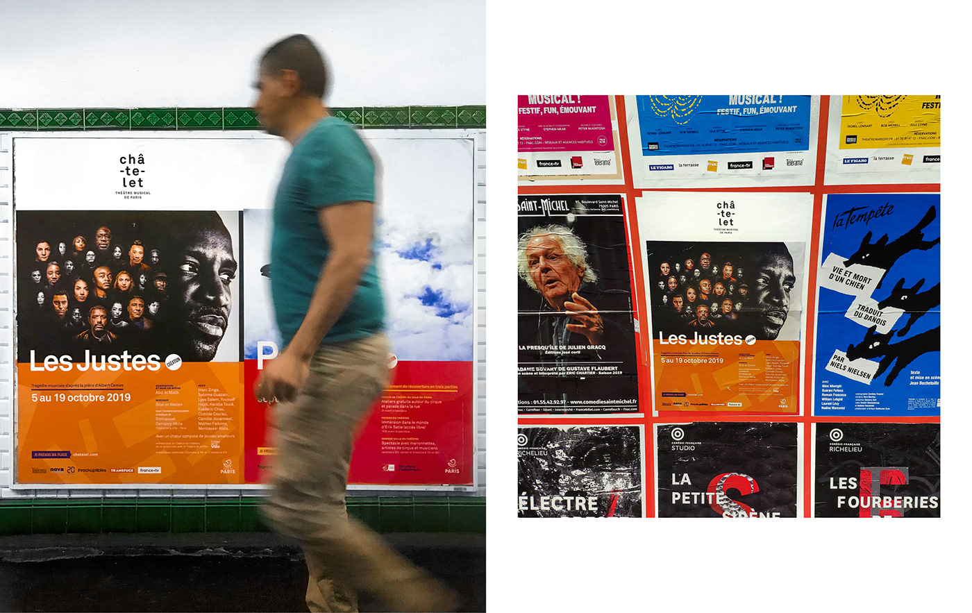
With the first campaign, we sought to create a witty tone of voice that speaks directly to the audience, inviting them and announcing the reopening of the theater.
Accentuating the vision at the théÂtre du ChÂtelet.
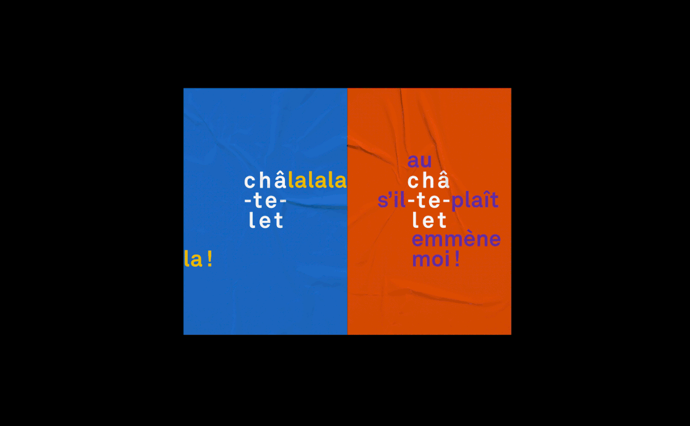
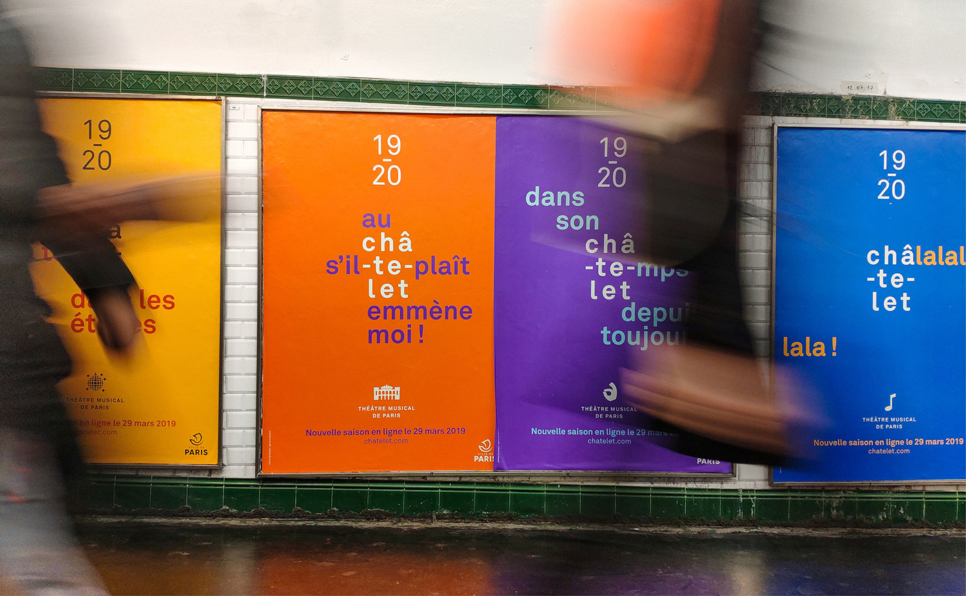
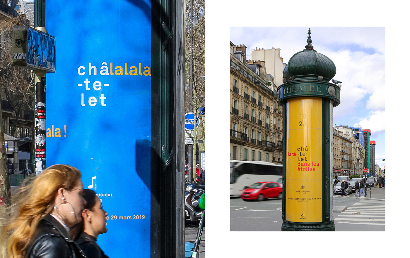
The recurring elements in this highly conversational campaign are the ‘cheeky punctuation marks’ and the ‘circumflex accent’. For this ‘Save the date’ campaign, we capitalized on the spelling of ‘Châ-te-let’ and the form of the logo in 3 parts, to create puns and witty catchphrases that capture the viewer’s imagination and celebrate the newly renovated theater.
Accentuating the vision at the théÂtre du ChÂtelet.
The recurring elements in this highly conversational campaign are the ‘cheeky punctuation marks’ and the ‘circumflex accent’. For this ‘Save the date’ campaign, we capitalized on the spelling of ‘Châ-te-let’ and the form of the logo in 3 parts, to create puns and witty catchphrases that capture the viewer’s imagination and celebrate the newly renovated theater.
« Châ-te-let’s dance »
« Au Châtelet s’il-te-plait emmène moi! »
« Châlalalalalala ! »
« Enchanté, vous le serez aussi »
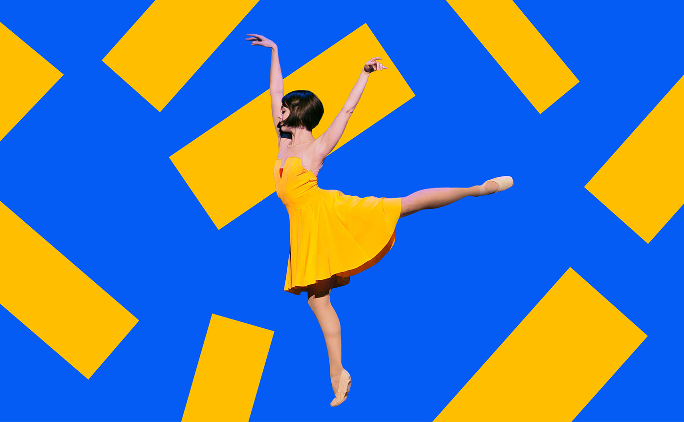
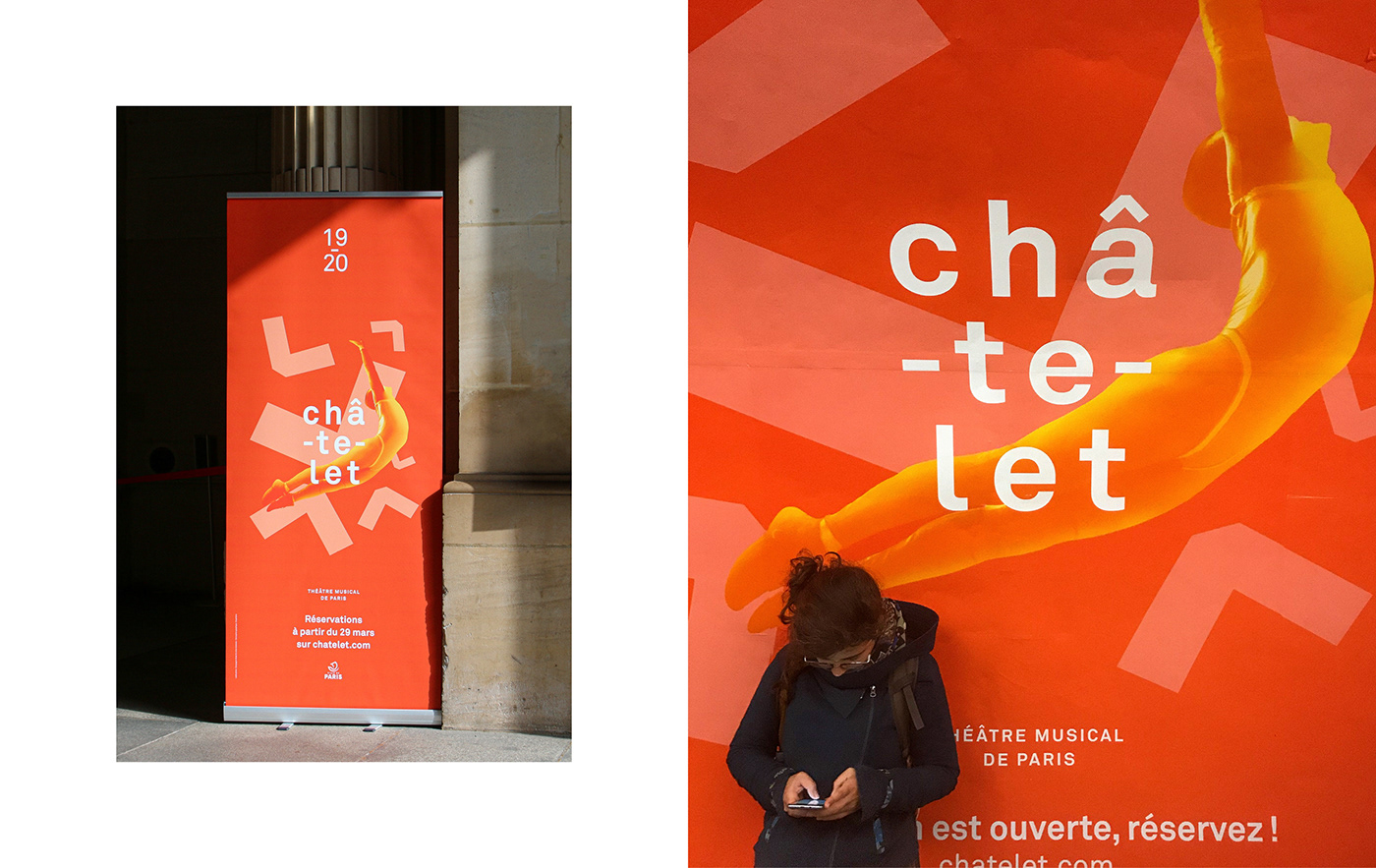
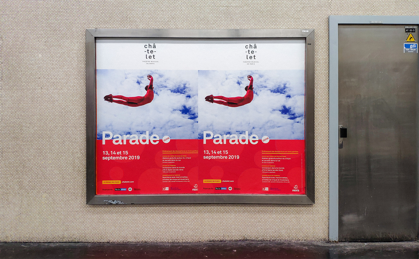
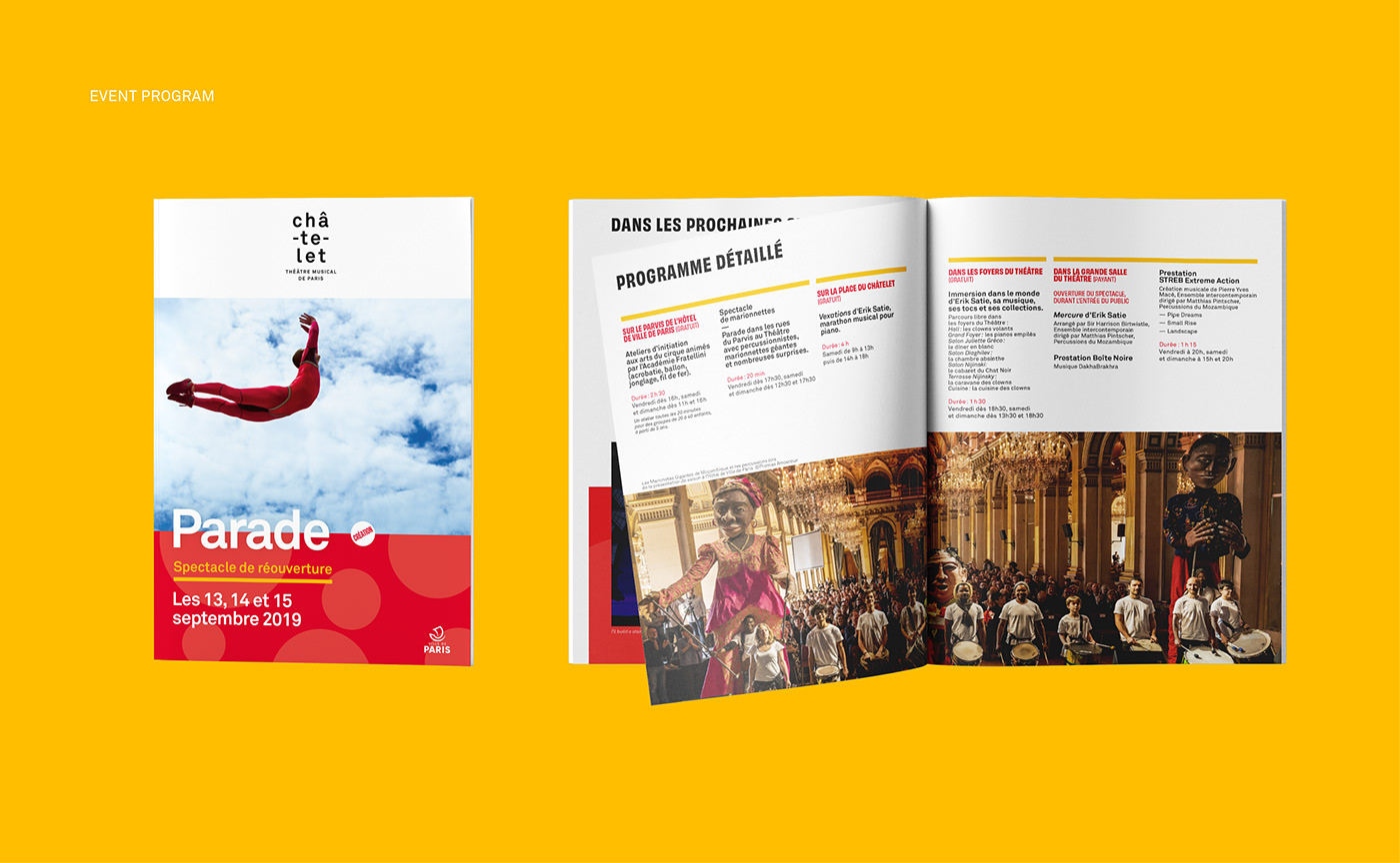
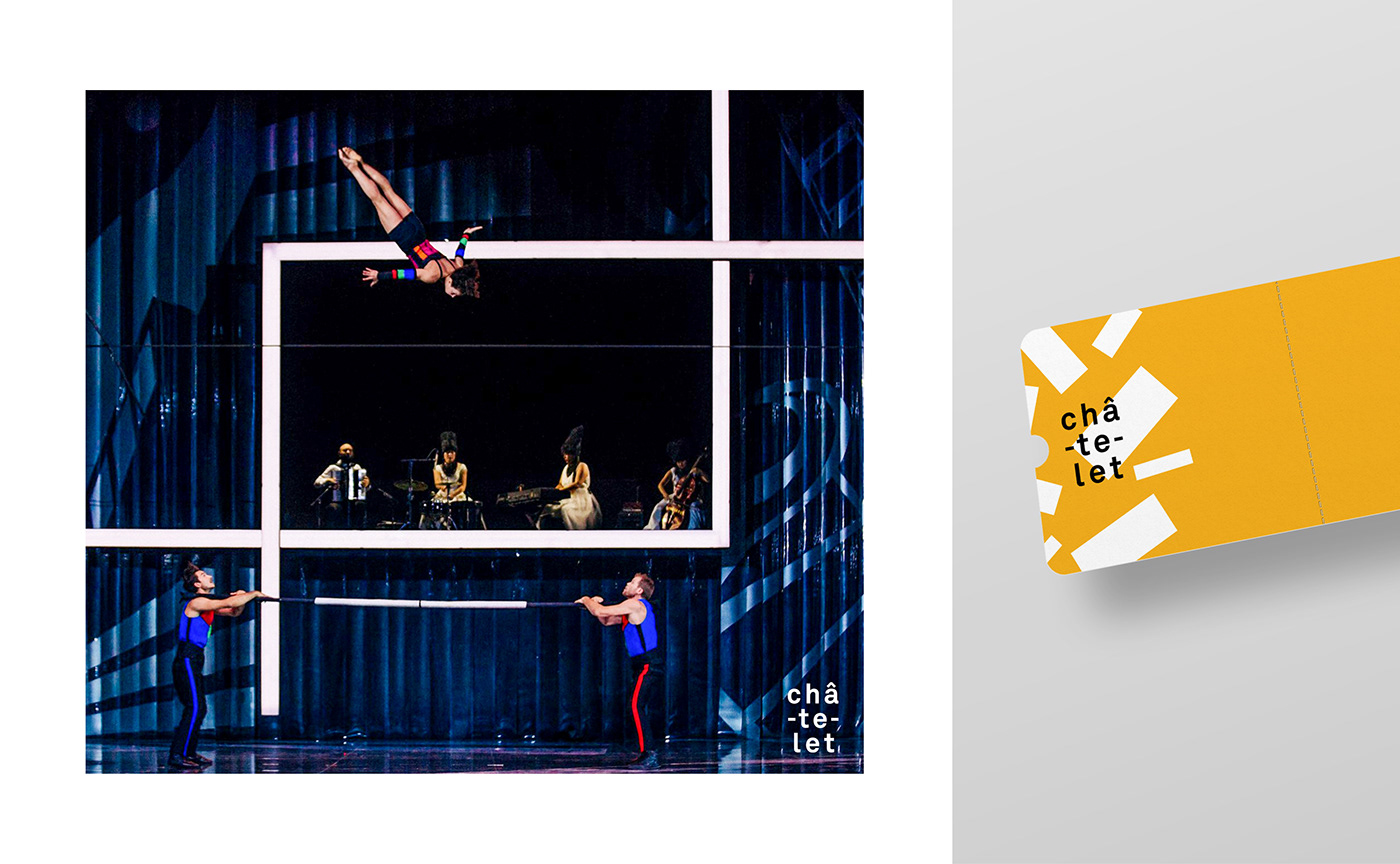
This initial slogan-based campaign was accompanied by the launch of the new season, that nudges viewers to take a leap of imagination. Giving a sneak-peek from the opening show ‘Parade’, the poster for the new season shows an acrobat mid-flight.


An omnichannel brand identity
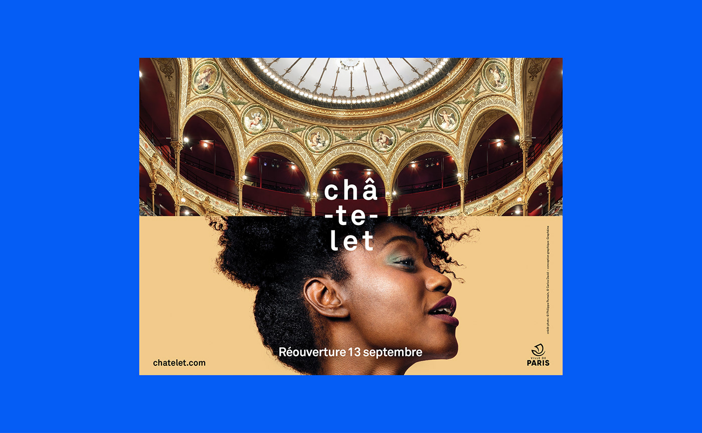
Divided into 3 parts, the event posters also put the « Châ-te-let » logo in the forefront. A dedicated space for the logo creates immediate recognizability for the theater. Followed by a photograph that conveys the mood of the announced event. And finally, the third zone communicates all the event details while reiterating the colorful and geometric ambience of the brand identity. These posters have been conceived as responsive ‘interfaces’ which makes them extremely flexible and allows them to be adapted across all touchpoints, whether printed or digital.
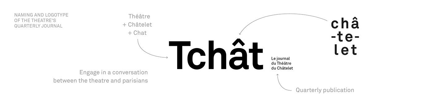
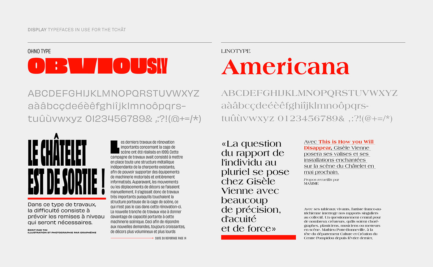
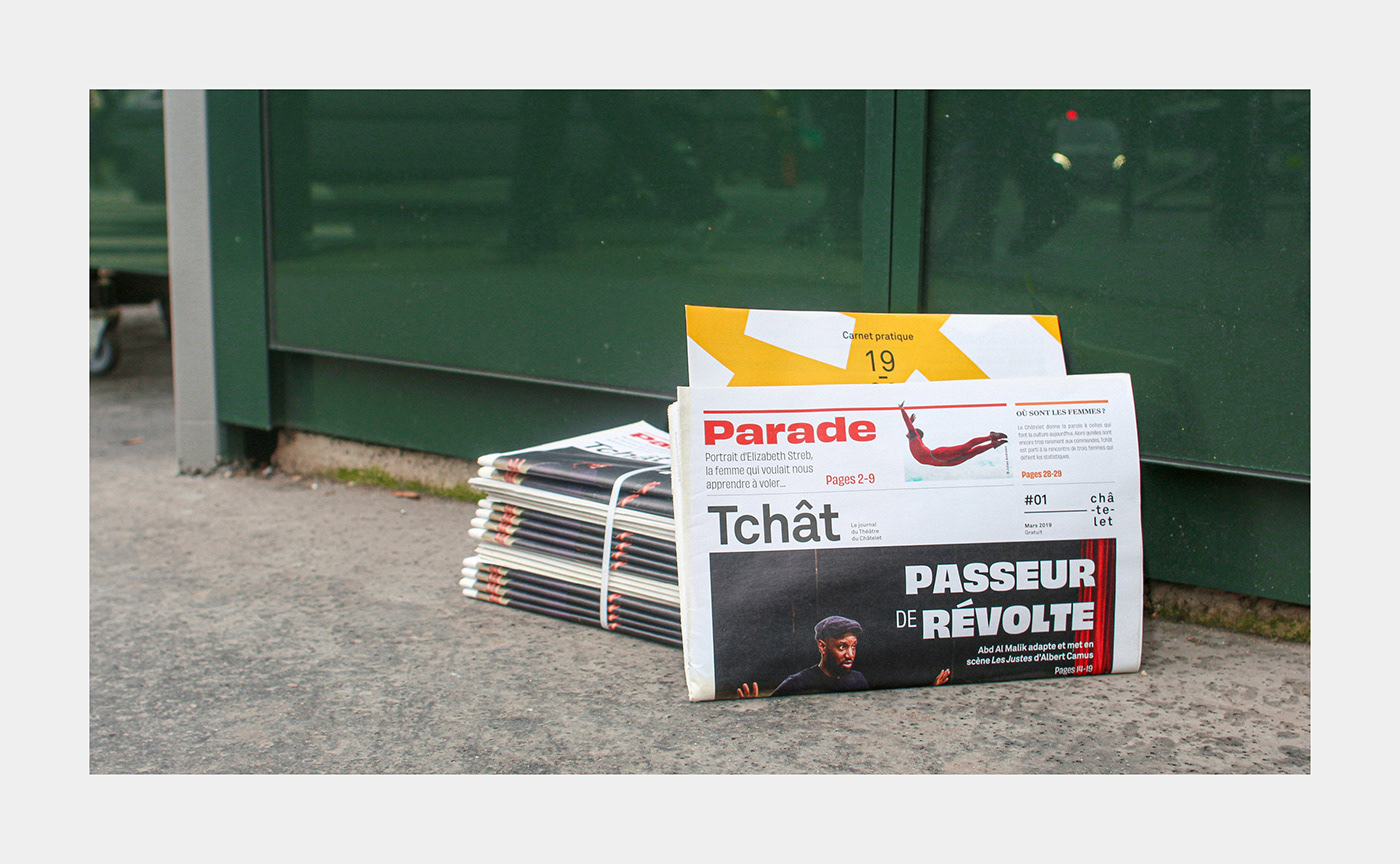
For announcing the reopening of the theater and its message of accessibility, we created a short-run publication that showcases the management’s vision of inclusion and sharing. In collaboration with the editorial team at Châtelet, we also set up a trimonthly newsletter. This newsletter communicates the schedule and the line-up of events, in addition to the regular brochure, but in a quirkier manner.
Graphéine is proud to partner with the Théâtre Musical de Paris for its upcoming seasons and to collaborate with its teams as we take up the challenge of getting the theater back with a bang.


Credits:
Creative direction: Jérémie Fesson
Art direction: Maxime Saint-Etienne, Céline Chenu, Jean-Albert Heckel
Project management: Leslie Darné
Creative direction: Jérémie Fesson
Art direction: Maxime Saint-Etienne, Céline Chenu, Jean-Albert Heckel
Project management: Leslie Darné


